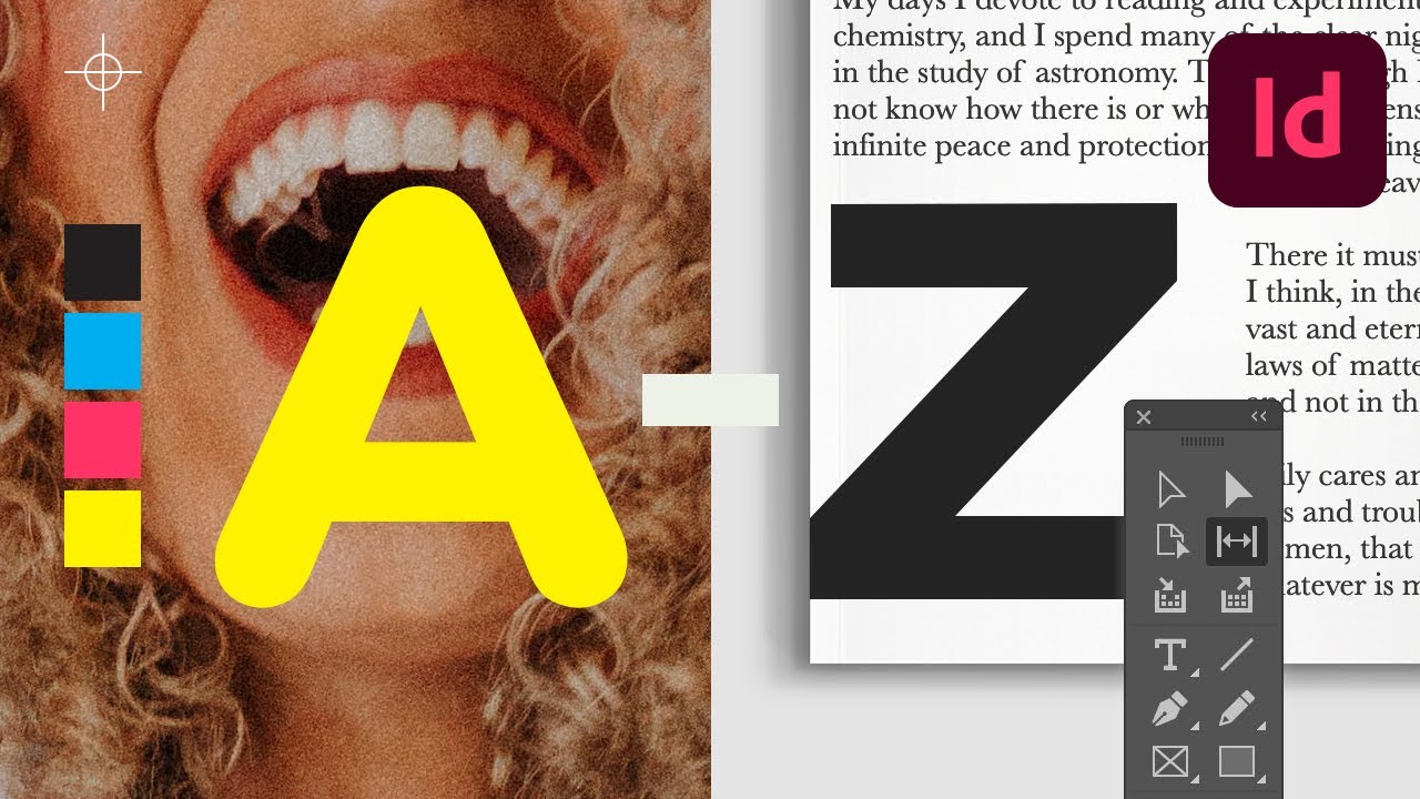
Prefer a video tutorial with InDesign typography tips? Then you must check out this one by Ashlee Harrell from the Envato Tuts+ YouTube channel. Follow it to learn how to create Adobe InDesign text effects:

What you’ll learn in this InDesign text effect tutorial
- How to set up your document
- How to create a text-inside-text effect
- How to create a block-color text effect
- How to enhance text with a dramatic drop cap
- How to add a surreal twist to your typography design
What you’ll need
For this tutorial, you’ll need to add fonts to InDesign (but you can really use any fonts you want):
1. How to set up your document
To learn how to add cool text effects in InDesign, first we’ll set up the document. For all of the InDesign text effects below, we’ll be using an A4 layout.
Feel free to skip this step if you’ll be incorporating any text effect into an existing document.
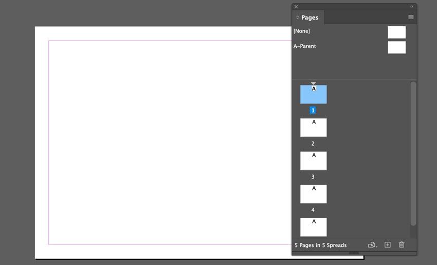
To create a new A4 layout, Open InDesign and select File > New Document. In the New Document window set the No. of Pages to 5. Deselect Facing Pages.
Under Page Size, select 297 mm for the Width and 210 mm for the Height. Leave the Margins at their default value and set the Bleed to 0 mm all the way round.


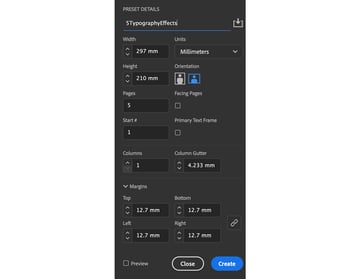
Click OK, and your document’s ready to use.

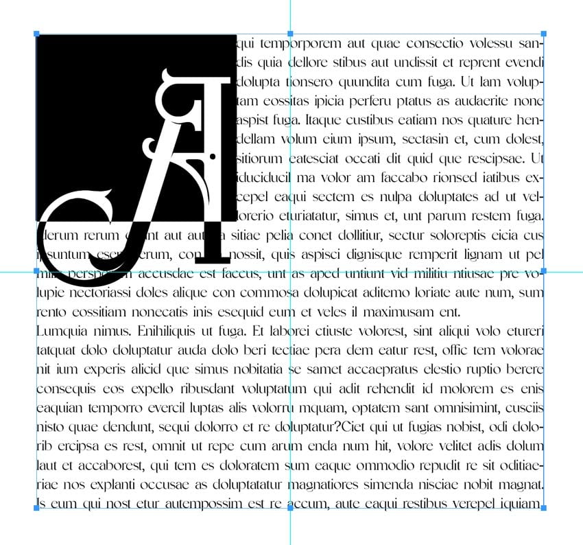
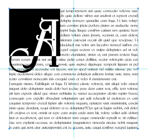
2. How to create a text-inside-text effect
Let’s start with this eye-catching, cool typography design. It’s a text-inside-text effect, perfect for posters, flyers, and more.


Step 1
For this cool typography design, you’ll need to use two fonts. The first font will form the enclosing text, and it needs to be heavy enough to contain a body of text. Cartif is a great choice as it’s also an uppercase style, giving the typography added impact.
The second font will fill the characters of the first font. It doesn’t need to have a particular style or weight, but try to select a typeface that fits the look of your design. In this case, I’ve gone for the soft and simple Dudek.
Step 2
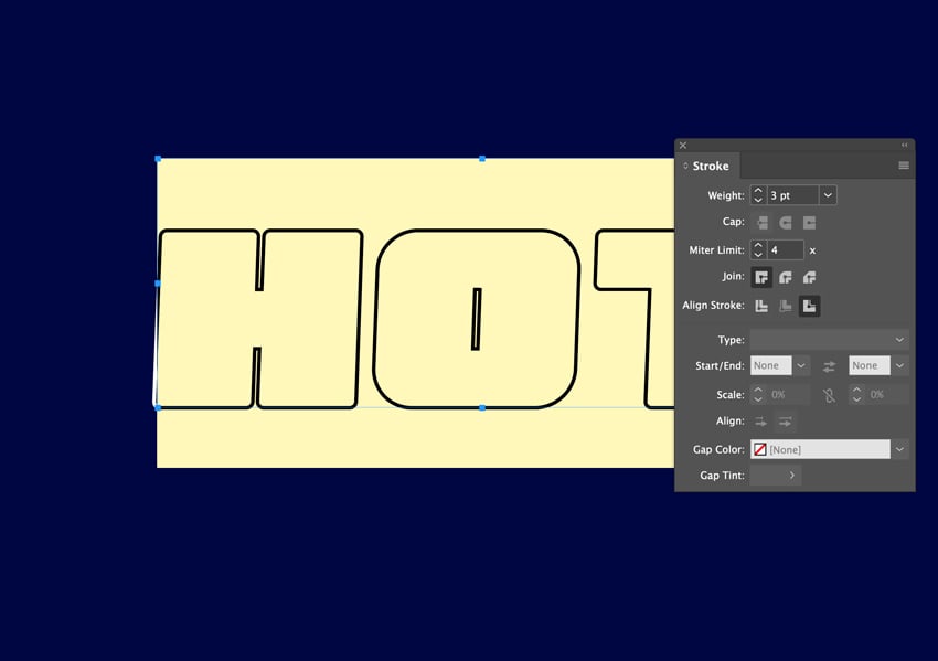
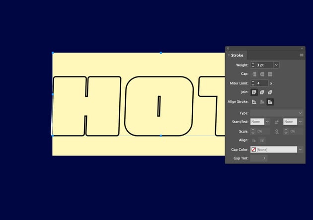
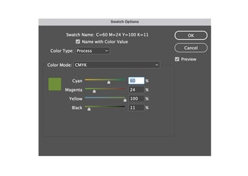
Create a new Swatch and Fill the background with C100 M90 Y10 K67. Type the word ‘HOT‘ using Cartif 210 pt. Set the Fill to None and the Stroke to Paper with a 3 pt Weight.

Step 3
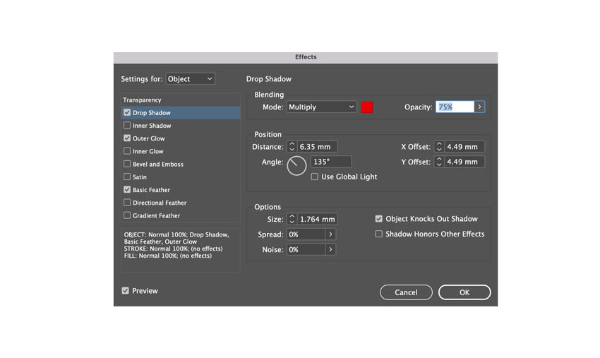
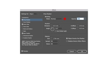
Copy (Command-C) and Paste (Command-V) this text layer. Create a new Swatch and Fill it with C9 M100 Y96 K93.
Now, let’s apply a Drop Shadow on text in InDesign. Add it to this second text layer using a C0 M100 Y100 K17 swatch.

Step 4
Apply an Outer Glow to this second text layer using a C0 M45 Y100 K0 swatch.


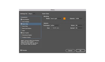
Step 5
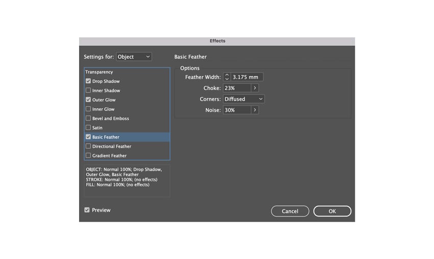
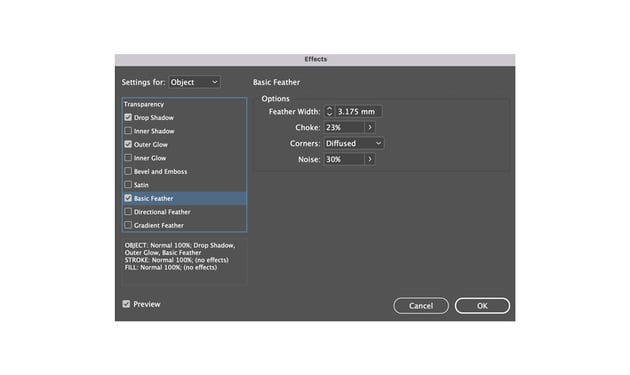
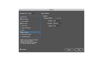
Apply a Basic Feather to this second text layer.
Step 6
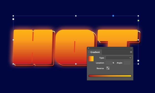
Duplicate this second text layer and remove the Basic Feather. Add a Gradient to the third text layer for the Fill using the Red and Orange swatch.


Step 7
Grab the Type Tool (T) and Type ‘H’. From the Character Formatting Controls panel along the top of the screen. Set the following parameters:
- Font: Cartif
- Size: 210 pt
- Orientation: Align Left
Maintain the default [Black] text Fill. Select the text frame and Edit > Copy and Edit > Paste. Change the character to ‘O’ and maneuver the frame to the right of the first character.


Pull down a Guide from the top Ruler (View > Show Rulers) to create a baseline for the characters to sit on. Or pull out horizontal Guides from the left-hand Ruler to create guidelines for equal spacing between characters.
Repeat the above process for the other character—in this case, ‘T’ to form the word ‘HOT’.


Step 8
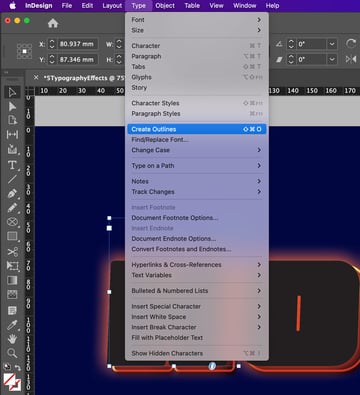
Select the first character’s text frame and go to Type > Create Outlines. Repeat for each text frame. Each character is converted to a vector outline.


Step 9
Select all the outlined characters by pressing Shift and selecting each letter.
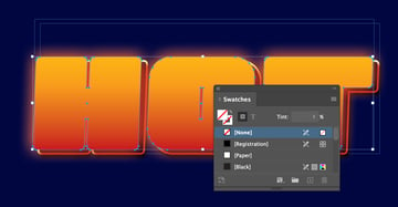
Open the Swatches panel (Window > Color > Swatches) and set the Fill to [None]. Deselect the characters by clicking once outside of the page.


Step 10
Select the Type Tool (T) and hover over the first character in the word (here, ‘H’). You will see the icon change from a type icon with straight brackets to a type icon with curved brackets.
Click once, and the vector shape will be transformed into a text frame. Switch to the Selection Tool (V, Escape) and select the first character, here ‘H’.
A small white square has appeared at the bottom-right of the shape. Click once on the square and click again in the next character (here, ‘O’) to connect both with text threads.
Go to View > Extras > Show Text Threads to view how the characters are connected. Repeat the process above until all the characters are connected.


Step 11
Select the Type Tool (T). In the Character Formatting Controls panel, set the following parameters:
- Font: Dudek Semibold Round
- Size: 9 pt
- Leading: 9 pt
- Orientation: Justify with Last Line Aligned Left
Click once inside the first character and go to Type > Fill with Placeholder Text. Or add your own text for artistic InDesign typography effects with extra meaning.


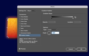
Select the three text frames and apply a Gradient Feather.


Step 12
Increase contrast by using another text layer with a gradient stroke. Get the effect right by also adding a drop shadow on text in InDesign.
And you’re done! These InDesign text effects are ideal for large-scale settings, like posters or banners.


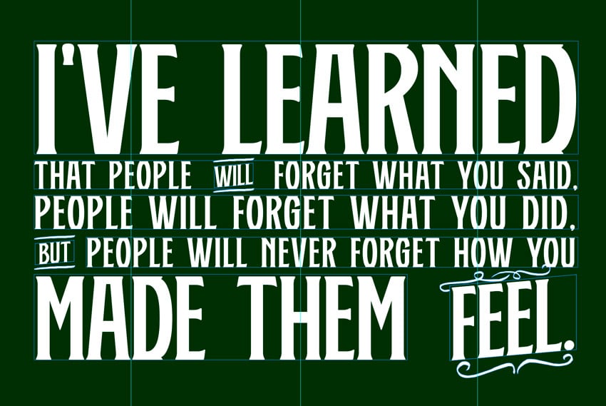
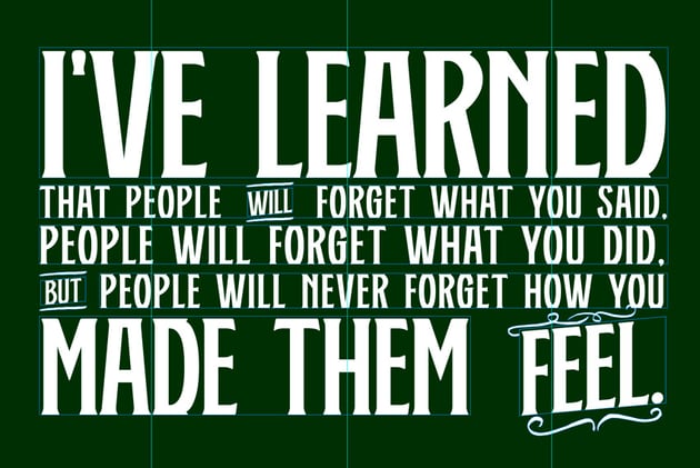
3. How to create a block-color text effect
This is a simple yet high-impact Adobe InDesign typography design. Use it to introduce some visual interest and pops of color in an otherwise solid block of text.


Step 1
On Page 2 of your InDesign document, Fill the background with C81 M18 Y100 K83. Select the Type Tool (T) and drag to create text frames.
Type a phrase about four lines long. Set the Type to All Caps (next to the Font Size drop-down menu, in the Character Formatting Controls panel).
Set the Orientation to Justify all Lines. Uncheck Hyphenate in the Paragraph Formatting Controls panel. Center the text frame on the page.


Step 2
Select a font with a bit of personality—depending on your choice of colors, this can have a different impact. Here, I’m going for a fun, craftsy feel, so I’ll choose a font called The Folman to evoke this.
Step 3
Apply The Folman to your block of text. Pull out different sections of text and play around with the Size and Leading.
This will create a larger chunk on the top and bottom of the block. Here, the Font Size varies from 42 pt up to 166 pt.


Step 4
Pull out a vertical Guide from the left-hand Ruler to around 83 mm. Pull out a second vertical Guide to around 146 mm, and drag a third Guide to around 212 mm. These will mark out sections where you can apply different colors.

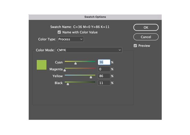
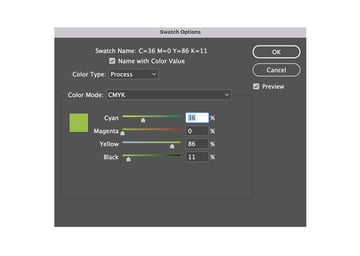
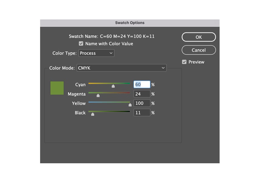
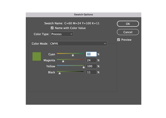
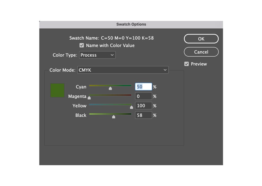
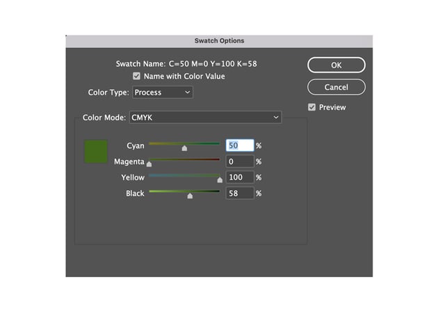
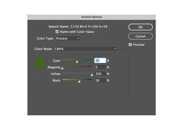
Step 5
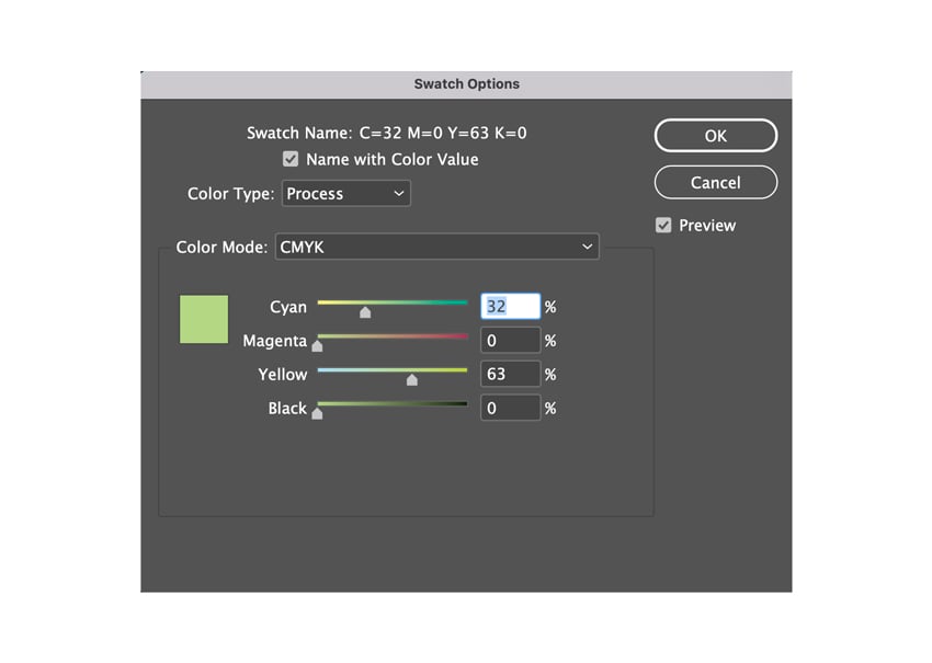
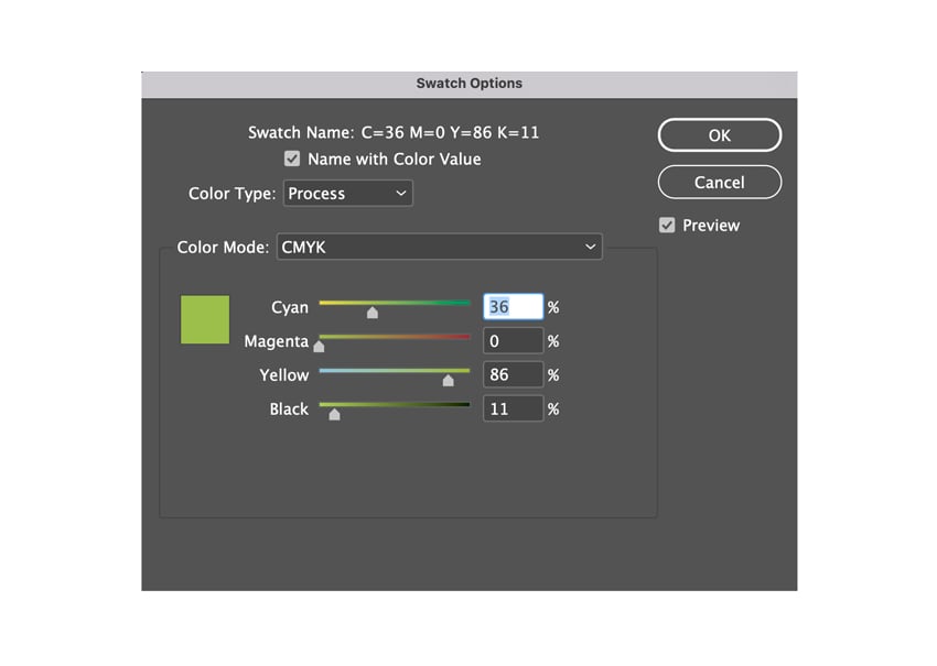
Create four new CMYK Swatches (Window > Swatches, then click the New Swatch icon). In this Adobe InDesign typography example, I’ve gone for four shades of green.


Step 6
Highlight parts of the text within the guidelines and apply color in vertical blocks. Don’t worry if individual characters fall across guidelines. Slightly imperfect application of color will give a jaunty, folk-like look.
Finished! This is one of those cool text effects from InDesign that will brighten up cards and invitations. It also looks great with a letterpress printing technique.
For this typographic design, we’ll use the Type on a Path Tool to create this amazing look! If you like stylish InDesign text effects, you can’t miss this one.


Step 1
Go to Page 3 of your InDesign document. Use the Type Tool (T) to create a new text frame, but move this to the side of the page in the Pasteboard. Stick with Normal View (tap W) so it can still be seen.
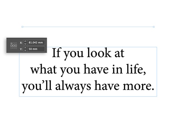
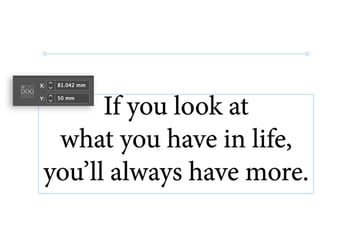
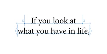
Choose any paragraph of text you would like to apply the effect to. Type, or Copy and Paste, this text into the text frame.
For now, maintain the default font:
- Font: Minion Pro
- Size: 40 pt
- Orientation: Align Center
Step 2
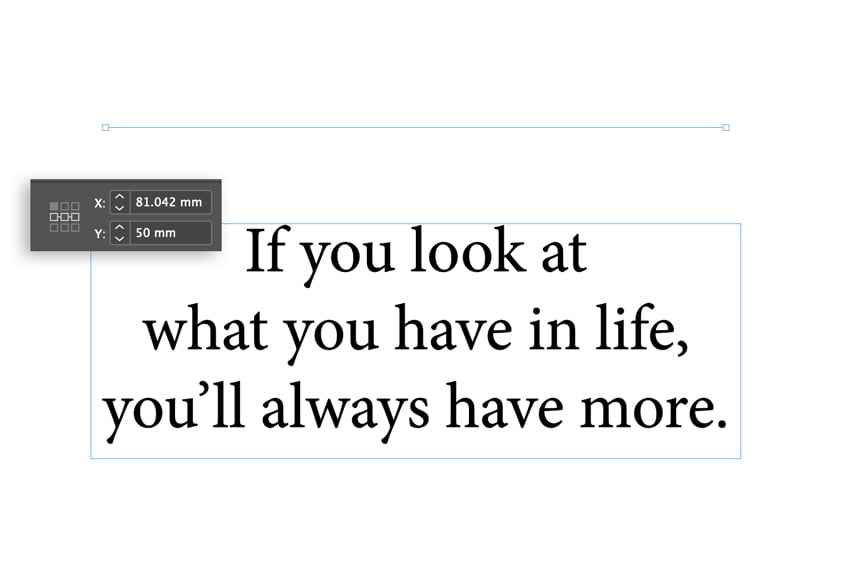
On the page itself, select the Line Tool (\) and. While holding down Shift, drag to create a horizontal Line 134 mm in Length. Position this centrally on the page at Y position 50 mm.
Step 3
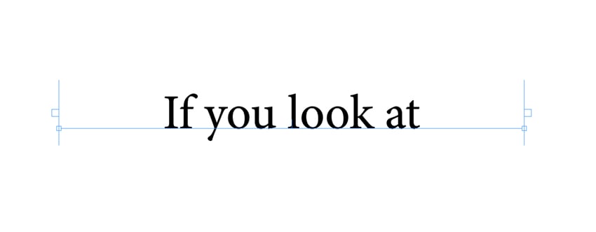
Select the Type on a Path Tool (Shift-T; found in the Tools panel, in the drop-down menu from the Type Tool icon). Hover the cursor over the far-left of the Line until the icon changes to reveal a ‘+’ symbol. Click once to transform the Line into a Path for text.
Highlight and Copy the first line of the paragraph of text using the Type Tool (T). Switch back to the Type on a Path Tool (Shift-T). Paste the text onto the new Path you have created.
Step 4
Switch back to the Selection Tool (V, Escape) and change the Stroke Color of the Line to [None].
Repeat the above steps for the next few lines of the text paragraph, situating each line on its own path. You can set the original text paragraph directly behind the paths. This will help line up the text and create even leading.
Step 5
Now you can get started with some different InDesign typography effects. You are no longer bound by the arrangement rules of text within a text frame. Move different paths into organic and fun positions to create a sense of movement in your text block.
Why not try using the Ellipse Tool (L) to create a long oval with a Stroke and Fill of [None]. You can then divide it in two halves using the Scissors Tool (C). Position the lower half at the bottom of the paragraph and use the Type on a Path Tool (Shift-T) to add the final line of text.
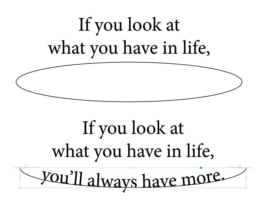
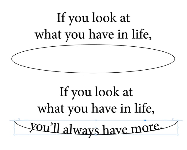
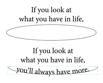
Move the top half of the oval to the top of the paragraph and reset the top line of text along this new curved path. Go to Object > Paths > Reverse Path to curve the text along the line.
Step 6
Create new paths and move individual words or phrases onto them. Try altering the font size to create new arrangements of words as in the example below.
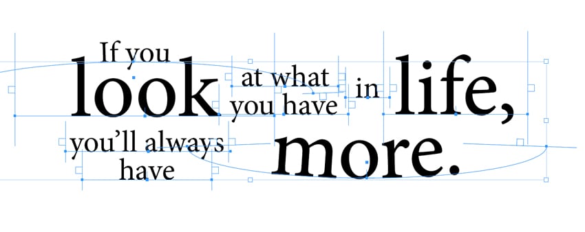
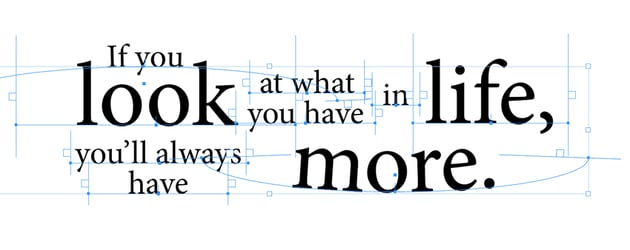
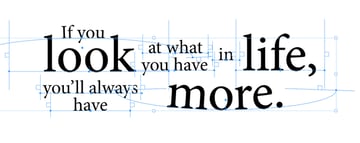
Change the Font and Sizing of the phrases and words to get the desired effect, creating new paths if you need to. Here, I used Blackbear and Dudek to achieve an old-fashioned, letterpress-style appearance.
Pull the Paths closer together, even allowing some of the letters to overlap a little. This will give a more solid look to the text.


Step 7
Let’s introduce some color. Go to the Swatches panel (Window > Swatches) and create new CMYK Swatches (click the New Swatch icon).
Select a base color to apply to the bulk of the text, bringing out a couple of words and phrases in accents of light blue. Here, I went for purple, C=69, M=70, Y=0, K=0.


Step 8
Place your typography against a dark background to highlight the colors of the text.
Use the Rectangle Tool (M) to create a frame that extends across the whole page. Set the Fill to C=93, M=99, Y=17, K=22. With the frame selected Right-Click (PC) or Control-Click (Mac) and Arrange > Send to Back.


Your typography’s looking awesome—very trendy! This sort of Adobe InDesign text effects look great on posters or brochures. They would also be ideal as part of a print version of a quirky book.
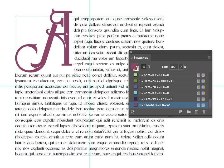
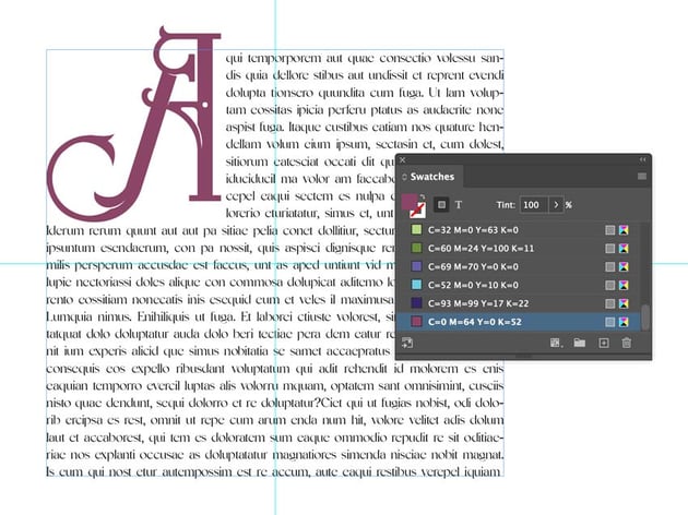
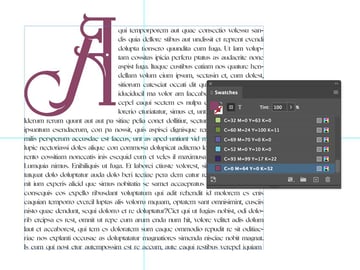
5. How to enhance text with a dramatic drop cap
Sometimes, we need dramatic InDesign text effects to make a page pop! Here’s a cool typography design that’s perfect for books, magazines, and more:
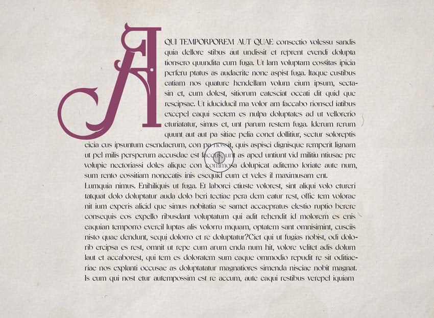
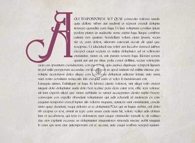
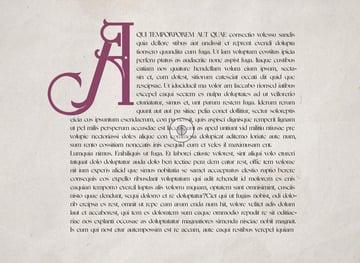
A Drop Cap is a very simple but incredibly effective typography technique. It gives emphasis to an introductory paragraph.
You can incorporate the steps here into your own document, like a book or magazine. For now, we’ll stick with our A4 layout.
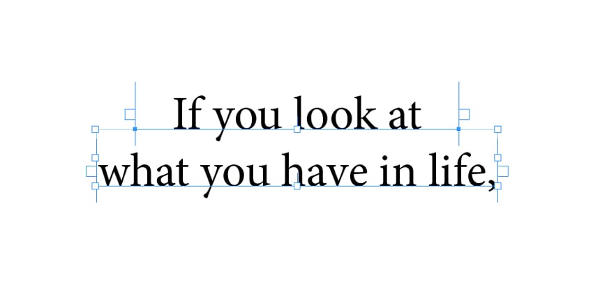
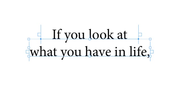
Step 1
Go to Page 4 of the A4 document. Use the Type Tool (T) and drag to create a text frame 115 mm in Height and 140 mm in Width. Center this on the page, using Guides dragged from the Rulers if needed.
Step 2
For a dramatic Drop Cap, you’ll need to contrast a striking typeface (for the Drop Cap) against a bookish font.
For the main text here, I’m using Silvania, but Baskerville would also be a good choice.
For the Drop Cap, I’ve selected the calligraphic typeface Xerophone to give a historical flourish. After all, Drop Caps were originally used in medieval manuscripts.
Step 3
Return to the text frame and click once in the frame with the Type Tool (T). Set these parameters:
- Font: Silvania
- Size: 12 pt
- Leading: 15 pt
- Orientation: Justify with Last Line Aligned Left
Also, allow the text to hyphenate. Paste in your own chosen text or, for now, go to Type > Fill with Placeholder Text.
Step 4
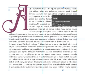
Highlight the first letter of the paragraph. Go to the Character Formatting Controls panel, along the top of the screen, and set the Drop Cap Number of Lines to 10.
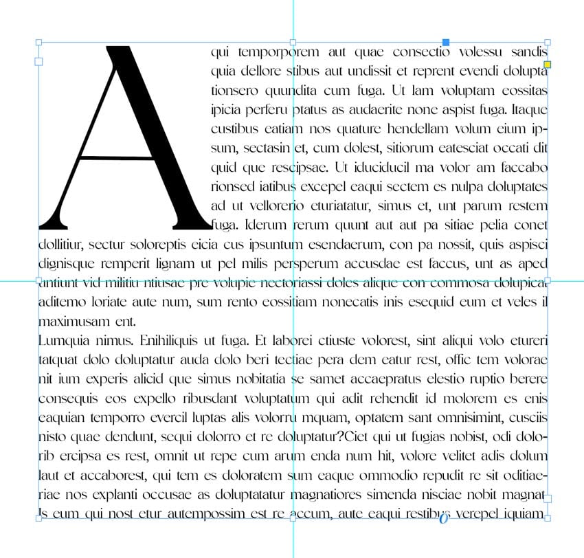
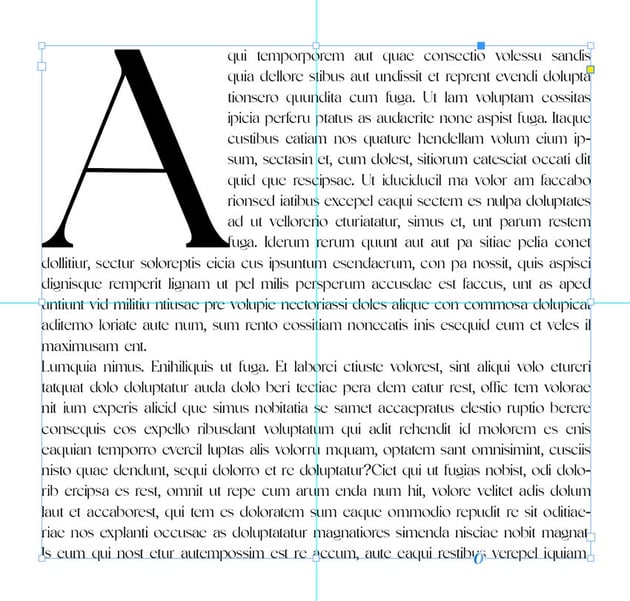
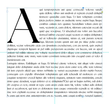
Step 5
Change the font of the first letter to Xerophone.
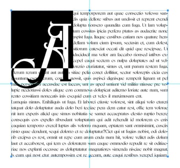
Introduce a new Swatch in the Swatches panel (Window > Color > Swatches) for added contrast and impact. Here, I set the Color of the Drop Cap to C0 M64 Y0 K52. Move the Baseline Shift to 48 pt in the top toolbar.
Step 6
To give an extra professional touch to the paragraph, highlight the first four or five words (excluding the Drop Cap). Select the All Caps icon from the Character Formatting Controls panel.
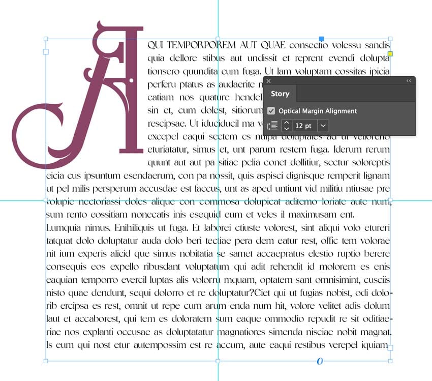
Select the text frame with the Selection Tool (V, Escape) and go to Window > Type & Tables > Story to open the Story panel. Click in the Optical Margin Alignment check-box. The text will subtly shift position and look more pleasant to the eye.

Step 7
Lastly, add a texture background to finish off the effect.
And you’re done! This is a very simple technique for adding a professional touch to more formal documents, such as books, magazines, and brochures.
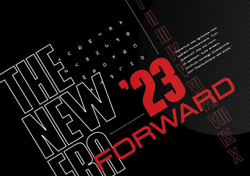
6. How to add a surreal twist to your typography design
This InDesign text effect is more decorative than functional, but it’s really easy to make.

Step 1
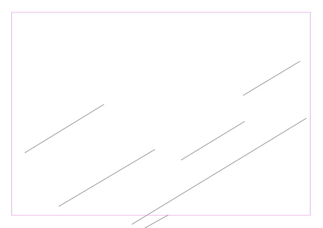
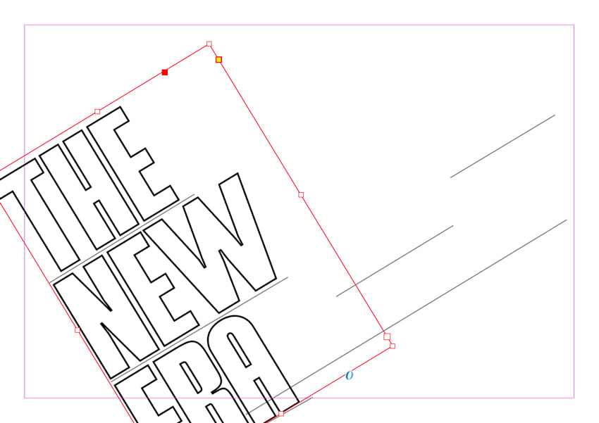
Navigate to Page 5 of the A4 document. Select the Line Tool (\) and drag across the page from the left to the right.


Create additional lines by copying and pasting, Edit > Copy and Edit > Paste.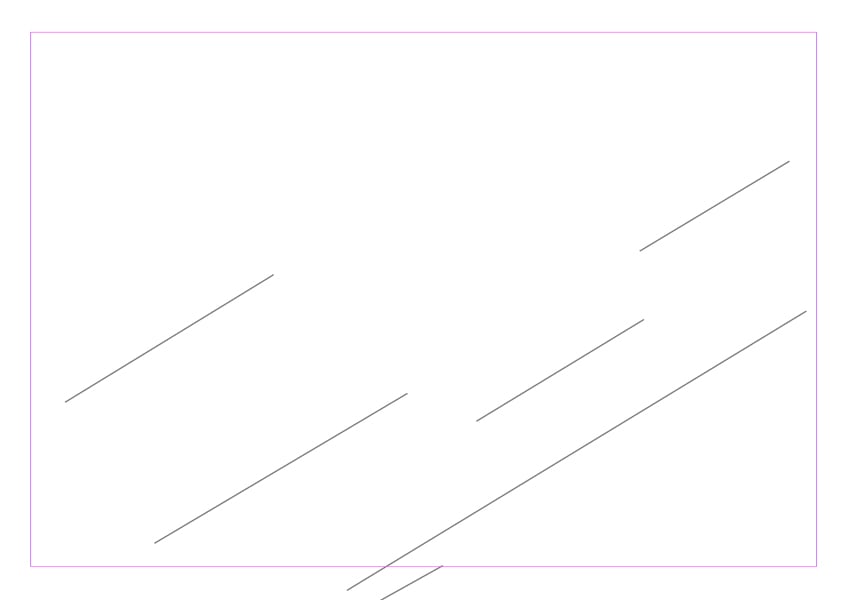

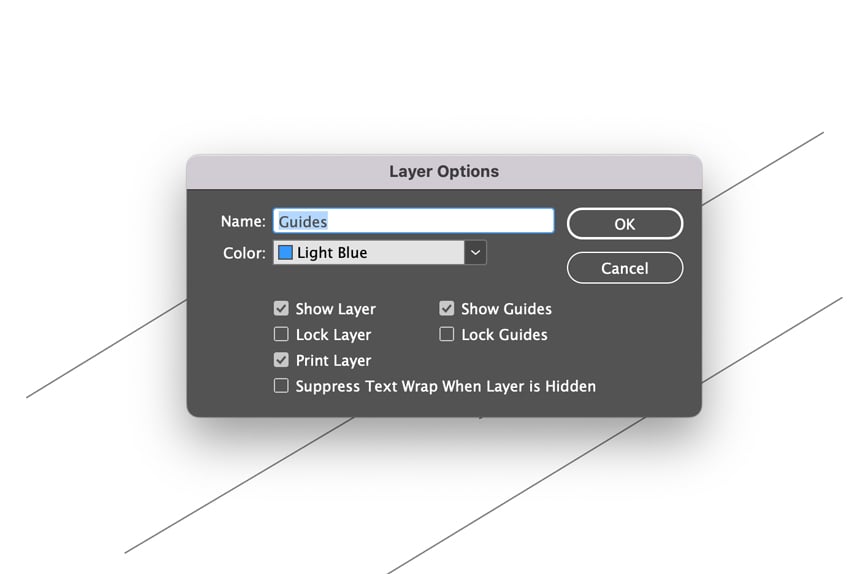
Step 2
In the Layers panel (Window > Layers), double-click the ‘Layer 1’ default name. Rename this ‘Guides’. Lock this layer in the Layers panel.


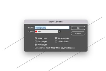
Click the Create New Layer icon and rename this second Layer ‘Typography’.


Step 3
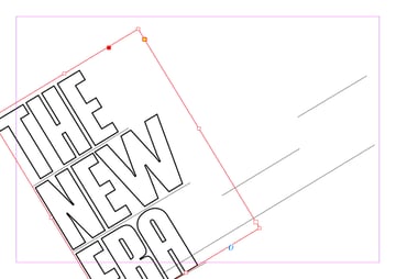
Remaining on the ‘Typography’ layer, use the Type Tool (T) to introduce a new text frame. Type out your text, ‘The New Era’, and set the font to Lorison, Size to 220 pt.
Switch to the Free Transform Tool (E) and hover over one of the corners of the text frame until a rotate icon appears. Rotate the frame and align it against one of the lines you created in Step 2. Set the Stroke to Black and Weight to 2 pt.
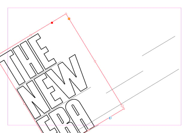
Step 4
Using the lines as guides for positioning the text, repeatedly create new text frames and adjust their position on the page. Use the Rollbox font at various sizes to create contrast and difference. Add a new red swatch C0 M100 Y100 K17 in the Swatches panel.
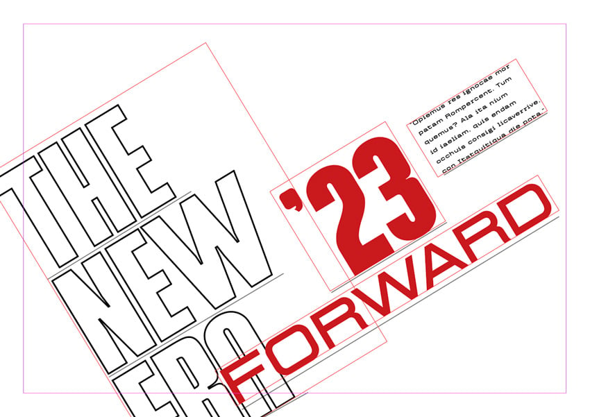


Continue to create new text frames, inserting different text as you go. Switch the visibility of the ‘Guides’ layer off and on as you go to view the final effect.


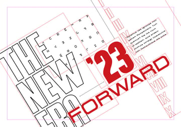
Step 5
Finish off your design by adding a black background and changing up your font colors. I decided to use black, white, and red.
Awesome! That’s great work.
This typography effect is mostly just for fun. Why not print it on a decorative poster or card to show off your new typography skills?
You’ve mastered how to add effects to text in InDesign!
These InDesign typography tips show how versatile, creative, and fun typography can be. In your next project, try a special typography effect in InDesign to add a touch of creative professionalism.
Are you looking for even more Adobe InDesign tutorials and resources? Explore more tutorials and videos here: