
In this second part, we’re going to see how to design a sidebar and order the elements – specifically, the widgets – inside of it.
Designing the Perfect Sidebar
One of the main reasons visitors don’t pay attention to the sidebars amounts to poor design choices. Other reasons could be using too many or too few elements, displaying dull and uninteresting content and not ordering the elements properly, and so on.
Neglecting to design your sidebar means lower page views, lower ad clicks, lower conversion rates, and lower sales. Even if you’re not expecting any income from your WordPress website and just expect people to read your content, you still have to design your sidebar(s) well to be able to guide your visitors with your navigational sidebar elements.
We’re going to go through three main factors of a good sidebar design: dimensions, colors and typography basics.
Width and Height of the Sidebar
Common sense for the width of the sidebar is to reduce the width of the sidebar(s) compared to the main content area. This is a sensible approach since the main content is almost always the most important element of a web page and a narrow content area with wide sidebars de-emphasizes the content.
A width between 20% and 40% is usually the best choice for a single sidebar and if you’re going to use more than one sidebar, I suggest you don’t exceed a total width of 50% (20% + 20% and 15% + 35%, for example).
For a single sidebar, you can also utilize the Golden Ratio approach, where the width of the sidebar is around 38% of the main content area’s width. You can find more information about Golden Ratio in Jarel Remick’s The Golden Ratio in Web Design article at Nettuts+.
As for the height, there isn’t much to discuss other than “the fold”. The Fold is the bottom line on the visitor’s screen, where the visitor has to scroll before seeing the rest of the page. I used to advise my clients to try to stay “above the fold” but since there are lots and lots of different devices (thus, screen dimensions) and people are very used to scrolling, life below the fold isn’t that scary anymore.
Having said that, you should mind the fact that the elements above the Fold are the first elements the visitors will see. We’ll talk about it on the last topic, “Ordering the Elements of the Sidebar”.
Oh by the way, you really, really should be careful about not exceeding the height of the main content area. If the sidebars are longer than the content, it looks very ugly.
Using Colors and Images
Recall the design motto, “less is more”? Well, we can read it as “more is less”, too.
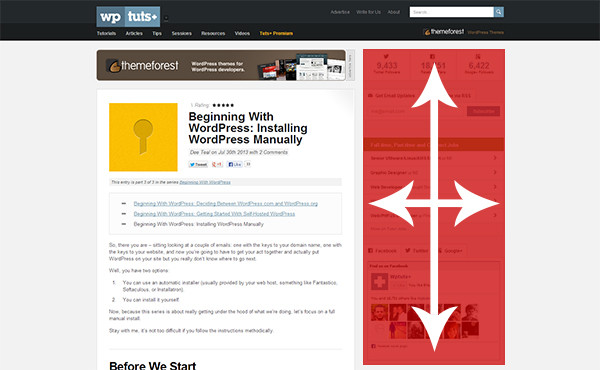
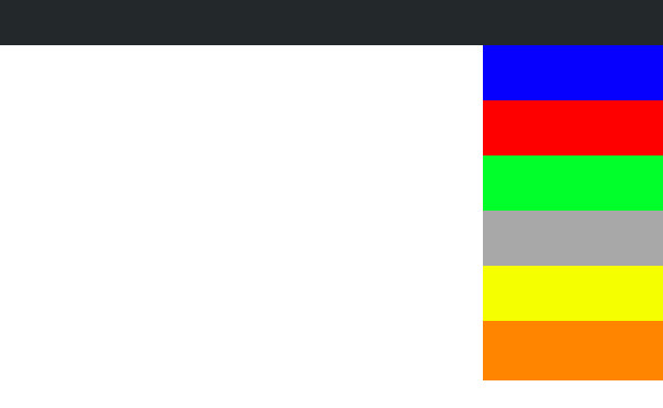
Colors could both attract and distract. If you use so many colors like the sidebar above, none of those colorful, ugly elements will get the most attention – they will get the least attention.
But if you use just a few colors for just a few elements (that you need to attract visitors the most), they will draw the most attention. You need to keep in mind that in order to pop out a widget, you need to set back the others. “Contrast” is the keyword here.
Images can be an exception, though. While all the things I said above apply to digital graphics as well, photos could be used in order to draw attention separately from the colored up elements. But as you can imagine, too many images will distract the visitor as well – that’s why advertisements may or may not be noticed based on your sidebar design.
I suggest that, if you can, you should use faded out pictures (which fade in on hover) in your sidebar widgets. Try and see if that looks nice or not.
Font Sizes and Alignment of the Elements
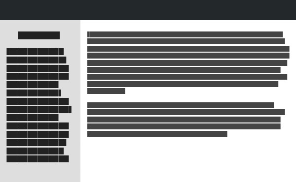
Typography is always important for good design. With good typography, you may not need anything else to make your web page look good.
With the sidebars I design, I like to set the font size slightly (10% to 20%) larger than the main content. It draws attention but does not distract the visitor from the main content — the visitors see what they want to see and that’s the thing we’d aim to do. Don’t forget that sometimes smaller text could be attractive, too.
I also like to align the headings to center and the text to the right but you can – and you should – do anything you see fit for your design. As long as they don’t look messy and unrelated, it’s good for you.
Ordering the Elements of the Sidebar
Even if you have just two sidebar elements or ten of them, you should consider ordering those elements a crucial practice. Doing it right will surely increase clicks and sales and doing it wrong can plummet them!
Think about the important elements that should definitely be seen by all visitors, and the not-so-important ones that doesn’t necessarily have to be seen by every single person who visits your website.
For example: while subscription forms and buttons or latest/popular posts lists are considered “important”, we can’t say the same for latest comments lists or blogrolls. Once you identify the “important” ones, you can order them between each other and have a nicely ordered sidebar.
Also, you should consider the fold: Which elements should be on top and which ones could be at the bottom of the sidebar? Having the most important elements (like an email subscription form and a popular posts list and possibly an advertisement) above the fold will benefit both you and your visitors.
Conclusion
I don’t believe that you should follow strict rules for a good design but there are always “guidelines” for you to create better designs. This series is one of those guidelines and I hope you’ve enjoyed it.
Do you have anything to add or improve? Share your ideas with us by leaving a comment!