1. How to Use the Affinity Publisher Interface
1.1 Introduction to the Course
Watch Video Lesson (1 minute) ↗
Welcome to the Affinity Publisher course! We’re going to walk through some essential Publisher basics, while also creating a simple project. No experience is necessary, and by the end of the course, you’ll have created a two-sided, three-panel brochure.
1.2 How to Use Affinity Publisher Panels
Watch Video Lesson (1 minute) ↗
Let’s begin with Panels in Affinity Publisher.
Panels are an essential part of working in Affinity Publisher. Think of them as key spaces where you can view and manipulate content in your work. For example, we can turn to the Pages panel to view, add, and delete pages in our document. There are a wide variety of panels in Affinity Publisher, each with different purposes.

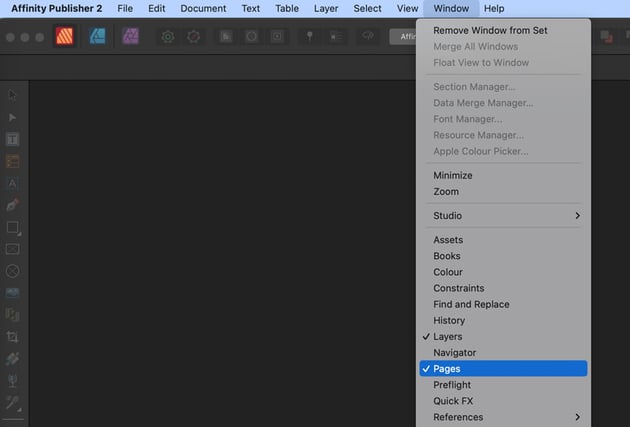
Can’t find a panel in Affinity Publisher? Go to the Window menu. If you see a checkmark by the name of the panel, it’s open.
In this lesson, we’ll take a look at opening up panels and working with them as one of the essential Affinity Publisher basics.
If you’re still having trouble finding a panel that Affinity Publisher lists as already opened, it might be docked with another open panel. Make sure to tab between them to see what might be docked together.
Go to Studio > Reset Studio to reset your work area. This may make it easier to follow along as it will reset the placement of your panels. You can, however, customize them any way you prefer.
1.3 How to Use the Help Feature in Affinity Publisher
Watch Video Lesson (1 minute) ↗
If you ever find yourself lost in Affinity Publisher, the Help feature can be a huge help! At the top of the software, simply go to the Help menu. Then, you can click and type in your search term. Affinity Publisher will lend a hand.
In this example, “Pages” has been typed in as a search term. It then highlights not only topics, but also menu items that it will direct you to, to help you find where and how to do things. It’s very handy! Tune into this lesson to see this in action.
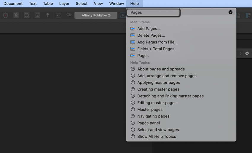

 Use the Help feature to find things in the software like tools or panels.
1.4 How to Use the Affinity Publisher Command Bar
Watch Video Lesson (2 minutes) ↗
The Command Bar is another essential part of working in Publisher. You can find it right at the top of the screen, as highlighted in the screenshot below. There’s a lot to see here, but don’t worry about memorizing everything right off the bat. In this lesson, we’ll walk through the content you can find here and when you might use it.
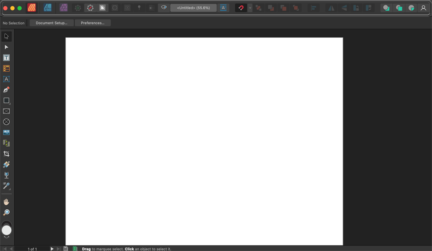
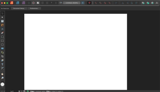
If you’re ever unsure about an option in the Command Bar, just mouse over it. Leave your cursor on the item, and the name of the tool or option will pop up to help inform you of what it is. These hints can be very helpful for beginners!
1.5 How to Use the Affinity Publisher Context Bar
Watch Video Lesson (2 minutes) ↗
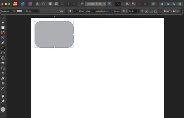
In this next lesson, we’ll take a look at the Context Bar. Think of this as a secondary list of options. The Context Bar is dependent on the tool or content you have active at the time. So, for example, after drawing a rectangle, the Context Bar shows us options relative to our content when it’s active and highlighted.


2. How to Set Up an Affinity Publisher Document
2.1 How to Create a New Document in Affinity Publisher
Watch Video Lesson (3 minutes) ↗
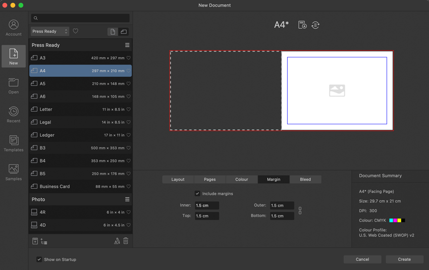
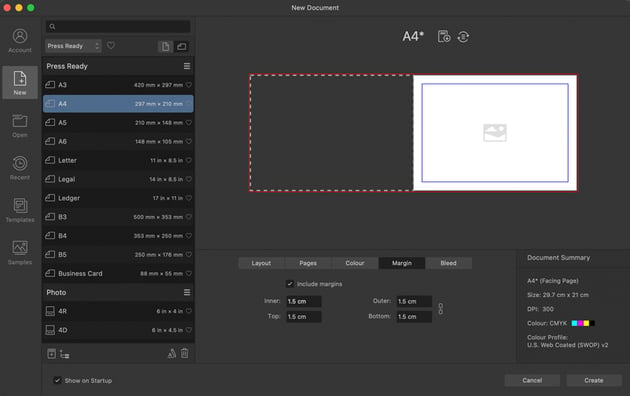
Now, let’s create a new document together. In this lesson, we’ll walk through the document settings you’ll need to create a tri-fold brochure along with this course.
Make sure to look under Press Ready for the document preset we’ll use in this design. We’re going to choose A4 size. We’ll look at some other options here, like the margins, too. Ready to get designing? Then let’s dig in.

2.2 Working With Your New Affinity Publisher Document
Watch Video Lesson (1 minute) ↗
Next, let’s take a look at our new Affinity Publisher document together. We’re going to create all kinds of things in this space, but we’ll start with just a basic intro to our canvas. You’ll also want to make sure you have all of your assets and fonts ready to go.
This is a great time to remember to save your work! You can do so by going to File > Save at the top of the software.
3. How to Use Master Pages in Affinity Publisher
3.1 What Are Master Pages in Affinity Publisher?
Watch Video Lesson (2 minutes) ↗
In this next lesson, we’ll take a look at Master Pages. So what are Master Pages? Think of them like a master guide that your other pages can follow. For example, if you wanted every page to have a page number in the same place, you could define that on a Master Page rather than doing it on every page individually. Handy, right?
3.2 How to Use Columns in Affinity Publisher
Watch Video Lesson (1 minute) ↗
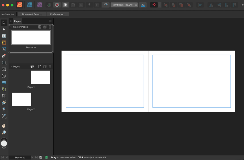
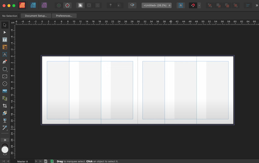
However, we’re going to use our Master Pages to create some Column Guides. Since we’re making a tri-fold brochure, it will be helpful to have visual guides to show us where each section is. Luckily, Affinity Publisher makes this easy. Ready to see how to do it together?
Not seeing your Column Guides? Make sure that under View you have Show Column Guides checked. Otherwise, they won’t be visible in your workspace.
3.3 How to Use Rulers and Guides in Affinity Publisher
Watch Video Lesson (2 minutes) ↗
In this next lesson, we’ll also use Rulers and Guides to help further establish some guidelines in our work. Not only is this handy, but it’s also simple to use. This takes all of the guesswork out of lining up content to match folds, having consistent margins, and other visual associations.

4. How to Create Wireframes in Affinity Publisher
4.1 How to Create an Initial Layout in Affinity Publisher
Watch Video Lesson (1 minute) ↗
Next, let’s start talking about our layout design. This is the fun part, right? We’ll start with Page 1, and look at which panels in our tri-fold are which part of our design (we’ll need to consider how our work will look and function when folded). Follow along with this lesson, or use it as a guideline to experiment with your own take on this design.
Don’t forget to save your work! Remember, this can be done by going to File > Save at any part in the process.
4.2 Laying Out Design Elements in Affinity Publisher
Watch Video Lesson (3 minutes) ↗
Now, let’s experiment with some of the tools in Affinity Publisher. In this lesson, we’ll try out three different tools as we begin laying out our design:
- The Artistic Text Tool—this is an excellent tool for placing key copy, like headlines or titles. We can easily click and drag to scale our text, and then insert it.
- The Picture Frame Rectangle—this allows us to place down a placeholder rectangle, where we can insert an image later. This is great for creating wireframes and getting a feel for where you might like content to go.
- The Frame Text Tool—when you’re setting body copy, rather than a single headline, this tool can be the perfect choice. Create a larger box for your copy and then easily insert some placeholder copy.
Here’s an example of each tool in action below! Tune into this lesson to work along and see them in use.
4.3 How to Use Affinity Publisher Text Styles
Watch Video Lesson (2 minutes) ↗
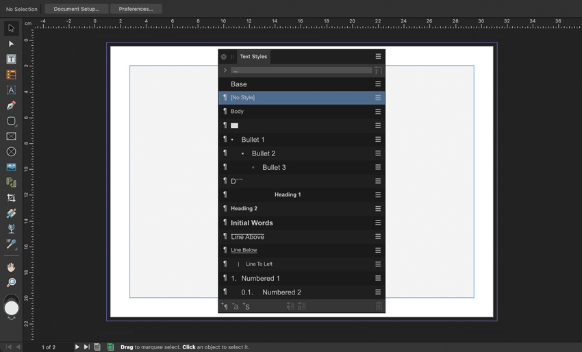
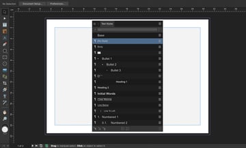
Text styles make styling our text easier than ever. In this lesson, we’ll take a look at the Text Styles panel and some of the introductory things we can do with it. For some introductory context, imagine having one header style for every header in your entire document. That’s way easier than styling each header manually! Ready to learn how? Then tune into this lesson.
4.4 Continuing Our Layout and More Use Cases
Watch Video Lesson (10 minutes) ↗
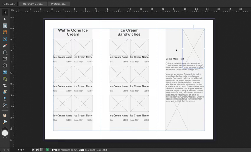
We’ve covered a bunch of really fun and easy-to-use concepts so far in this course. Tune in and we’ll continue to practice them together, in this lesson, with practical examples. We’ll use these techniques to further build out our tri-fold brochure, step by step.
5. How to Use Images in Affinity Publisher
5.1 How to Insert Images in Affinity Publisher
Watch Video Lesson (2 minutes) ↗
Now that we’ve built a wireframe to work with, it’s time to start working with images. We’ll learn how to insert images in Affinity Publisher in this lesson of the course. There are multiple ways to do it too, including:
- The Image Place Tool—a handy tool you can find right in the Tools panel.
- File> Place—located at the top of the software, this is another way you can select an image from your computer and insert it into your layout.
Having trouble or stuck on this concept? Here’s a free written walkthrough that can help troubleshoot any problems you might have with inserting images in Affinity Publisher.
5.2 How to Adjust Images in Affinity Publisher
Watch Video Lesson (3 minutes) ↗
Now that you’ve got your images inserted in Affinity Publisher, you’ll likely want to adjust them. This would include things like resizing, cropping, rotating, and more. Luckily, Affinity Publisher makes this a breeze.
Follow this lesson and we’ll look at some of the ways you can adjust your images in Affinity Publisher together.
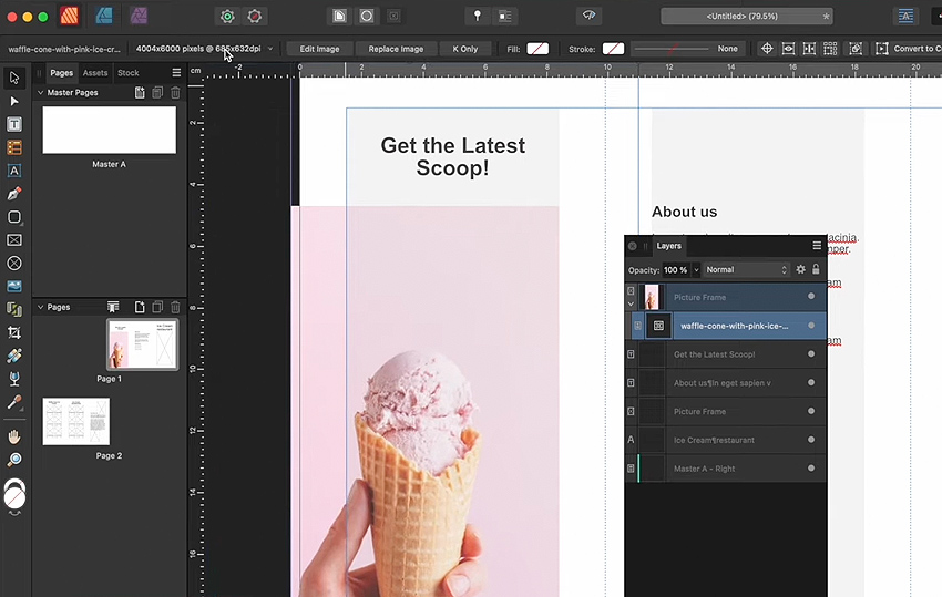

 You can adjust your images in Affinity Publisher in many different ways
5.3 How to Use the Photo Persona
Watch Video Lesson (4 minutes) ↗
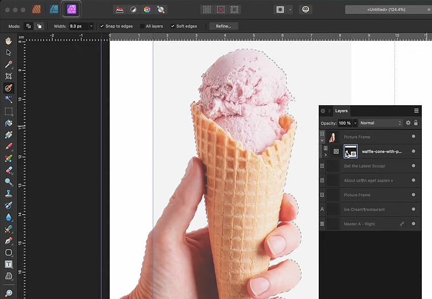
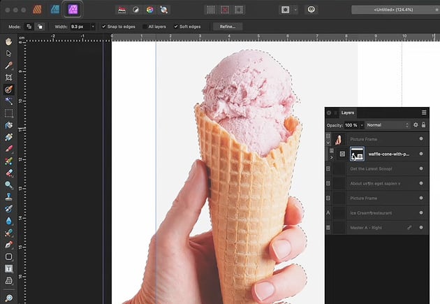
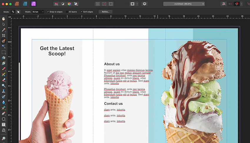
For advanced image editing, we can also turn to the Photo Persona in Affinity Publisher. In this lesson, we’ll test out the Photo Persona and use it to select and mask the background out of this image in our design. It might look complicated, but Affinity makes it easy. We don’t even need to jump to Affinity Photo to make these edits—Personas make it simple to make these changes all within Affinity Publisher.
5.4 Additional Image Techniques in Affinity Publisher
Watch Video Lesson (10 minutes) ↗
Let’s take these techniques we’ve learned and put them to practical use. In this lesson, we’ll use the concepts we’ve covered in other parts of our layout design. We’ll add additional images, edit them, and adjust them to make our tri-fold brochure. Follow this lesson to practice these techniques together.


5.5 How to Use the Baseline Grid in Affinity Publisher
Watch Video Lesson (1 minute) ↗
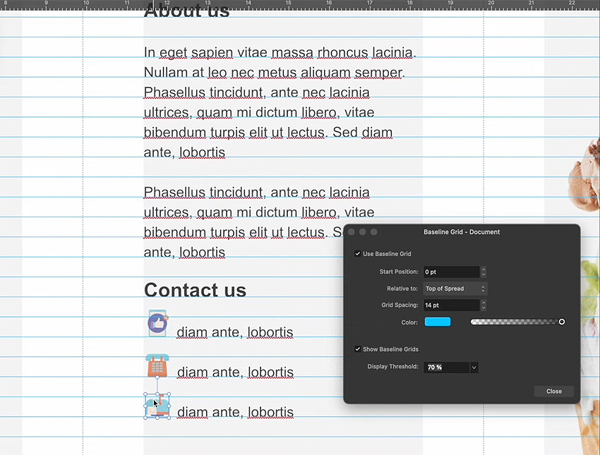
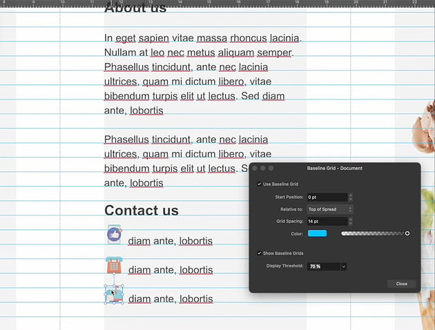
We’ll wrap up this lesson with a look at the Baseline Grid in Affinity Publisher. Think of this like a line that all of your content can sit on—and even snap to! We’ll take a look at toggling this feature on, and how you can use it in your design work, in this lesson.
6. How to Work With Type in Affinity Publisher
6.1 How to Install Fonts for Affinity Publisher
Watch Video Lesson (2 minutes) ↗
You’re likely going to want to use fonts other than the default, when working in Affinity Publisher. In this lesson, we’ll walk through installing some new fonts, like the sans serif font Visby, from Envato Elements.
Affinity Publisher will access your system fonts, so if you’re curious about how to install fonts for Affinity Publisher, that’s where to start.
If you’re having trouble installing fonts, check out these free walkthroughs for extra help. There’s a walkthrough available for both Windows PC and Mac.
6.2 How to Use Fonts in Affinity Publisher
Watch Video Lesson (4 minutes) ↗
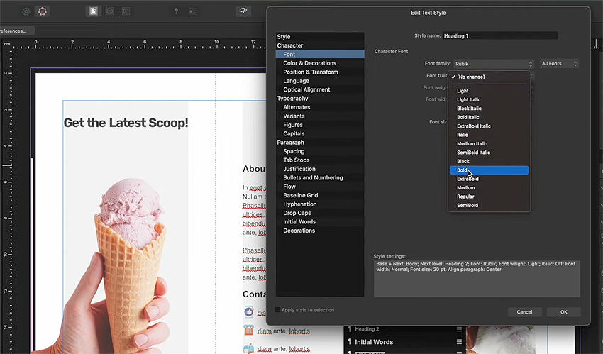
Now that you’ve got your fonts installed and ready to go, how do you use them? In this video lesson, we’ll walk through using fonts in Affinity Publisher, accessing them, and getting them into your Text Styles too. Affinity Publisher Text Styles give you a ton of options, from the font itself to the weight, the color, and much more. Ready to give it a try for yourself?


6.3 How to Use the Affinity Publisher Character Panel
Watch Video Lesson (2 minutes) ↗
The Character panel is another key place you can turn to when you’re working with type in Affinity Publisher. Here, we can easily access a whole host of options for our copy, like the font, the font size, the weight, and more. It’s also an easy way to access our Character Styles—and, in turn, our Text Styles. You’ll get a chance to try all that out in this video lesson. Ready to get started?
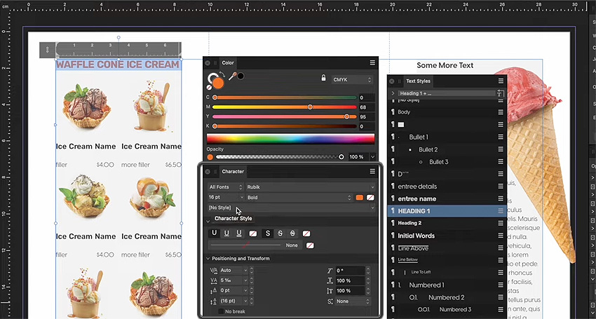
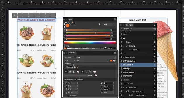
Can’t find the Character panel? You can open it up via Window > Text > Character.
6.4 How to Use the Find and Replace Panel in Affinity Publisher
Watch Video Lesson (1 minute) ↗
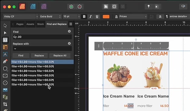
The Find and Replace panel is another handy panel that you should be aware of. It makes it much easier to find and replace content located in your document. This is especially handy if you’re working in a very long document. In this lesson, we’ll check out an example where we can easily change up some of our text.


6.5 Additional Typography Techniques in Affinity Publisher
Watch Video Lesson (1 minute) ↗
Let’s wrap things up by adding some finishing touches to our design. We’ll refine our title, for example, with some of the techniques we’ve learned in the course so far. Take in some additional practice in this lesson’s walkthrough.
Remember, you are welcome to take these techniques and experiment with them. Want to make a different tri-fold brochure or a different design altogether? Go for it! You can also go through this course a second time to give it a try with some content of your own.
7. How to Work With Color in Affinity Publisher
7.1 Introduction to Color in Affinity Publisher
Watch Video Lesson (1 minute) ↗
In this lesson, we’ll shift our focus to color. We’ll start out simple by just adding a simple shape to our design that we’ll then apply color to. It’s simple and easy, but very effective. We’ll use this simple shape as our starting point, and then move on to more advanced ways of working with color.
You can find the Shape Tools in the Tools on the left-hand side of the software. In this case, we’ll use the Rounded Rectangle Tool.
You may only see a Rectangle when you look in the Tools—that’s okay! Just click and hold on any Shape Tool to expand the list. Then, you’ll see a giant list of shapes to choose from!
7.2 How to Use the Color and Swatches Panels
Watch Video Lesson (3 minutes) ↗
Next, it’s time to start talking about some key panels you’ll need, when working with color: the Color panel and the Swatches panel.
- The Color Panel—we can use this panel to easily select colors in a variety of ways. Choose from different color modes, like CMYK or RGB, or choose from sliders or a color wheel.
- The Swatches Panel—this is where your color swatches will go. Think of them as a collection of colors you can store and use whenever you’d like to.
We’ll use these panels in this lesson so you get a feel for how they work. Ready to take them for a test run?

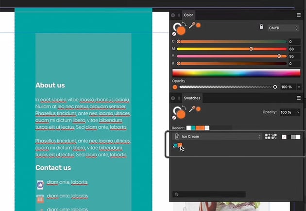
 The Color panel and the Swatches panel in Affinity Publisher—with some Global Colors created too!
We’ll also take a look at Global Colors in this lesson, which are an even more convenient way to work with color in Affinity Publisher. When you set a Global Color, it gets applied to your entire document—so when you change it, it changes globally.
7.3 How to Use the Designer Persona to Add Color
Watch Video Lesson (5 minutes) ↗
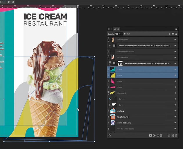
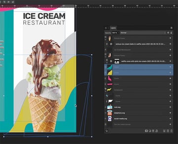
We’ll try out the Designer Persona in this lesson, another one of the Personas you can use in Affinity Publisher. In this demonstration, we’ll draw some abstract, colorful shapes to bring some more color to our design. No need to switch to other software—with Personas, we can do it all right here in Affinity Publisher. Give it a try in this video lesson.

7.4 How to Use Image Blending Modes in Affinity Publisher
Watch Video Lesson (2 minutes) ↗
Blending Modes are another way we can adjust our images in Affinity Publisher. In this case, we have an image that isn’t exactly playing nice with our abstract shapes. While there are many ways we could resolve this issue, we’ll use this as an opportunity to give Blending Modes a try. Take a look at the before and after, below! This is what you’ll learn to easily achieve in this lesson.
8. How to Preflight in Affinity Publisher
8.1 How to Use the Preflight Panel in Affinity Publisher
Watch Video Lesson (3 minutes) ↗
What is Preflight? Preflight is a means of checking your work for errors. You’ll want to do this before you sent it off to be printed, for example. Preflight can apply to both printed and digital work too—you don’t want to send off work as “complete” with errors!
In this lesson, we’ll take a look at Preflight in Affinity Publisher. Walk through the content along with the video to help prevent errors in your own work.
Open the Preflight panel by going to Window > Preflight.
9. How to Export for Print in Affinity Publisher
9.1 How to Use the Export Options in Affinity Publisher
Watch Video Lesson (5 minutes) ↗
So you’ve finished your design, and you’ve checked everything over with the help of the Preflight panel in Affinity Publisher. What’s next? It’s time to Export your work!
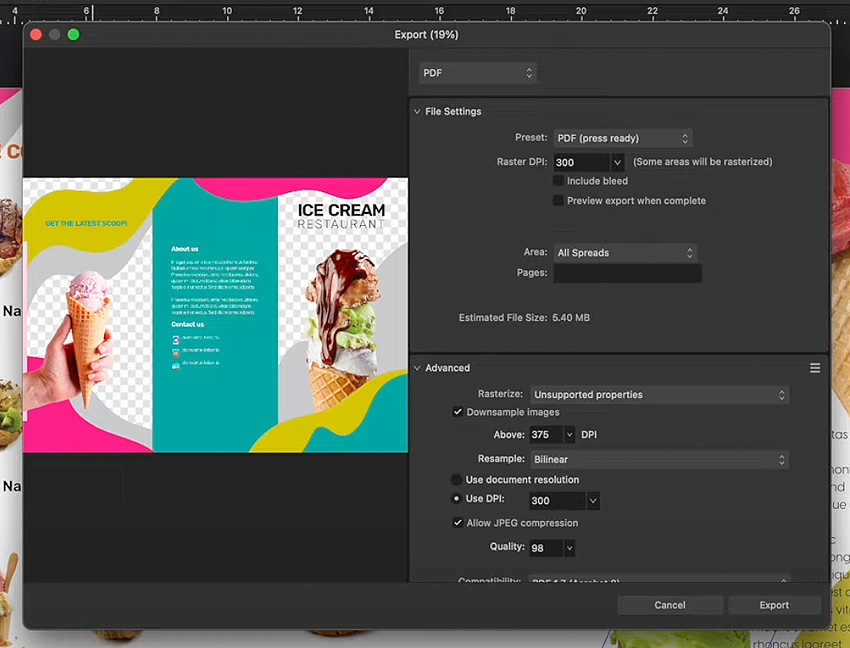
In this lesson, we’ll go through the options you have when exporting your work in Affinity Publisher. There are a lot of options, which might seem overwhelming at first—but it’s a good thing! From PDF files for print to digital work, Affinity Publisher gives you a ton of choices. Learn about them in this video lesson.


9.2 How to Package Your Affinity Publisher Document
Watch Video Lesson (1 minute) ↗
It’s also a good idea to package your work in Affinity Publisher, and in this video lesson, you’ll learn how to do so. This is a step beyond exporting your work, but it’s still a really important one to consider. It’s a simple process but can be an essential one, especially if you need to go back and edit your work later.
Why package your work? This way, all of your content is in one place, so you can easily access your work and all the linked files in the future.
10. Now You Know the Affinity Publisher Basics
10.1 Thank You for Watching!
Watch Video Lesson (1 minute) ↗
You’ve made it to the end of the course. Congratulations! Now, you know the basics of working in Affinity Publisher. You’ve created an Affinity Publisher brochure of your own, and you can take these techniques and apply them to any work of your choice.
If you enjoyed learning Affinity Publisher with a project walkthrough, like our brochure in this course, you may also enjoy these other Affinity Publisher projects. Learn to make a flyer, a magazine layout, or even a menu template with these free Affinity Publisher tutorials.
Learn More About Affinity Publisher
Looking to learn even more about Affinity Publisher? Check out these additional videos from Envato Tuts+. There’s plenty more to learn and plenty more to watch.