This moon was haunted when she trained her phone’s lens on it. For unbeknown to her the camera had been trained on it already, on countless copy-nights before. The latest thing with memories was that they were built into things and no longer had to be your own…

Moon-based UX
These beginnings of a possible story popped into my mind when I encountered this news: Samsung’s new smartphone camera uses AI to sneak details into photos of the moon, beyond what’s perceivable in the moment.

The moon’s “UX” is strong on attraction, it seems, as a driver of currents and a recurring milestone, from Stonehenge to one small stepping stone for giants. It is a collective human experience: Who has never looked up, expectantly? Who could have resisted?
It is fitting, then, that zooming in on the moon must have seemed as exciting as predictable at Samsung: In an age where unboxing a phone is a designed experience, let us shift the user’s gaze upwards, towards opening the night sky, instead of finite cardboard.
Except that the experience is not meant to evoke a sense of wonder for the universe but for a marvel of technology: The lens that is too good for its size. As a user on reddit cleverly inferred, it is indeed too good to be true.
Or is it?
The answer may depend on your definition of the “true” blue moon.
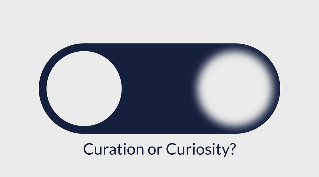
Curation or curiosity?
The phone uses AI to detect the moon and enhance it, with information presumably extracted by training a machine learning model on thousands of high-quality moon shots. Therefore, one might metaphorically say that the phone has seen this moon before, that it keeps it in dear memory, ready to inject its statistical associations into the user’s eye on the sky.
The resulting image is not the moon-in-the-moment but it is “the moon” — or rather, our moon, rendered from the past photography of many people. Maybe this is in fact more representative of the moon as a collective memory? Maybe this asynchronously shared moon-gazing is the true human moon experience? Or maybe it is merely a false promise that sacrifices authenticity for user experience, a trick played on unsuspecting consumers and lunar enthusiasts.
It is not without control, though. It could be toggled on and off in the camera settings. This interface asks its users intriguing questions:
Do you prefer the sharply estimated average experience, or do you risk a blurry, individual one?
Do you choose user experience or experience?
Do you favour curation or curiosity?

Designed perception and memory
One UX heuristic is recognition over recall — here it might mean: Give users a clear picture so they don’t need to remember themselves. In this light, Samsung’s design choice asks designers and users alike: Is this principle applicable to digital memories?
Whatever your answers here, moon zoom AI is a herald of designed perception and memory: With generative AI, much of what we see, read and hear will be a future t(a)inted by models of the past. In a way, this has always been true for humans, who are influenced by history, tradition and memory. And now also by the “stochastic memories” built into our tools of perception, production and preservation.
What about previous instruments? Humans have invented plenty of perceptive aids, including glasses, microscopes and telescopes. Any old lens may bias perception.
Where does focus end and distortion begin, and what is different now?
Here’s one take: Previous optical effects arise from physical constraints handled in instrument design. In contrast, an in-painted moon arises from digitally designed constraints slapped over physics. Crucially, this means that someone can change it on a whim: If the camera’s AI was trained on children’s books, it might give its moon shots a face.
At the break of dawn, she swiped through the batch of the night. Suddenly, a message alighted her screen and face. The latest thing with memories was that they were built to try and last. “I’m going to sleep”, said the moon in the photo, smiling. “Remember me.”

Trick or treat? Unraveling the UX of Samsung’s secret moon zoom AI was originally published in UX Collective on Medium, where people are continuing the conversation by highlighting and responding to this story.