Let’s talk about those little boxes, buttons, and dropdowns that we encounter all over the web: form controls or input fields. From signing up to a newsletter to completing an online purchase, these elements are the unsung heroes of user interaction.
In this article, we’re diving into the world of form controls from a UX perspective, sprinkled with some real-life examples to keep things interesting.
1. Text Inputs
The classic text input field – where users input their thoughts, name, queries, and details. Google sets the gold standard with its minimalist search bar. It’s clean, it’s inviting and simple. When in doubt, remember: less is more when it comes to text inputs.


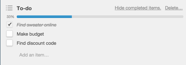
Tick, tick, tick – checkboxes are like digital checkboxes for your to-do list. Trello (a project management tool) nails it by using checkboxes to manage tasks effortlessly. They’re satisfyingly clickable and make it easy to keep track of completed items. It’s like crossing things off your list without the messy scribbles.


3. Radio Buttons
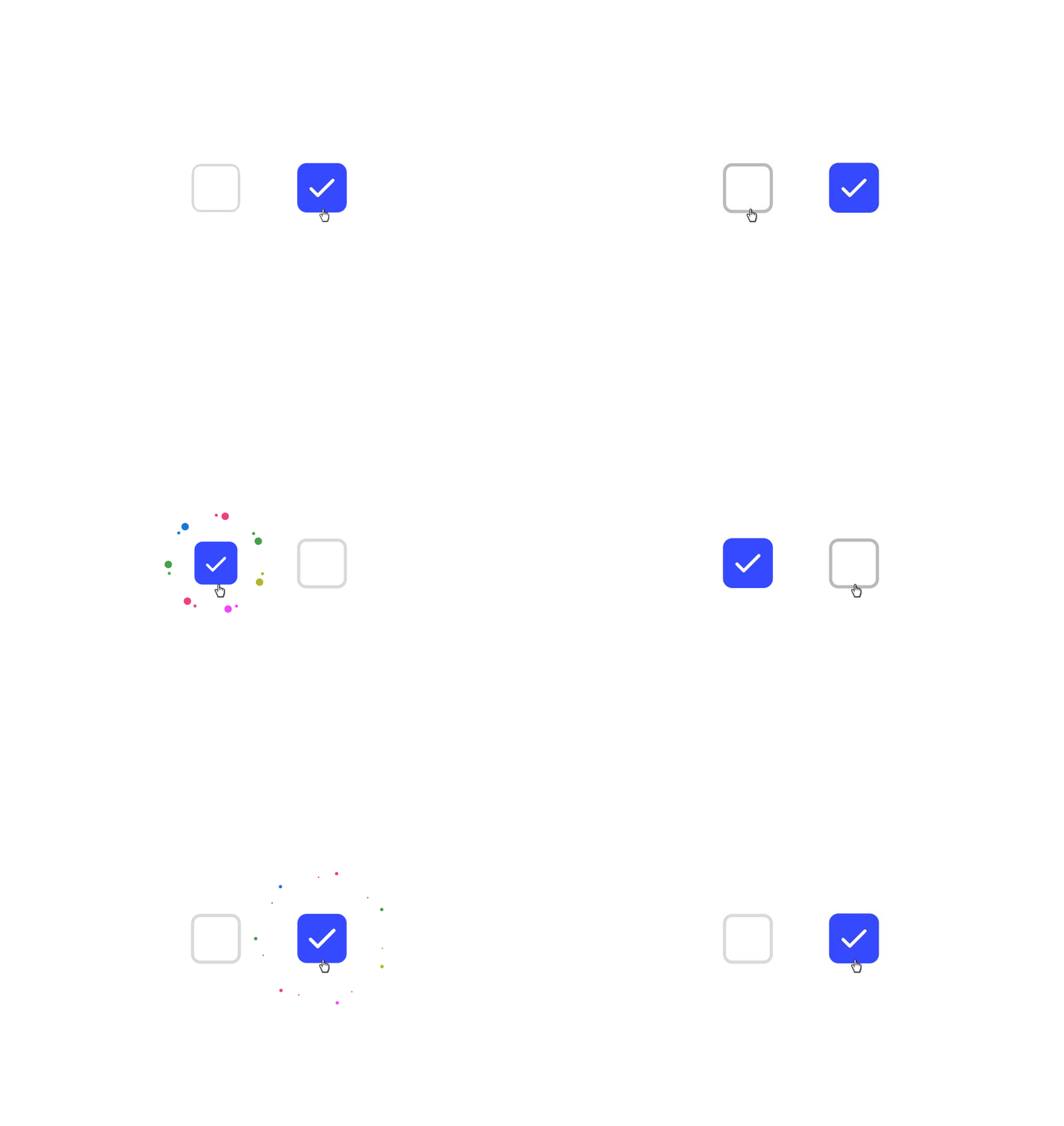
Radio buttons are used when there is a list of two or more options that are mutually exclusive, and the user must choose exactly one option. In other words, when you click on a non-selected radio button, the other button previously selected in the list is deselected.


4. Dropdown Menus
The dropdown menu is another type of form control that displays a list of options when clicked or tapped, allowing users to select one choice from the list. They are commonly used to conserve space and simplify navigation by presenting options in a compact format until needed.


When to Use Dropdown Menus or Radio Buttons?
If there are fewer than five options, use radio buttons; if there are more than five options, use a dropdown – to avoid having a very long list.
If you only have two options, they are good to place side by side so that the user can easily and quickly scan the options. That provides a quick response instead of opening a dropdown and choosing from multiple options.
5. Slider Control
A slider features a horizontally adjustable knob or lever, utilized to change a variable aspect, such as sound volume or screen brightness. They allow users to smoothly adjust settings by sliding a button, handle, or bar along a linear track. The slider control is intuitive and allows users to explore different options or values easily.
In UI design, sliders are versatile tools. They help users select specific value ranges or fine-tune settings like brightness or volume with ease. Inspired by video player interfaces on platforms such as YouTube or Netflix, sliders come in various styles to suit different user preferences and aesthetics.


6. Buttons & Button States
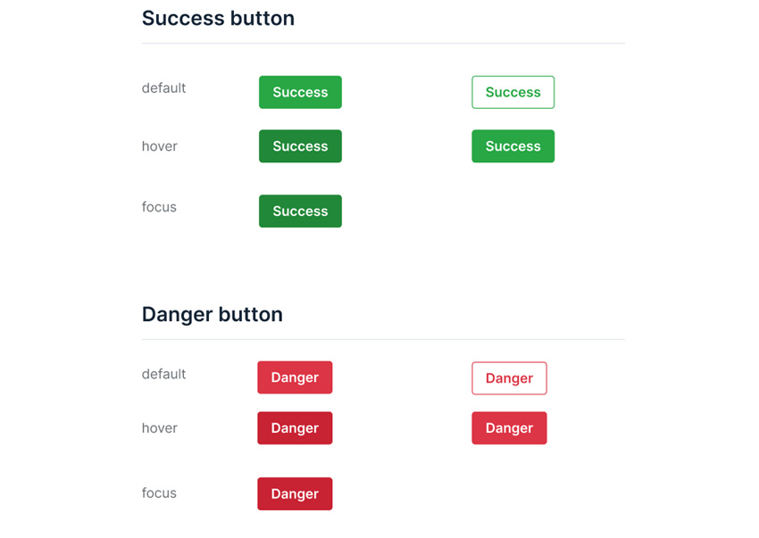
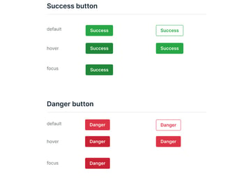
Last but not least, buttons are fundamental components of user interfaces, serving as interactive elements that facilitate user actions within websites and applications. However, buttons are not static; they can exist in various states to provide feedback and guide user interaction effectively.
The default state of a button is its initial appearance when first encountered by the user. It is neutral and unassuming, waiting for user input.
Hover state occurs when a user hovers their cursor over the button. This state provides visual feedback to indicate that the button is interactive. Changes in color, shading, or subtle animations can signal to the user that the button is ready for interaction.
The active state is activated when a user clicks or taps on the button. It confirms the user’s action and provides immediate feedback that the button has been activated. This state often involves visual changes, such as a color shift or increased contrast, to indicate the button’s pressed state.
Conversely, the disabled state occurs when a button is temporarily unavailable for interaction. It is commonly used to indicate that certain conditions must be met before the button can be activated. In this state, the button may appear faded or grayed out to signify its inactive status.
By incorporating these various button states, UI designers can enhance usability and provide clear visual cues to users, ultimately improving the overall user experience.
Learn more about buttons on Tuts+:
Here Ends the List of Form Controls!
Form controls may seem like minor players in the broader context of UX design, but they make quite an impact. From text inputs to buttons and everything in between, mastering these elements can elevate the user experience from good to great.
With real-life examples from the likes of Google, Trello and Netflix, it’s clear that the key to form control success lies in simplicity and intuitiveness. So go ahead, sprinkle some UX magic into your form controls – your users will thank you for it.