
It’s difficult to persuade new visitors to sign up for a website. Most of the time they just found the site and have no idea what it does. With exciting copy and some relatable graphics you can often get people interested. But how do you craft a registration page that attracts visitors and pushes them toward the submit button?
In this post I’d like to examine a number of registration pages which utilize superb methods of interface design. It’s possible to create a well-designed website but ignore the facets of great interfaces and user experiences. By focusing on both design and experience you can put together a much more cohesive registration page which naturally draws attention from visitors.
Creative Form Inputs
Getting a little rowdy with your design process can be a good thing. You’ll discover ideas that you hate but also stumble onto concepts you love. Most people are familiar with default browser input fields. They’re reliable, tame, expected, and placid. Like your old desk or running sneakers, they work as expected and eventually just blend into normalcy.
I suggest trying to break away from the default browser styles by creating your own input fields. You should obviously still use the HTML tags but modern CSS properties offer web designers a spoonful of expanded creative boundaries. And man, those are tasty!
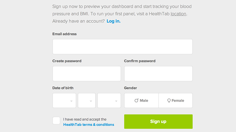
Check out the example on HealthTab which is quite minimal and effective. Each of the form fields have been designed to eloquently match. There are select menus, radio buttons, and a checkbox for terms and conditions. The custom form design style is emulated nicely and offers a sense of uniformity to the page.
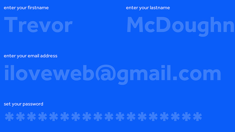
Similarly the signup page for Oozled uses large oversized letters and input fields which blend cooperatively. This may be something you like, or something you hate, but it’s difficult to feel ambivalent towards such a dramatic interface. Oozled may be taking a risk but there are plenty of benefits to using large oversized fields – notably the ease of interaction from any device.
Purposefully go out of your way to attempt new ideas. Put down sketches on paper or hit Photoshop to see what you can come up with. You might surprise yourself with a bit of unique ingenuity.
Guiding Tips
For more detailed webpages you might consider offering brief tips during signup. These could be placed in the form of tooltips, floating text, or input labels. The goal is to clarify a specific purpose for each field and get visitors onto a streamlined path towards completion.
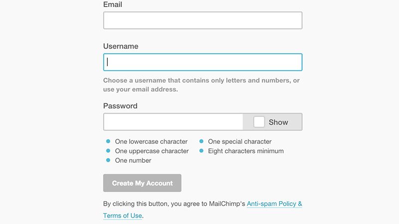
I pretty much love everything they do over at MailChimp. I’m an ardent supporter of the company’s design style and website layout. Their signup page is a great example of how these guiding tips work in action. The email and username fields display short informative tips when selected.
Additionally the password field has a bulleted list of requirements. Passwords can be exceedingly frustrating because users don’t always want to create new a password for every website. If they know the statutes upfront it can help them determine a secure password that fits within the required characters(letters, numbers, symbols, etc).
Quick & Simple UX
When discussing the user experience of signup pages one word comes to mind: simplicity. The end goal should be to finish registration in the simplest manner possible. Avoid extraneous fields that aren’t necessary on signup. Keep a focus on the form itself and write error messages that encourage rather than dissuade.
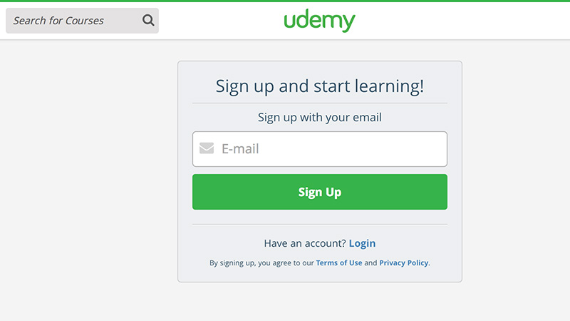
Perhaps one of the simplest examples can be found on Udemy. The signup page starts with an e-mail address and once filled out moves on to request a name & password. This feels less intimidating and often works to push users further into the next step. Be careful not to split the signup process into too many stages or it may become frustrating and drive people away.
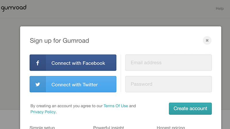
To avoid alienation make the whole signup field clear and concise. Succinct, pithy labels & errors are more useful than exhaustive descriptions. Take for example the signup modal window on Gumroad which offers two distinct methods of registration.
A new user might just signup using their e-mail address with a password as you’d expect. But alternatively people with Facebook or Twitter accounts can sign up with OAuth. This process is reliable because it works through HTTPS with existing accounts on trusted 3rd party websites. Connecting through Facebook means a brand new account, sans the login credentials. The process is quick, simple, and majestic compared to filling out numerous input fields.
Dynamic Content
While animated pages are not always going to increase registration numbers, they will often feel more developed than static pages. The effect is more psychological than technical but I find myself impressed with forms that use animations for CSS3 effects or switching between input fields.
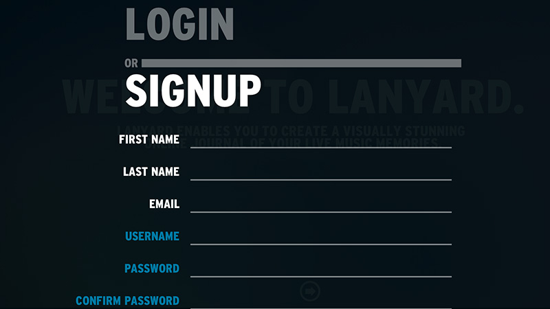
Take for instance the login & signup page for Lanyard. Once it first loads there are two large text links that users can click between. Both login and signup forms are located on the same page and switch between views like an accordion menu.
It feels much more dynamic and responsive to common user interaction. Plus this saves time when people aren’t sure if they’ve already signed up or need to create a new account. Lanyard does a lot of things right on this page: contrast, readability, simplicity, and of course dynamism.
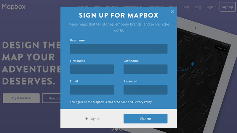
Another similar example can be found on Mapbox which relies on the modal window approach. After clicking the “sign up” link a modal window appears over the screen with typical input fields. You’ll also notice a small “sign in” link in the bottom-left corner of the modal which animates a swipe event to show the login form. Both forms are displayed in the same manner and easily accessible from the same page.
However not all dynamic effects will prove useful. Avoid animations which are flashy for the sake of being flashy. If you can improve a user experience or draw attention to something on the page then dynamic effects can really add some spice into the design.
Closing
When toying around with new interface ideas keep one eye focused on design and the other eye focused on user experience. Signup forms are meant to bring visitors further into the site through curiosity and congenial design traits. Basic signup forms are more inuring in that they condition users to expect the obvious. If you can design a registration page with familiar behavior plus engrossing aesthetics you’ll be sure to reel in a wide audience.