Learn CSS: The Complete Guide
We’ve built a complete guide to help you learn CSS, whether you’re just getting started with the basics or you want to explore more advanced CSS.
New CSS Techniques
It’s easy to get stuck working with the CSS techniques we know well, but doing so puts us at a disadvantage when new problems surface.
As the web continues to grow, the demand for new solutions will also continue to grow. Therefore, as web designers and front end developers, we have no choice but to know our toolset, and know it well.
That means knowing even the specialty tools – the ones that aren’t used as often, but when they are needed, are exactly the right tool for the job.
Today, I’m going to introduce you to some CSS tools you might not have known about before. These tools are each units of measurement, like pixels or ems, but it’s quite possible that you’ve never heard of them! Let’s dive in.
rem
We’ll start with something that’s similar to something you are probably already familiar with. The em unit is defined as the current font-size. So, for instance, if you set a font size on the body element, the em value of any child element within the body will be equal to that font size.
<body>
    <div class="test">Test</div>
</body>
body {
    font-size: 14px;
}
div {
    font-size: 1.2em; // calculated at 14px * 1.2, or 16.8px
}
Here, we’ve said that the div will have a font-size of 1.2em. That’s 1.2 times whatever the font-size it has inherited, in this case 14px. The result is 16.8px.
However, what happens when you cascade em-defined font sizes inside each other? In the following snippet we apply exactly the same CSS as above. Each div inherits its font-size from its parent, giving us gradually increasing font-sizes.
<body>
    <div>
        Test <!-- 14 * 1.2 = 16.8px -->
        <div>
            Test <!-- 16.8 * 1.2 = 20.16px -->
            <div>
                Test <!-- 20.16 * 1.2 = 24.192px -->
            </div>
        </div>
    </div>
</body>
While this may be desired in some cases, often you might want to simply rely on a single metric to scale against. In this case, you should use rem. The “r” in rem stands for “root”; this is equal to the font-size set at the root element; in most cases that being the html element.
html {
    font-size: 14px;
}
div {
    font-size: 1.2rem;
}
In all three of the nested divs in the previous example, the font would evaluate to 16.8px.
Good for Grids
Rems aren’t only useful for font sizing. For example, you could base an entire grid system or UI style library on the root HTML font-size using rem, and utilize scaling of em in specific places. This would give you more predictable font sizing and scaling.
.container {
    width: 70rem; // 70 * 14px = 980px
}
Conceptually, the idea behind a strategy like this is to allow your interface to scale with the size of your content. However, it may not necessarily make the most sense for every case.
Can I use it?
Feature: rem (root em) units on caniuse.com
vh and vw
Responsive web design techniques rely heavily on percentage rules. However, CSS percentage isn’t always the best solution for every problem. CSS width is relative to the nearest containing parent element. What if you wanted to use the width or height of the viewport instead of the width of the parent element? That’s exactly what the vh and vw units provide.
The vh element is equal to 1/100 of the height of the viewport. For example, if the browser’s height is 900px, 1vh would evaluate to 9px. Similarly, if the viewport width is 750px, 1vw would evaluate to 7.5px.
There are seemingly endless uses for these rules. For example, a very simple way of doing full-height or near full-height slides can be achieved with a single line of CSS:
.slide {
    height: 100vh;
}
Imagine you wanted a headline that was set to fill the width of the screen. To accomplish this, you would set a font-size in vw. That size will scale with the browser’s width.
Can I use it?
Feature: Viewport units: vw, vh on caniuse.com
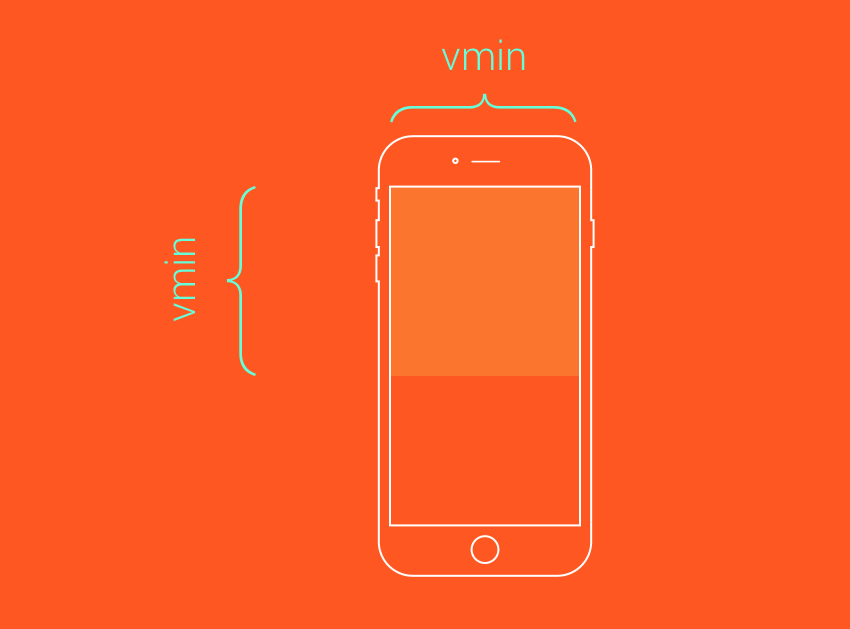
vmin and vmax
While vh and vm are always related to the viewport height and width, respectively, vmin and vmax are related to the maximum or minimum of those widths and heights, depending on which is smaller and larger. For example, if the browser was set to 1100px wide and the 700px tall, 1vmin would be 7px and 1vmax would be 11px. However, if the width was set to 800px and the height set to 1080px, vmin would be equal to 8px while vmax would be set to 10.8px.
So, when might you use these values?
Imagine you need an element that is always visible on screen. Using a height and width set to a vmin value below 100 would enable this. For example, a square element that always touches at least two sides of the screen might be defined like this:
.box {
    height: 100vmin;
    width: 100vmin;
}

If you needed a square box that always covers the visible viewport (touching all four sides of the screen at all times), use the same rules except with vmax.
.box {
    height: 100vmax;
    width: 100vmax;
}

Combinations of these rules provide a very flexible way of utilizing the size of your viewport in new and exciting ways.
Can I use it?
Feature: Viewport units: vmin, vmax on caniuse.com
ex and ch
The units ex and ch, similar to em and rem, rely on the current font and font size. However, unlike em and rem, these units also rely on the font-family, as they are determined based on font-specific measures.
The ch unit, or the character unit is defined as being the “advanced measure” of the width of the zero character, 0. Some very interesting discussion about what this means can be found on Eric Meyers’s blog, but the basic concept is that, given a monospace font, a box with a width of N character units, such as width: 40ch;, can always contain a string with 40 characters in that particular font. While conventional uses of this particular rule relate to laying out braille, the possibilities for creativity here certainly extend beyond these simple applications.
The ex unit is defined as the “x-height of the current font OR one-half of one em”. Thex-height of a given font is the height of the lower-case x of that font. Often times, this is about at the middle mark of the font.

There are many uses for this kind of unit, most of them being for typographic micro-adjustments. For example, the sup element, which stands for superscript, can be pushed up in the line using position relative and a bottom value of 1ex. Similarly, you can pull a subscript element down. The browser defaults for these utilize superscript- and subscript-specific vertical-align rules, but if you wanted more granular control, you could handle the type more explicitly like this:
sup {
    position: relative;
    bottom: 1ex;
}
sub {
    position: relative;
    bottom: -1ex;
}
Can I Use it?
The ex unit has been around since CSS1, though you won’t find such solid support for the ch unit. For specifics on support, check out CSS units and values on quirksmode.org.
Conclusion
Keeping an eye on the continued development and expansion of CSS is incredibly important so that you know all of the tools in your toolset. Perhaps you will encounter a particular problem that requires an unexpected solution utilizing one of these more obscure measurement units. Take time to read over new specifications. Sign up for news updates from great resources like cssweekly. And don’t forget, sign up now for weekly updates, courses, free tutorials and resources like this one from Web Design on Tuts+!
Further Reading
More CSS unit goodness.