Pantone’s color of the year choice is a symbolic color pick by the famous American color corporation. It is a representation of the current global state of mind.
Since the beginning of the 21st Century, Pantone has picked 17 unique colors which have served as trend guides for industry professionals. The company’s yearly color views have always been a trendsetter in all spheres of design. Fashion gurus, graphic design geeks, and interior experts have been following Pantone’s color guides for years and this one won’t be an exception.
This collection Pantone 2017 web design inspiration shows how the different tints and shades of the color Greenery and other colors from the green color palette can be used and transformed to match the needs of the web design industry.
Pantone 2017 Web Design Inspiration: Greenery
MailChannels
Visit this website: here
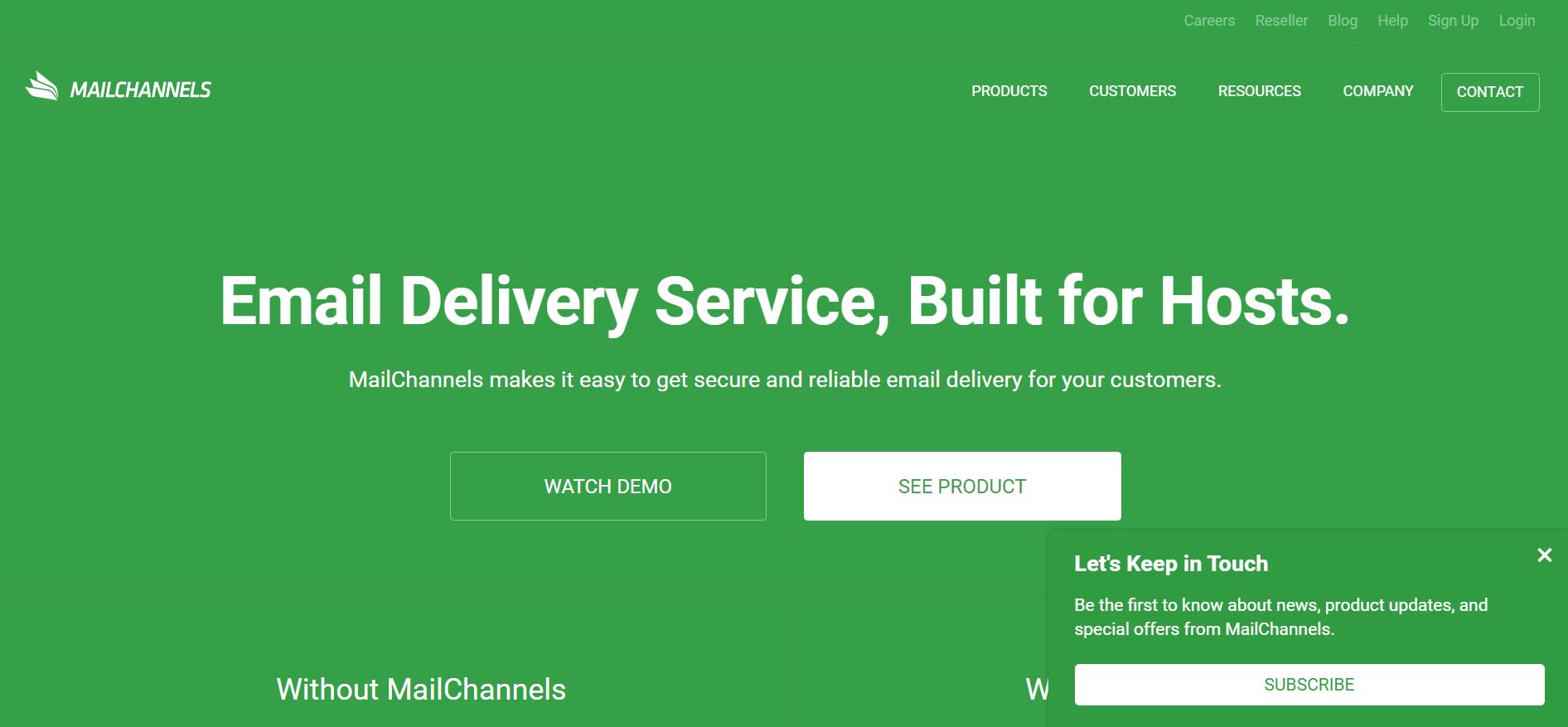
MailChannels has conveniently picked a green shade for the website design of their email delivery service. The color creates a sense of trustworthiness and reliability, characteristics that resonate with the company’s mission.
Verana
Visit this website: here
Created by: Verde
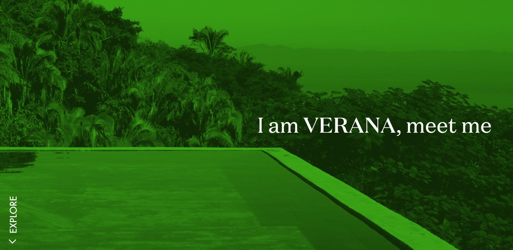
Verana is a website created by the Verde team ( “verde” is the Italian word for “green” ). The design team’s web design portfolio has quite a few excellent examples of different green shades applied in their work. Are they inspired by Pantone’s 2017 color of the year or they’re maybe simply representing the global mood, we can’t be sure, but their green websites are definitely something worth checking out.
Verde.io
Visit this website: here
Created by: Verde
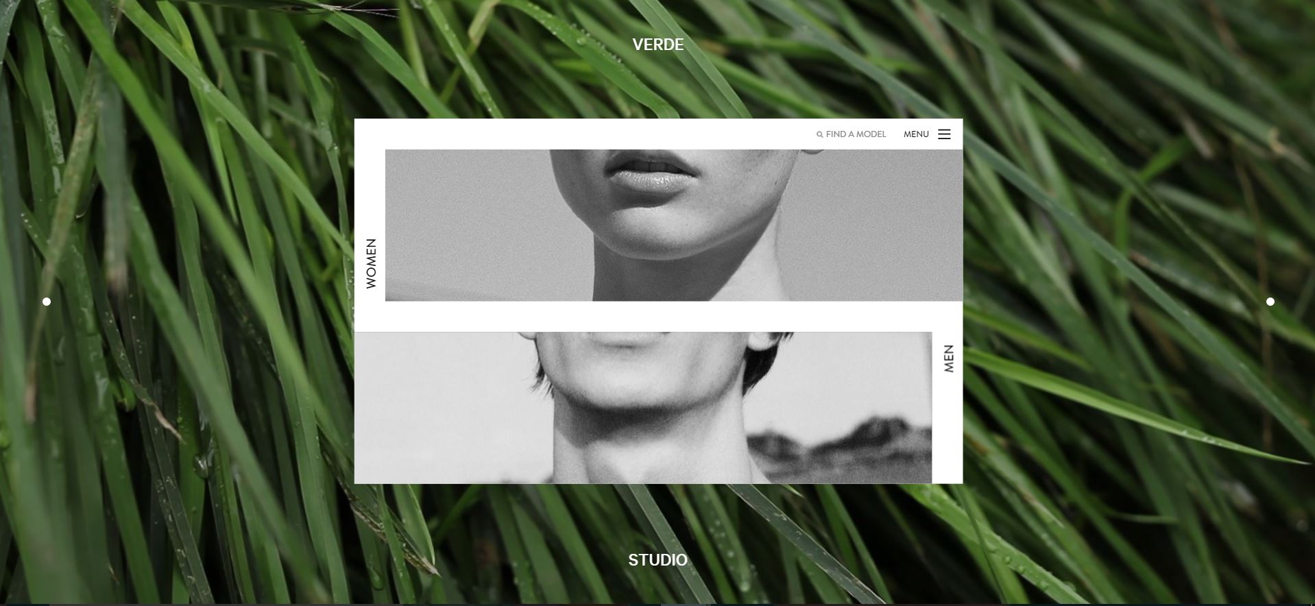
Another website by the same agency this time representing a corporate portfolio. The website’s nature-inspired video background subtly moves as if a gentle breeze is stroking the lush grass. The site has an overall minimalist look that combines raw images, clean typography, and a grid-based layout.
The Rhythm of Food
Visit this website: here
Created by: Google Creative Labs, Truth & Beauty
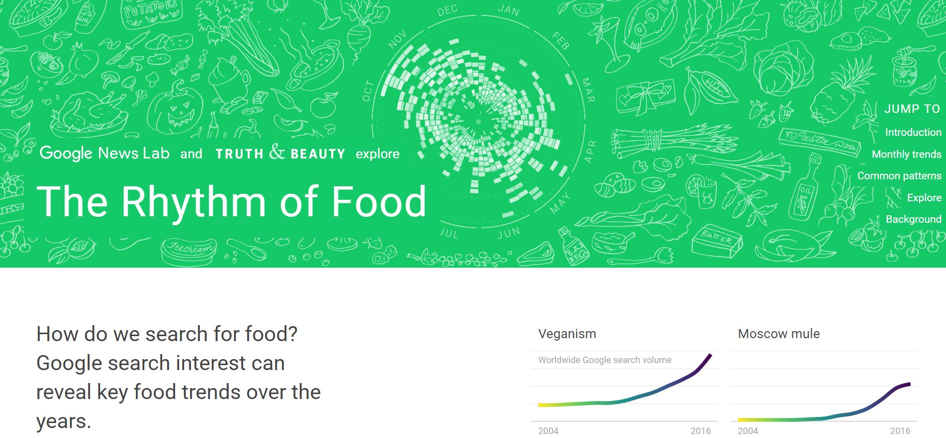
The Rythm of Food is a combination of visual graphics and charts that reveal key trends in food search over the years. The website’s accent color is a minty green shade that gives off a fresh, natural look. The world’s focus on nature, mentioned in Pantone’s color of the year page can be clearly seen from the statistics on the site.
HI, We Are Pixelart!
![]()
http://www.awwwards.com/sites/hi-we-re-pixelart
Visit this website: here
Created by: Pixelart GmbH, Austria
Picking the exact color as Pantone’s 2017 color choice may be pure coincidence but the Greenery-inspired pages surely make a great statement. Besides being the color of nature, as mentioned above, this green shade is often related to trust which makes it a great choice for the site’s main slides.
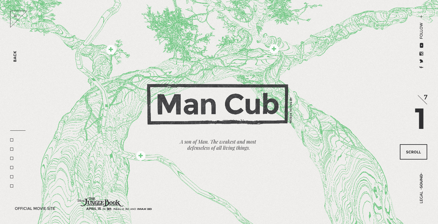
The Law of The Jungle
Visit this website: here
Created by: Watson / DG, USA
Awwwarded as site of the day.
The Law of the Junge is a green-tinted website that combines impressively rendered 3D models, immersive slide animations and beautiful vector graphics that blend seamlessly into an enticing browsing experience
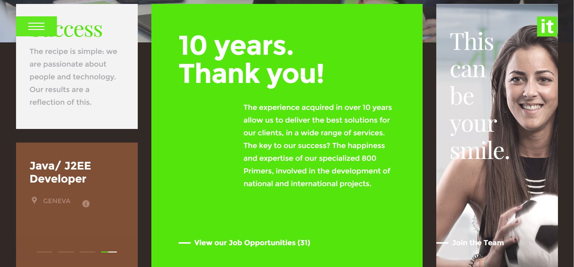
PrimeIT
http://www.awwwards.com/sites/primeit
Visit this website: here
Created by: Burocratik, Portugal
Awwwarded as Site of the Day.
PrimeIT is another site that’s seemingly inspired by the Pantone 2017 color of the year. This IT company has chosen an electric green shade that quickly grabs the attention and makes for a great brand color.
DefenGuard
Visit this website: here
Created by: Kennymax, Vladimir Zilka
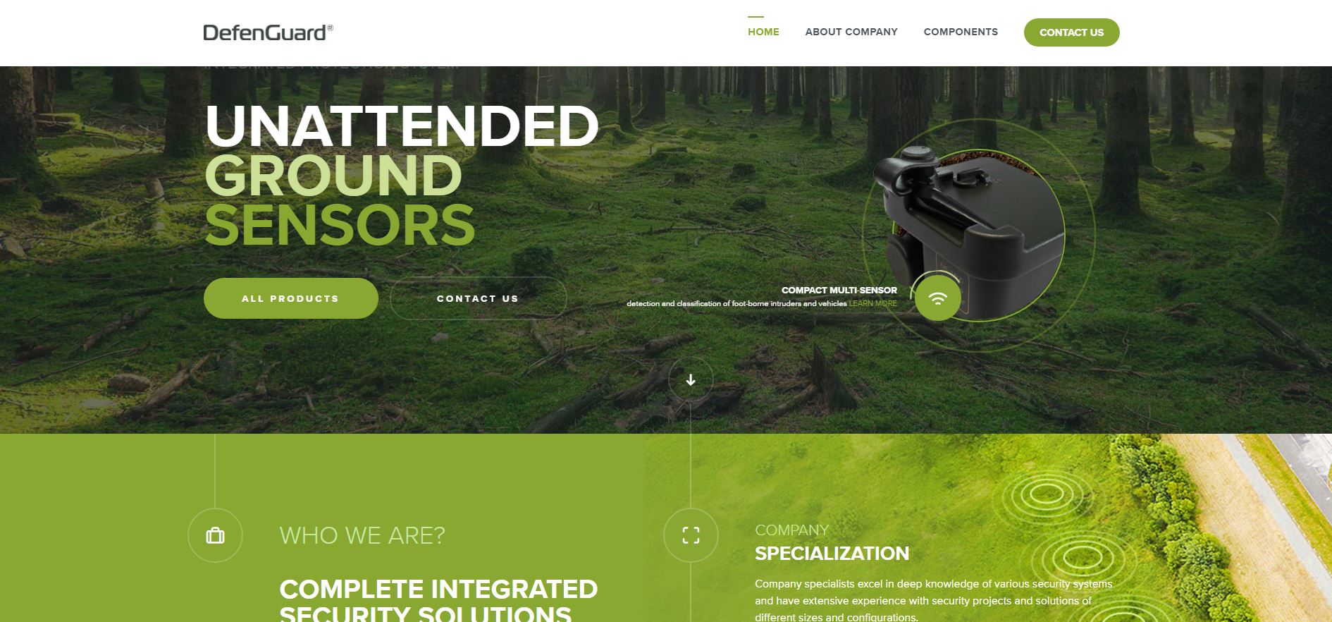
DefenGuard is a Slovak security oriented company that delivers integrated security solutions. Being mainly focused on ensuring the safety of its customers, the company has conveniently picked the Pantone 2017 color of the year for their website.
City Switch
http://www.awwwards.com/sites/cityswitch
Visit this website: here
Created by: Wild, Austria
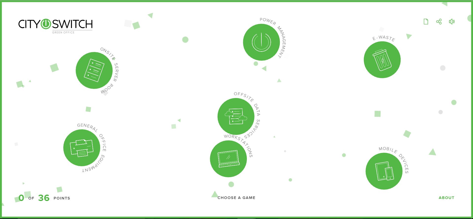
CitySwitch is a green-tinted website that provides a drag-and-drop entertainment and education experience for its users. The site helps users learn more about saving money on Information and Communications Technology, an industry that’s often represented with different shades of the current Pantone 2017 color pick.
Ricanza
Visit this website: here
Created by: Scada, Latvia
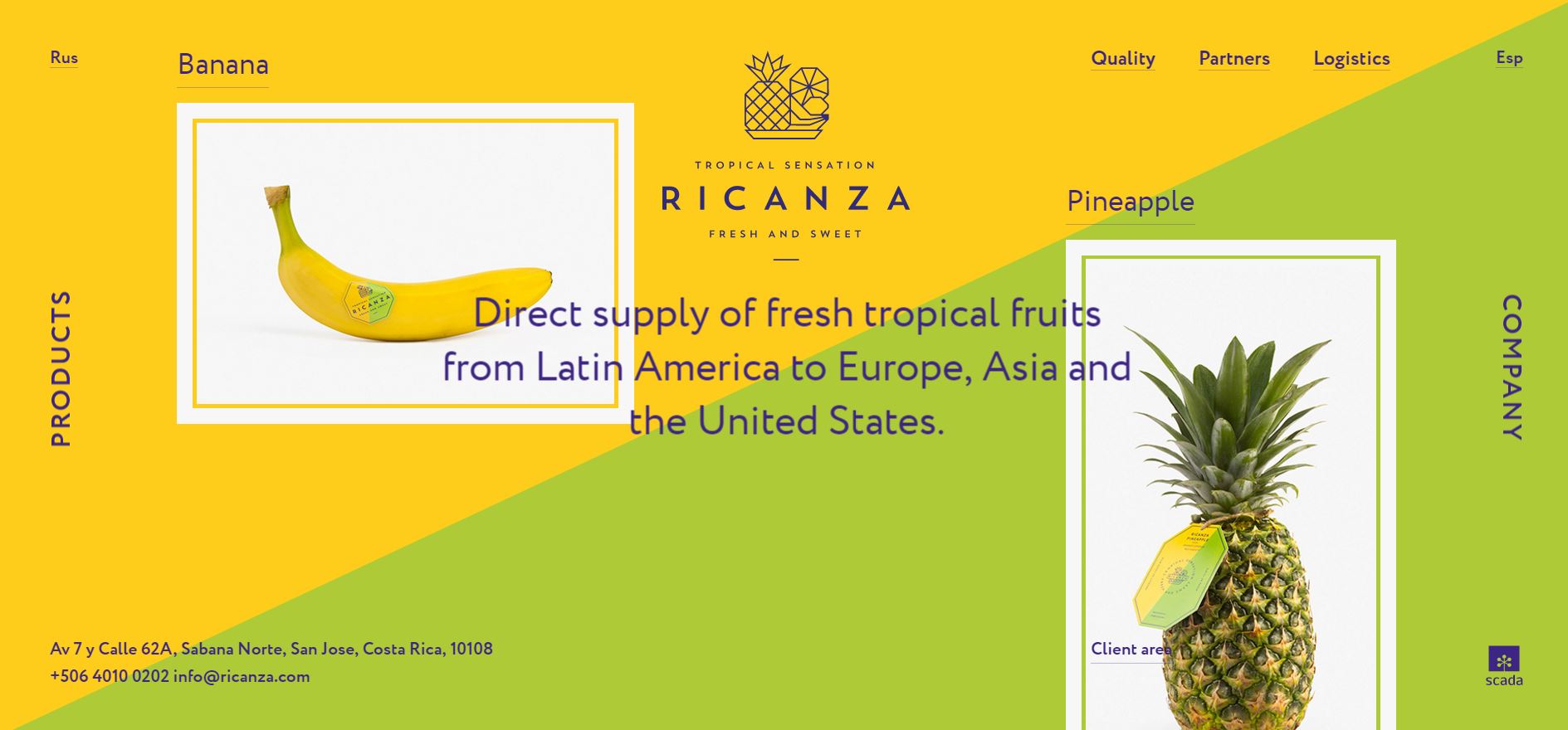
Ricanza is a gorgeous minimalist website with a geometric background that combines a tropical shade of the yellow color and the Pantone 2017 color. The fruit supplier website is a rich combination of colors, grid systems, and sans serif typography which all blend beautifully together.