As designers, it’s part of our job to find beauty in the most unassuming of places. Our surroundings can always inspire us if we look a little deeper. This is what Climadoor’s latest project looks at. They’ve made a series of striking colour palettes, complete with HEX codes, inspired by scenes of urban decay. Each one shows how you can find inspiration for your next design project no matter where you are.
For any design project, using a consistent colour palette helps to bring a sense of familiarity throughout. Whether it’s a brand website or a new product, having a harmonious colour palette that’s used consistently helps take the project to the next level of quality.
If you’re struggling for inspiration on how to build your own colour palette, check out Climadoor’s urban decay colour palettes to see how they’ve created theirs.
Yard
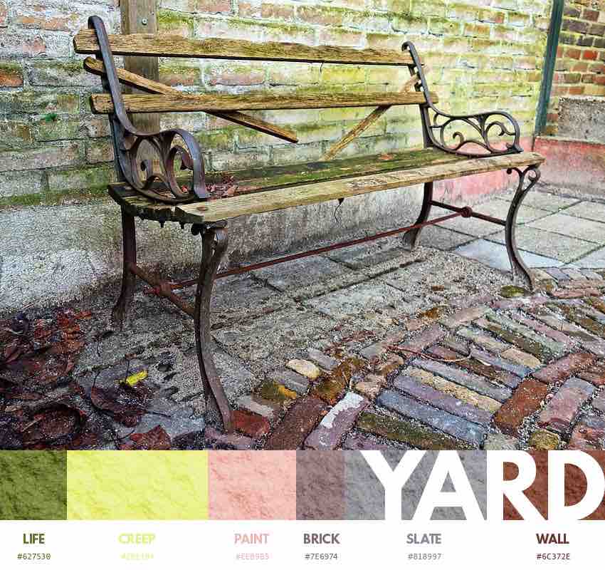
Public benches, you pass them all the time, but have you ever stopped to think about all the things that bench has seen? That bench has met thousands of people, from all walks of life. There really is so much more than meets the eye and the same goes for the colours. The weathered wood combines with the red brick and surrounding concrete, create a colour palette of earthy tones mixed with bright wood hues and neutral greys.
Time Please
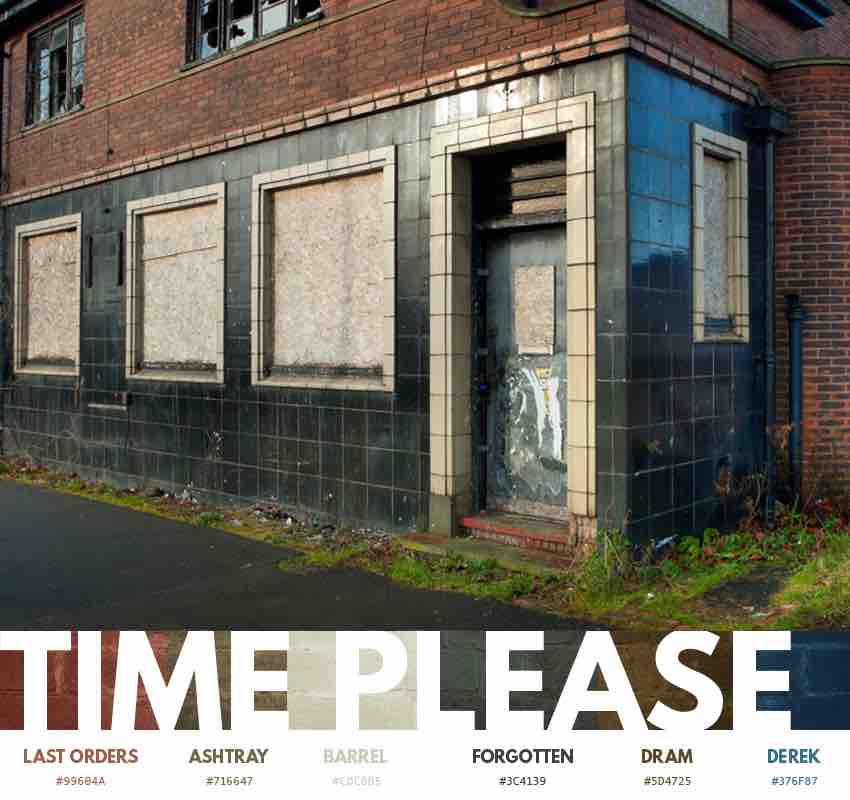
This scene of a closed English pub offers us plenty of shades and hues. Climadoor have opted for a palette with deep and dark tones. A mixture of browns, deep blues and the respite of creamy white, ties this all this together to create a seriously moody colour palette, all inspired to create a reflective atmosphere.
Rust
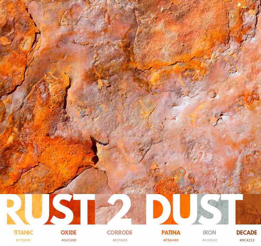
Who knew rust could be this pretty? The natural process of oxidisation transforms metals to create roaring, bright shades of incandescent orange combined with sepia-tinged metallic colours, bringing together a vivid, almost tropical colour palette.
Reclaimed
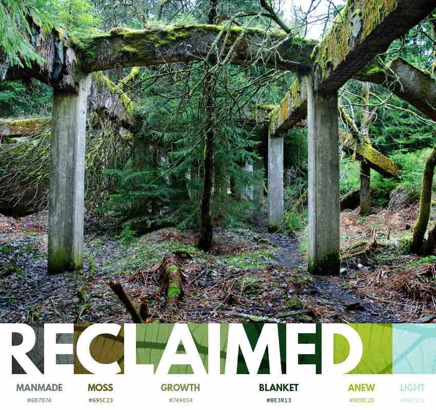
In this scene, the fractal chaos of nature combines with the order and balance of manmade structure to create a gorgeous setting with an extremely pleasing colour palette. We have earthy tones combining with oranges and mossy greens to produce a really well-balanced and harmonious colour palette.
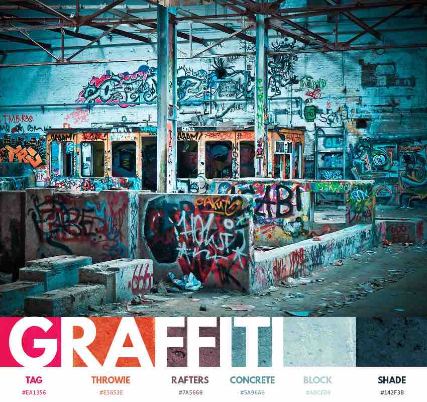
Graffiti
Graffiti is one of the purest forms of street art and whilst it isn’t for everyone, the contrast between bright, eye-catching spray paints against the monotony of urban architecture, makes for a bold and vibrant colour palette. If the fonts and tagging aren’t for you, at least take inspiration from the colours of graffiti – a rebellious art form that’s open to everyone.
Evacuate
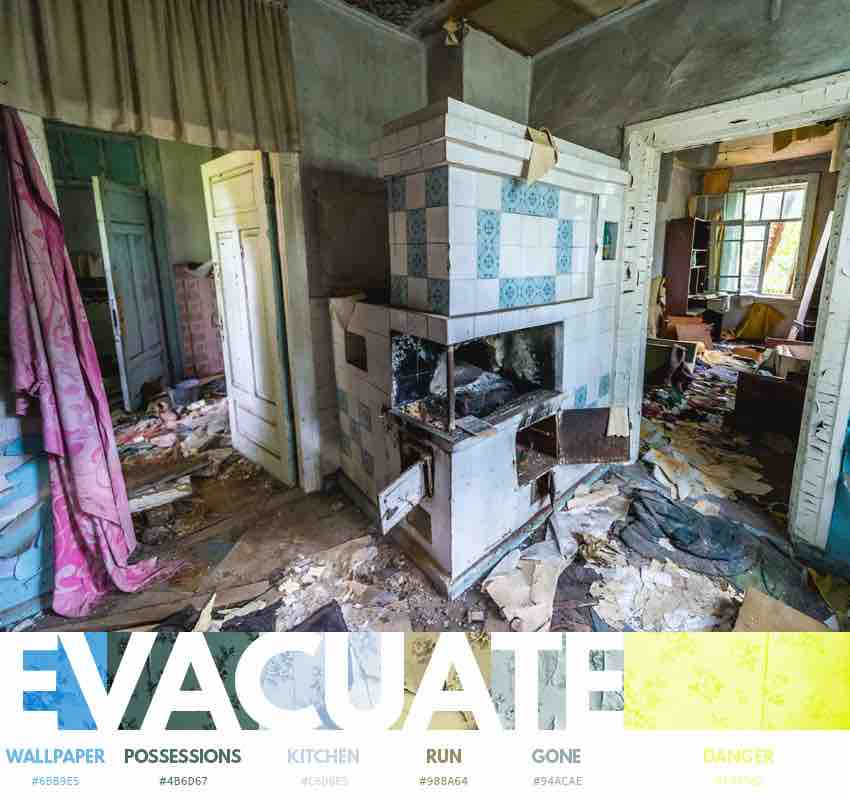
This scene of an abandoned house gives us plenty of colour inspiration. Decay and dilapidation has a funny way of bringing the different colours of a household into line with each other. As they all decay together, colour contrasts that otherwise could be considered garish in a house setting now complement each other in a mix of dreamy tones.
Drained
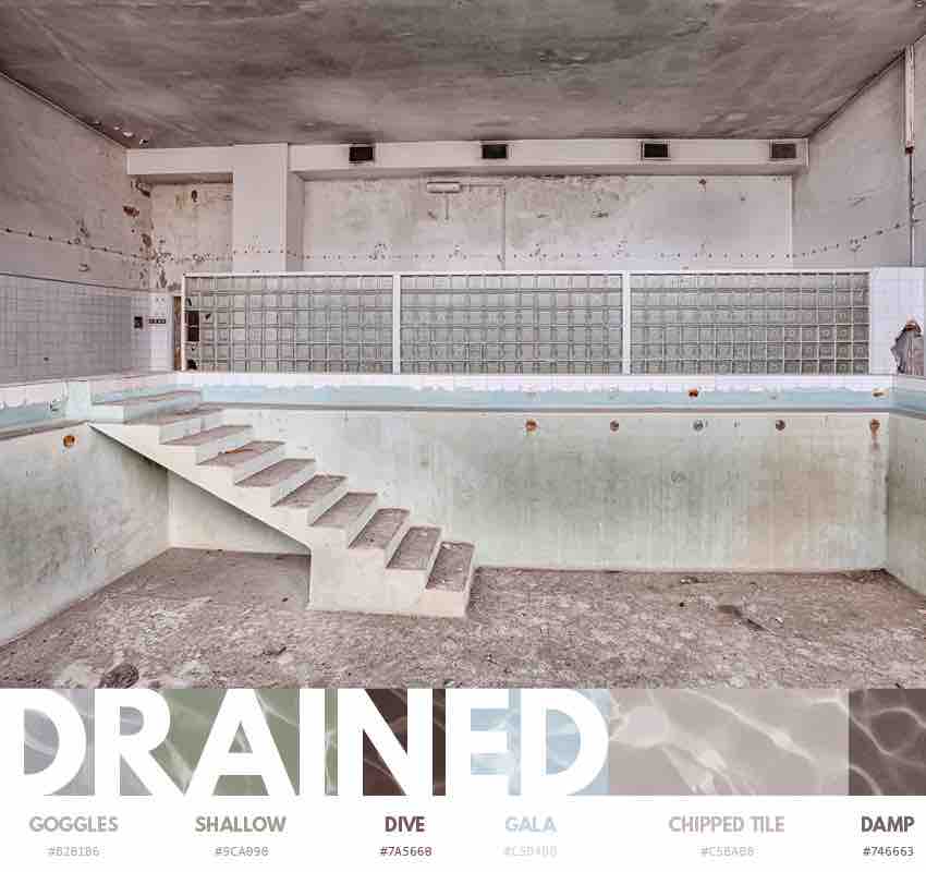
Taking an abandoned swimming pool as the inspiration for this palette, hollow blues combine with neutral, quiet greys to create a classy colour palette. We love how subtle the different hues are and how they work so well when they’re put together. The perfect backdrop for any pop of colour you wish to introduce.
Clock Out
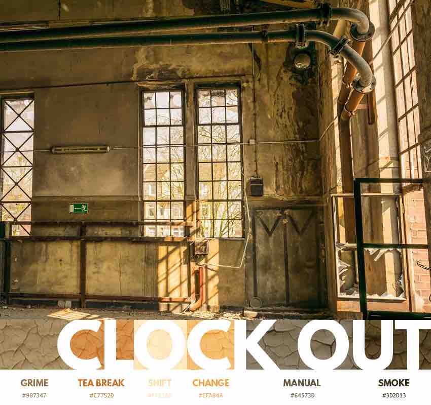
The remnants of the Industrial Revolution can be seen all over the western world. And whilst the Industrial Revolution isn’t exactly known for its colour, the decaying factories, mills and building can offer us plenty of inspiration. For this palette, dusty, worn colours combine in a range of oranges, browns and more. This palette gives off a desert feel as much as it does abandoned factory.
Brickwork
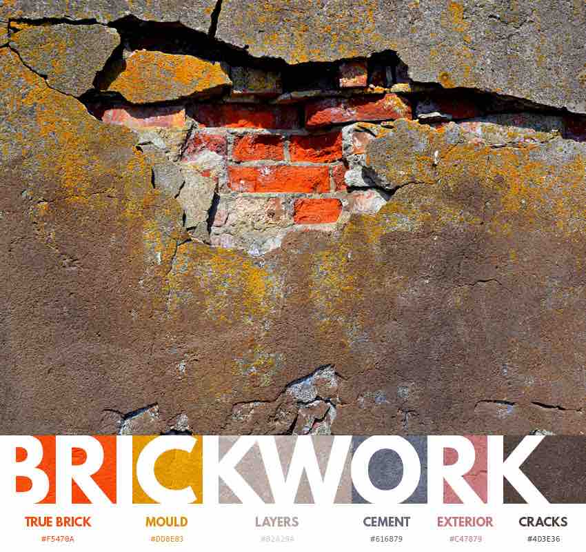
Like the natural vibrance that comes with rusting metal, the juxtaposition of red brickwork against grey concrete and cement is definitely one to be explored. This palette delves deeper into this contrast, combining the harsher, darker colours of cement and concrete with the bright orange clay of brick and its ensuing mould to great effect.
Better Times
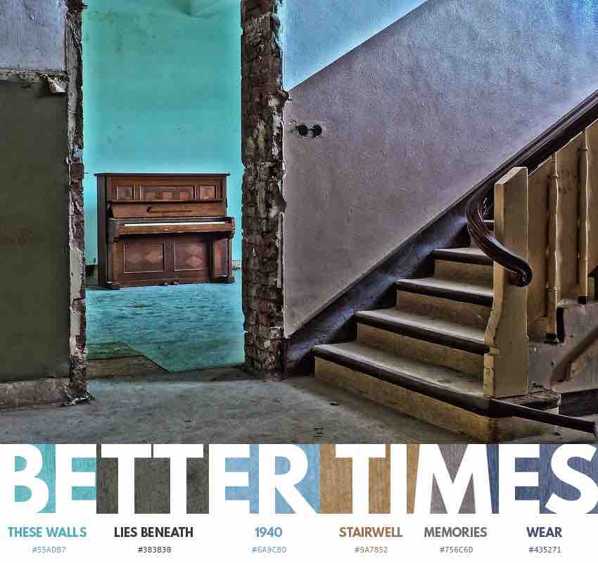
Another house laid bare, another scene ripe for inspiration. We really like what Climadoor have done with this one. They’ve created a fantastic colour palette here with consistent tones and a harmonious relationship between them all. Blues dominate this one, with a splash of warming caramel to round this off nicely.
Author: Spyre Studios