Facebook is one of the most used social media networks today. Be it individuals or businesses, Facebook is used by billions around the world to showcase their talent, promote or sell products or build a following for themselves. Moreover, with constant updates in the way in which this social network works, it has become a commonplace for businesses to advertise and sell products. Integration of features such as Facebook Business Pages, Facebook Ads, and Analytics, Facebook Marketplace etc.. have added to its popularity as a potential channel for accelerating business growth.
It would be no overstatement to say that Facebook today is an all-in-all marketplace – bringing together sellers and consumers onto one common platform.
One of the ways in which Facebook facilitates businesses is through Facebook Ads. Perhaps, no social media marketing campaign today can be successfully implemented without using Facebook ads. It is now one of the most effective tools to grow your business, create loyal and lasting customers, and generate leads and sales.
There are now over 3 million businesses already advertising on Facebook and there’s never been a better time to start than now. The most important factor, when it comes to Facebook Advertising, is undeniably the design – and this does not just include the images or graphics. Stellar creativity in Facebook ads can go a long way in marketing your business and create a unique identity through brand storytelling in a compact space of an advertisement.
By optimizing every element of your Facebook ad, you are actually tapping your audience’s impulse to buy your products and this is why creating unbeatable designs can go a long way in doing so. The following are some of the ways in which you can design perfect Facebook ads for businesses, which surely will generate more Facebook followers for your brand with a potential to increase sales and eventually make your business a bigger brand.
Test Multiple Creatives

When it comes to Facebook ads, you cannot just assume what might appeal to your audience, because in the end that’s what they will be – simply assumptions. For creating a perfect Facebook ad, the best way is to try out multiple variations and see how they perform.
Try out different arrangements of creative elements in your ad such as text, graphics etc.. and you can test which among the generated ads are converting more leads.
Be Clear and Conversational
Anything that just goes on and on is monotonous; lives are rushing at the pace of desert wind and honestly, nobody likes to spend time on reading lengthy sentences. This holds true for Facebook ads as well. Coming to the point directly is the key for any advertising campaign.
The text that goes with your Facebook ad should be right on point about what you do or sell. At the same time, make it catchy enough to grab the attention of your audiences amidst their endless scrolling.
Include Call To Action

A great ad is the one which works! And there is no denying that the contemporary audience has an attention span of a needle and needs things that are fast and easy.
Including a call to action in your Facebook ad, such as ‘Visit Now’ or ‘Shop Now’ impels the audience to take a brief look to your website or online store – which is a thousand times better than if they just scroll past your ad. This can also prove beneficial for imprinting your brand identity in the minds of the audience.
High Resolution Images
Using blurred images and low quality, unprofessional clipart for your business ads is probably the last thing that you would want your audience to see in your Facebook ad. An attractive image is often what first captures the interest of the audience.
Several online resources offer high quality, high resolution images and graphics for use in social media ads such as Pexels, Shutterstock etc.. Taking the first image that appears on Google is simply a big no, for running a Facebook Ad that performs.
Tell Great Stories With Carousel Ads

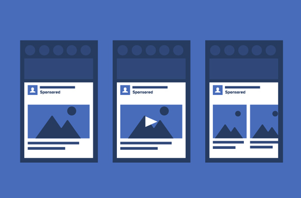
Stories are what people relate to and through stories is possible to create a unique identity in the massive competition that a floats social media. A carousel ad on Facebook uses up to 5 images or videos to showcase your product or service.
You also have the option to add an individual link to each image or video you add to the carousel to drive people back to your website to directly purchase the depicted product. You can use this space to reflect your true brand identity and for storytelling.
Concise and Creative Can Go A Long Way
Imagine looking at an ad with a headline that is never-ending or an ad that is basically just stuffed with text. Filling up the compact space of your ad with unappealing bulk can be such a major artistic turn-off.
When it comes to creating compelling Facebook ads, being concise and creative is the key. What matters the most is how much you can say in the minimum number of words. Nail your Facebook ad with a short, crisp and witty headline so that the audience cannot do, but click on your ad.
Be Consistent With The Landing Page
The aesthetic of your Facebook ad should match the overall appearance of your landing page – be it the online store on Facebook, your website or any of your e-commerce stores. Consistent colors and appearance appeals to the audience and also, enables them to identify your brand uniquely.
Too much variation has a negative impression on the audience as they do not feel the credibility of your brand. Consistency delivers more engagement and definitely, will generate more Facebook followers for your page.
Automate The Designs

Facebook allows for this great option to automatically generate Facebook ad designs or templates. For doing so, you simply need to upload your catalogue of products or desired images that reflect your brand identity or the products that you sell.
After this, Facebook will generate several automatic templates and designs for you to use for creating stellar advertisements. You can select from a variety of designs and use them directly for your Facebook marketing campaigns.
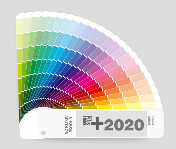
Play With Colors And Contrasts

If the more important aspect of your Facebook ad copy is the text rather than the backdrop, then you would like to use a layout which makes the headline stand out.
Depending on what you want to do in your Facebook ad, create contrasting graphics, images, text and other visual contrast (and do not forget to personalize!). By using contrasting colors to help the focal point of the image stand out, you are letting your audience know what you are offering or selling without much ado.
Create a Creative Tension
Imagine seeing an ad in which the image conveys a message that does not match with the text on the ad. You will probably be intrigued to pause and see what it has to say exactly. Intriguing audience by creating an opposition between what is shown and said is a proven and tested psychological method of marketing products.
If you manage to grab the attention of your audience for a moment, half of your marketing campaign is half-way being successful.
Conclusion
So wait no further and go on to design stellar Facebook ads like a pro! By using the above mentioned ideas to design your next Facebook Ad, you are already a step closer to running a successful Facebook marketing campaign.
These ads not only will generate more Facebook followers but also leverage your marketing campaigns to its best possible potential. There is absolutely no end to creativity here, and perfect Facebook ads will surely make you stand out from the vast majority of ads already floating on the network.

