As we already mentioned, ‘wow’ is the word we want our users to say when they open our website. It shows that they are amazed by what we’ve done and that our work was successful. You could appreciate them liking the site or addressing it as nice, but it is much better if they are astonished and they love the quality of your work.
Design has the central role in obtaining a ‘wow’ reaction. It is design that can impress us, surprise us, and wake up positive feelings. Whatever you do, make sure you’ve employed the right design to provoke such attitude.

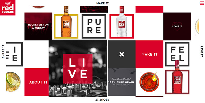
Image source: redsquarevodka.co.uk[3]
In many occasions, the ‘wow; element is a simple transition, bold color combination, or an interesting animation. Thanks to such items, we will remember that particular website and we will definitely visit it again.
However, it is important to remember that is not us who need to be ‘wowed’ by the design. It is our users’ ‘wow’ that actually counts.
Then, devil’s in the details. The wow items are often small, but noticeable ones that can help us make an impressive web experience.
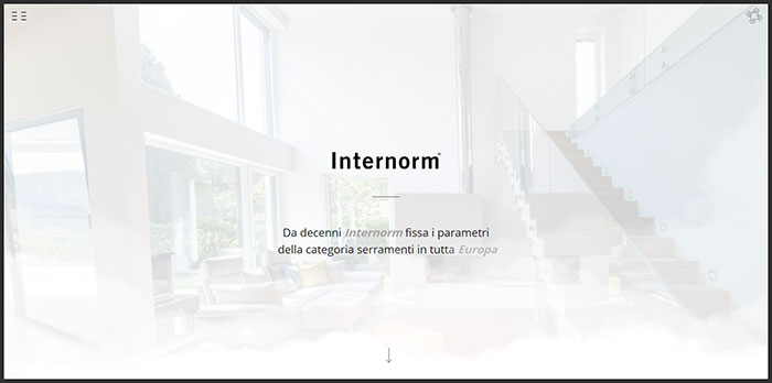
Image source: larioliving.it[4]
Summing up, why is the wow factor so important for web design? Most generally, it can help you stand out of the crowd and to be easily recognized in the web industry. It doesn’t take to be imposing or to employ complex effects, but to use simple tricks in a clever manner. The ultimate purpose, once again, is to impress users to the extent they would remember the site and they would come back.
Steps that enable you to control the wow effect
People tend to confuse functional web design with an amazingly looking one. It is not absolutely wrong.
Let’s analyze functional design first-there are few factors that produce excellent effects, and they are available for everyone who wants to drive traffic to a particular website. Employing these principles can certainly lead you to an effective website, without needing to redesign/rework the structure to adapt it to the users.
Developing a concept
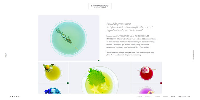
Image source: paletteforyourpalate.com[6]
You have to consider every option you have, inside the box and outside it. Develop potential scenarios and resist the temptation to follow the first idea that comes to your mind. Besides, you can always use the advice and ideas of people around you-few heads think much better than a single one.
Establish communication
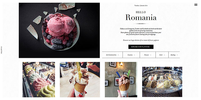
Image source: anita-gelato.com[7]
Web design is a two-road street. You need to communicate with your users and to be familiar with their opinions and ideas. The communication pattern should be simple and clear-there should be no jargon or ambiguous language, but something that sounds warm and human.
After all, you’re not contacting engines to purchase your product, but real people; and you want them to love the way in which you’re approaching them.
Keep the purpose clear
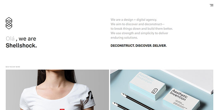
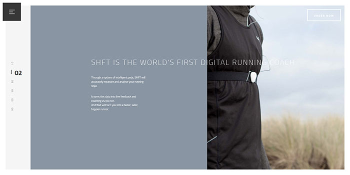
Image source: weareshellshock.com[8]
You should never allow users to have doubts about the purpose of your website. Therefore, try and find a way to convey messages that are clear enough to explain your concept and to keep customers on the same page.
Simplicity is tightly connected to time-remember you have nothing more than few seconds to convince a user to stay on your website. Therefore, make sure he understands your products, services, or information.
Here are some tips:
- Make a clear and cohesive navigation scheme.
- Include big and clear images/graphics to co-explain your content.
- Avoid too much information because it can hurt the quality of your website.
Great navigation schemes
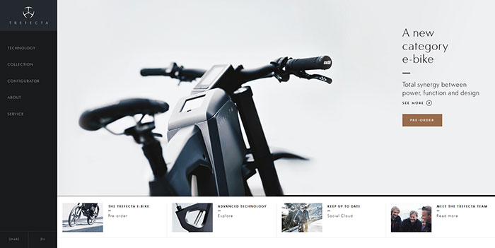
Image source: trefectamobility.com[9]
Great navigation is important for the quality of users’ experience. It is up to you to provide clear and cohesive navigation structure that users will have no trouble to use.
For instance, most important data should be placed on the homepage, while the rest should be thoughtfully divided in different pages with clear titles. Importance should be graded between primary/secondary menus and there should always be a small sidebar to explain the meaning of most important features.
Think about the first action of your users and inspire them to go for it
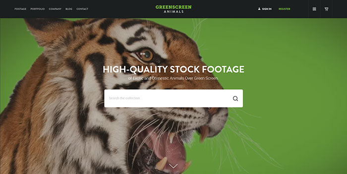
Image source: greenscreenanimals.com[10]
Is there a specific action you’d like your customers to perform once they land on your homepage? The best way to motivate them is to provide a great first impression. Here are some of the actions you might be thinking about:
- Making an account
- Subscribing for email newsletters
- Purchasing your product/service
- Contacting you
- Fulfilling informative forms
Whatever action you might be expecting, make sure it has a central place on your homepage. Put it in the middle, or emphasize it with large letters and bold colors. Apply a coercive call for action and leave no space for them to turn towards the other options.
Include search filters
Searching boxes can easily help users locate information on your website. As good as your navigation tools may be, users tend to be specific and you need to provide them with an opportunity to jump on the desired information. Besides, they rarely have time to scroll the entire content, so they will appreciate your efforts to provide them satisfying experience.
Welcome users with colors
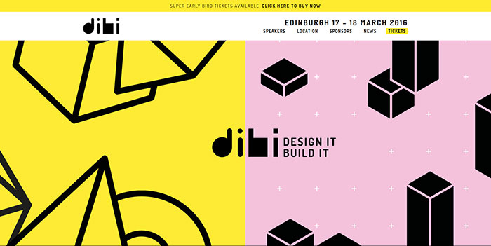
Image source: dibiconference.com[11]
You might thing that playful palettes are for brave and established designers, but that doesn’t stop you from becoming one. Feel free to experiment with sharp tones and interesting contrasts and you’ll discover it is one of the best ways to create an entertaining website.
Bright background colors can help you introduce a feeling of coziness and warmth. Surrounding essential information with positively colored and edgeless space is the best way to attract users’ attention towards it.
Think about accessibility
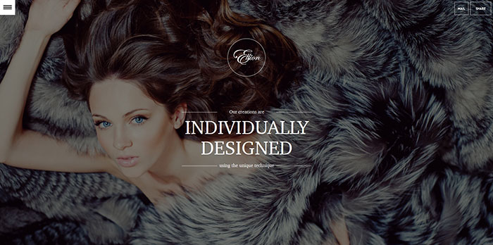
Image source: elliondesign.com[12]
Nowadays, when web usage relies significantly on mobile devices, you need to adjust your design to the various size screens available on the market. Design is not just supposed to be beautiful-it has to be effective and responsive for all devices. Think about accessibility and create a design that can adapt itself, with no need for the user to zoom and expand content in order to understand it.
Choose nice images that are related to your content
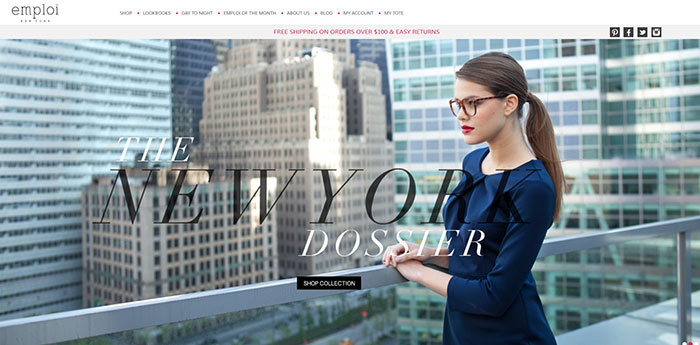
Image source: emploinewyork.com[13]
What is more attractive than a thoughtful image? Attaching rich mages to your textual content, or a gallery with small captions is the best way to enhance usability. In fact, many studies have shown that captions are the most considered parts on a website.
Images should not only be thoughtful-they should be interesting and emotional. For instance, if planning to display a portrait, make sure the person on it looks like trying to establish eye-contact with the visitor.
Speed is essential
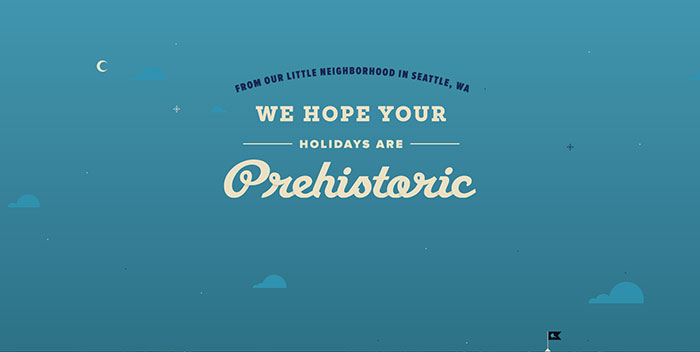
Image source: holidayharold.com[14]
We all know this from personal experience-there is nothing more annoying than loosing time to load a particular page! Ideally, you should make sure your pages are loading in less than five seconds.
Time is determinant for a great user experience. Therefore, it is considered inside every algorithm of outstanding search engines, and it is the feature users appreciate the most when working on a particular website.
On the other hand, lethargic loading is heavily punished by the searching engines and it will discourage users with a very low ranking. Therefore, if you have a website facing similar troubles, don’t expect users to lose time waiting for your content to load-incorporate accelerating technology such as compression, caching, etc.
Don’t forget: The ultimate target is WOW!
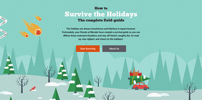
Image source: survivetheholiday.com[15]
Obtaining a ‘wow’ effect is not an easy task. You have to reconsider what you’ve done so far and to discover why your website is not generating the results you expected. The reason is usually a very simple one: you need clearer navigation schemes, readability, welcoming colors, or involving images.
Wow, however, is not the final outcome of your work. It is the begging of interaction, which has to last until the very last moment users spend on your website. To be more precise, ‘wow is the’ feature that differs a Ferrari from an Opel Corsa, and it can be experienced with every well-executed visual tool (photos, text, paintings, etc).
Motion or audio, on the other hand, can enhance the ‘wow’ effect on a later stage. The first thing is to incorporate a ‘wow’ concept, suitable for generous videos and animations.
Summing up, WOW is not necessarily sharp, big, or loud. It can also appear through subtle elements, small or neutrally painted items on your website.