Dieter Rams’ design motto, “Weniger, aber besser” (“Less, but better”), has inspired many industrial designers in the past 50 years. Among them is Jonathan “Jony” Ive, Apple’s Senior Vice President of Design, who gave the world the simplistic yet refined designs of Macs, iPods, iPads, and iPhones.
Rams believed that understanding people is the key to a good design. He also encouraged designers and everyone else to be responsible for the world around them. He advocated against wastefulness and urges the earth’s inhabitants to make good use of its limited natural resources.
Needless to say, these carried over into his design philosophy. One day, while pondering if one of his designs was a good design, he developed his now-famous 10 principles of design. The list has become a mantra for today’s designers who follow the ideal that “Less is More.”
While the principles were created in an industrial design setting, they can be easily applied to web or UI design.
Good Design is Innovative
There is always room for innovation. Developments in technology always provide new avenues for innovation in design. But, innovative design cannot be an end unto itself. It must develop as the technology does.
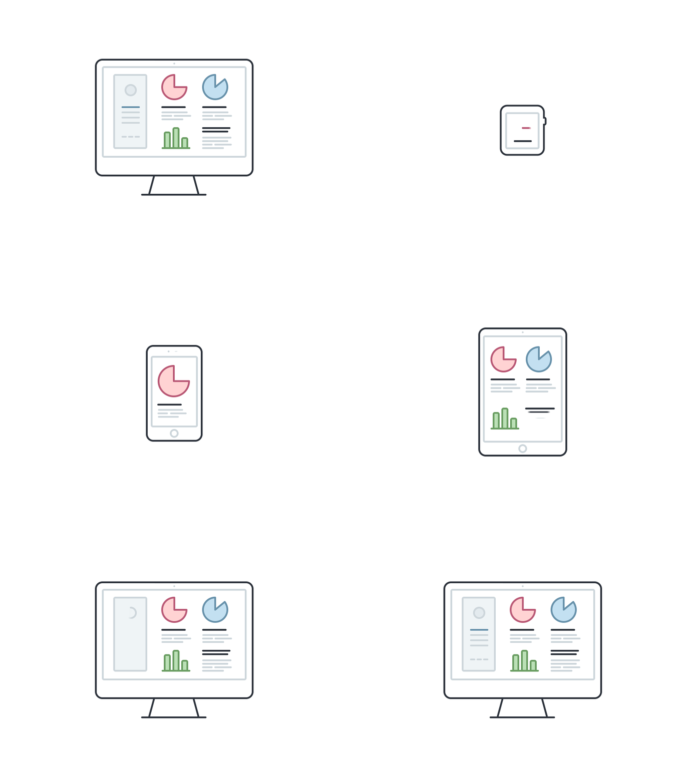
The goal of innovative design is to offer durable, bold solutions to issues that are constantly emerging. One example of this idea is the evolution of websites adapted for mobile display. Early in the era of mobile devices, most designers created a second website for mobile display.
Then came the the innovative idea of Responsive Web Design. This development gives a website the ability to “adjust itself” to various screen sizes by using CSS media queries.
Any innovative design should be simple and practical. It should work well and does what it is designed to do, but also have style and be pleasing to the eye.
The key to creating innovative design is to not be trapped by trends. Designers should improve and build on someone else’s work. They should not copy other’s work, but allow it be inspirational. The new creation may not spark a revolution, but it should strive to stand out from the rest.
Rules and guidelines are okay to use, and convention can be useful. However, knowing when to break from convention allows the good designer to add that spark of innovation.
Good Design Makes a Product Useful
Customers buy products for their usefulness. The product should be functional, but also meet the psychological and aesthetic needs of the consumer. Good design brings the product’s usefulness to light, while downplaying any feature that may detract from that purpose.
Products have specific functions of usefulness and aesthetics, and those functions have different types of outcomes. Objectively the product should fulfill its purpose, doing what it is designed to do.
Subjectively, it should give the customer satisfaction on psychological and aesthetic levels. Any part of the design and function that does not fulfill those outcomes, whether directly or indirectly, should not be included.
Before beginning, the product designer should study their target users, looking at what the users hope to accomplish, what they need in the product and how they behave when using it. The designer should take a walk in a user’s shoes to see the product from his or her point of view.
Following this principle, web designers should keep designs basic without making them empty or plain. Every feature they add should have a purpose. Important parts of a web page should be accented by elements with pleasing aesthetics, but decoration for the sake of decoration wastes space and clutters the page.
Good Design is Aesthetic
The oft repeated phrase of “Form follows Function” does put function in the lead, but the form itself should follow, but not too far behind. Good function is essential to any product, because each product should be useful. However, a good form or design is essential in enhancing or promoting the product’s purpose.
When customers use a product daily, the aesthetics of that product will have an effect on them and their sense of well-being. A well designed and executed object will add beauty to their lives.
Adding Aesthetics to a web page means more than just making it “pretty.” Proper aesthetics give the viewer a sense of harmony with the page’s elements blending together and complementing one another. Any visual element of the page should serve a purpose. Designers should consider the color and size of each element and ask themselves what purpose it serves. Elements without purpose will just add clutter and not add to the aesthetic value.
An aesthetically pleasing design starts with meaningful colors. Designers should carefully consider color schemes and sometimes venture outside their tried and true pallets. The chosen colors should enhance the website user’s experience. Website designers should research color theory and the psychology behind the different hues.
Good Design Makes a Product Understandable
The best design gives the user a clear understanding of a product’s design. Even better, the design will encourage the user to intuitively understand the product’s function. At its best, good design is self-explanatory.
The ability to enhance understandability is an essential part of product design. Some products are complex, and some products will always need some documentation or explanatory text. However, if a product cannot be used without an excessive amount of instruction and explanation, there is an error in the design.
On a website, new users immediately look for navigation. They are in a hurry or easily distracted, so if they do not understand the site’s home page immediately, they will move on. Even worse, the user now associates frustration with the website. This is bad for business.
To prevent this scenario, designers should have menus that stand out and succinct labels for sections. If the user must follow directions, an illustration or list of steps would be helpful. Dictation will turn users away.
Of course, website designers need to understand their audience, and should ask themselves how sophisticated their potential users are. A website for children will have simpler language, while one for professionals can be a bit more straightforward.
Good Design is Unobtrusive
A product’s design should never get in the way of its user. The product is a tool and not stationary decorations or artwork. Product design should be neutral and subdued, so the user has room to express himself and explore the product’s potential.
While a good design makes a website aesthetic and useful, it should never draw away from the site’s ultimate goals. The design allows the user to find what they are looking for quickly and easily.
Designers need to lead the user through the site, perhaps using color and elements to lead their eyes to what’s important. Poor design or clashing colors will cause the website visitor to wander randomly around the site, perhaps causing them to miss important information.
The designer’s goal is to keep the page simple and succinct. As shown above, the Victoria’s Secret website has no ads. Its design is clear and simple. In reality, the site is complicated, but it keeps the navigation subtle and well directed. The customer’s focus is on finding the item they want and buying it.
Good Design is Honest
Good design does not mislead the consumer. It enhances and calls attention to the product’s features without making it seem more powerful or cutting-edge than it really is. Customers do not like to be manipulated by empty promises.
Honesty about what the product delivers is important. Any promise, whether made in a visual manner, by graphic or through marketing, should be kept. It is important that the product fulfills the consumer’s expectations.
Design principles can be utilized to give users the information they need and help them make decisions, but this should never cross the line into deception. For example, suggesting a costlier, more sophisticated product to the customer is acceptable. This is an up-sell, something customers expect. However, it would be dishonest to use default options to magically make that item appear in the customer’s cart at check-out. Honest design will operate like a sophisticated, well-mannered shopping assistant, not like the scam artist selling fake watches on the street.
Here are some key ways to keep website design honest:
- Give the website user clear choices.
- Make sure they understand each element’s purpose.
- Ensure that navigation links always lead to the correct pages.
- Have titles that accurately reflect the content of a section.
- Do not use dark patterns[8].
Good Design is Long-Lasting
Good designers avoid passing trends – popular ideas that will soon fade making way for the next fad. Doing so keeps the product from appearing old or outdated. If it’s done properly, the design will last for years. Following trends is not helpful and can be dangerous. The latest trend will soon be outdated, and somewhere down the line it may become the object of ridicule.
Good design lasts and endures the tests of time. Certainly, there is sometimes a fine line between trends and what constitutes good design, but the difference is the trend will soon feel out of date.
Good Design is Thorough Down to the Last Detail
A good designer will agonize over the smallest detail because he knows that design details make a difference[11]. He leaves nothing to chance and makes sure that every part of the design has a purpose. This attention to detail signifies care about the design and conveys respect to the user.
The best designers are very thoughtful. They carefully plan out each detail including inputs, images, blocks of text and workflows. They ask themselves how each element will assist the website user.
The designer ensures that every part of the web pages serves a purpose, and any time something is placed, re-positioned or re-configured he gives it careful attention. This thoroughness will give the website the endurability, beauty and boldness it needs to succeed.
Website designers should equally attend to every element on the page, in the same manner they would consider the whole page. Every pixel deserves their attention.
Good Design is Environmentally Friendly
Design assists in saving the environment by preserving natural resources and not contributing to pollution throughout the product’s life.
The digital world is not as involved with the earth’s environment as much as were the products designed by Rams. However, website designs should be flexible in order to change as its display environments do.
As device, platform and browse environments change, a well-designed website will continue to be usable and aesthetically pleasing. As their display environment changes, the user’s experience will differ, and the website should be able to endure those changes. A web designer should follow the underlying principles of responsive web design, progressive enhancement and graceful degradation.
Good Design is as Little Design as Possible
Even the best designer will get carried away, so following Rams[13]‘ “less, but better” principle can help him or her focus on important aspects of the product, so it is not laden with inessential features. Purity and simplicity is the rule of good design.
Every aspect of a design should be purposeful and should never just be filler. If an element does not assist the user, it should be deleted, but the designer should keep in mind that some elements will indirectly help. For example, some colors will indirectly guide the user.
Keen editing is an important part of design. Determining what is not essential and deleting it actually takes more time and effort than adding elements. Designers need to focus on the fundamental elements of the design to maintain its simplicity.
They should ask themselves whether each element has a purpose or reinforces the website’s goals. Then, they should jettison any detail that does not add to the user’s experience. An uncluttered, well-designed site can actually achieve more than its cluttered counterpart.
References
- ^ Web Design (www.designyourway.net)
- ^ Image source (dribbble.com)
- ^ Image source (dribbble.com)
- ^ Image source (dribbble.com)
- ^ Image source (dribbble.com)
- ^ Image source (dribbble.com)
- ^ Image source (dribbble.com)
- ^ dark patterns (darkpatterns.org)
- ^ Image source (www.google.com)
- ^ Image source (littlebigdetails.com)
- ^ design details make a difference (www.designyourway.net)
- ^ Image source (dribbble.com)
- ^ Rams (en.wikipedia.org)
- ^ Image source (plover.co)
