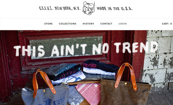
Appearances matter. It takes one twentieth of a second for your site visitors to judge you.
What can people take in in 0.05 sec?
Looks are the only thing a prospect can absorb so quickly.
You will lose a prospect instantly if your e-commerce page has any of these seven design flaws. Your chances of success improve when you choose an ecommerce theme bearing these seven boo boos in mind.
Poor Color Scheme
There are four aspects of your color scheme to consider:
Conventional
Give your customers what they expect. If all your competitors use a black on white interface, so must you. Using an unconventional color scheme smacks of gimmickry in customers’ minds, and you lose trust in a flash. As this Spyre Studios post suggests, you should discount this year’s trendy designs because they will achieve nothing for an e-commerce site.
Good contrast
Mobile users will often be viewing your site in bright sunlight, so high contrast is especially important. Forget how smart pale gray on white looks, because if it frustrates customers, they will go elsewhere.
Emotional meanings of colors
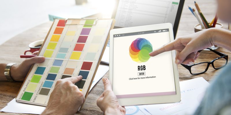
That one twentieth of a second you have is only enough for an emotional rather than a logical decision and colors play a massive role in deciding your viewers’ emotional responses to your site.

Be careful about the colors you choose for menus and headings and the emotions they elicit in viewers.
Your brand colors
The heading and logo are the only places you should use your brand colors. Fitting in with the norm is more important.
Customers care more about trust than they do about your brand, so limit your use of unusual colors because trust comes from fitting in with what buyers expect.
Unusual Layout
On a big screen, we read from left to right, and on a small one from top to bottom. Ensure your design avoids visual interrupts such as using the product image to split the text into two blocks.
Unusual Font Choice
You may well use a custom font in your branding, but it has no place on your e-commerce site. You have much more freedom of choice regarding your font on your blog than here, so put your personal preferences aside and choose one of the standard font options.
You may have read that the W3C recommendation for font size is much larger than the standard one on most e-commerce pages. Forget that advice here because it is all about conforming to customers’ expectations
Designed for the Big Screen
Most customers use their phones and tablets for at least part of their research before deciding to buy, so optimize your layout for both mobile and desktop users. Always check the mobile layout before accepting the default responsive design your e-commerce provider offers.
Slow to Load
Speed is even more important to mobile than to desktop users.
Perhaps the most popular CMS for Ecommerce sites, Shopify (the Ecommcerce “Wix”) has fast loading e-commerce themes that are easily customized. Some themes have large images or has fancy effects because they will always impact your loading time, so be careful on the one you choose. Oberlo wrote a great guide on finding good Shopify themes. Mobile users want instant loading and usability, and nobody has two seconds to wait while your site loads all its full-sized images.
No videos
Video works. Auto-start video may irritate some users, but you must include a user option to view videos of your products.
When customers visit a site with product videos, 64% of clients’ are more likely to buy because video reduces the risk inherent in buying any product without seeing or handling it. If you lower the risk, customers are more apt to reach for their cards.
Animated Text
Flashing text might have worked in 1992 when the Internet was new. Nowadays most visitors will click the back button as soon as they see anything flashing. It’s THAT irritating.
TL;DR
People buy based on their feelings. You need to elicit an instant positive emotional response as soon as someone opens your page. Forget trying to be different. Fitting in with customer expectations is the only way to build trust. Use colors, fonts, and layouts that users are comfortable with if you want to make a sale.