 You’re going to have build your site in such a way that the eye is naturally drawn from one step to the next.
My sister used to accomplish controlling my focus by sternly, but calmly, telling me to “Get back to your schoolwork” anywhere from fifteen to forty times in a single day. But your users aren’t going to put on some music and “buckle down” to finish browsing your website, they need to be drawn in.
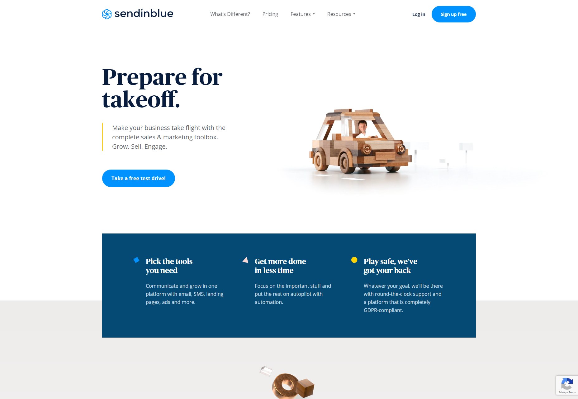
The Call to Action—that “Buy” button, for example—needs to look good.
1. Contrast
The first and easiest way to catch the eye is to use contrast. By “contrast”, I mean that the important elements of a design need to stand out from the rest in a meaningful way. See what I did there?
Now, there are several kinds of contrast to discuss:
- Light/dark contrast
- Color contrast
- Size contrast
- Contrasting styles
Most of these are fairly self explanatory, but let’s go over them.
Light/Dark
Light things stand out from dark things, and vice versa. Pretty simple, right? Well… that depends. If most of your site is pretty bright, then making your Call to Action big and dark (or at least a bit darker than everything else) makes sense.
However, there are lots of designs out there where high light/dark contrast is a feature of the entire layout, and that contrast is used to give everything a sense of structure. In that case, you’ll need to use another kind of contrast to direct people’s focus.
Color
Okay this one is self explanatory. A splash of color, or even just a different color, is enough to make things stand out. In this example, color is used to cut through a lot of typographical noise.
Size
Make the important buttons bigger than other buttons. Make your headline text bigger than other text. Size contrast can not only make things stand out, but also help to establish hierarchy in the page.
Style
A difference in style can be illustrated by something as simple as the bold text joke I made earlier. But to look at a more UI-focused example, let’s talk about “Ghost buttons”. Ghost buttons are buttons with an outline, but no background color, and they’re often used in combination with regular buttons, like on the home page of IndieGoGo:
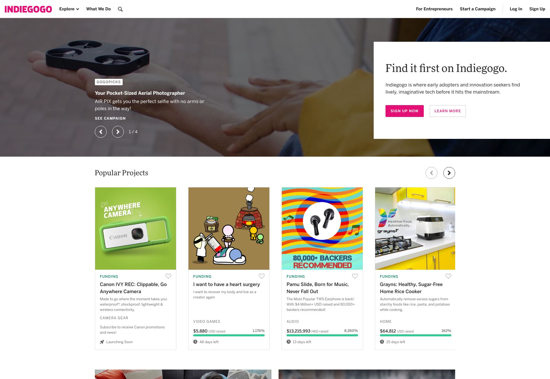
I bet you can tell which button they really want you to click on. The stylistic contrast makes this clear.
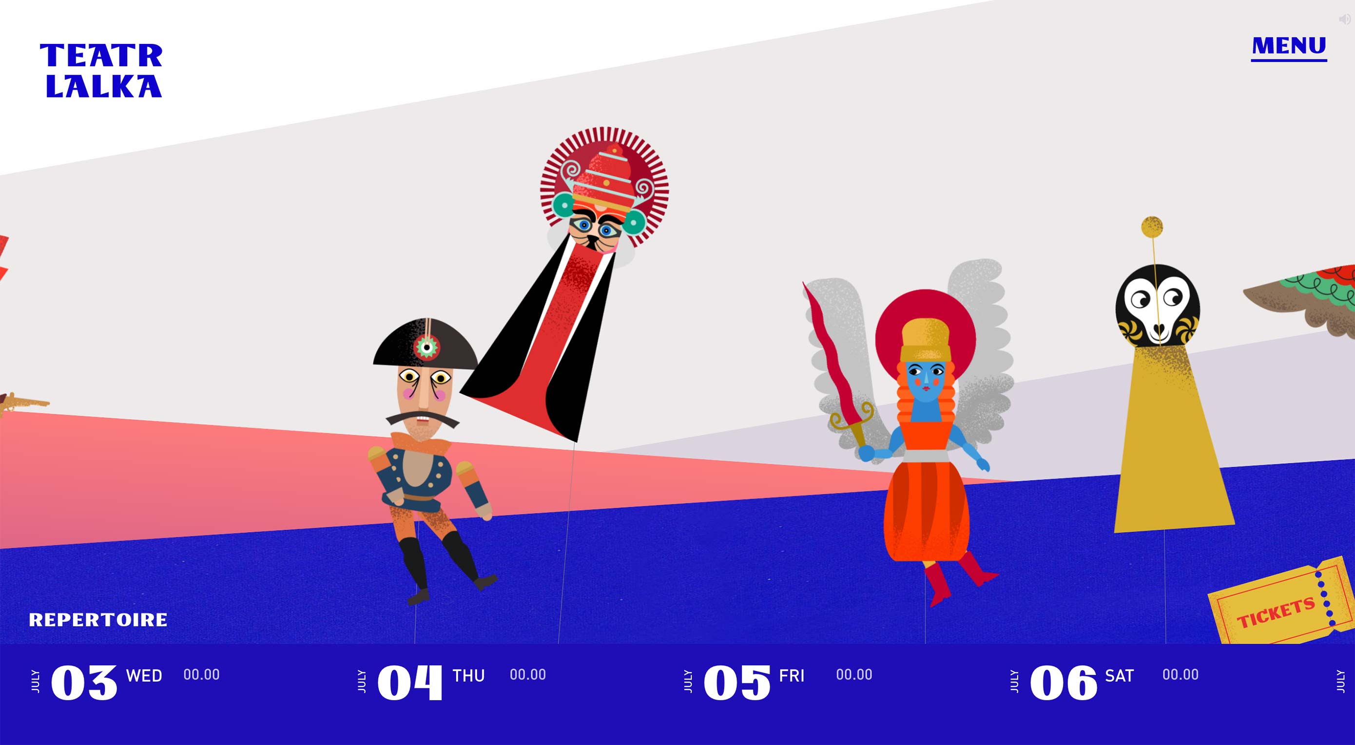
2. Images
Whether we’re talking about photography, illustration, painting, or 3D graphics, images grab eyeballs. You can redirect anyone’s attention easily enough with a picture. The only real exception to this would be pictures that are surrounded by other pictures.
You can use images as the objects of focus on their own, of course, but you can also use them to draw the eye to other things, such as text or buttons placed on top of them. You didn’t think those were just pretty backgrounds, did you? That may have been how things started, but everything is a lot more calculated these days.
If you really want to go all out, place your call to action in such a way that it looks like the picture is pointing to it. This is what your manager would call “synergy”, and it tends to work, despite sounding so very corporate.
3. Animation
And if you think we like pictures, let me tell you about moving pictures. No but seriously, if there’s nothing more interesting going on in a room, my eyes will inexorably be drawn to any TV that’s been left on, no matter what’s playing. It could be sports, daytime talk shows, or even a soap opera, and I’ll have trouble looking away. Most of us would.
Motion just catches the eye that way. It started out as a survival reflex, and now we just have to know if Brian will ever regain his memory and marry Patricia, or if she’ll remain forever trapped by his evil twin Drake. Use that reflex to your advantage, by incorporating some light animation into things like buttons, helpful tooltips, and any text you really want people to read first.
4. Convention
Lastly, take advantage of your user’s default behavior patterns. As web users, most of us have been trained to look for navigation near the top, Calls to Action right under that, and more CTAs at the bottom. Putting important bits of information and functionality where people expect to find them is a perfectly valid strategy.
Also keep in mind whether you’re designing for people who read right-to-left, or left-to-right. English speakers, for the most part, will look at the left side of their screen first, for example. While there is something to be said for breaking the mold, never underestimate the power of simple yet deeply-ingrained habits.
5. Use Emphasis Sparingly
When everything is bold, bold text just tends to blur together, rather than burning important information into the user’s brain. When there are many pictures on a page, and you’re not running a photography portfolio, users may just get distracted. And don’t get me started on the overuse of animation. When everything’s moving, how do you expect them to read any of your text that’s more than a sentence long?
To really draw and focus your user’s attention on one or two things, you need to eliminate, or at least deemphasize things that might compete for their attention. Compete with other sites, not your own content.
p img {display:inline-block; margin-right:10px;}
.alignleft {float:left;}
p.showcase {clear:both;}
body#browserfriendly p, body#podcast p, div#emailbody p{margin:0;}
![]()