 As human beings, we like to think that we’re rational creatures.
We tell ourselves that we make our decisions based on fact and logic. However, that’s rarely the full truth. As much as we try to make choices guided by rationality, the truth is that we’re often highly emotional people, driven by the way that things make us feel.
So, what does that mean for a website designer?
Though designing a functional and logical website is important, it’s crucial not to forget about the emotional impact of each interaction that your customer has with the sites that you build.
Sites that don’t elicit any kind of emotional response aren’t just boring; they’re forgettable.
A forgettable website is poison to any website designer’s portfolio.
That’s why we’re going to introduce you to some easy ways to use emotion in your designs this year.
Getting to the Bottom of Emotion in Web Design
First, you need to understand the part that emotion plays in user decisions.
Don Norman’s book Emotional Design says that there are many things that designers can do to make their designs more emotional. Even something as simple as focusing on the aesthetic impact of your website can make it more likely that you’ll reach your audience on an emotional level.
One important thing to remember about emotional design, is that it’s not just about making your customers feel good. Emotion can be both positive and negative. Sometimes negative emotion is more impactful than positive feelings – it all depends on the kind of site you’re trying to create.
A website selling health products to customers needs to make that audience feel comfortable and confident that they’re buying a trustworthy item. However, it may also need to trigger small feelings of worry or concern in the audience about what might happen if they don’t buy.
Knowing how to walk that balance between positive and negative feelings is how a designer takes a simple website design and turns it into something incredible.
So, where do you get started?
Step 1: Use Visual Elements to Trigger Emotion
Visual elements are one of the easiest points to get started with when you’re designing for emotion. That’s because visuals are fantastic at drawing out feelings.
An animation can create an emotional connection with your audience by helping them to understand how your product works or making them laugh when they land on your page. A genuine photograph of your team working together can inspire trust and feelings of affinity.
One of the most common visual elements used to trigger emotion is color.
Shades like blue and green in the digital design world are more likely to drive feelings of calmness and comfort. On the other hand, red and yellow often encourage feelings of enthusiasm and happiness.
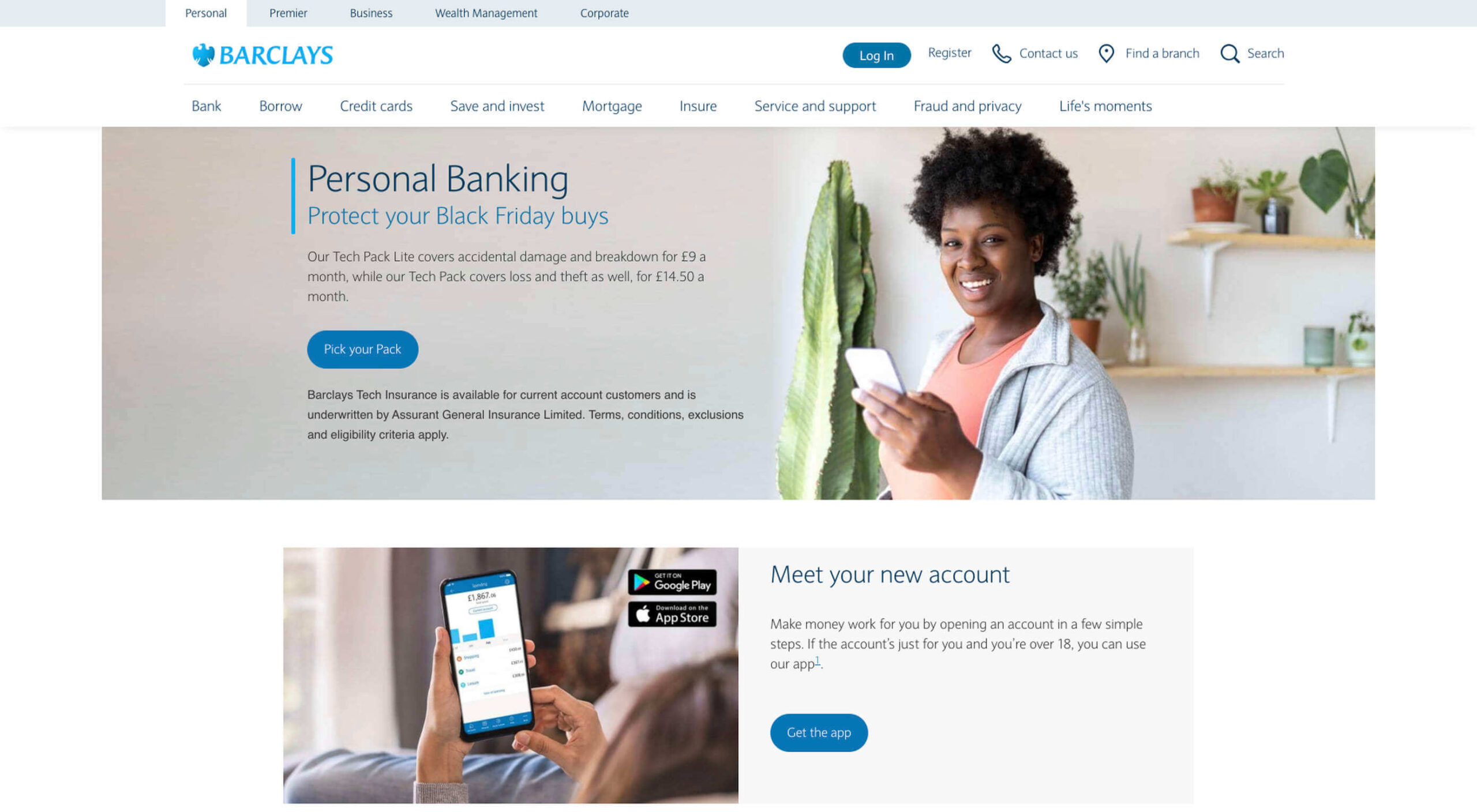
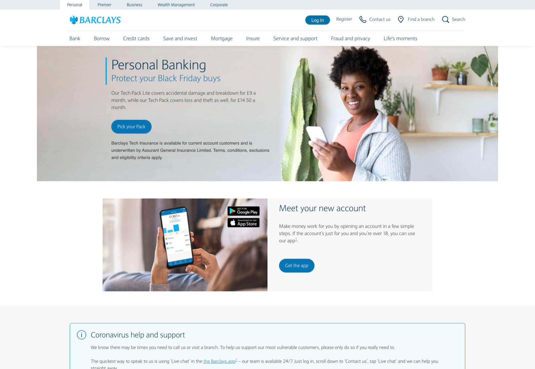
The way that you use color can make a massive difference to how users feel when they arrive on a website. For instance, the Barclay’s website would have been pretty boring if it was just a basic black and white screen. However, a banking site can’t afford to go over the top with animations or illustrations in most cases, as this can detract from its professional image.
Adding small patches of blue in a way that complements the brand’s color palette is a great way to generate feelings of trust. Combined with the image of a genuine real-life person, and calm tones, the bank instantly presents itself as something approachable and honest.
At the same time, the clear hierarchical layout of the bank’s website, with an easy-to-follow navigation bar, easy-to-read font, and clear headings and buttons comfort the customer. Users get exactly what they expect when they come to a financial website, and that makes users feel as though they’re in the right place.
Step 2: Create Engaging and Emotional Interactions
Visual elements are a great way to embed emotion into digital design. However, they’re just the first step. The emotional aspects of your web design choices should also appear throughout the interactions that customers have with the website.
A good interaction on a website or app needs to be simple and straightforward enough that users feel comfortable taking the next step in their journey. However, it also needs to drive the right emotional response from users too.
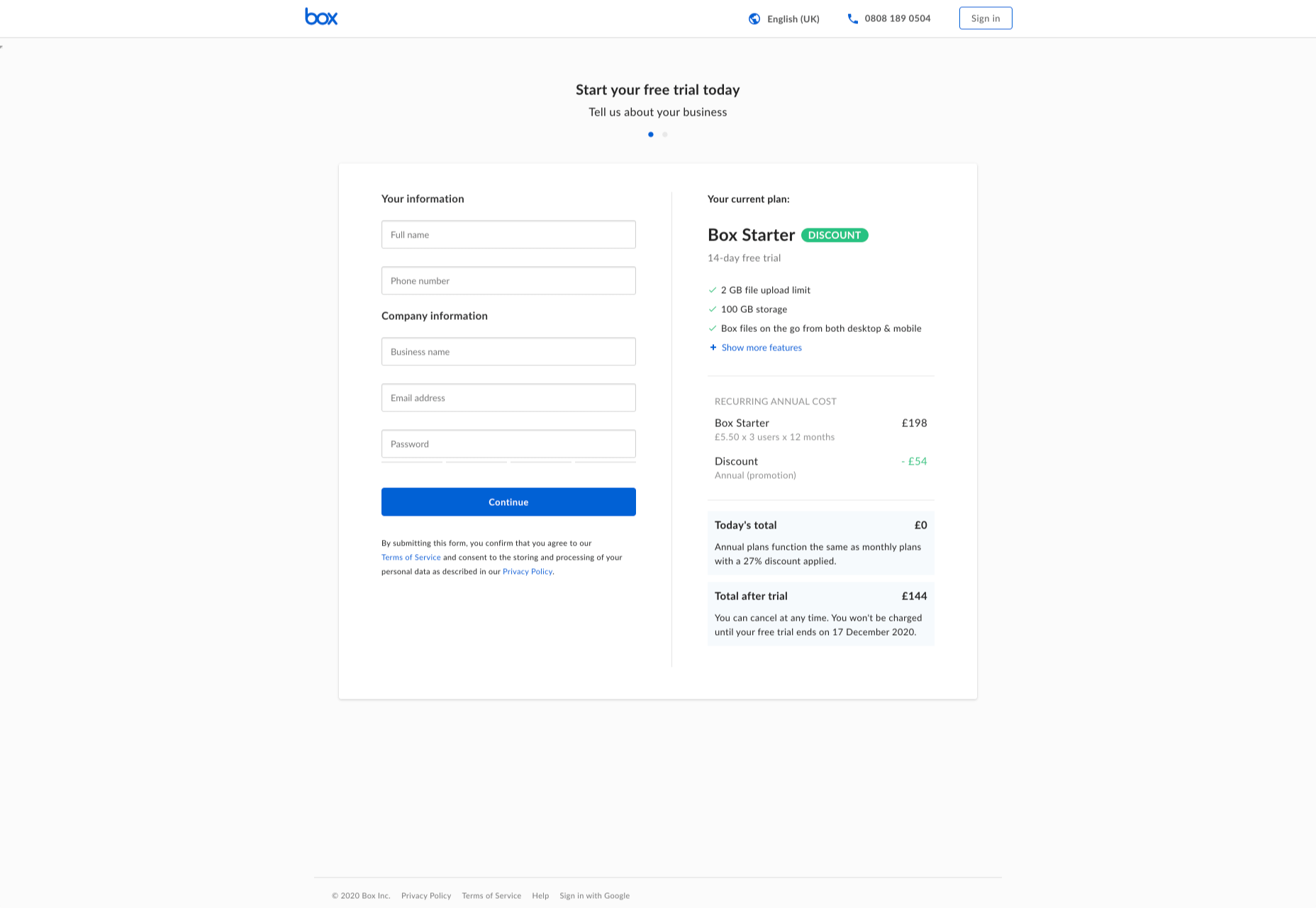
For instance, when you sign up for a free account trial from Box.com, you don’t just get a form full of information that you need to fill out.
Next to the form, you also get information about what you’re signing up for, complete with small checks next to each of the free features you’re getting. This helps to put the customer’s mind at ease and remind them that they’re in the right place.
The use of a box, including discount information next to the sign-up form also helps to make the interaction more emotional, by reminding customers that they’re getting something for free.
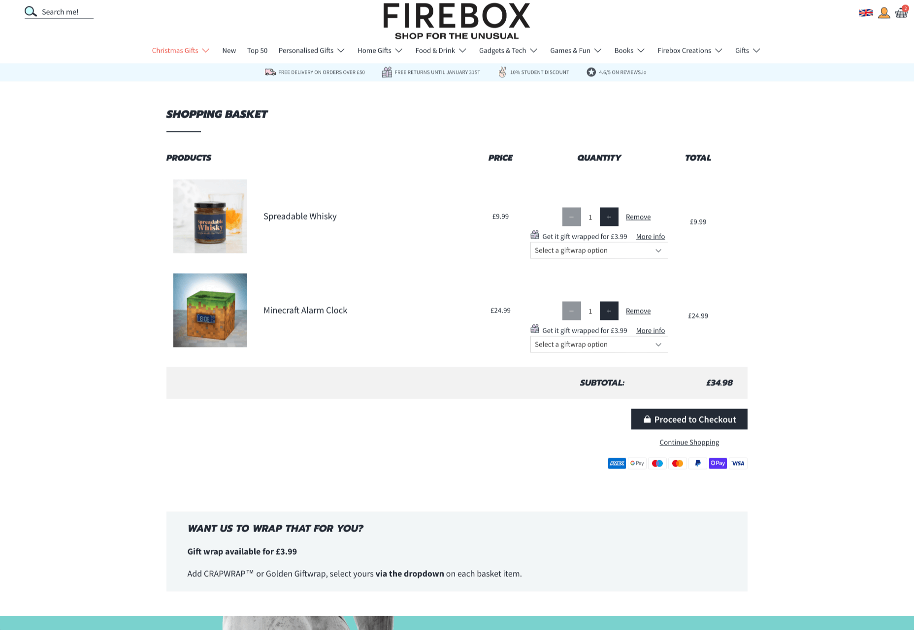
Every time a customer interacts with a website, there’s another opportunity to engage them on an emotional level. On the Firebox website, when a customer adds something to their cart, there’s a small animation on the cart icon that informs them that something is waiting for them.
When they click through to the checkout, they get instant information, including what they can do to “gift wrap” their item, and buttons showing the various payment options available.
Whenever you’re designing a page for a website, whether it’s the checkout page, a product page, or something else entirely, think about the interaction that the visitor is having at that moment. How can you ensure that each customer feels more comfortable, delighted, informed, or engaged?
Step 3: Leverage Microcopy and Detail to Express Emotions
Visuals are an excellent way to express emotions.
However, they’re not the only option.
As a designer, you’ll need to think about how you can combine web design with the use of microcopy to connect with customers on a deeper level.
Rather than drawing attention to tedious, dull, or impersonal instructions, notifications, and error messages on a site, how you can you make sure that everything on the website delivers the same emotional impact?
The simple addition of a tiny illustration is enough to provide a much more emotional experience to customers. Compelling micro copy and illustrations on 404 pages can also strengthen the connections that customers have with the sites they visit.
Just look at how Google added a dinosaur game to the page that customers are sent to when they don’t have an internet connection.

The right micro copy and interactions can instantly transform even a negative experience, like not being able to connect to the internet, into something emotionally engaging and positive.
When it comes to making an emotional connection between your customer and their end users, web designers need to remember that often the smallest details can make the biggest differences. Little extra features, like implementing a way for customers to have fun when their internet connections aren’t working, are the things that make websites more memorable from an emotional perspective.
Don’t Choose Emotion Over Functionality
Although emotional impact can be an essential aspect of a fantastic website design, it’s important not to get carried away. Adding too much to a website in the form of little extra graphics and unique interactions could end up weighing down a site and making it slow to load.
Although it’s valuable to think about how every interaction an end-user has with a website will make them feel, it’s important not to overlook the basics of web design when you’re at it. You’ll still need to ensure that the finishing design is easy to use, engaging, and attractive.
Pay attention to the basics of user experience design, and make sure that the extra emotional elements you’re infusing into your sites aren’t going to damage the experience that end-users get.
If you can get the blend right between emotional impact and functionality, then you could create the kind of website that audiences will never forget.
It pays to implement emotion into your design portfolio.
p img {display:inline-block; margin-right:10px;}
.alignleft {float:left;}
p.showcase {clear:both;}
body#browserfriendly p, body#podcast p, div#emailbody p{margin:0;}


