Mar 2
I just crave simple things that get the job done. But when it comes to IKEA, it’s not just the basic furniture that currently fits my needs (well-designed, functional, affordable and happily being abused by my cat and 3 little kids), it’s the holistic customer journey I’m always impressed by, feeling that IKEA really understands my day-to-day moments.
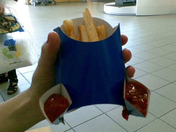
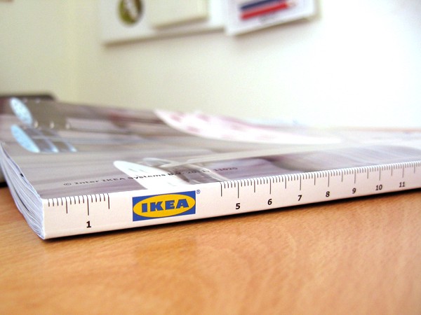
By promoting ‘simplicity’ in each and every aspect of communicating with their customers, IKEA is designing their perception of the product itself – It is easy to convey, easy to assemble and easy to maintain. And most of all, it’s not just a brand’s declaration. The smart yet simple solutions for daily interactions can tell that IKEA observes their target audience in order to find solutions to ease their lives. Here are a few examples.
To touch
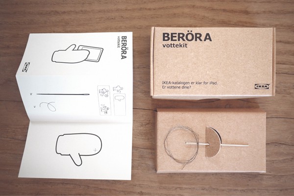
During the cold winter in Norway, IKEA wanted to launch their new catalog for iPad. While the Norwegians prefer to stay outdoors, wearing woolen clothes and mittens, touch screens can’t be used with mittens. So in order to promote it, IKEA (by SMFB agency) developed a new product, called ‘BERÖRA’ (means ‘to touch’), a sewing kit with a special conductive thread to sew into the index finger of the mittens (End of story – the 12,000 kits were distributed for free in two weeks, and the iPad catalog became the most downloaded free app in Norway’s App Store).
Easily find everything
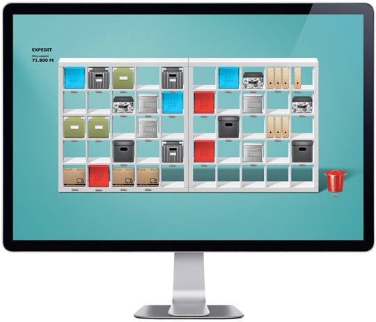
“From the very start, we have always aimed to help you organize your home in a better, more efficient way“- that’s the opening text in the IKEA e-Folder set page, where users are invited to download an alternative desktop that offers the familiar ‘Expedit’ storage unit along with decorative IKEA storage bins to replace the boring desktop folders – “Just a few clicks and your cold desktop will become a comfy, transparent shelf system/storage unit where you can easily find everything.”
“We had to rethink how people use recipes”
One of the greatest products IKEA has created is ‘Cook this page’ (By Leo Burnett Toronto), aiming for people who get scared by new recipes (me, for example), with smart step-by-step instructions, to make it fun and easier for them to cook:
Stop pretending
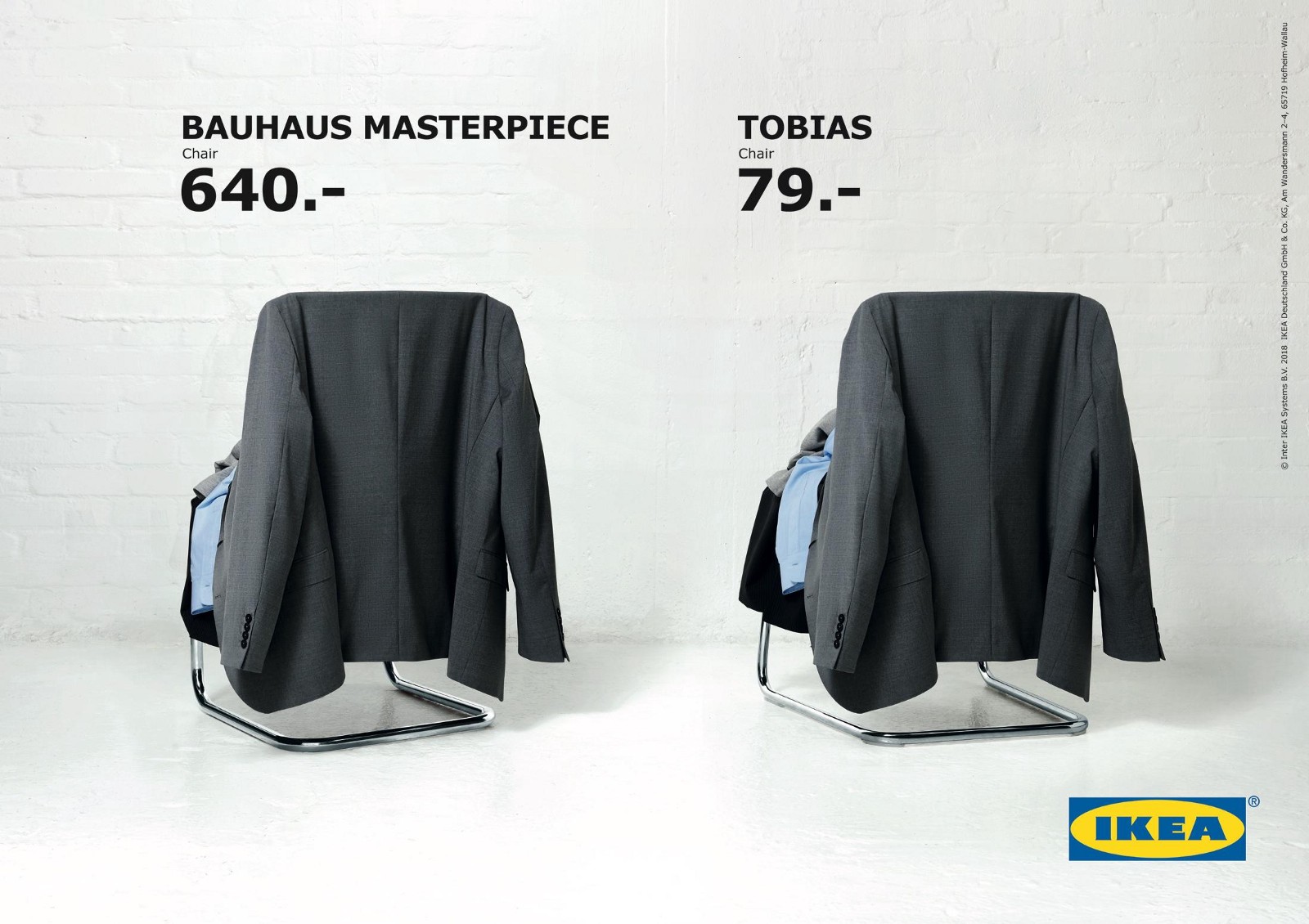
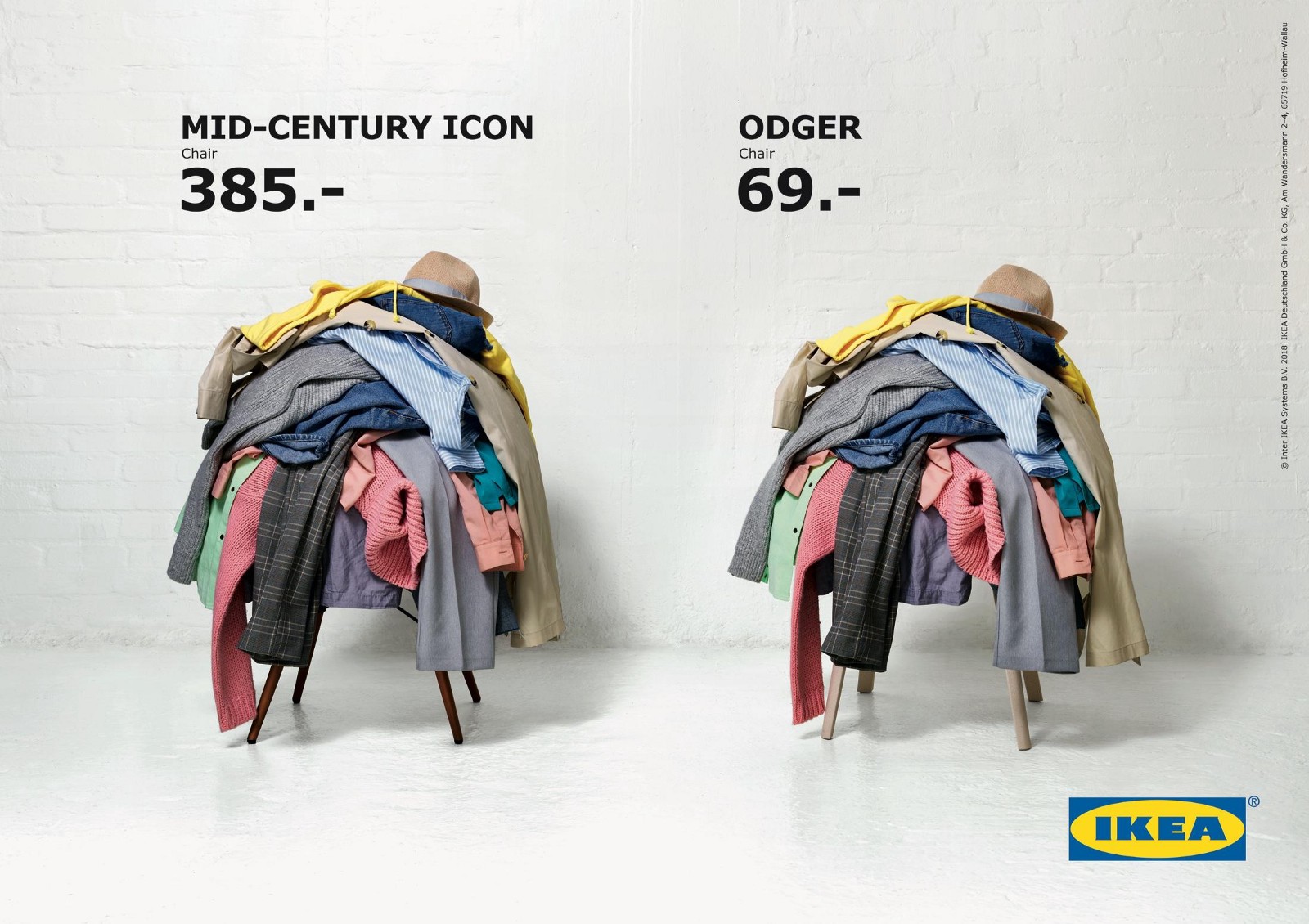
The simplicity is also based on embracing real life. While we are surrounded by brands that tell us a story about the way our homes should look, using unmanned-well-framed pictures in their catalogs, with minimal elements, meticulously folded towels and a single book on a shelf, IKEA is presenting the real mess.
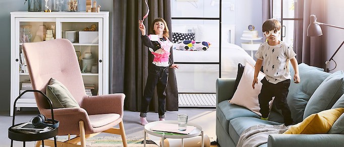
That’s the way it is presented in their catalog as well as in this print advert (by loved agency):
Think inside the box
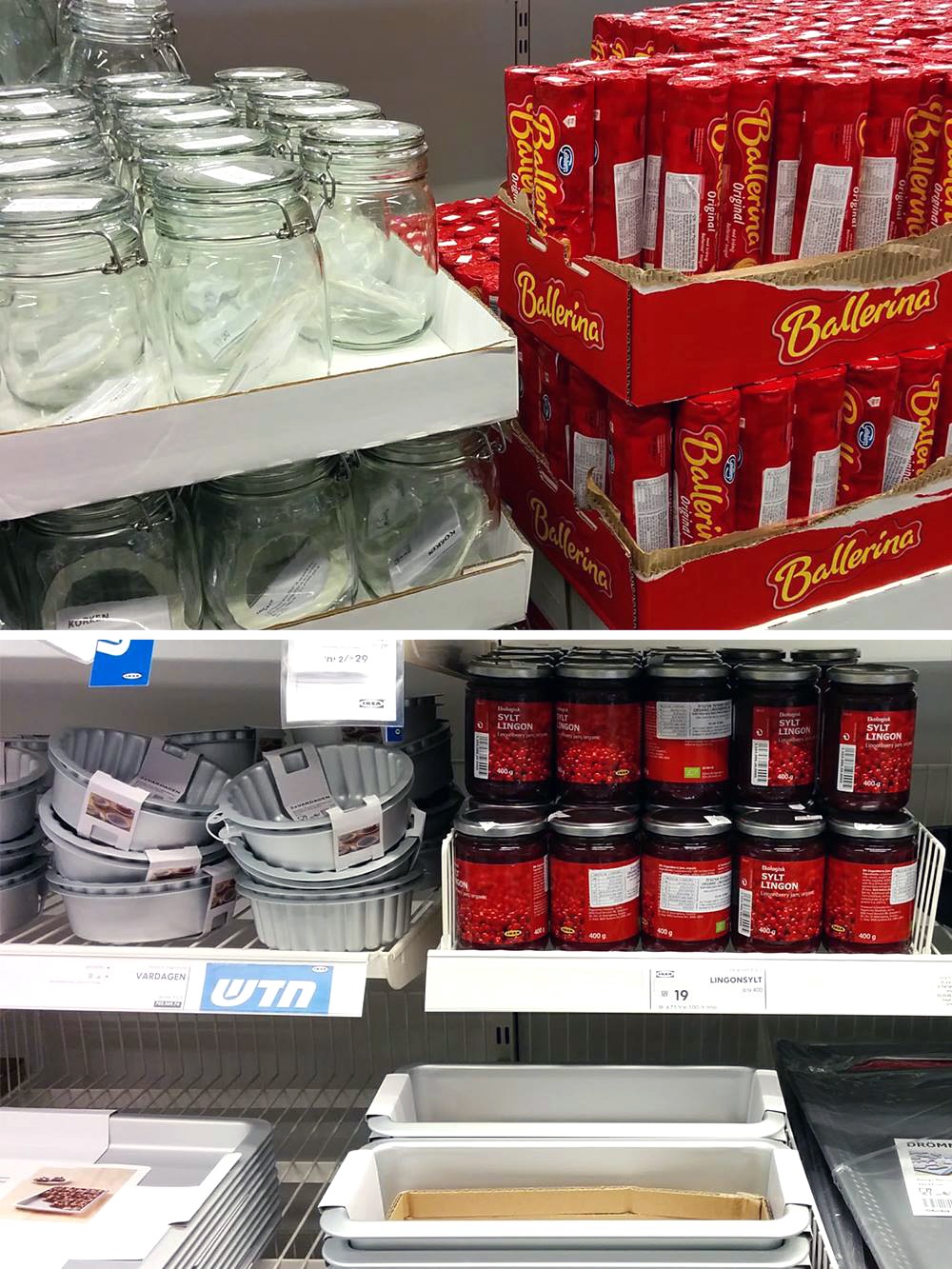
Speaking of real life, on one of my latest visits, I have noticed that IKEA repositioned some cookies and fruit jams from its Swedish food market to the kitchen storage department, right next to the baking pans and storage jars. This smart combination creates a story from real life and by that raises the chances for customers to buy a few products as a kit.
