Pros and cons of the questionnaires SUS, PSSUQ, and ISO 9241–110 plus three more openly available, science-grounded, business-driven UX surveys (all including question sources)

User Research Methods
User research is one of the most important, if not the most important element of user experience (UX) and design. In this area exist many methods and materials, grounded in science as well as used in business contexts. From user interviews, over focus groups, questionnaires and surveys, usability tests, competitor analyses, observations, or shadowing, to usage analytics — all of them gather user-related data and can formulate relevant inputs for conception and design.
Focusing especially on user interviews, observations, and usability tests, the methods of research can be structured in:
- quantitative (based on numbers, e.g., scale-based items, timings, error counts)
- qualitative (based on text/speech, e.g., open questions, recorded speech, conversation protocols, think-aloud transcripts)
- objective (measured at the user, e.g., clicks, mouse paths, timings, heart rates, eye movements)
- subjective (formulated by a user, e.g., verbal assessments, adjectives, scale-based items)
- synchronous (e.g., interviews, usability tests, observations)
- asynchronous (e.g., online surveys, task protocols, diary studies)
- explorative (or prospective, understanding a problem space, e.g., user interviews, user surveys, stakeholder interviews)
- evaluative (or retrospective, examining solutions or prototypes, e.g., usability tests, expert reviews, analytics)
Standard questionnaires are of especial interest when using surveys, both stand-alone, and as part or after an interview or test. In most cases, they go together with individually created items, focusing on more specific questions towards the research scope. Both can be highly effective and serve supplementary outcomes: Standard questionnaires can compare a product to others on the market or to industry standards, whereas individual items can produce more detailed rating of a product aspect and its components.
Methods and Materials
In the following sections, six quantitative standardized surveys are discussed: the SUS, the PSSUQ, the ISO 9241–110, the UEQ, the NPS, and the AttrakDiff. All of them have been used several times by the author of this text and belonging teams, and thus, the following chapters are based on the experience of the survey usages in a medium-sized data science company, in a product design agency, and in a human-factors department at a university. The surveys here have been in use either as material in addition to user interviews or as part of stand-alone questionnaires. In both cases, subjects got a link to LimeSurvey (or a similar web-based survey tool) to fill them out. In rare cases, a print-out version was used due to the setting.
The selection is based on the experience in numerous projects and focused on such surveys openly accessible, in contrast to also established and known, license-fee restricted surveys like the SUMI, the QUIS, or the SUPR-Q. The criteria for choosing the methods for this article and to decide for the top three have been: scientific quality factors (objective — independent from the executor, reliable — produces similar results under consistent conditions, valid — covers all aspects; all this ensures the trust in the instrument), that they are suitable for management (clear result, singular outcome, self-explanatory scale), that thresholds are available (in best case scientifically proven, as a minimum with recommendations from the creators), and repute in the community (are they known, used, and well-received).
A standardized survey for the usage in the industry must be scientifically grounded and community-proven, the results must be easy to read as well as strong in statement, and thresholds must be in place to give clear benchmark anchors for development targets.
SUS
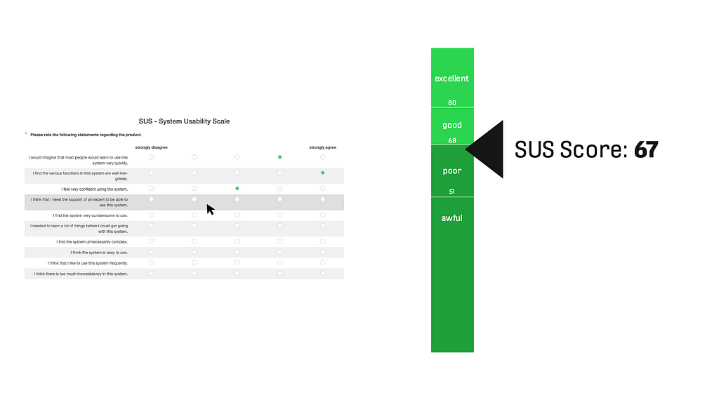
The System Usability Scale is a standardized, well-known method with good repute to rate any system’s usability quality. It was developed in the 1980s (John Brooke at Digital Equipment Corporation in the UK). It contains 10 items with a 5-point scale (from 1 “strongly disagree” to 5 “strongly agree”), which are shown to the participants in randomized order. The scale is coded as 0 to 4, items 1/3/5/7/9 must be multiplied by +1, and items 2/4/6/8/10 multiplied by -1. The overall sum is then multiplied by 2,5. The calculated SUS score is a single value between 0 and 100.
The SUS questionnaire is available in several languages (EN, DE, FR, ES, CN, and more). There are benchmarks for different categories existing, with a widely accepted threshold value dividing bad and good at 68. Systems below 51 are perceived as awful, and such with values above 80 are considered to have a very good usability. Also, online calculators are available. The execution typically takes about 2 to 3 minutes.
Advantages:
- Absolute evaluation possible
- Technology-agnostic
- High scientific quality (positive and negative items, randomized) and reputation
- Widely accepted benchmark of 68
Critique:
- “Only” focused on usability
Modifications:
- None
The SUS is a very helpful tool, scientifically grounded and both fast in execution and convincing in business contexts. Even with small sample sizes of N=7, it can give trustful assessments (with all downsides due to the sample selection), above N=12 it is experienced as super stable. The SUS therefore is recommended to be used as comprehensive material. For every study, which touches usability aspects, it is recommended to use the SUS.
PSSUQ
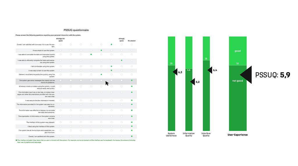
The Post Study System Usability Questionnaire measures the users’ perceived satisfaction (aka User Experience) with a product or system. The PSSUQ and CSUQ (“Computer System Usability Questionnaire”) were developed by Jim Lewis in the late 1980s as part of an early user experience research project at IBM. They are popular questionnaires for the assessment of perceived usability and have been published in 1995. Like the SUS, the PSSUQ is technology-agnostic, meaning it can apply to any interface — hardware, software, mobile apps, or websites. The result is a value for User Experience between 7 (very bad) and 1 (very good) along with three sub-factors.
There are different versions published; the original one has 19 items (1995, 2005), and a newer one has 16 items (2002). It uses a 7-point Likert scale from “strongly agree” (1) to “strongly disagree” (7). The items have also a “no answer” option. The overall user satisfaction is calculated by taking the average of all questions 1–19. Three sub-factors are: the system usefulness (calculated by taking the average of questions 1–8 of 19), the information quality (calculated by taking the average of questions 9–15 of 19), and the interface quality (calculated by taking the average of questions 16–18 of 19). It is available in English, and publications using other languages can be found (DE, TR, GR, PT, Arab). Also online calculators are available. Benchmarks are published too, like the overall 2,82 threshold with a 99% confidence interval between 3,02 and 2,62 (2002). The execution takes typically about 3 to 5 minutes.
Advantages:
- It rates User Experience
- Benchmark available
- Sub-scales available (but not as useful as expected)
Critique:
- Original item anchors are “incompatible” (something visually on the right means typically higher), reaching originally from “strongly agree” on the left end to “strongly disagree” on the right end
- The result scale (ranging from 7 to 1) is not easy to read and therewith not suitable with management contexts.
Modifications:
- Switched rating scale (to “strongly disagree” on the left and “strongly agree” on the right)
- Projected the final result to a decimal 0-to-10 scale (the original 1 becomes a 10 and the original 7 becomes 0, benchmark threshold of 2,82 becomes 7,0), indicated as PSSUQ10
The PSSUQ is a very helpful tool to measure the UX of a system. It is not so known compared to the SUS and less backed with published data, but with small modifications in displaying results, it has a very good reception in business contexts. It seems also stable for small sample sizes, starting at N=5; and it becomes very stable at sample sizes above N=12.
ISO 9241–110 Questionnaire
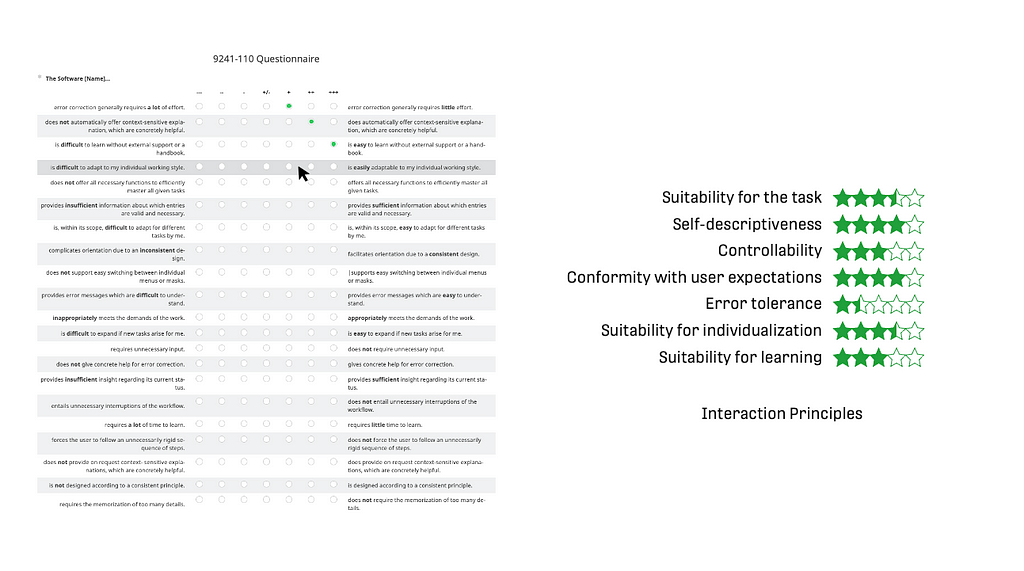
The Questionnaire of the ISO 9241–110 measures a system within the seven interaction principles of the norm (Suitability for the task, Self-descriptiveness, Controllability, Conformity with user expectations, Error tolerance, Suitability for individualization, Suitability for learning). It was developed at the University of Berlin by Prümper in the 1990s. The norm underwent an update in 2020, this seems to be missing for the questionnaire yet.
For every of the seven principles, there are three items in the survey using a scale from “‑‑‑” (coded as -3) to “+++” (coded as +3). The results are calculated by the average of the according items for each interaction principle. The outcome are seven factors on a scale between -3 to +3 (sometimes also coded as 1 to 7). The questionnaire is available in English (or here), German, Dutch, and French. A common benchmark, proposed by the authors, is the value of “+1”. The execution takes typically about 5 to 8 minutes.
Advantages:
- Connects to the interaction principles of the ISO norm
- Benchmark existing (although not scientifically backed, only recommendation from the authors)
Critique:
- Overall scale missing
- Focus mostly in usability
- The readability of the anchors is not ideal, as the quite long texts often only differ in one word
- Not updated yet with the norm update of 2020
Modifications:
- Items used in randomized order
- Trigger words (e.g., “good”/“bad”) formatted bold in the item anchors as they use very similar text on the left and on the right side
- Results translated to a 0-to-5-star scale, known from online commerce
The ISO 9241–110 Questionnaire is by its nature a very trustworthy instrument. Together with another instrument like the SUS as overall value, it can give quite good indications about where usability problems are in more detail. Its factors seem to have a bit more meaningfulness compared to the UEQ factors.
UEQ
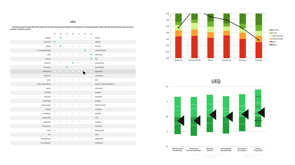
The User Experience Questionnaire is a well-known and widely discussed instrument. It measures six dimensions and is available in a long and short version. The dimensions are “Attractiveness”, “Perspicuity”, “Efficiency”, “Dependability”, “Stimulation” and “Novelty”. It contains 8 (short version) or 26 (long version) items as a semantic differential with a 7-point scale, so it has an adjective on the left and right side of each item. The result is a number between -3 and +3 for each of the six factors.
For every group, the arithmetic mean is calculated. The dimensions are evaluated against a large benchmark from 486 studies. Translations into more than 30 languages are available and provided on the UEQ website (EN, DE, ES, PT, TR, ID, CN, FR, IT, JP, NL, RU, ES, SL, SW, PL, GR, IN, PE, BG, CZ, ML, TH, DN, BN, IS, TA, Arab, BS, KR, FN, HU, NO, SL) along with online calculators and spreadsheet templates. A UEQ KPI extension and a modular extension UEQ+ are available as well. The benchmark consists of deviations for every of the 6 dimensions along 5 adjectives (bad, below average, above average, good, excellent). The duration for completion is about 4 to 8 minutes.
Advantages:
- Widely known
- Scientifically proven
- Localized in many languages
Critique:
- No overall value nor single threshold
- Visualization as outcome is quite complex and not dead easy to read/interpret
Modifications:
- Shifting the threshold values so that “above average” and “below average” are divided at “0”
- Simplified the color scale from 5 different to 2 different colors
The UEQ is an acknowledged and widely used instrument. According to publications, sample sizes from 10 upwards seem to carry information. Nevertheless, in business contexts, it lacks clarity and misses to produce an aggregated measurement for user experience. Also, when trying to make use of the 6 dimensions, it failed to deliver semi-concrete evidence where problems must be searched. The complexity level was still too high there to get meaningful indications or to tell a management audience a simple statement. It might be more useful in science though.
NPS
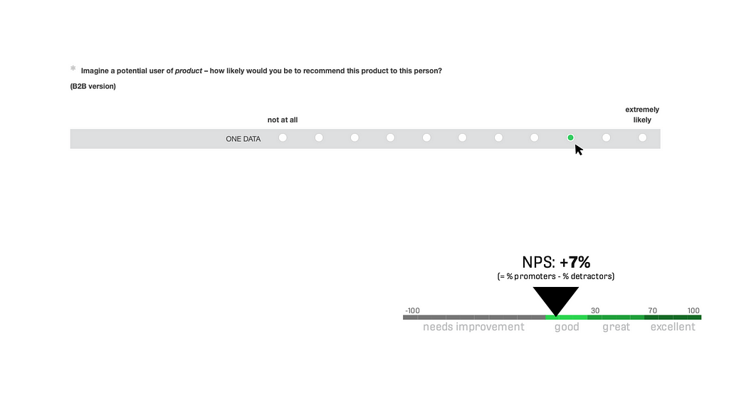
Originated in marketing, the Net Promoter Score measures a general satisfaction of a user judging a product. It is applicable in wide areas and for almost all products and thereby very universal. It contains 1 item with a 11-point scale (from 0 = “not at all” to 10 = “extremely likely”). Values of 0 to 6 are “detractors” and count negatively, values of 7 and 8 are “passives” and are not taken into calculation, and values of 9 and 10 are “promoters” and count positively. The NPS score is calculated as “promoters minus detractors in %”, and it ranges from -100% to +100%. Results <0% are negative results and judged as not good (“need improvement”), values >0% are positive results which meet minimum requirements for the product. Furthermore, 0% to 30% are assessed “good”, 30% to 70% are “great”, and 70% to 100% are translated as “excellent”. This is a selectively created outcome, based on experiential knowledge. There is an original version existing (2003, website). This is here and there reformulated to fit different settings, for example to fit B2B products. It is translated to many languages and takes about 1 minute or less for execution. There are also benchmarks available, like a source stating +12% as industry average for software products (Qualtrics).
There is quite a scientific discussion about positive and negative aspects of the NPS. It is also questionable to apply it in B2B contexts, as it originates in the B2C world. Also, it was developed originally to measure company growth, now it is used for many other objectives. It is favorable to management audiences as the execution and the result are easy understandable. It is also easy to handle, be it online or offline, usable in any tool without more complex things like randomized items, and it is easy to calculate. As it has only one item and it takes out the middle of the deviation in the calculation, it needs way bigger sample sizes compared to the other instruments in this article. It seems to need minimum N=25 to N=50 participants to be somehow stable. More than 100 participants are recommended.
Advantages:
- Simple & fast in execution and analysis
- Easy to setup and execute, easy to read the result
Critique:
- Questionable in B2B contexts or where users have no alternative as product
- High sample size needed due to the “ignored” middle of the deviation, absolute minimum N=15, recommended minimum sample between N=25 to N=50
Modifications:
- Necessary reformulation to fit B2B context
The NPS is a handy, widely known, and an often-used instrument, especially for B2C and big sample sizes. For business contexts, it provides a clear outcome and recommendations of threshold values. Its informative value extends user experience, and it includes customer personas along with business aspects. For less big endeavors, small sample sizes, and more focus on interaction, it has its limitations. For example, for a UX team with 5 to 10 designers doing research just from time to time, projects containing user interviews with 3 to 12 persons, interests more on a feature level, and scientifically proven argumentations, it is not the instrument of choice.
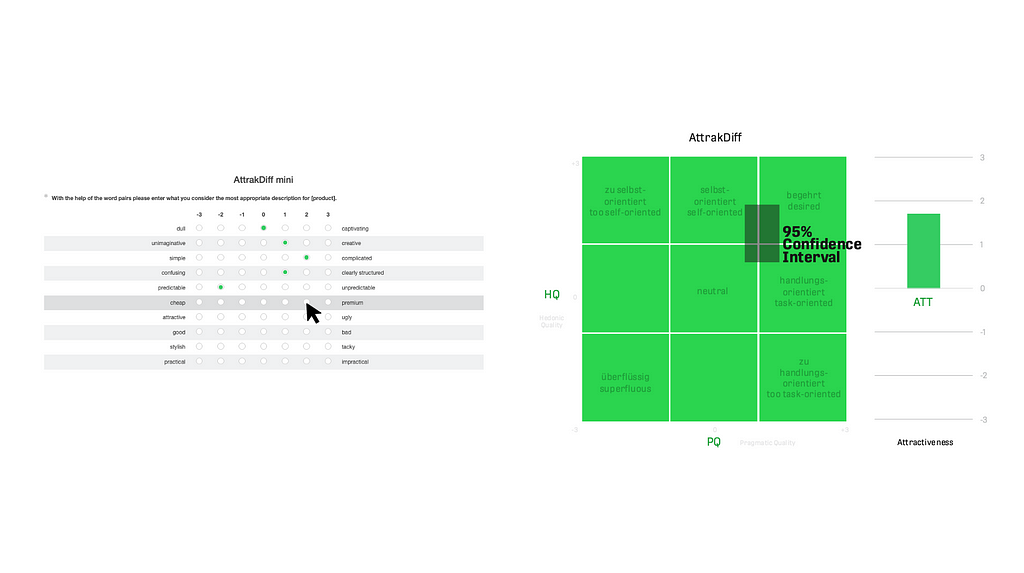
AttrakDiff
The AttrakDiff measures pragmatic quality (PQ), hedonic quality (HQ, subdivided in stimulation and identity), and attractiveness (ATT) of products (Hassenzahl, UID). It contains 10 (short version 2.0) or 21 (long version 2.0) items with a 7-point scale, each item using two adjectives on the left and right side as anchors. For every group, the arithmetic mean is calculated. Also, the 90% confidence interval is calculated to show the box in the result diagram. Its outcome is a 2-dimensional area (axes pragmatic quality and hedonic quality) with nine quadrants. The calculated result is shown as a rectangle (confidence intervals of the current sample) on the matrix between “superfluous” and “desired”. The attractiveness value (ATT) is an additional outcome.
The AttrakDiff has no threshold benchmarks per se, despite the quadrants of the result visualization. It is intended to be used in a single evaluation, to be used in a comparison (product A, B), or in a longitudinal study (point in time 1 and 2). It is available in different languages (EN, DE, FR), and the execution takes about 2 to 4 minutes for the short version and 3 to 6 minutes for the long version.
Advantages:
- Scientifically grounded
Critique:
- Missing overall value to be used in business contexts
- Missing benchmark thresholds to compare
- Scientific language and not so easy to use terms
- Complex outcome diagram
Modifications:
- None
The AttrakDiff is a widely known and a scientifically backed method. In business context, it lacks simplicity and clarity in results. The used scales (hedonic, pragmatic, attractive) are not easy to interpret and not easy to align with concepts like usability and user experience. After it was used for several research projects, it was discontinued by the author and its research teams for future endeavors, and it is also not on the recommended material list. It might be more useful in scientific contexts, though.
Individual Items
Besides using standardized questionnaires, it is almost always useful to add individually created quantitative items. This, of course, must follow rules of good practice (e.g., do not ask 2 questions in 1 question, do not ask suggestive questions, use a proper amount of rating options, give the possibility to not answer and to comment, use only anchor answers). The big advantage of those items is that they can be very focused on the research question and even tackle several aspects of this question. A typical ratio is to add five to twenty quantitative items to one or two standard questionnaires. When combining standard questionnaires and individual items, an eye must be put on the rating scales: Different sections should use similar scales or at least be compatible (follow the same direction). When for example two scales are used in two bigger item groups, a disrupting qualitative question between the groups is methodologically helpful.
Another recommendation according to experience of past projects is to combine quantitative and qualitative sub-items. For example, to ask about the rating of the performance of a software (on a scale from very bad to very good) and in addition to ask about verbal or textual explanations to get more valuable insights about this particular topic.
Furthermore, practice showed that the rating scale in the execution and the outcome values in the reporting can be different on purpose. For small sample sizes, for example, it seems pragmatic to use more detailed scales with seven or ten answer possibilities. For putting the results in a report or presenting them in front of management, a 5-star scale, as known from online commerce, is immediately understandable (see ISO questionnaire).
Summary & Outlook
The top three preferred standardizes questionnaires for usability and UX of a product are the SUS, the PSSUQ10, and the ISO 9241–110.
The SUS serves as most reliable, most useful instrument in the experience of the author and teams, along with the PSSUQ10, which extends the usability-focused SUS towards a user experience measurement. To complement this, the ISO 9241–110 questionnaire adds the interaction principles as measurements and connects the research to the ISO norm. The UEQ is not used any longer by the author as the other tools produce more meaningful results. The AttrakDiff and the NPS, which were used in several projects, are not part of projects anymore nor recommended instruments, due to missing simplicity and relevance in business contexts and methodological flaws. Hence, it is recommended to use a combination of standard questionnaires, individual quantitative items, and individual qualitative items. Independent from the method, for all user research, it is important that correlation is not causality.
For future activities, it is planned to have a look at the “Accessible Usability Scale” (AUS, 10 items), which could be a good extension towards accessibility aspects. Other surveys might be taken in consideration, too. As one example, the “INUIT questionnaire” might have better understandable item results for product managers, as the authors claim. For usability tests of single features, there are more dedicated instruments like the “Single Ease Question” (SEQ, 1 item), “After-Scenario Questionnaire” (ASQ, 3 items), or the “Subjective Mental Effort Questionnaire” (SMEQ, 1 item).
Appendix: Templates of the questionnaires
All templates are taken from public sources mentioned in the chapters and just collected here in the same format.
SUS: Word (EN, DE), LimeSurvey (EN, DE)
- +1 and -1 are the factors for the calculation
I think that I like to use this system frequently. || strongly disagree □□□□□ strongly agree || +1
I find the system unnecessarily complex. || strongly disagree □□□□□ strongly agree || -1
I think the system is easy to use. || strongly disagree □□□□□ strongly agree || +1
I think that I need the support of an expert to be able to use this system. || strongly disagree □□□□□ strongly agree || -1
I find the various functions in this system are well integrated. || strongly disagree □□□□□ strongly agree || +1
I think there is too much inconsistency in this system. || strongly disagree □□□□□ strongly agree || -1
I would imagine that most people would learn to use this system very quickly. || strongly disagree □□□□□ strongly agree || +1
I find the system very cumbersome to use. || strongly disagree □□□□□ strongly agree || -1
I feel very confident using the system. || strongly disagree □□□□□ strongly agree || +1
I needed to learn a lot of things before I could get going with this system. || strongly disagree □□□□□ strongly agree || -1
PSSUQ: Word (EN, DE, switched item scale), LimeSurvey (EN, DE; switched item scale)
- SYSUSE = System Usefulness, INFOQUAL = Information Quality, and INTERQUAL = Interface Quality are the sub-factors used in the analysis
Overall, I am satisfied with how easy it is to use this system. || strongly disagree □□□□□□□ strongly agree □ no answer || no. 1 || SYSUSE
It was simple to use this system. || strongly disagree □□□□□□□ strongly agree □ no answer || no. 2 || SYSUSE
I could effectively complete the tasks and scenarios using the system. || strongly disagree □□□□□□□ strongly agree □ no answer || no. 3 || SYSUSE
I was able to complete the tasks and scenarios quickly using this system. || strongly disagree □□□□□□□ strongly agree □ no answer || no. 4 || SYSUSE
I was able to efficiently complete the tasks and scenarios using this system. || strongly disagree □□□□□□□ strongly agree □ no answer || no. 5 || SYSUSE
I felt comfortable using this system. || strongly disagree □□□□□□□ strongly agree □ no answer || no. 6 || SYSUSE
It was easy to learn to use this system. || strongly disagree □□□□□□□ strongly agree □ no answer || no. 7 || SYSUSE
I believe I could become productive quickly using this system. || strongly disagree □□□□□□□ strongly agree □ no answer || no. 8 || SYSUSE
The system gave error messages that clearly told me how to fix problems. || strongly disagree □□□□□□□ strongly agree □ no answer || no. 9 || INFOQUAL
Whenever I made a mistake using the system, I could recover easily and quickly. || strongly disagree □□□□□□□ strongly agree □no answer || no. 10 || INFOQUAL
The information (such as on-line help, on-screen messages and other documentation) provided with this system was clear. || strongly disagree □□□□□□□ strongly agree □ no answer || no. 11 || INFOQUAL
It was easy to find the information I needed. || strongly disagree □□□□□□□ strongly agree □ no answer || no. 12 || INFOQUAL
The information provided for the system was easy to understand. || strongly disagree □□□□□□□ strongly agree □ no answer || no. 13 || INFOQUAL
The information was effective in helping me complete the tasks and scenarios. || strongly disagree □□□□□□□ strongly agree □ no answer || no. 14 || INFOQUAL
The organization of information on the system screens was clear. || strongly disagree □□□□□□□ strongly agree □ no answer || no. 15 || INFOQUAL
The interface of this system was pleasant. || strongly disagree □□□□□□□ strongly agree □ no answer || no. 16 || INTERQUAL
I liked using the interface of this system. || strongly disagree □□□□□□□ strongly agree □ no answer || no. 17 || INTERQUAL
This system has all the functions and capabilities I expect it to have. || strongly disagree □□□□□□□ strongly agree □ no answer || no. 18 || INTERQUAL
Overall, I am satisfied with this system. || strongly disagree □□□□□□□ strongly agree □ no answer || no. 19 || OVERALL
ISO 9241–110: Word (EN, DE), LimeSurvey (EN, DE)
- name of the software, manufacturer
- version number
- if applicable, application part
- Sft = Suitability for Tasks, Sd = Self-Descriptiveness, C = Controllability, Cue= Conformity with User Expectation, Et = Error Tolerance, Sfi = Suitability for Individualization, Sfl = Suitability for Learning
The Software… □ — — □ — □- □+/- □+ □++ □+++ The Software…
does not offer all necessary functions to efficiently master all given tasks. □□□□□□□ offers all necessary functions to efficiently master all given tasks. || Sft1
requires unnecessary input. □□□□□□□ does not require unnecessary input. || Sft2
inappropriately meets the demands of the work. □□□□□□□ appropriately meets the demands of the work. || Sft3
provides insufficient information about which entries are valid and necessary. □□□□□□□ provides sufficient information about which entries are valid and necessary. || Sd1
does not provide on request context- sensitive explanations, which are concretely helpful. □□□□□□□ does provide on request context-sensitive explanations, which are concretely helpful. || Sd2
does not automatically offer context-sensitive explanation, which are concretely helpful. □□□□□□□ does automatically offer context-sensitive explanation, which are concretely helpful. || Sd3
forces the user to follow an unnecessarily rigid sequence of steps. □□□□□□□ does not force the user to follow an unnecessarily rigid sequence of steps. || C1
does not support easy switching between individual menus or masks. □□□□□□□ supports easy switching between individual menus or masks. || C2
entails unnecessary interruptions of the workflow. □□□□□□□ does not entail unnecessary interruptions of the workflow. || C3
complicates orientation due to an inconsistent design. □□□□□□□ facilitates orientation due to a consistent design. || Cue1
provides insufficient insight regarding its current status. □□□□□□□ provides sufficient insight regarding its current status. || Cue2
is not designed according to a consistent principle. □□□□□□□ is designed according to a consistent principle. || Cue3
provides error messages which are difficult to understand. □□□□□□□ provides error messages which are easy to understand. || Et1
error correction generally requires a lot of effort. □□□□□□□ error correction generally requires little effort. || Et2
does not give concrete help for error correction. □□□□□□□ gives concrete help for error correction. || Et3
is difficult to expand if new tasks arise for me. □□□□□□□ is easy to expand if new tasks arise for me. || Sfi1
is difficult to adapt to my individual working style. □□□□□□□ is easily adaptable to my individual working style. || Sfi2
is, within its scope, difficult to adapt for different tasks by me. || is, within its scope, easy to adapt for different tasks by me. || Sfi3
requires a lot of time to learn. □□□□□□□ requires little time to learn. || Sfl1
requires the memorization of too many details. □□□□□□□ does not require the memorization of too many details. || Sfl2
is difficult to learn without external support or a handbook. || is easy to learn without external support or a handbook. || Sfl3
UEQ (short and long version): Word (EN, DE), LimeSurvey (EN, DE, long version), LimeSurvey (EN, DE, short version)
annoying □□□□□□□ enjoyable || Attractiveness
not understandable □□□□□□□ understandable || Perspicuity
creative □□□□□□□ dull || Novelty || -1
easy to learn □□□□□□□ difficult to learn || Perspicuity || -1
valuable □□□□□□□ inferior || Stimulation || -1
boring □□□□□□□ exciting || Stimulation
not interesting □□□□□□□ interesting || Stimulation
unpredictable □□□□□□□ predictable || Dependability
fast □□□□□□□ slow || Efficiency || -1
inventive □□□□□□□ conventional || Novelty || -1
obstructive □□□□□□□ supportive || Dependability
good □□□□□□□ bad || Attractiveness || -1
complicated □□□□□□□ easy || Perspicuity
unlikable □□□□□□□ pleasing || Attractiveness
usual □□□□□□□ leading edge || Novelty
unpleasant □□□□□□□ pleasant || Attractiveness
secure □□□□□□□ not secure || Dependability || -1
motivating □□□□□□□ demotivating || Stimulation || -1
meets expectations □□□□□□□ does not meet expectations || Dependability || -1
inefficient □□□□□□□ efficient || Efficiency
clear □□□□□□□ confusing || Perspicuity || -1
impractical □□□□□□□ practical || Efficiency
organized □□□□□□□ cluttered || Efficiency || -1
attractive □□□□□□□ unattractive || Attractiveness || -1
friendly □□□□□□□ unfriendly || Attractiveness || -1
conservative □□□□□□□ innovative || Novelty
NPS: LimeSurvey (EN, DE, B2C), LimeSurvey (EN, DE, B2B)
How likely would you be to recommend {product} to a friend?
not at all □□□□□□□□□□□ extremely likely {B2C}
and
Imagine a potential user of {product} — how likely would you be to recommend this product to this person? {B2B}
not at all □□□□□□□□□□□ extremely likely
AttrakDiff (2.0): Word (EN, DE, mini and long version), LimeSurvey (EN, DE, long version), LimeSurvey (EN, DE, mini version)
- HQ = Hedonic Quality, S = Stimulation, I = Identity, PQ = Pragmatic Quality, ATT = Attractiveness
undemanding □□□□□□□ challenging || HQ-S1
dull □□□□□□□ captivating || HQ-S2
unimaginative □□□□□□□ creative || HQ-S3
inventive □□□□□□□ conventional || HQ-S4 || -1
novel □□□□□□□ ordinary || HQ-S5 || -1
innovative □□□□□□□ conservative || HQ-S6 || -1
bold □□□□□□□ cautious || HQ-S7 || -1
alienating □□□□□□□ integrating || HQ-I1
brings me closer to people □□□□□□□ separates me from people || HQ-I2 || -1
isolating || connective || HQ-I3
unpresentable □□□□□□□ presentable || HQ-I4
cheap □□□□□□□ premium || HQ-I5
stylish □□□□□□□ tacky || HQ-I6 | -1
professional || unprofessional || HQ-I7 || -1
practical □□□□□□□ impractical || PQ1 || -1
unruly □□□□□□□ manageable || PQ2
predictable □□□□□□□ unpredictable || PQ3 || -1
confusing □□□□□□□ clearly structure || PQ4
cumbersome □□□□□□□ straightforward || PQ5
technical □□□□□□□ human || PQ6
simple □□□□□□□ complicated || PQ7 || -1
pleasant □□□□□□□ unpleasant || ATT1 || -1
ugly □□□□□□□ attractive || ATT2
likeable □□□□□□□ disagreeable || ATT3 || -1
rejecting □□□□□□□ inviting || ATT4
good □□□□□□□ bad || ATT5 || -1
repelling □□□□□□□ appealing || ATT6
motivating □□□□□□□ discouraging || ATT7 || -1
![]()
Three very good standardized UX surveys for industrial use was originally published in UX Collective on Medium, where people are continuing the conversation by highlighting and responding to this story.