Part I
If you’ve ever visited a museum website, the above navigation structure probably looks familiar to you. Sections for “visit,” “exhibitions,” and “collection” are the core navigational components for the vast majority of museum websites. There’s an essential distinction that museums make between the permanent collection (those objects owned by the institution) and exhibitions (temporary exhibits that typically consist of objects loaned to the museum from other institutions or private collections). This dichotomy has informed the navigational structure for thousands of museum websites.
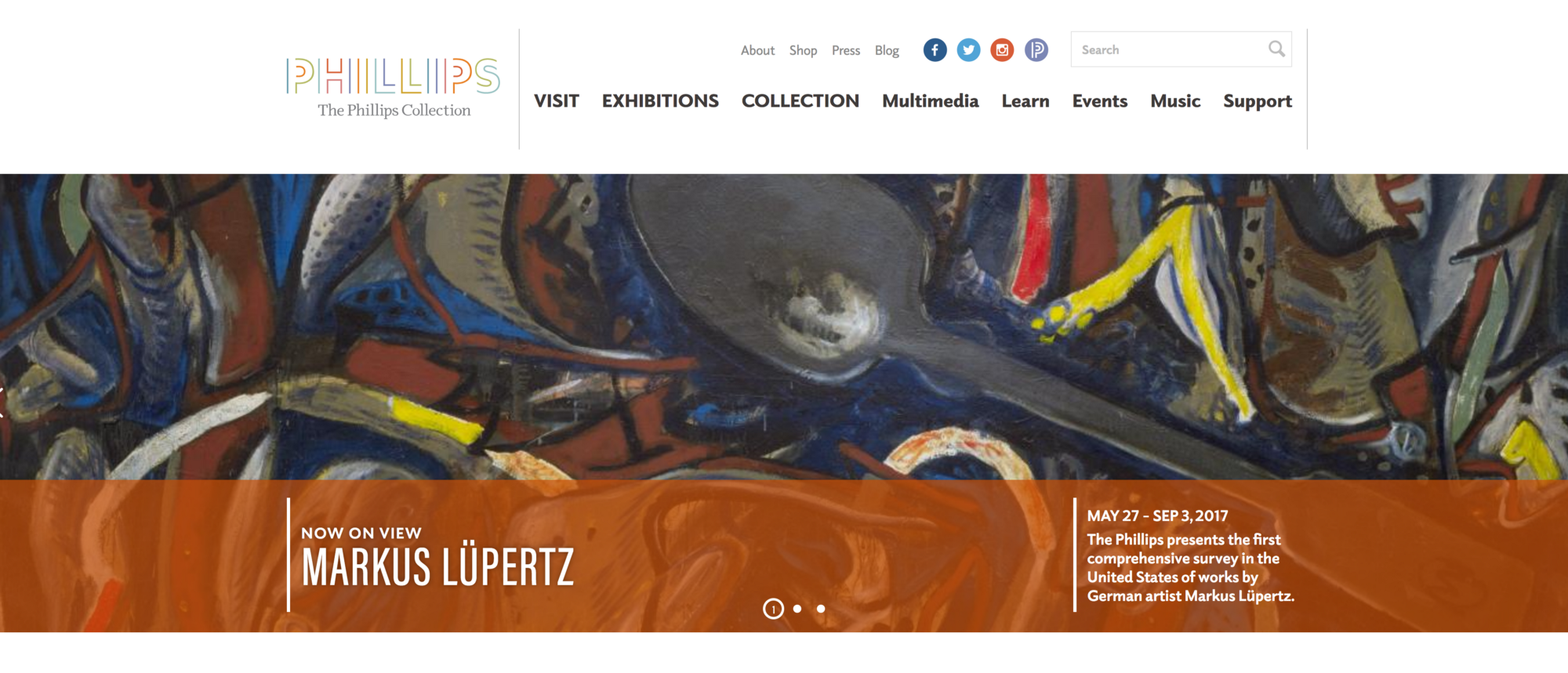
Most people who work in museums (including myself) have probably never thought twice about their website navigation, because this is how everyone does it, and this is how it’s always been done. In a recent usability test I conducted for The Phillips Collection’s website, however, I discovered that users were struggling with the navigation in surprising and unexpected ways.
90% of usability test participants had difficulty identifying the Collection tab as a place where they could discover highlights from the collection.
I used usertesting.com to run a 15-minute usability test with 10 users — a sufficient sample size, according to the Nielsen Norman Group. The usability test participants varied in age, gender, and zip code, and only those who had visited a museum at least once in the previous 12 months were selected. Five participants accessed the museum’s website on desktop computers and 5 used mobile devices (3 on iOS and 2 on Android).
I asked users to complete what I considered to be a very simple task, “You’re planning an upcoming visit to The Phillips Collection. Find out what the museum’s highlights are so you can make sure to see them during your visit.” From my perspective, this task represents one of the most essential functions of a museum website, and one that I think any museum would hope that 100% of their users could accomplish with no trouble. What is the point of a museum website if not to display the museum’s collection in a compelling manner that inspires users to learn more and hopefully to visit the museum in person? This is an aspect of the website that museums need to get right.
I was shocked to find that 90% of usability test participants had difficulty identifying the Collection tab as a place where they could discover highlights from the collection; 50% of the participants never navigated to the Collection tab at all. Most participants searched for this information on the Visit and Exhibitions pages instead. Some users moused over the Collection tab and read the drop down menu, but still did not recognize this section of the website as an area where the museum’s highlights might be featured.

These usability tests suggest that the term “collection” does not resonate with most museum website users who are trying to find out what they can see when visiting the museum. This problem is by no means unique to The Phillips Collection. In fact, it may be a barrier preventing millions of website users across thousands of museum websites from finding information about museums’ permanent collections.
The term “collection” does not resonate with most museum website users who are trying to find out what they can see when visiting the museum.
In recent years, some of the world’s most prominent museums have come out with sleek, streamlined websites that replace the term “Collection” with “Art,” or in some cases “Explore.” I would love to know if their permanent collection pages have seen increased engagement since completing these navigation redesigns; I imagine they have.
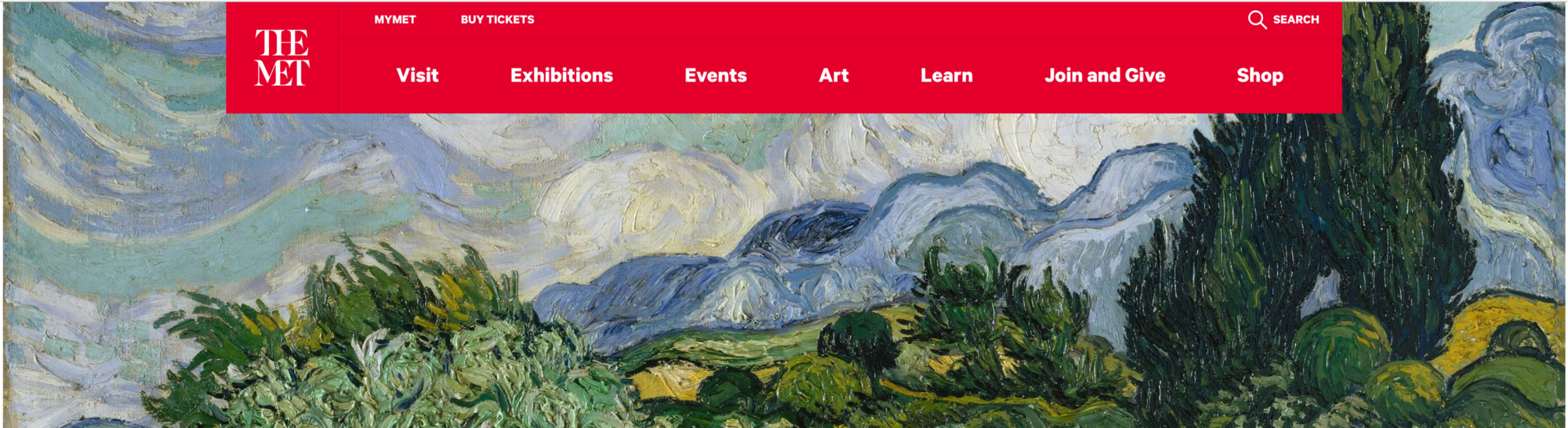
The Metropolitan Museum of Art’s navigation nestles it’s permanent collection (and much more) under an “Art” tab.
Based on the findings of this usability study, however, I would argue that renaming the collection tab only solves half the problem. In many cases, the continued separation of Exhibitions from Art/Collection/Explore still creates a barrier to users discovering the permanent collection. One reason for this is the typical structure of exhibitions pages, which are organized according to On View/Current, Upcoming, and Past exhibitions.
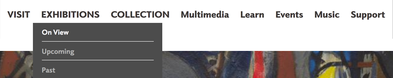
The Phillips Collection’s Exhibitions page structure
Forty percent of the participants in our usability test were under the impression that the Exhibitions > On View page shows them everything that’s available to see in the museum right now.
In other words, to many users “on view” implies that the opposite is true of everything excluded from that page. These same users are then likely to overlook separate tabs labeled Collection or Art, because if they want to find out what’s available to view in the museum right now, they expect to find it on the On View page.
After arriving on the Exhibitions>On View page, users said things like “I consider this to be what’s going on now, what I can see when I go there.” When asked whether there were any paintings by Vincent van Gogh on view in the museum, several users navigated to the Exhibitions>On View page. After not finding any works by Vincent van Gogh listed there, one user remarked, “I would trust the on view area. So, I’m gonna say the answer would be ‘no’ based on what I’m seeing. If something is going to be available to see, it should be front and center, and pretty easy to tell.” In fact, there were paintings by van Gogh on view, but they were listed under Collection.
Although museum professionals, or people who visit museums often, understand that there is typically a selection of both permanent collection and temporary exhibitions on display in any museum at a given time, the average museum visitor does not understand the difference between exhibitions and collection. This leads to a confusion over why some objects on display are listed under the On View page, and others are not.
The problem is two-fold
- The term Collection does not resonate with most website visitors.
- Once users find a page labeled “On View,” many of them misinterpret that page as an aggregator of all objects on view in the entire museum (including both permanent collection and special exhibition objects).
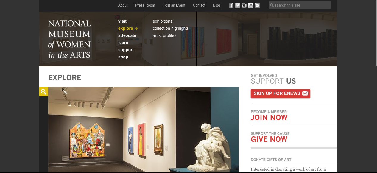
Simply renaming the navigation tabs could go a long way toward addressing both problems. Using the term “art” instead of “collection” and calling exhibitions “current” instead of “on view” may offer significant improvements, and this is something we plan to explore at The Phillips Collection. Furthermore, redesigning the navigation so that both exhibitions and permanent collection pages are rolled up under one Art/Explore tab, as seen on the National Museum of Women in the Arts’ website below, may help to overcome users’ lack of distinction between these two terms.
It makes sense for exhibitions to receive a dedicated and prominent place in the website navigation, because a large percentage of museum website users come to these sites specifically to find information about exhibitions. However, if millions of museum visitors are overlooking museums’ permanent collections because of this navigation structure, then this convention is worth revisiting. While ticketed temporary exhibitions are the main revenue streams for most museums, their permanent collections are their raison d’être. Museums are stewards of their permanent collections. They have been entrusted with these masterpieces to conserve them, research them, and share them with the public. Museum professionals feel a huge sense of responsibility for providing the public with access to and information about permanent collection objects. After all, what is a museum without its stuff?
In the interest of full disclosure, I should admit that there was some degree of confusion around my use of the term “museum highlights” in my usability prompt. This confusion led another interesting insight, which I look forward to sharing next week, in part 2. For now at least, I think many museums would benefit from investigating how well their website navigation is directing users to their collection pages, and perhaps showing those collections some love by giving them a new name.
Thanks for reading! Find me on Twitter or LinkedIn, and let’s talk about how user research can solve tough UX challenges you didn’t even know you had.
