In the recent years I’ve seen dozens of articles saying that Dribbble is destroying the design community, promoting the wrong mindsets and taking value away from real Design Work™. While it’s hard to doubt some of these claims, I decided to stop being negative (like I was with UX has pretty bad UX) and this time find some arguments for Dribbble.

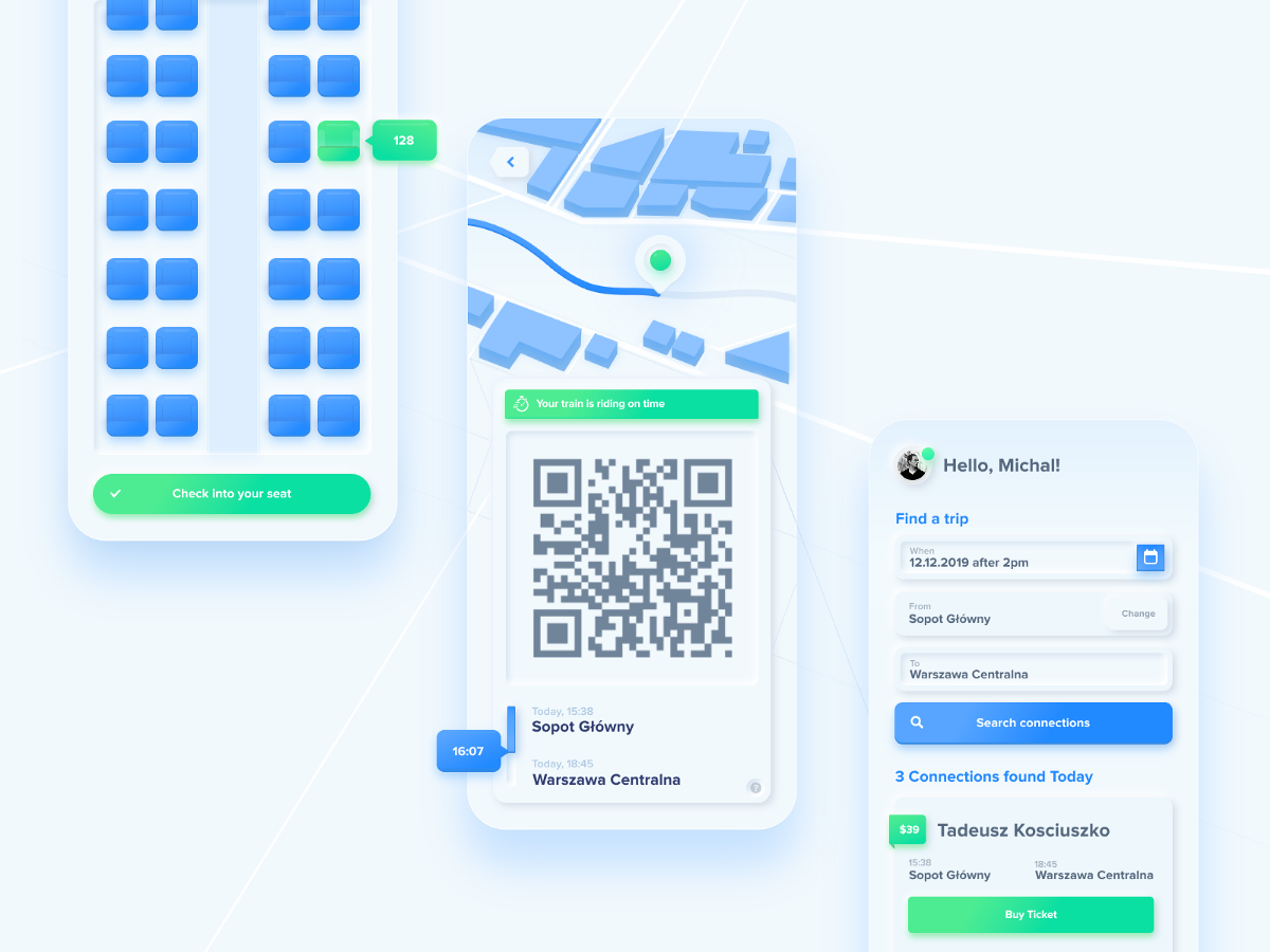
One of the main concerns around most Dribbble shots is their lack of focus on User Experience. As they focus on fonts, colors and “nice ways to showcase the shot” we are often facing products that wouldn’t make any sense in the real world.

You see a beautiful, antialiased graph that even casts a shadow. Super low contrast (definitely won’t pass any WCAG) dark mode. But overall it looks nice.
Then you’re confronted with the real world — this is how graphs usually look like online.

Ugly tooltips, jagged, super thin and unreadable lines. Dense data representation. It’s far from friendly.
So we stick with our antialiased sine curves for the sake of showcasing the product because it simply looks better. And the idea behind presenting something is for it to look it’s best.
And then the screaming starts — it’s not real. You’ll never be able to code a graph like that!
The trend of sugar-coating bad ux is slowly decreasing in the recent years — possibly because of all the critique. You can still find poor design masqueraded as a pretty picture, but you can find a lot of horrible design (both the AI and UI) in the real world too.
Bad projects are everywhere. They’re not exclusive to any one platform.

And there are better (in terms of UX) projects popping up all over Dribbble now, that merge the aesthetics with function.
The fact that function is not front and center in these shots doesn’t necessarily come from the fact that the designer doesn’t understand UX. After all a large group of those designers is making real products as well.
It all comes down to the simple facts of how and what you’d like to show.
People buy with their eyes and it’s not going to change.
We use our lizard brains to quickly determine our approach towards the things we see. If it’s a “meh” experience for the lizard brain it may just be dismissed.

So if you want to prove you make nice things, nobody is going to analyse your navigation pattern, thought process and research methods. There is no time for that initially and it all should come later, during the kickoff client workshops and first build phases.
For some customers it’s definitely a trap — they get attracted to a shiny, pixel-perfect creation and start a project just to end up with something “nice looking” but not functional. Then they go out of business.
But the trap works both ways.
There are companies out there that are all about the UX process, but not about the final product. It usually ends up being a bloated talk-fest, mapping some customer journeys and looking all fancy in scribbled wireframes. Then the end product is both ugly and not that functional because some statistics skewed the flows away from user-centric anyway.

I believe Dribbble is important for the design community. It may not influence customer retention practices or drive business goals of digital products up. It does however create user-delight. It focuses on some of our most primal needs and desires to be surrounded by “pretty stuff”.
It influences all those real products built by real designers using real (lengthy) processes. They borrow some visual ideas from those despised “artworks” left and right.Then update it to be more usable with higher contrasts and better flows.
And that is good. Medium is a great place to read detailed UX case studies and follow all of those user centric trends. Combine that knowledge with how to make rectangles look beautiful from Dribbble and you can build something truly awesome.

The last few years at I worked mostly on a couple of larger projects.
Imagine a year of designing the same thing, in the same category. I quickly realised that continuing this way will lead to faster burnout, project fatigue and general quality decrease.
Nobody wants that.
That’s why we (at my company) spend at least two days a month on internal design hackathons (sometimes more while waiting for client feedback rounds).
The goal is to make something “different” both in style and in category to what we’re normally working on.
This allows us to stay fresh, be playful and have actual fun moving rectangles around.
Because if you are not having fun designing then what’s the point?