Use real data in your chart mock ups
Designers have a tendency to create the most beautiful version of a chart possible without any regard to the real data that it needs to handle when it’s actually implemented.
This can cause endless headaches for the developers trying to build this thing you designed, and even more importantly, you haven’t even verified that the chart design will be practical in a real life situation.
The best solution is to create two versions of the design. The first version shows the chart in a state where the data is perfect, (i.e., optimized for purely aesthetic purposes). This design can be used for your portfolio and to present to potential clients. In the second version, use data that the chart is likely to display when it’s actually implemented. This is the design you can hand off to developers.

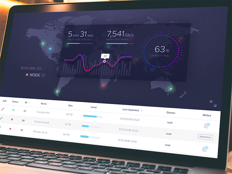
This looks nice, but it’s not real data. Source: https://dribbble.com/shots/3203320-Map-Dashboard
