Apr 27

Some people think design is just about flashy colors and sleek animations. And while it is delightful to scroll through the pages of Dribbble, real design is messy. It is a process. Real design recognizes constraints, asks tough questions, forces you to make tradeoffs… but ultimately, it solves a problem and helps people.
This is my process of continually testing and failing as I worked to deliver a native iOS weighlifting app on a tight budget and a speedy timeline.
The problem: Inability to easily create customizable weightlifting workouts and track workout history and progress.
Understanding the Problem
Playing devil’s advocate
When my client first approached me with hopes of creating a weightlifting app I played devil’s advocate and I pushed back. Asking tough questions helped me get down to the root of the problem and understand what the client was setting out to achieve.
Setting realistic expectations
Stakeholders pushed for a New Year’s release to catch the ‘New year, New me.’ wave. This was an unrealistic expectation with the minimal budget and large scope. I broke down my timeline and explained my process to convey the value of proper research and testing.
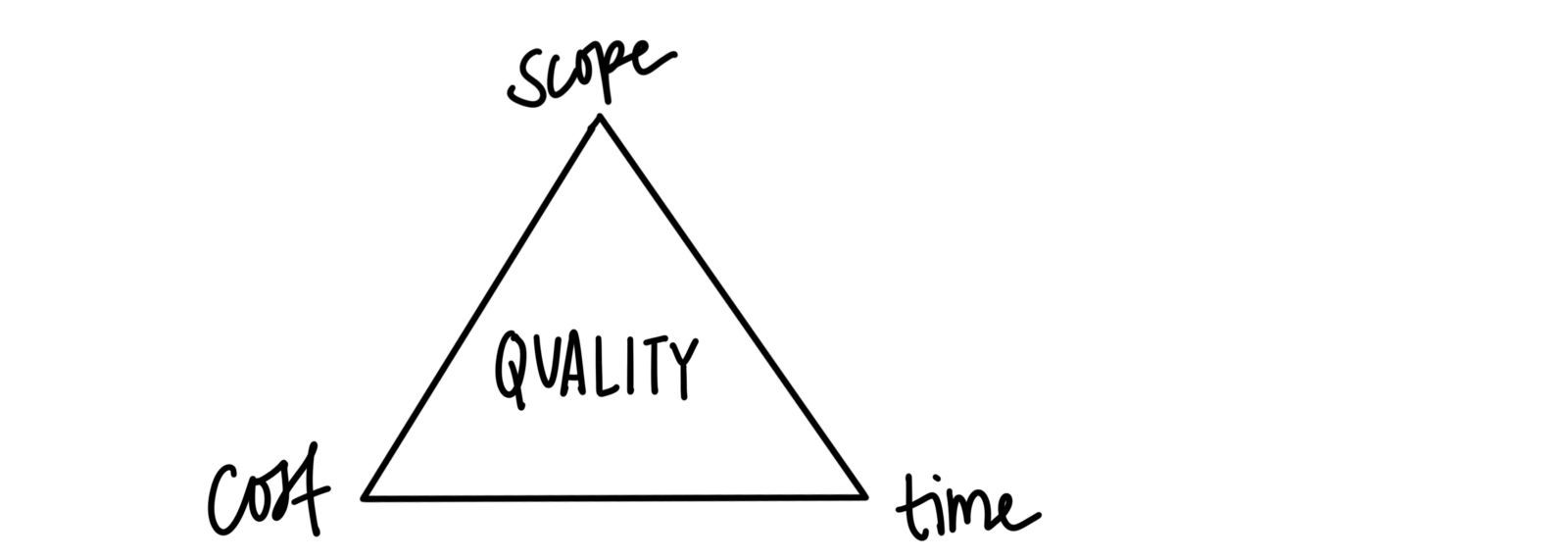
I backed this up by using the project management triangle to communicate with the stakeholders that tradeoffs would have to be made.
Competitive analysis
To dive further into the problem I began with a competitive analysis on weightlifting apps to evaluate functionality and their overall goal. I discovered that most apps focus on preprogrammed workouts and the process of creating a workout can be difficult and frustrating. This helped me to validate and better understand the direction we were headed.

Through a deep analysis I realized that you cannot please everyone, nor should you try. A lot of apps try and do too much and they become overly complicated and difficult to manage. So I set out to do some user research to gain a better understanding of who we were trying to reach.
User research
I began my research with some of my assumptions about weightlifters:

I sent out a survey to gather data and find out more about my potential users and their workout routines.
Questions I needed answered:
- Do you currently follow a workout program or set up your own workouts?
- How do you currently track your workouts and progress?
- What issues/frustrations have you faced in trying to track your workouts?
Breaking down the data


Insights
- 89% of people from the research are advanced/intermediate weightlifters. They know what they want to do and don’t need workout demonstrations or much explanation.
- 57% of people said they create their own workouts and do not follow a workout program. This strongly supports the need for easily creating custom workouts, as the alternatives put their focus on workout programs.
- More than half of people do not currently track their workouts because is it a hassle and distraction during workout. What can be done to eliminate that?
- Athletes and coaches make up a strong percentage of people from the research. Although there is great potential there, this likely falls outside of the scope for v1.
Digging deeper: user interviews
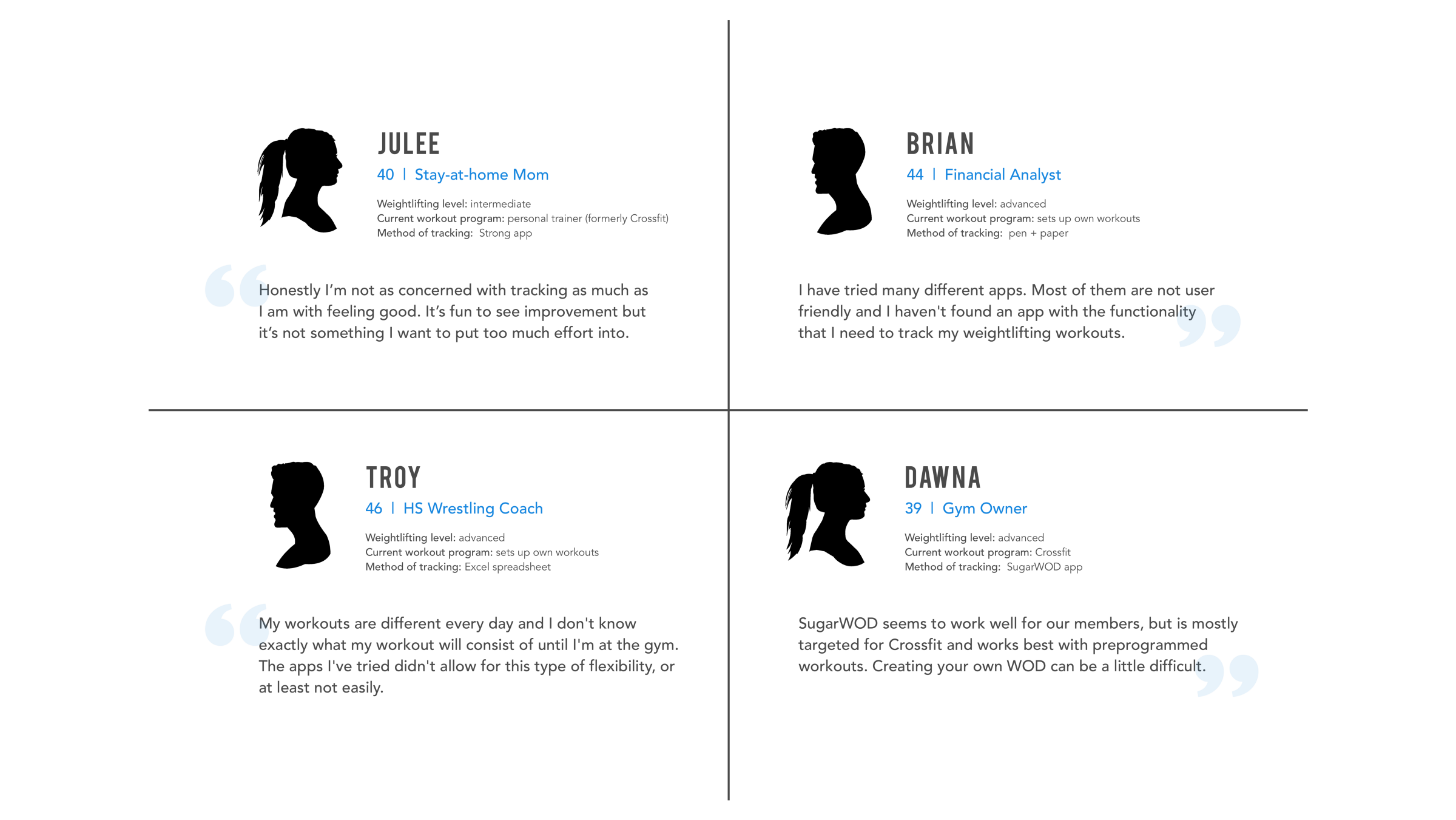
I contacted both high school and collegiate athletes and coaches and reached out to crossfit goers, gym owners, personal trainers, as well as the everyday, casual weightlifter.
Learning more about their specific workout routines helped me paint a picture and build context of when and how the app would be used.
Defining the Scope
After sifting through the resesarch I began to establish who we were trying to reach and what goals and frustrations could be addressed in the MVP release.
Creating a persona
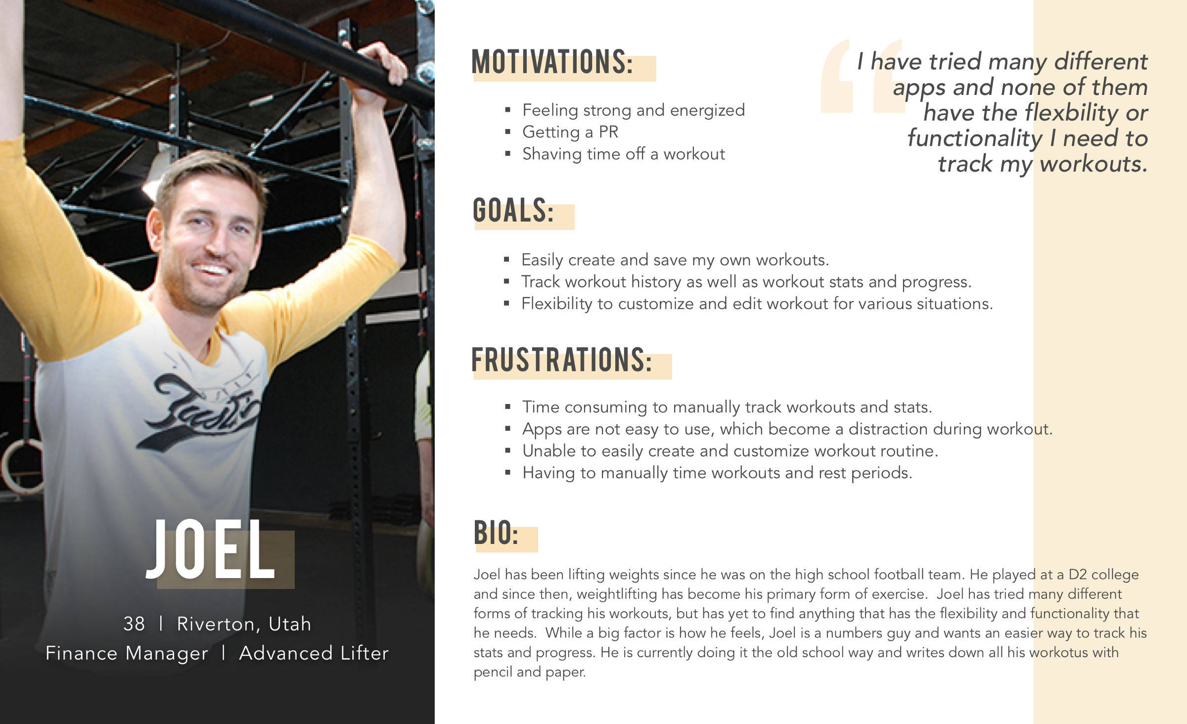
I consolidated my research into a persona to ensure that my designs were focused on solving the problem and meeting my users’ needs. Humanizing the research helped me empathize and advocate for my user by digging down into motivations, frustrations, and his overall goals.
Meet Joel: 38 year-old Joel has been lifting weights most of his life, but hasn’t been able to find a simple way to track his workouts and progress. None of the apps that he has tried have the flexibility that he needs, so his current tracking method is pen and paper.
Secondary Persona?
The high volume of coaches and athletes from my research pointed me in the direction of a secondary persona (coach) and potentially a tertiary persona (athlete). I knew this was a big bite to chew, but I didn’t cast aside any ideas as I began user story mapping.
User story mapping
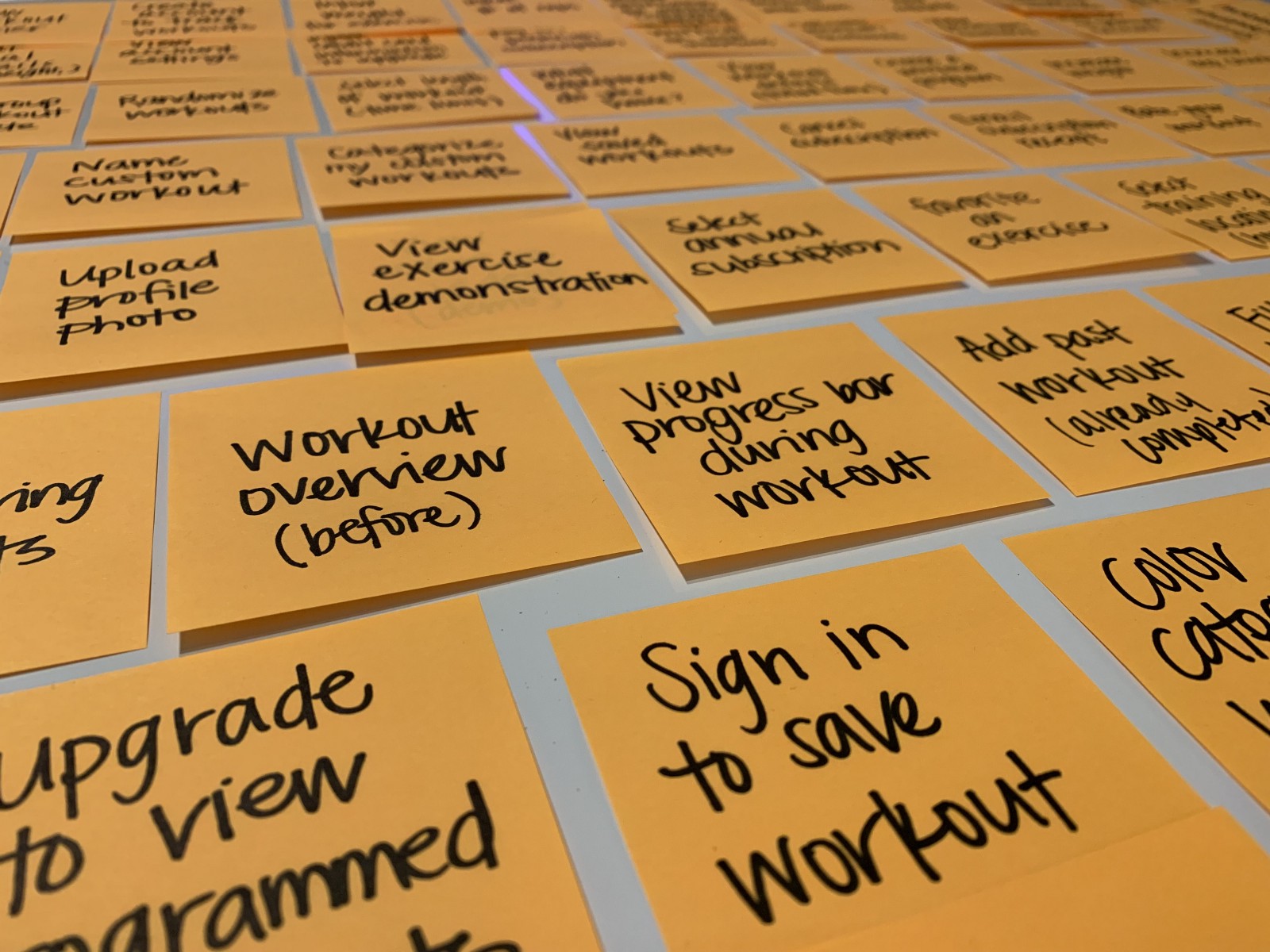
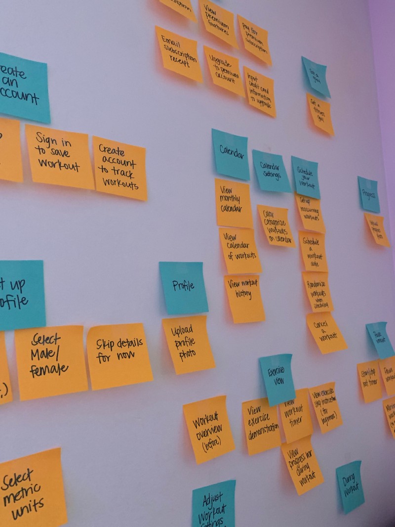
I took a bottom-up approach to user story mapping, beginning with my low-level tasks and using those to build out the narratives (create a workout, manage account, stats, etc.), taking into account both my user’s goals and the business needs.
Narrowing the scope
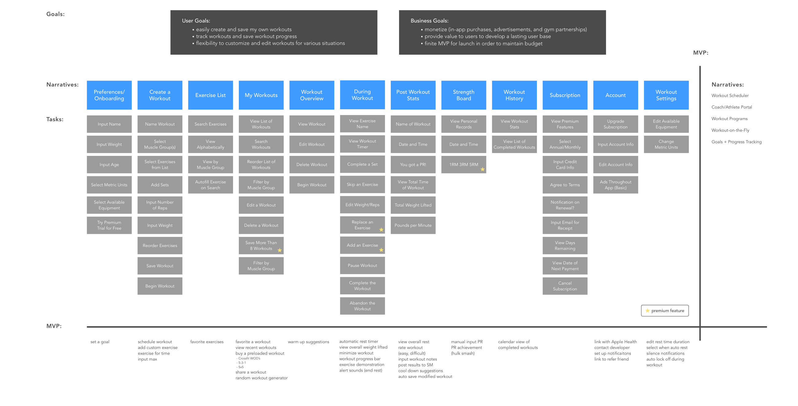
Although my client expressed bold dreams, the constraints of this product begged for a slim MVP (to maintain budget and time frame). I had a frank conversation with him to ensure that we were on the same page and to discuss the features that were being cut.
The following diagram shows the tasks that were removed from the scope, as well as the high-level narratives that were axed in order to establish a necessarily finite MVP.
Is this enough?
At this point I began to wonder… is the MVP too slim? Are we providing enough value to users? Not only was I trying to advocate for my user, but I also wanted to be strategic from a business standpoint. Would users be disappointed by the basic functionality at launch?
Structuring a Solution
I singled out the top three tasks from the MVP that the design needed to accomplish in order to meet Joel’s goals.
- Create and save a workout.
- Use the app during a workout to track weight lifted and time the workout.
- View progress and stats.
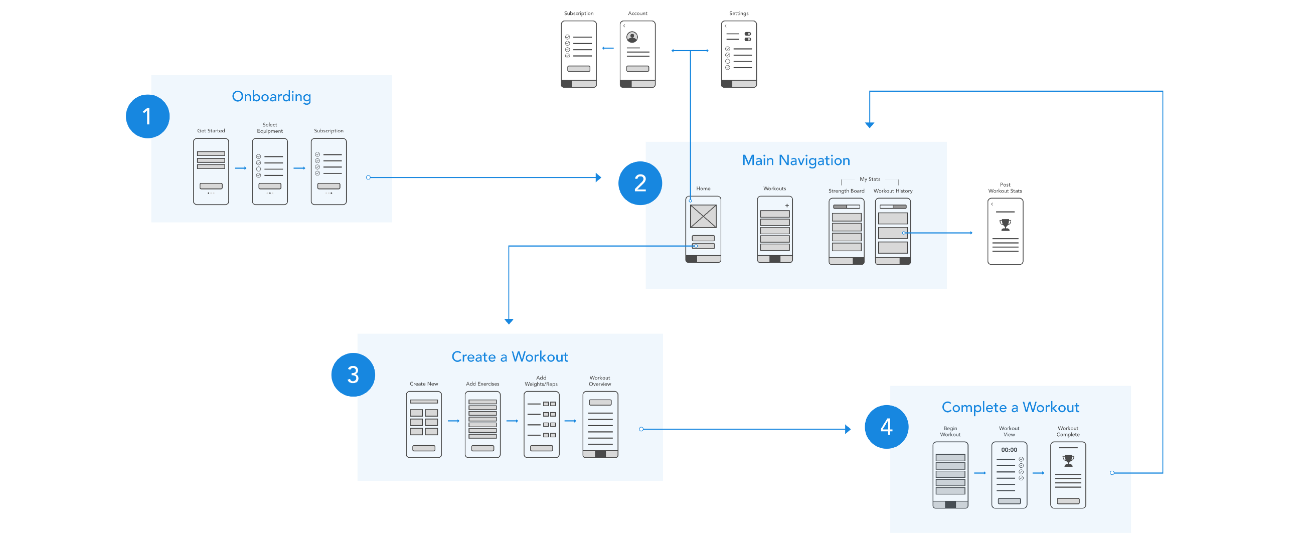
I translated these tasks into a simple user flow which helped me identify basic navigation. My user flow helped me answer three important questions: where am I, what am I doing, and where am I going? Answering these questions ensured that I designed views that are predictable, consistent, and give proper feedback to the user.
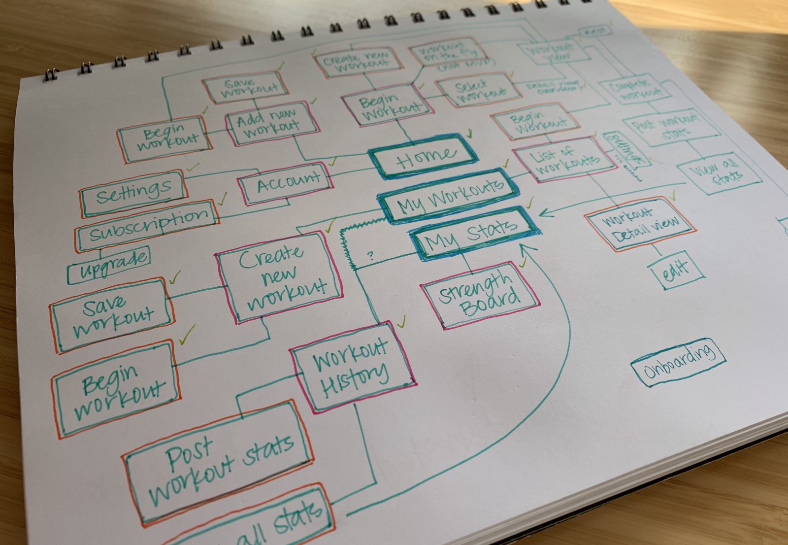
I sketched out multiple iterations of the three main tab bar views to push past using the first idea and ensure I went with the best idea.
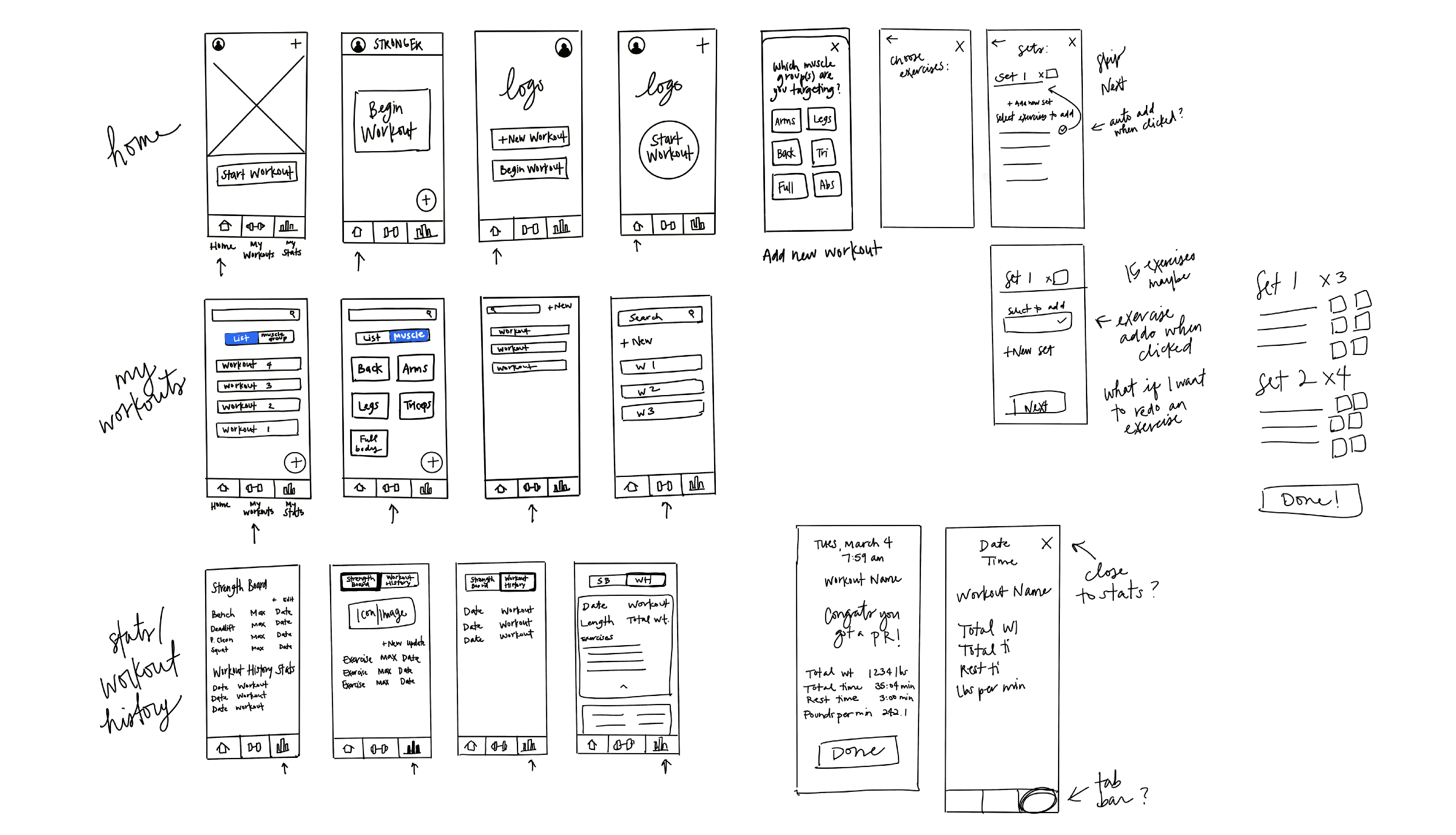
I translated these sketches into Sketch and then Invision to create a lo-fidelity prototype. I used the prototype to begin basic usability testing as well as get feedback from the product stakeholders.

Guiding the user through a flow
To provide value and increase engagement, I felt it was important to guide the user through a natural flow and not bombard them with options and settings. For this reason, users do not have to create an account and all data will be backed up and connected to their Apple ID. Noted: a future version with multiple platforms would require account creation.
Below shows the basic flow a user would realistically take upon first opening the app.
Promoting Premium
As a way to monetize the app there is a basic version and a paid premium version. The following shows a list of basic and premium features and how I created balance between advocating for my user and promoting the business.

Developing a Prototype
Using a design system
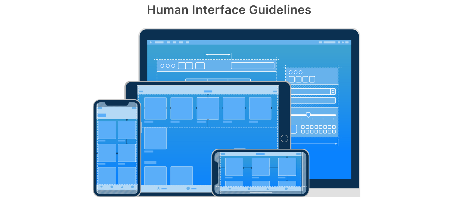
In order to help maintain a tight budget and timeline, I used Apple’s design system, Human Interface Guidelines. Taking advantage of native UI components (segmented control, action sheet, etc.) would help cut down on development time, especially for a potentially less-experienced developer.
Making tradeoffs
Unfortunately, in trying to maintain our budget and accelerated timeline, tradeoffs had to be made. Even after scaling back the scope early on, basic features and stats were cut along the way. This was a tough conversation to have with the stakeholders, but it was important to explain, with a small budget and short timeline, capability and functionality might be sacrificed. (Remember our special triangle?)
- Features that were cut (user): automatic rest timer, max out option (customized keypad), view overall weight lifted (during workout)
- Extending the timeline (business): In order to provide value to the users I fought to ensure we took the time to test. Solving usability problems before development ends up saving a ton of money and time in the future.
Accessibility
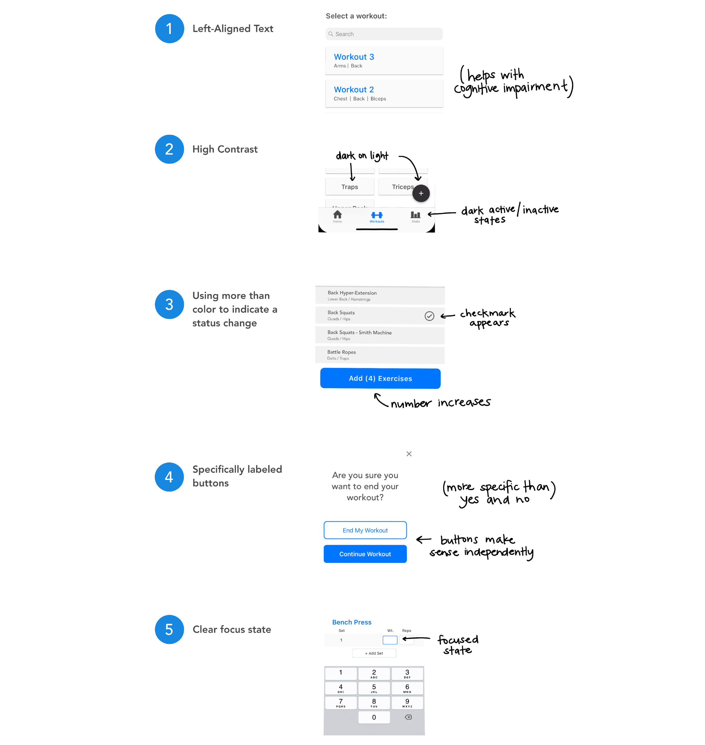
I addressed users with potential cognitive impairment, low vision/blindness, or color blindness by implementing the following best practices. Not only does this make the design more inclusive, but it increases overall usability for everyone.
Setting the tone
- Honest and transparent: In order to gain trust with the user we opted to allow a free premium trial without requiring credit card information. Many apps prey on users forgetting to cancel the upgrade when the free trial ends.
- Productive redundancy: Many workout apps open to a dashboard view which can be overwhelming and confusing. In order to set my users up for success there are two clear actions on the home screen. If first time users select ‘Begin a Workout’ it will guide them to create a workout first. This means, either way, the user cannot get it wrong.

Designing a style guide

Implementing Feedback
Conducting usability testing
I suffered through many rounds of disappointing testing throughout my process from lo-fi sketches to a hi-fidelity prototype. I conducted formal usability testing as well as casual exposure in order to get feedback on the overall functionality. Let’s just say it was definitely a process.
Specific tasks that I tested:
- create a workout
- complete a workout
- edit an existing workout
- identify customization capability during workout
These tasks are directly related to the user goals so this helped me gauge if I was properly addressing them. Here are the major points of feedback I received:
Live or die by copy
Testing brought up issues with the naming convention. Rounds, circuits, supersets… everyone has a different term for it. The problem: immediately people thought the app wouldn’t work for them because they “don’t use circuits.”

Redesigning the ‘Workout’ view
The workout view was initially broken down by set (as opposed to showing the entire workout on one screen). This was done to increase visibility and focus on the set the user was currently completing.
The majority of users expressed interest in seeing the entire workout so they could have the flexibility to complete exercises out of order if a particular machine was taken.
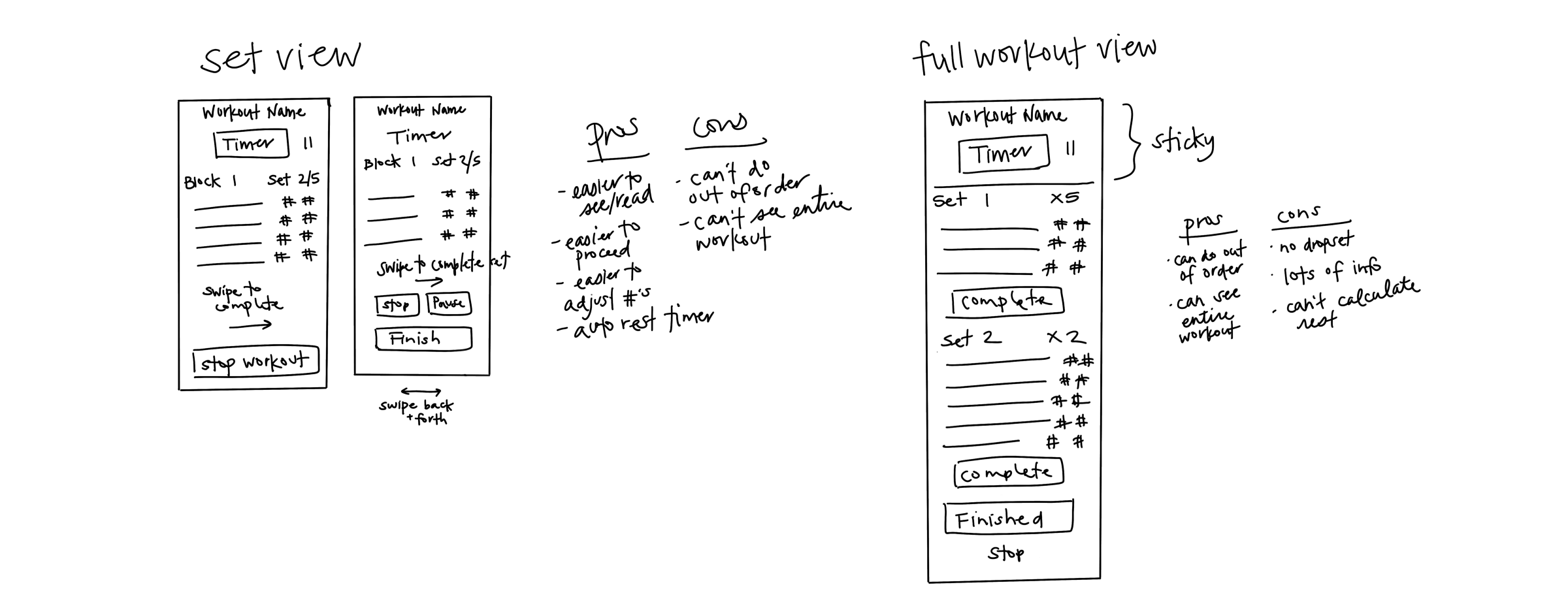
Secondly, I designed the workout view so the user could check off an entire superset at once, which would mean less fiddling with the app and more focus on the workout. Through testing I discovered that users actually liked the feedback and satisfaction of checking a completed exercise off the list.
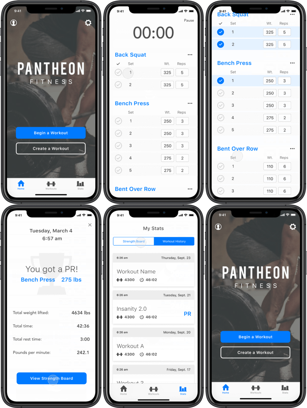
After continuous testing and reiterating here is the final workout view and the flow of completing a workout.
Is it versatile?
I pulled various workouts to see if the design could handle different types of workouts. I successfully tested a Crossfit WOD, a high school wrestling workout, a collegiate soccer workout, a Daily Pump by the Quad Guy, and a workout developed by a Strongman competitor.
Evaluating the Result
This project forced me to find the balance between getting things perfect from a design perspective and getting things done from a business standpoint. I don’t believe this design is perfect, but it solves the problem and with the given time constraint I opted for usability over aesthetics.
The Final Word
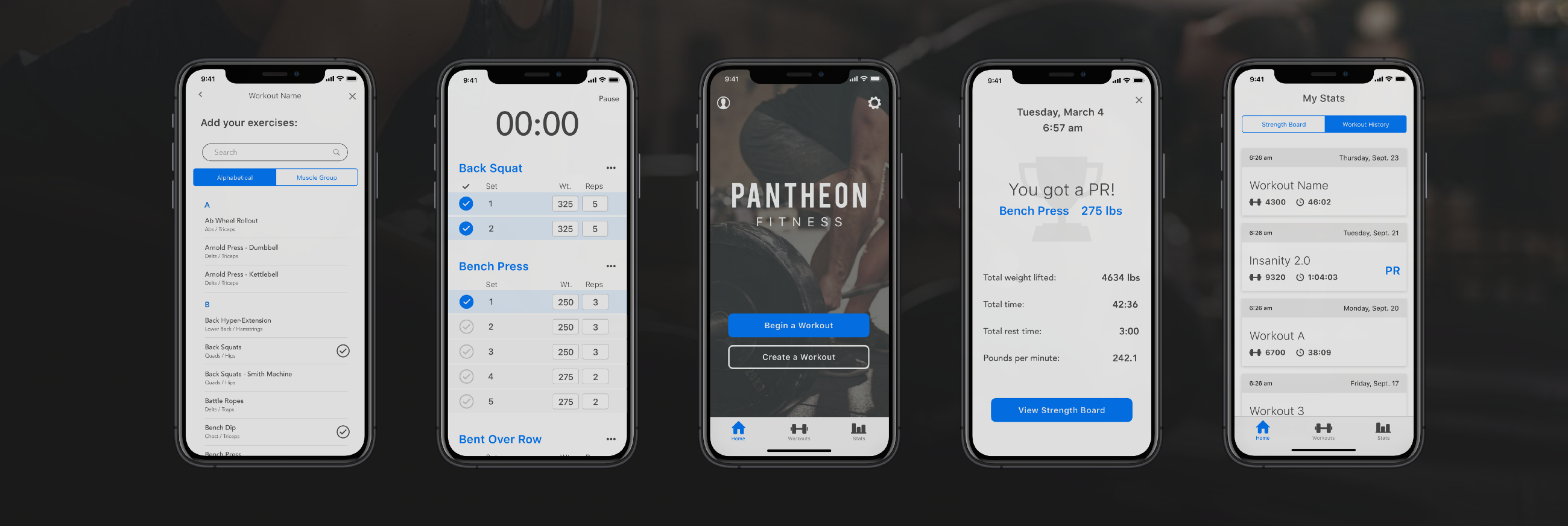
When testing the final prototype, 4/4 people were successfully able to create a workout, complete a workout, replace an exercise during the workout, and find the workout stats, effectively meeting all of Joel’s goals. 👊🏼
Click on the link below to check out the prototype!
Establishing Next Steps
I am currently in product support, to ensure that the integrity of the design is maintained as this project continues through development. The stakeholders and I are continuing conversation to discuss strategy and implementation of new features to come.
Version 2.0
Improved functionality: turn off auto lock screen, autofill weights and reps from previous, increased stat analytics, easily create supersets, auto rest timer
Workout on the fly: Although supported by research, the budget didn’t allow for this in v1. A strong percentage of people make up their workout at the gym so this feature is a must in the next release.
Cross platform integration: Increasing progress tracking by integrating Apple Health will give user access to more detailed stats. (This will require that the user create an account.)
Coach/athlete portal: While this might not make v2 this is a great opportunity to expand our reach. It will likely require a desktop interface as coaches will be frequently creating and managing workouts.
