Although the utilization of impressive images as a header background is considered to be a huge web design trend, it seems that not everyone has a burning desire to follow the tendency and join the mainstream. Instead, some folks go for opposite tactics and prefer ditching wide-screen pictures in favor of clean, solid color backdrops. This solution is already named as a fresh trend.
The more so, with such a fertile ground kindly provided by flat style and material design, an increase in popularity of this approach is quite evident and expected. Add to this an astonishing variety of instruments for making fantastic and visually interesting designs and you definitely won’t resist.
Bare use of colors or accented colors, bold or creative typography, stylish details such as a hamburger icon>
or ghost buttons, spectacular logos and an enormous emphasis on the content, from traditional to unorthodox everything can do the trick. To find out what else artists come up with for prettifying header sections delve into our brand-new collection.
The Absence of Full Screen Images
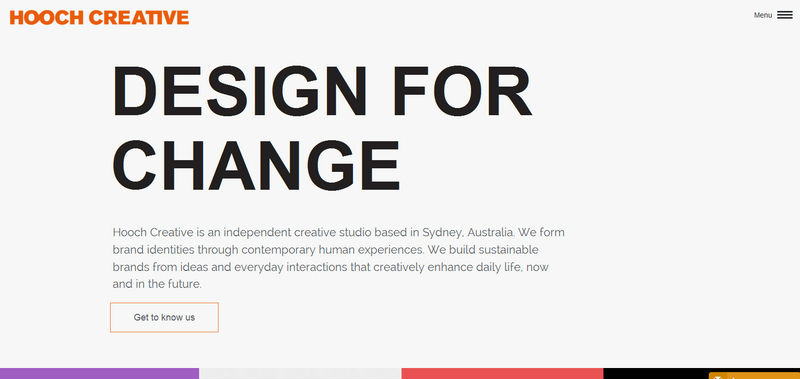
Hooch Creative
Hooch Creative has a clean and open design that is based on a soft coloring spruced up with some splashes of gorgeous vibrant hues. The bold, huge tagline immediately catches the eye thanks to a solid backdrop and the absence of lavish ornaments. Everything looks succinct and appealing.
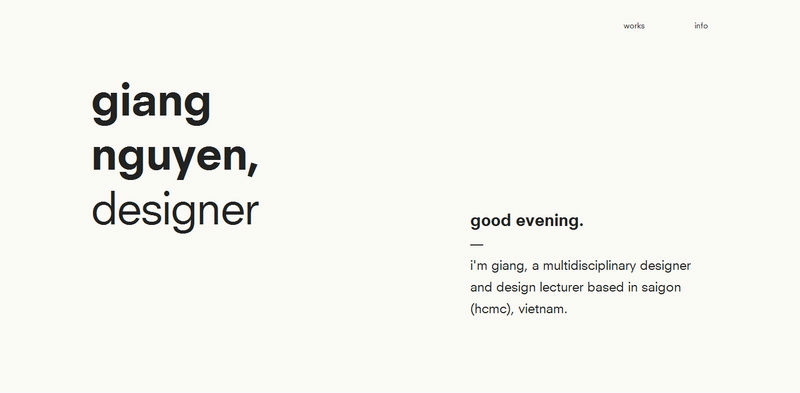
Giang Guyen
Giang Guyen has a sleek, minimalistic personal portfolio that reflects the person in an understated and modest manner. The artist goes for a smooth two-tone palette and bold, regular type that naturally lays emphasis on the content and sets up a calm and serene atmosphere.
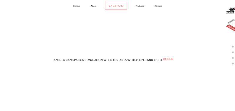
Excitoo
Excitoo easily maintains a splendid simplistic look that keeps interest alive. From a flawlessly executed streamlined navigation menu to witty taglines, the project breathes modernity and refinement. Here, the absence of a huge dramatic image background lets the designer achieve a subtle sense of sophistication with no muss, no fuss.
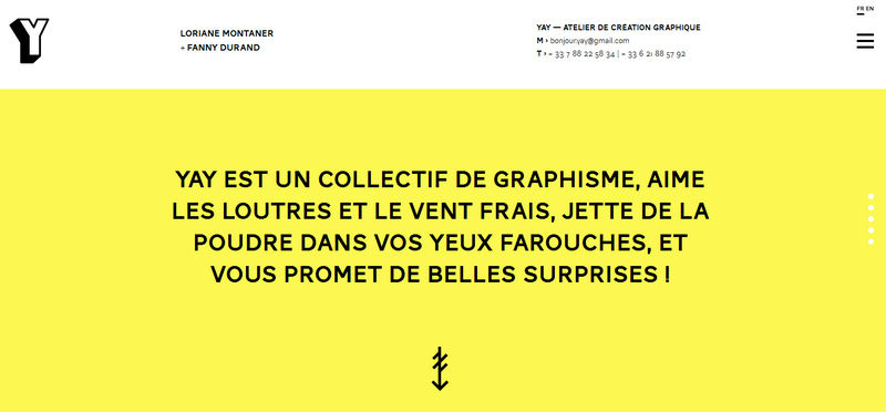
YAY
YAY evokes positive emotions from the first seconds. Bright yellow, used as a core color, develops the rhythm and charges the whole project with amiable energy. While friendly aesthetics add an extra edge to user experience, the choice of solid canvases instead of rich image backdrops throws the spotlight naturally into visuals and does not overwhelm users.
Brand Junkie
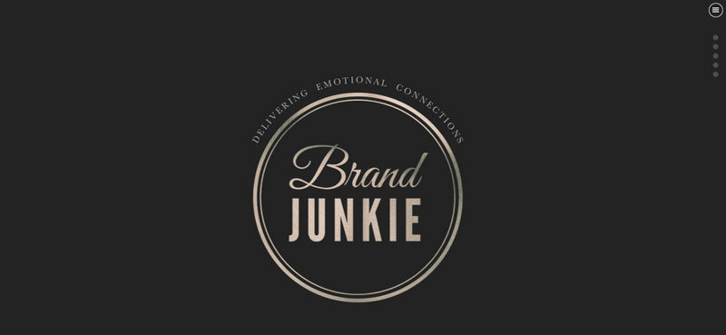
Brand Junkie demonstrates how to get the most out of the “less is more” ideology by capably omitting needless things and opting for black as a primary color. In such a manner, the artist has managed to direct users’ attention quickly to bright images, and bold, relatively massive titles as well as put the text above everything without a hitch.
Hermes Tocchetti
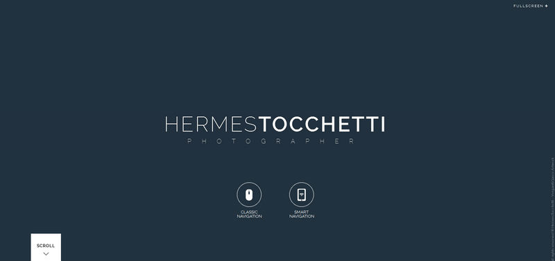
Hermes Tocchetti is a talented and extremely professional photographer so his online portfolio could not help but include a bunch of his mind-blowing works.
In this case, it is vital to not overpower users. The “welcome” screen wisely offers no more than a robust solid color backdrop, a couple of subtle CTAs and the tagline.
Sam Weekes
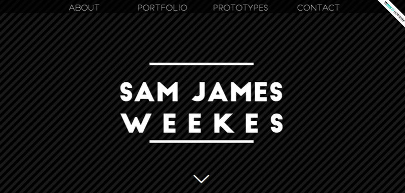
The “welcome” section of Sam Weekes’ online portfolio demonstrates how to leverage the minimum of elements for creating a necessary welcoming and powerful atmosphere that actively encourages users to scroll down. The massive bold white tagline naturally contrasts with the otherwise dark, slightly primitive background, and relatively huge navbar provides an optimal way for exploration.
Dishoom
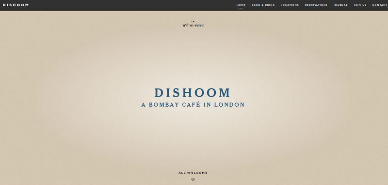
The official website of Dishoom, a small local cafe, is highly populated with startling images that reflect an amiable atmosphere, as well as displaying an original interior. The first section effectively balances with the rest of the design thanks to an almost blank page that comprises only a tagline and navigation.
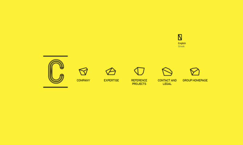
Entec
Entec instantly draws users into the website with its awesome minimalist landing page. A skillful combo of bright, almost neon yellow, and exquisite contour graphics produces an indelible impression.
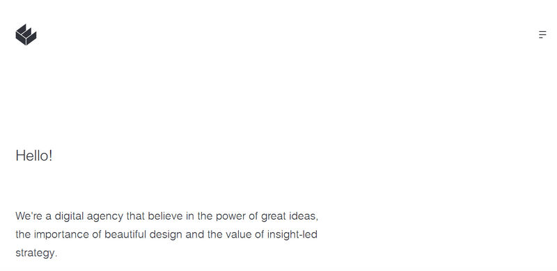
We Are Empire
The homepage of We are Empire has an untouched and void appearance with a beautiful open feeling that certainly is worth your attention. A generous amount of white space in collaboration with a beautiful and harmonious black-and-white color scheme gives the content the center stage and transforms tiny details such as the hamburger icon and the logotype into focal points.
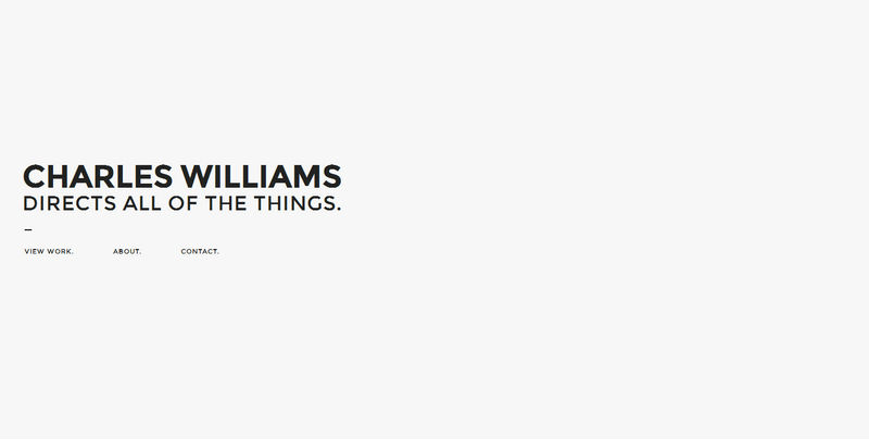
Charles Williams
Charles Williams also prefers to familiarize online visitors with its persona in a simple, straightforward and concise manner. Proceeding straight to the point, he opts in favor of a clean, primitive backdrop and legible display of content that is tightly packed together.
It is a pretty beneficial solution since the website does not overwhelm users in the beginning and gives them a kind of a break before starting to bombard them with spectacular portfolio pieces.
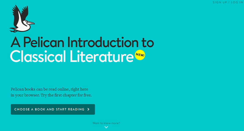
Pelican Books
The designer makes quick access to the content thanks to a properly-structured and well-formatted layout that is based on a clean canvas. The landing page harmoniously balances negative space and the copy.
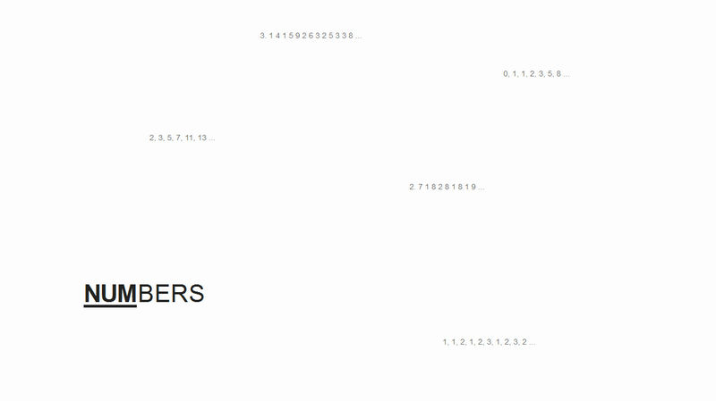
Numbers
The front page is designed to bolster the nameplate substantially, giving numbers a central position. Here, the blank page with digits that are beautifully scattered throughout the area, in tandem with an eye-catching nameplate naturally urges the users to find out what is hidden behind it.
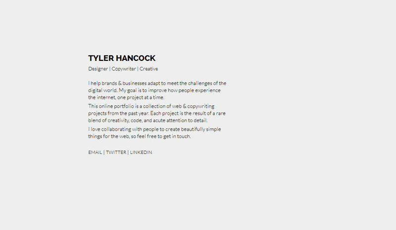
Tyler Hancock
Tyler Hancock briefly familiarizes online viewers with his persona, giving the content center stage. Since copywriting is his bread and butter, it is not surprising that the landing page does not include any images at all; since here they are just inappropriate.
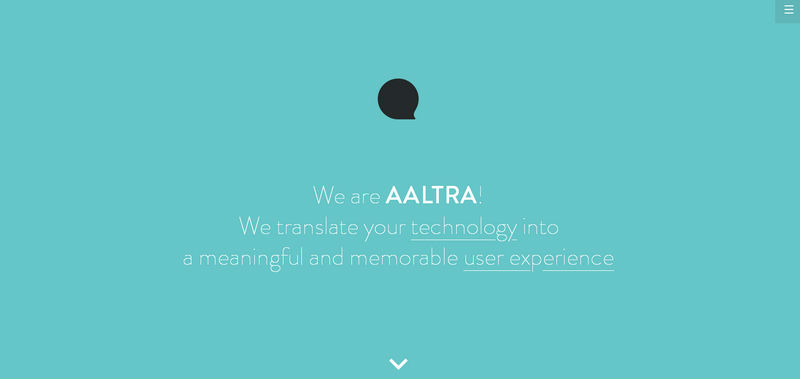
Aaltra
Aaltra shifts images away in order to provide the text with more space and make it a highlight. Smooth solid color backdrop nicely supports foreground elements, especially the content, and avoids a clumsy appearance.
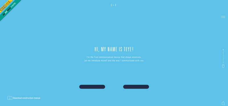
Teye
The website has friendly aesthetics that offer a pleasant user experience. The color scheme paired with the absence of everything excessive recreates the overall design and establishes a memorable general feeling. Thanks to such an approach, images easily illustrate the product in the best way as well as boost its value.
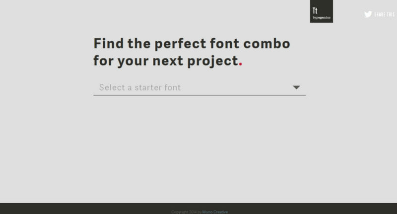
Type Genius
Type Genius, with its minimalistic design, tries getting straight to the point and not distracting users’ attention on trivia. Thus, the front page offers a basic drop-down list, where you can select the necessary font.
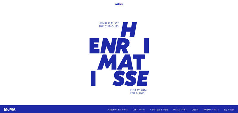
MoMA
MoMA ditches widescreen images and adopts a minimalist approach in terms of decorations since in such a manner the message is best communicated and readily perceived. Indeed, the nameplate in a bold type and with a lovely chaotic appeal easily falls within the field of view of the targeted audience.
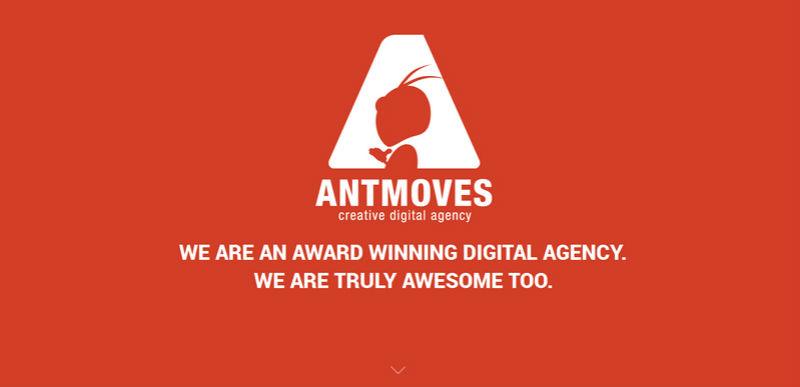
AntMoves
AntMoves does a great job of implementing negative space ably using it in the logotype and backdrop. The website produces a strong impression from the outset and kindles interest.
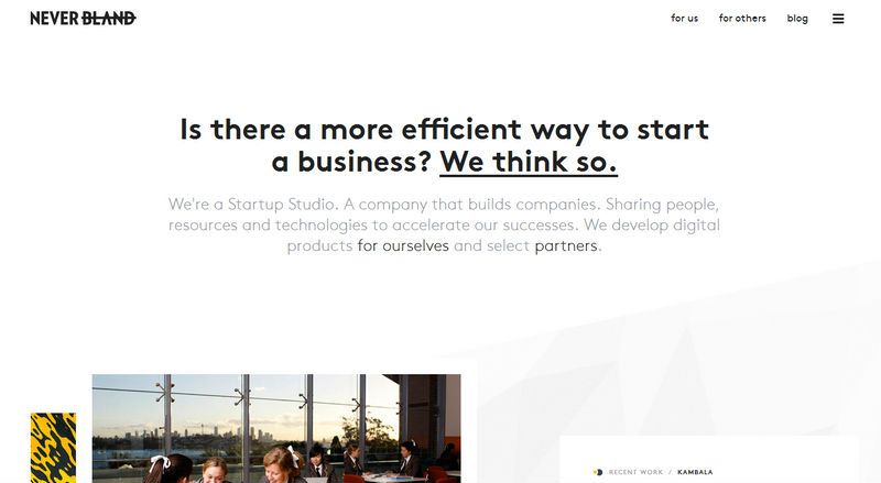
Never Bland
Never Bland has a traditional layout that greatly benefits the project based on a pristine backdrop. The choice of color scheme also contributes to the aesthetics, perfectly complementing the overall design.
Conclusion
Those designers who have chosen to paddle against the current have managed to create web projects that differentiate themselves from others with their pristine and unstained appearance, where content rules the roost.

