
There are many fundamental principles of art & design which are crucial for every web designer to understand. One such principle is negative space, also known as white space. The use of white space can be difficult to explain but it’s much more obvious via example.
Negative space is a key component to any great visual composition. Web design uses negative space to create distance between elements and allow the page to breathe. In this post I’ll cover some different methods for how to incorporate negative space in your own design work. In the beginning it can be a tricky subject but once it “clicks” you’ll never forget how to use negative space in a positive light.
Empty Space is Not Fruitless
An important place to start is that negative space is not a bad thing! Some designers think that it’s necessary to fill up most of the white space on a page in order to add more features, more images, or make the page smaller.
All this does is cramp everything together so it looks more confusing and difficult to read. Page text especially needs a good amount of space or else content becomes almost unreadable. The tricky part is that too much negative space can also be a problem. So as a beginner you’ll need to find a balance.
But from a general perspective it can be better to overshoot than undershoot negative space. This means having a bit more space in blocks of text may look better than having not enough space. When in doubt try various alternatives to see what fits best.
Keep negative space by your side as a classic design technique and remember that it really does want to help. It certainly is a double-edged sword where too much or too little causes havoc. But as a designer you’ll need to train your eye to see the perfect values for certain font sizes and layout components because these properties will change with each new project.
Clear Content Hierarchy
Perhaps the greatest purpose of composition-related negative space is to distinguish between tiered page elements. Think of different areas in a typical website from the logo, navigation, headers & image slideshows. These elements all have different levels of importance based on their size and relationship to each other.
Negative space can be used to increase or decrease visibility of certain elements on the page. Of course you don’t want to decrease visibility so much that elements are crammed together. But the point is that having more space between an element forces it to stand out against the overall composition.
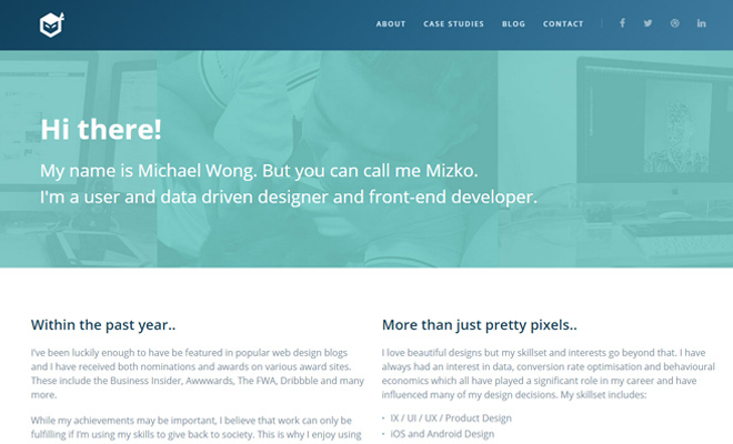
Take a quick peek at the portfolio of Michael Wong which also breaks up content into horizontal sections. The big heading text stands out immediately because of the size and distance between other elements. There’s plenty of space before & after the header so nothing else in that area can become a distraction.
Also notice some of the text and graphical elements on his “about” page. The paragraph text is relatively condensed and while it’s still readable, it feels more like background info. Just below these paragraphs are a series of logos with links out to pages discussing his website. These are much more noticeable because of the negative space and bright colors emanating from each graphic.

And of course everyone should know about the famed Tuts+ Network. Their homepage recently underwent some changes but it still looks absolutely phenomenal. Font sizes range from very large to miniscule in comparison to other blocks of text on the page.
Element sizes coupled with negative space can give the illusion of importance. This concept is based on the idea that a visitor will be attracted to whatever catches their attention. If a page section is empty aside from a small bit of content, then that content will become the main focus.
Readable Typography
As mentioned earlier negative space is very important when thinking about typography. This rule is true for all mediums including print work. Letters need to be large enough to read but also properly spaced to get a sense of distinct words, sentences, and paragraphs.
Think about typography falling into a content hierarchy. Headers need to be immediately recognized as the “leaders” of page content. Big headers should really capture attention because they often define what the content will be about.
Paragraphs underneath headers should be closer to the header so readers can sense the relationship. But the paragraphs themselves need extra space between them or the text will look runny. Use extra bottom margins when appropriate but also try to keep related text closer together(like a header and the first subsequent paragraph).

GOOD Magazine exhibits a stunning use of oversized and well-spaced typography. This layout might be the pinnacle of oversized typographic hierarchy because it’s meant to be a content-oriented website. When reading an article you should notice that the text is given plenty of line height and uses high-contrast colors against the background.
This is crucial to achieve a natural flow down the page. When people start reading they want to get into an undisturbed zone. By designing typography with natural rhythm visitors will have a much easier time following along regardless of page size.
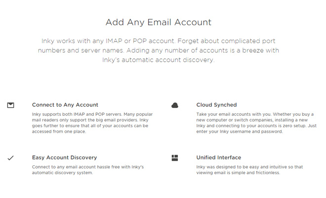
Another use of text-based hierarchy can be found on the homepage for Inky. The layout focuses on minimalism but has a wide array of legible font sizes. Most header text is quite large, but as you scroll down you’ll notice pockets of smaller paragraphs that seem insignificant.
Could this text be sized up a little larger? Yes possibly – however the composition itself speaks volumes regarding what the designer is trying to achieve. By placing lots of smaller paragraphs together they look like one big unit and none of them individually stand out from another.
The tough idea with typographic balance is that you need to strike it right on each project. Different websites have different needs for typography so it helps if you have a general idea of the website’s copy direction. This way you can organize which areas require more focus and which areas can be less noticeable.
Balanced Page Sections
Attaining a balanced layout requires a keen eye for very slight differences. Negative space can help achieve balance if you can measure content areas properly. Take for example the services page of Si Digital.
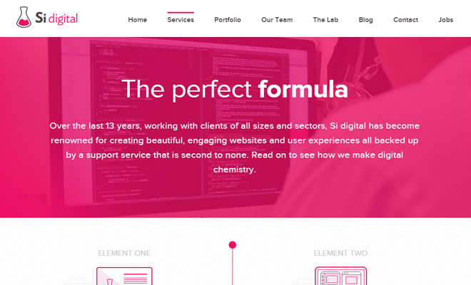
Their use of negative space differs between the heading, footer, and middle-ground content areas. Generally speaking the typography looks similar but ultimately the containers of each section are meant to be open and roomy.
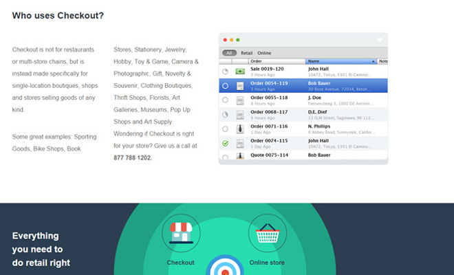
The homepage design for Checkout App uses a different spacing for typography but follows a similar pattern of negative space in the overall layout. Each major content area is quite spacious utilizing a whole lot of padding. This extra space can be interpreted as a differentiating feature between content areas.
Alternating background colors also create the feeling of a broad, roomy design. But the negative space is an indispensable piece to the layout. Proper negative space is one of those things where you rarely notice when it’s there – but if all the content areas were crammed together you would surely notice its absence.
Balance is typically unseen because it manifests as more of a feeling. When negative space is used improperly the layout will feel off-balance which means something needs to be adjusted.
Macro vs Micro White Space
This topic was originally discussed in a Tuts+ article and is still an excellent concept for web designers to understand. Basically white space(or negative space, same thing) can be broken down into two major components: macro space and micro space.
Macro space would be the distance between major page elements. Think about the margins between a website’s header, navigation, primary content, and footer. Also consider the space between sidebars and the background/outer border of the page.
Micro space would be applied to content inside these page elements. Paragraph margins, space between images, padding for navigation links, etc.
Both concepts are very important to understand because they both apply to the overarching technique of white space. Macro is a little easier to comprehend if you tend to look at the big picture. The problem is that many web designers get tunnel vision when really digging into a project, so the little details can end up taking priority.
Try to maintain a healthy balance of reviewing your design(s) at both the macro and micro level. Take a step back every so often to review the complete layout. It’ll help if you can step away from the design for a few hours to come back and look at it with a fresh eye.
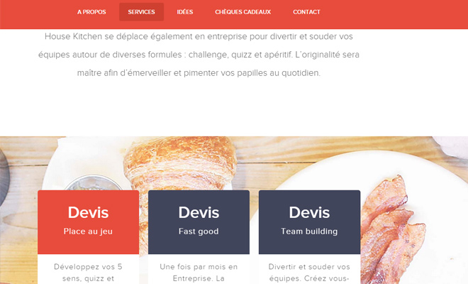
House Kitchen demonstrates a great example of both micro and macro spacing on their services page. While scrolling down you’ll notice that each section is split up with 100% horizontal width. The padding between each section is large enough to visually delineate boundaries on a macroscopic level.
But also take note how individual page elements use a lot of padding on the microscopic level. For example, most paragraph text has generous line height values which look great because there’s so much space between each piece of content.
House Kitchen is great for observing both micro and macro space together in the same layout.
Final Thoughts
Consider negative space as comparable to sleep or water. Humans need both to live a healthy life, but too much of anything can be unpleasant.
In order to craft a healthy website layout you’ll need to use negative space in proper proportions. The design methods from this post should get you thinking about how to incorporate space into your composition. There’s no harm in reading about general theory, but to actually improve your designs you will need to spend time practicing. Just be sure to practice negative space as a fundamental tool rather than a “required” formula for good design.