Recently Vox, together with 99% Invisible, produced a brilliant short film about a door on the tenth floor of the Vox Media office. Besides many other doors, it featured Don Norman: design icon and celebrated author of The Design of Everyday Things. The purpose of the film was to highlight the usability of products and systems, whittling down to two fundamental principles of human-centered design: discoverability and feedback.
Discoverability
“What do I do?” When you encounter an object, a product, or a system of some kind, you should understand how to interact with it. A lack of discoverability results in you simply having no idea how to use something.
Feedback
“What just happened? Once you’ve performed an action with your object or system, some element of feedback should inform you what happened and why. Without feedback you’re left in the dark.
Let’s take a look at some examples of interfaces and products on the web which demonstrate good use of these ideas.
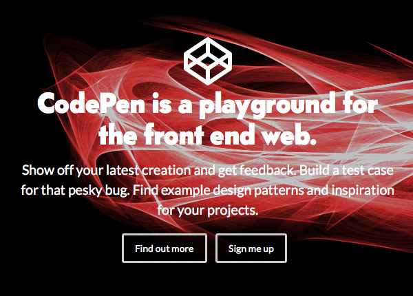
We’ll start with discoverability; any website, whether it’s for ecommerce, a portfolio, marketing, a product or service, or anything else, will need users to understand what’s expected of them. CodePen’s homepage uses a catchy strap line, followed by a clear value proposition, before leading the eye down and offering new visitors two clear courses of action.
There are many discussions on the web about the effectiveness of “ghost” buttons (where the button has no fill, just a border), because they don’t necessarily look like buttons. This could hamper discoverability, but I’ll let you make up your own mind there.
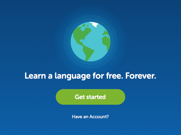
Duolingo, everyone’s favourite language learning platform (right?) make their homepage even clearer to new users. There’s one, very obvious, very clickable button in the centre of the screen. And if I hit it I know exactly what I’m letting myself in for.
These first two example are well executed “Calls to Action” (CTAs). As product owners we want users to feel compelled to take action, but making a button big, red and shiny isn’t enough. Beyond being visually obvious, a CTA needs to help users understand what they’re taking action for.
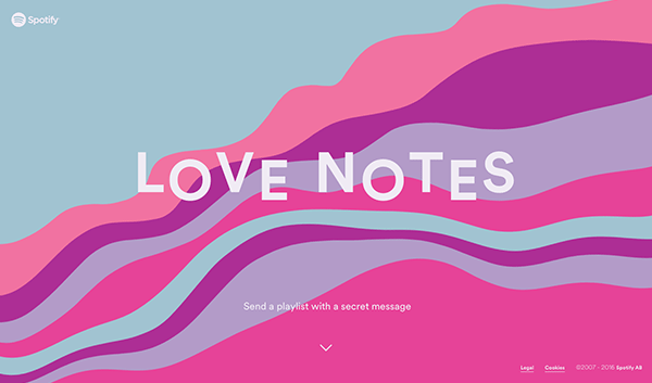
Spotify’s recent Valentine’s promotion, where you could send a love note by way of a playlist, was (as ever) aesthetically stunning. But the path to action might have been clearer. It’s obvious what we want the outcome to be, but the instruction (which acts as a CTA) doesn’t actually do anything. Instead we’re expected to scroll down, which may to some feel like they’re scrolling away from the action they want to take.
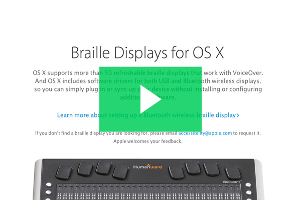
In contrast, here’s an example of a very discoverable action: the humble play button.
With acres of whitespace, this circular icon draws users in to take action. The play icon is universally recognised, and its very form suggests direction; a next step. Hit this and a video will play.
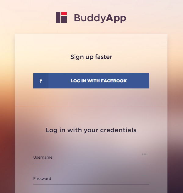
BuddyApp, a theme for WordPress’ community platform BuddyPress, gives us two possible options here, but clearly shows us which is the preferred sign up route.
Accessibility
All the discoverability we’ve discussed so far assumes one very important thing: that we have no accessibility issues. If an interface makes it difficult to discover what’s expected of us under perfect conditions, imagine how that affects those who have visual, physical, or cognitive disabilities?
I can’t recommend enough that you take a look at John Hartley’s Beginner’s Guide to Web Accessibility course. At 2.5 hours it’s a seriously comprehensive guide to what accessibility means to the web and how you can make it a part of your workflow.
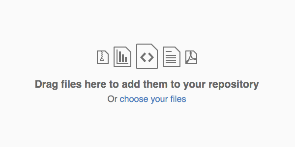
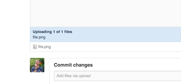
Github nowadays allow users to push files to repos directly through the web interface. In terms of discoverability this command is pretty clear. There’s even a secondary course of action, clearly presented, should we need it.
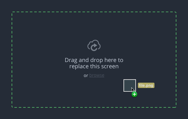
Once I drag my file into the window, I then get a change of state as feedback that my action has been acknowledged: dashed lines and further instruction.
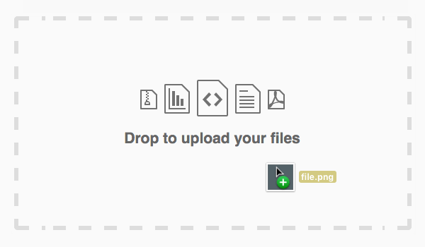
Finally, once I’ve dropped my file, I get more feedback in the form of a progress report to let me know the file is on its way, ready to be committed.
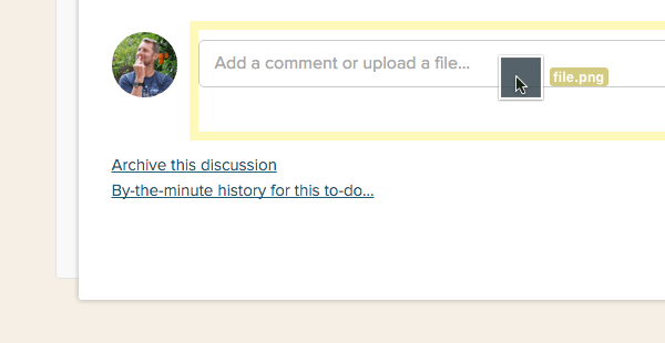
The dashed line has become a conventional pattern (excuse the pun) for feedback, telling users to drop whatever they’re dragging. Invision is another example, though the discoverability of such an action isn’t quite as obvious, instead relying on a certain proficiency from the user.
And Basecamp does something similar, though it’s not a dashed line. Either way, good feedback.
Animation
Motion is the perfect way to give feedback; we’re completely used to seeing action and reaction in the real world, so why not also on the web? For a long time now designers have been using subtle transitions on hover states (for example) because they help the user understand the connection between before and after. Nowadays, with animation and SVG, we can go beyond that. Have you liked anything on Twitter recently?

That mini explosion lets us know, without any doubt, that our action led to something happening.
In this example the Mode ecommerce theme for WordPress demonstrates typical Woocommerce behaviour. Upon adding a product to the cart, a thumbnail transitions its way from the main image to the cart at the top right of the screen. This is excellent visual feedback, letting me know that I’ve placed something in the cart, and suggesting where I can go next to complete my purchase.
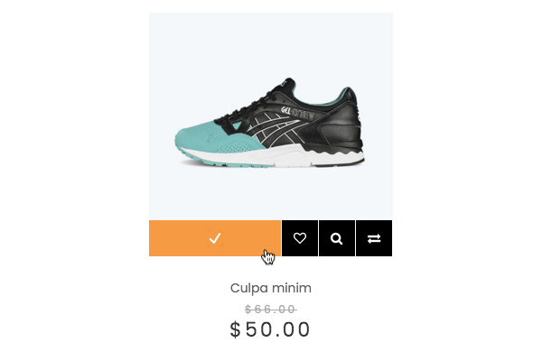
FcStore; another WooCommerce theme, takes a less literal approach, instead offering me a simple check mark to indicate that I’ve successfully added my product to the cart.
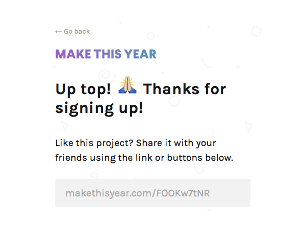
Forms are the classic example of situations where users absolutely need feedback. Did the form submit correctly? Did I mess anything up? Here, Make This Year use some personable copy and a high-five emoji to great effect. Clearly I did sign up for their newsletter.
It’s Been Emotional
By focusing on discoverability and feedback, you’ll ensure that users connect with your website. Tap into their behavioural traits, help them understand and predict what’s happening, and you’ll ultimately make them feel good about about your product. As two last references for inspiration, you should check out Aarron Walter’s book Designing for Emotion, and Don Norman’s TED talk 3 ways good design makes you happy.