When it comes to designing a logo for your brand, the usual tips are hard to miss: keep it simple, keep it clean, and make it memorable. Many hugely successful logos rely on symbols and images and can send their message across without featuring any text at all, but usually logos showcase the company behind the brand by clearly stating its name. The dos and don’ts of logo design remain vital for both pictorial and textual logos, but in the case of the latter there is one major point to consider first and foremost: the font.
Making the Case for All Caps
Font can be a tricky business; it can either make or break the point you are trying to send across. The first thing you need to consider is capitalization: should you go lowercase or uppercase for your logo, or perhaps mixed? In general, uppercase sends along a message of strength, stability and reliability to your clients; it also suggests that you operate within an industry that is focused on these things and bridges traditional elements with future goals. It is regularly chosen by brands that dominate a market and want to send a clear message of their sturdy presence to potential clients and competitors alike.
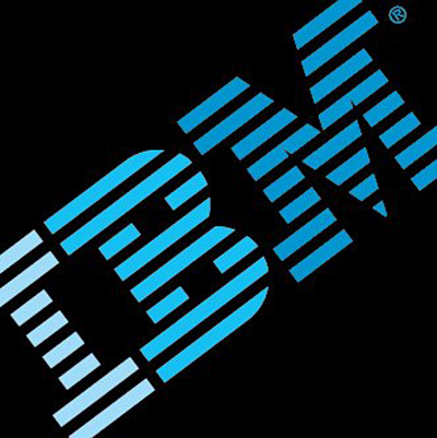
Consider for example tech titans IBM and SONY, news networks that rely on trustworthiness, such as CNN and BBC, credit provider VISA, automobile manufacturers like BMW or NISSAN, or even leading furniture and home accessories company IKEA. Uppercase seems to make people feel they can depend on the company and that they will be taken care of. In fact, a psychology study led by researchers from the University of Valencia suggests that people are more prone to remember and identify a brand name if the logo is uppercase. The survey, which included showing 20 volunteers pictures of familiar brand names, 52 of which were written in uppercase letters and another 52 in lowercase, supports the notion that, in any event, the case of the letters forming a logo plays a significant part for brand recognition. This evidence revisits former psychological beliefs that it was mainly the abstract letters’ identity that is crucial to consumers.
Lowercase: Casual and Creative
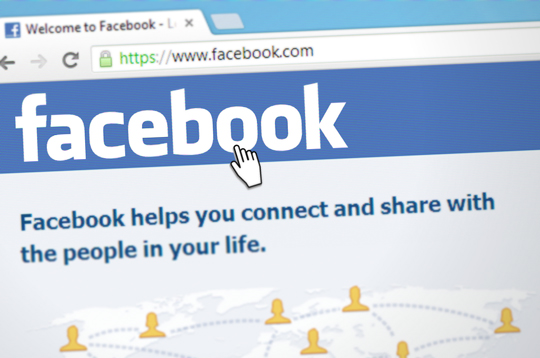
On the other hand, lowercase letters seem more approachable and allow clients to feel more connected with their preferred brands. Lowercase also seems to be associated with a view to the future (instead of relying too much on tradition) and innovation, along with playfulness and creativity. Brands which want to emphasize that they are shaping the future, like amazon, airbnb and facebook, have all chosen lowercase formatting.
In the gaming arena, providers like live-streaming video platform twitch, online casino site bet way, and indie games publisher nkidu have gone for lowercase logos in an effort to tap into the excitement and repose associated with recreational activities. After all, P. Williams, a marketing professor at the University of Pennsylvania, has described lowercase logos as being more casual and more conversational.
In fact, a lot of brands in the past have made the shift from uppercase to lowercase, arguably in an effort to underline such qualities and look more modern; in essence, lowercase works as reinventing oneself as a “brand of the future”. Examples include brands noted above: amazon, facebook, ebay, citibank, and xerox all moved from first letter capitalization to all lowercase. Furthermore, Aramark, BP and NibMor have all switched the text in their logos from all caps to all lowercase – allowing them to appear more appealing across different client demographics and signifying change and freshness, in line with the principles they want to promote as part of their corporate culture.
In the case of NibMor chocolates for example, who take pride in manufacturing organic chocolate bars that steer clear of GMO elements and are suitable for a vegan and gluten-free diet, a lowercase logo is more easily connected with the qualities of natural, socially responsible and handmade products they showcase.
Another case at hand is AOL, which switched from all caps to just capitalizing the first letter as part of a very bold rebranding move it underwent in order to restore its market position. The new logo signified creativity and open-mindedness and tried to attract younger audiences that saw the once-leading internet services provider as the internet of their parents’ era.
Beyond the Lowercase vs. Uppercase Divide
A mixed-case logo is also a good idea if you want to signal timelessness; the added benefit is that you can play to both sides without having to reinvent your logo every now and then. According to a survey, 44% of the top 50 brands and logos used both lower and uppercase in their logo designs. Coca-Cola tops the list, leaving Microsoft in second place, having created a truly iconic logo that has changed little over time after it was first introduced back in 1886. There are also other things to consider when choosing a font for your logo. Color and style for example, are extremely important.
A traditional font will appeal more to older demographics, but if you are targeting a younger audience you might want to go for something more out of the box. Spacing – or kerning, as it is known within the design industry – is also hugely important, as visual comfort or lack of it might attract or discourage clients accordingly.
To put it in a nutshell, choosing the right font in the right case is just as pivotal as any other part of your logo, since aesthetics play an important role on the subconscious level; clients will probably associate your ability to send the correct signal with your brand’s ability to deliver the promised services. Ultimately, whichever way you go depends on the type of business you are in and the kind of message you want to send across.
In Content Brand References:
– IKEA: Furniture & Home Furnishings
– IBM: Global Cloud Platform and Cognitive Solutions Company
– betway casino: Online Gaming Platform
– nibmor: Organic & Natural Dark Chocolate