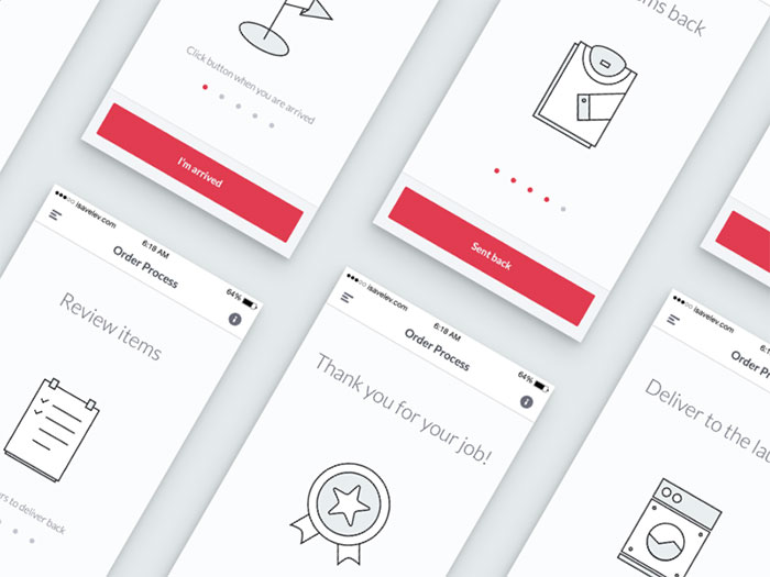
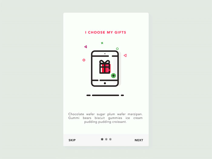
Image source: Dan Machado[2]
There are so many walkthroughs-misuse situations, that it is questionable whether designers really understand their purpose. There are many complex apps which don’t have walkthroughs, the same as simple ones which don’t need them, but they still incorporated them in their design. This makes the decision on whether to use walkthroughs a really tough one.
We hope that at the end of this article, you’ll be able to understand whether you should create a guide for your app, so get ready to save/spend some bucks!
How to design an app walkthrough

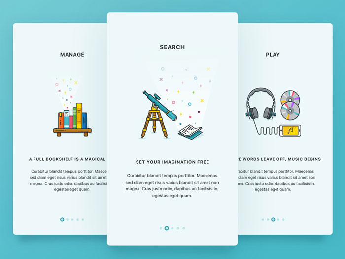
Image source: Igor Savelev[3]
When deciding whether to implement a walkthrough or not, think about your users and the patterns they are used to follow. The most difficult part is to balance between functionality and simplicity, and to implement precise walkthroughs everyone could understand.
Be careful with design
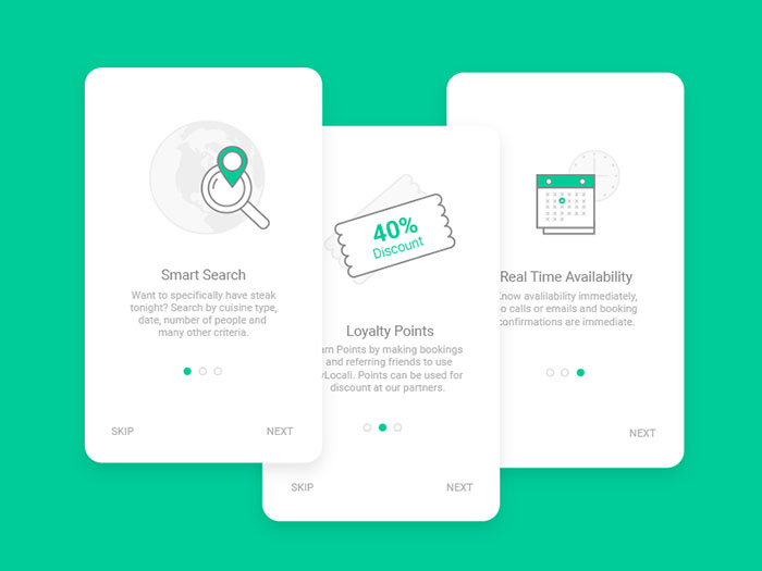
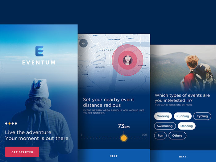
Image source: Nitesh Chandora[4]
Walkthroughs come last, once the entire app has been designed and tried. Many designers attempt to create a guideline before the app is created, which usually causes many inconsistencies.
Always try to design a walkthrough that is equally consistent and solid as the essential parts of your app. In addition, consider that your users’ first encounter with your app will happen through the walkthrough, so make it as catchy as you can. The walkthrough should fit the overall appearance and style of your brand in order to look like an inseparable part of your app.
Inseparable walkthroughs
The more you integrate your walkthrough within the app, the more it will be applied by the users. On the other hand, adding it as a separate part would make it look like a second-thought tool which is not useful.
Separate walkthroughs, however, are recommended in certain occasions-complex apps with high functions, as well as steep learning curve apps benefit from this tool, as they give priority to long-term efficiency learning, instead of short-term usability.
All things considered, your app will be more efficient if you take time to create a walkthrough inside it, and give users a really contextual experience. There are a lot of means that can help you achieve this-reveals, pop up messages, hints, etc. If you’re not sure how to do it follow the patterns of outstanding apps.
Make it fun
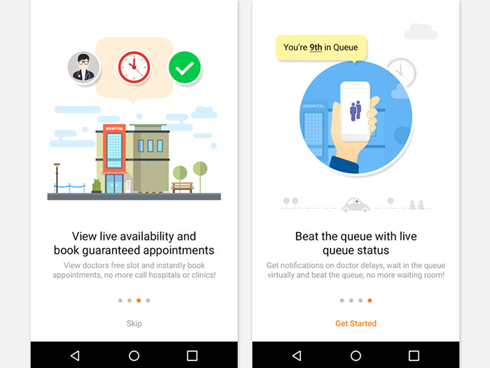
Image source: Kumar Vivek[6]
Just because the walkthrough should be educative and detailed, doesn’t mean it has to bore your users. The general rule is that people remember more stuff if they are presented to them in an interactive way. Their general impression would be that your app is fun and entertaining, and they would have no second thought whether to use it.
Decently executed walkthroughs are more than useful-they excite people and they create passion for using your product.
Motion and graphics
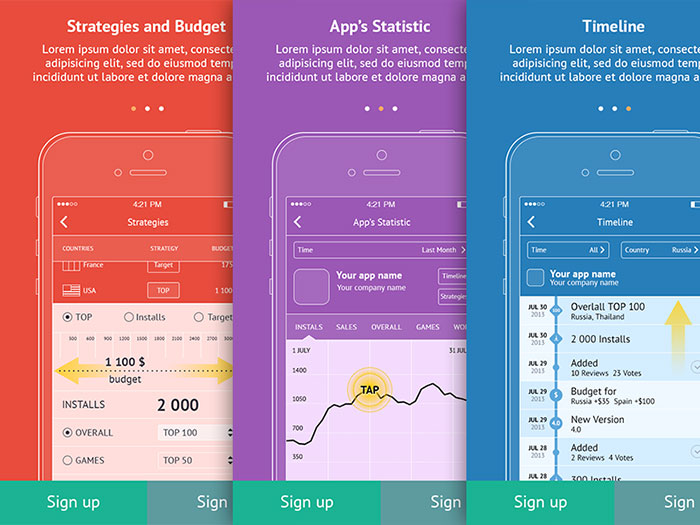
Image source: Sergey Zolotnikov[7]
Designing an app walkthrough should be a pleasure for the designer. Give your walkthrough some ‘soul’ and incorporate animations and graphics to keep users engaged. Motion is the perfect mean to present the functionality of your app in an engaging and enjoyable way.
Few lively images, cute animations or professional graphics will convince users that you really care about their experience and that you really want them to learn to use your app. One thing is for sure- a ‘jumping’ and ‘rolling’ walkthrough is much more capable of retaining attention than a classic textual one.
Role
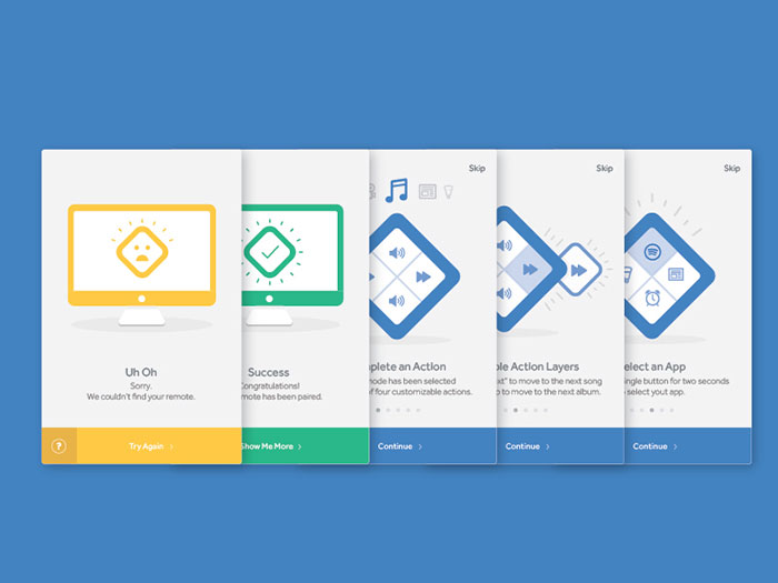
Image source: Justin Schafer[8]
A well-executed walkthrough will be hardly noticeable and it will appear only when needed. In fact, clear and precise app design should always strive towards eliminating the ever-present elements (for instance, the help menu) from the screen’s real estate.
As such, walkthroughs should never fail to appear when needed and they should be fully functional when users apply them.
Voluntary character
Have in mind there will also be users who don’t want to do the walkthrough, or they are already familiar with the options your app can offer. Therefore, give users an option to choose whether they want to do it or not- the thing which you shouldn’t allow is to lose users because they had no option to skip your walkthrough.
The easiest way to do that is to include a ‘Skip’ or ‘Cancel’ button in one of upper corners. However, you can be creative and think of original and more personalized sentences (for instance, ‘I got it!’). A fast swiping option is also an idea for those who prefer to see whether something is worth their attention before they start doing it.
Clarify your intentions
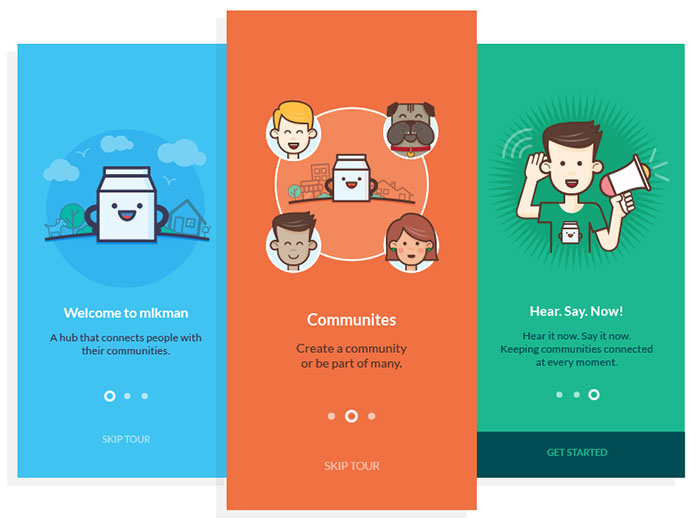
Image source: Mabelle Montina[9]
Do you want your users to have a simple tour of the app and to see what it contains; or you want to provide them a guide which explains how different actions are being performed? The best moment to introduce your functions is while the user is creating a profile within the app.
The main tips you should have in mind when creating a walkthrough
As we already mentioned, great walkthroughs are not easy to make, especially if you are adding them to an already designed app. However, almost every problem could be solved with proper scaling and appropriate, environment-orientated context. What designers should do from the very beginning is to focus on final users and their pattern expectations, and to determine the extent of the perfect walkthrough for their UX.
Don’t lose focus from the user
Image source: Nick Holmer[10]
Being focused on your user will require:
- To understand the user and to create a role-user based on the information you obtained;
- To think about your users while you are designing (adapting your design to their goals and expectations);
- To test and evaluate the power of your design –testing is essential in order to evaluate whether users like and understand tour app, and whether your app will be usable at the first place.
Prefer functionality to simplicity
High-function apps cannot be too simple. Automatically, they will require slightly more time and effort to be understood. It is up to the designer to get to know his users and to decide on the scale of the appropriate walkthrough for that app.
For apps with minimal UI, a proper walkthrough would require fundamental UX modification. It means that ease and simplicity have to be sacrificed in order to enable long-time utility and familiarization with the app.
You need to consider the needs and aims of every stakeholder
Users are not the only party whose needs and expectations concern walkthroughs. Designers should think of every stakeholder whose aims are relevant to the product or the design scheme. In fact, the designer should learn them and understand them in order to measure their influence on the overall success of that app.
Duration
As you already know, users have limited time to devote to your walkthrough. Long walkthroughs can be annoying for impatient users and it could affect their overall understanding of the app’s functions.
Besides, it is very likely that even those who have time to check the walkthrough will only swipe around it. There are also such who don’t want to be a part of the walkthrough, but to begin using the app right away.
Long story short, you have to develop a different approach for every group of users-simplified walkthroughs for novice users, accelerating (skipping) options for slightly interested ones; and a ‘Cancel’ option for those who have no interest to see it.
Ending thoughts
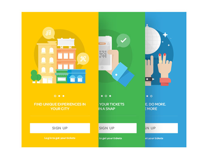
Image source: Lumen Bigott[13]
Those of you, who want a successful walkthrough in their app, should keep the following things in mind. Be innovative and use technology to improve users’ experience. Also, don’t lose focus from your users’ aims and the ultimate business goals.
You should consider stakeholders and exchange practices. The thing you prefer is not always the right one. Ask stakeholders to participate in the research-once again, the purpose is to defocus from your own ideas and to choose the best option.
References
- ^ UI design (www.designyourway.net)
- ^ Dan Machado (dribbble.com)
- ^ Igor Savelev (isavelev.com)
- ^ Nitesh Chandora (www.behance.net)
- ^ Shaun (dribbble.com)
- ^ Kumar Vivek (work.i2fly.com)
- ^ Sergey Zolotnikov (www.behance.net)
- ^ Justin Schafer (dribbble.com)
- ^ Mabelle Montina (mabellemontina.com)
- ^ Nick Holmer (dribbble.com)
- ^ Rob Luke (dribbble.com)
- ^ Valentin (valentinsalmon.com)
- ^ Lumen Bigott (dribbble.com)
- ^ Say something to Bogdan Sandu about this article. (twitter.com)