
It is a tricky task-we are not discussing content that will be opened once/twice, but such that will be browsed while users sit in waiting rooms, travel in the subway, rest in their beds, etc.
Regular usage opens the door for other challenges too-mobile screens’ responsiveness depends on lighting, and it produces a completely different image in bright sunshine than total darkness. Well-executed typography needs to remain visible under all conditions.
Last, but not least, typography ought to respond to your audience’s needs and expectations. Don’t forget that people have advanced knowledge and serious experience when it comes to web typography, and they want a responsive website with minimal chance for errors.
How to choose the appropriate font for smaller screens

Image source: Tyler Galpin[3]
Remember your ultimate purpose-everything you’ve written on the website is directed towards the accomplishment of your users’ goals.
How safe it is to assume that the marvelous choice you’ve made for the desktop version is going to function on mobile screens too? Practice shows that no matter how good your desktop fonts are, they fail to deliver results when applied on small screens. In order to provide the greatest experience we can, we should start from scratch and reconsider completely new mobile typefaces.
You could have the best content ever – if it proves to be non-responsive, it will not attract users. The trick is to identify with your users and to think about the way in which they use their mobile devices.
Effective and eye-catchy fonts are critical for the success of your web design. This counts especially for mobile design, where specially adapted fonts leave almost no possibility for a mistake.
Breaking down a typeface designed for bigger screens is not enough.
The importance of choosing the best font for mobile design

Image source: Murat Gursoy[4]
Yes, we’ve advanced a lot since the time of printing press and metal typesetting. However, this doesn’t mean typography is not challenging anymore – if you ask us, it is equally problematic and complicated as it used to be. Therefore, it is not strange for a designer to get lost in the sea of fonts; and to search for guidelines.
There are few factors that can help you choose the best font for mobile website or app and to ensure they’re flexible and functional. Choosing a font that you like without checking specific performances is not going to take you to your destination.
Appearances say a lot. Take this real life example – people tend to make wrong assumptions based on your clothing, style, income, or age. Sometimes, it is even you who is trying to impose the wrong impression. And… it works!
Image source: Michal Soukup[5]
Appearance also depends on the nature of the situation-a pajama is not suitable for a job interview, the same way an official suit is not cut for picnics. Therefore, you need to adjust web appearance to the conditions in which it is going to be met.
You wear your clothes with purpose, the same way you make font choices. Thanks to the font you use, you can invoke a positive/negative first impression that people will use to make an overall estimation of your web presence. Therefore, choose fonts that are appropriate and aim-orientated.
A quick reminder: fonts are an equally important element of a user-oriented design, as brave images and bold color schemes.
Your typography choice can attract or discourage a user. You’d say it’s an easy task, since there are a lot of available fonts to choose from, but the reality is that only a handful of them are a guarantee for success.
It is not rare for fonts to be decisive on quality, and to influence users’ entire perception about your design. The worse your font choice is, the more it will distract users from your content, message or purpose.
The basics of choosing the best font for mobile websites or mobile apps

Image source: Prakhar Neel Sharma[7]
To start with, you need a font that complies clearly with the purpose and message of your design. Before starting the hunt for a free/paid font on the web, think about the essence of your content and the overall values of your design. What is the exact thing you want to communicate to your users?
Tapping is the future
Image source: Afrian Hanafi[8]
One of the reasons why typing is so successful is that it enables users and their devices to build a more personal relationship in every situation.
While observing a user tapping on his phone, one of the things that would certainly draw your attention is their screen proximity. The most intimate relationship occurs in a relaxed environments (home, office).
The reduced size of mobile devices forces users to keep them closer to their eyes, which also contributes to the psychological connection between the user and your websites’ design. Therefore, you must provide readability-otherwise, your design will not be successful.
Finding that right font
As we already emphasized, font choice is essential for mobile readability. Larger letterforms seem suitable at first sight, but they also happen to break down to smaller ones. Scaling the fonts, however, makes the achievement of readability even more complicated. Users of Retina screens definitely know this.
Basic ideas for ensuring responsiveness
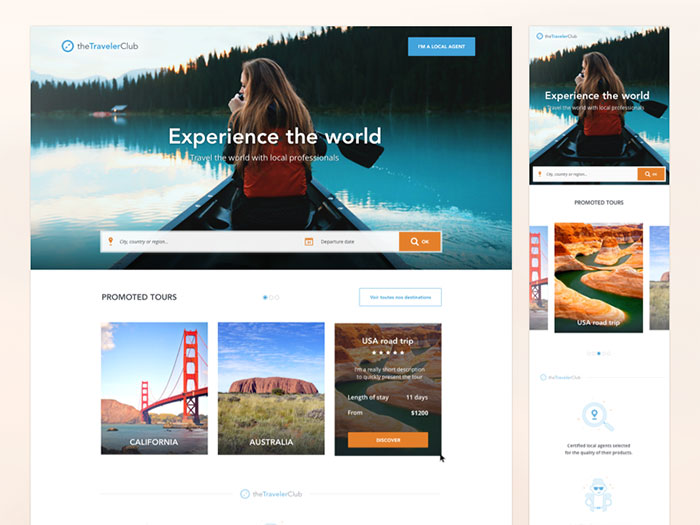
Image source: Kevin Cdnc[10]
Responsive design practices enable you to deliver readable content, even without abiding the ‘one size for all’ rules.
Responsive web typography is designed with pixels, unlike desktop/print fonts which work with point systems. This ensures some additional flexibility.
Your creativity will not be endangered, as you are not required to replicate the same font on all pages, but to employ different ones that will help users read your content. Remember that your goal is not to maintain consistency, but to design a positive reading experience regardless of the screen size.
These are the essential areas of responsiveness that you should take into account:
- Loading time
- Different CSS styles
- Fonts
The effect of light and movement
Image source: Maksim Shavkutenko[11]
The responsiveness variables are: the quality of internet connection; the dispersal of light; and movement. Our personal opinion is that light is the most important one, as it can be a serious drawback when reading content.
When it comes to movement, it is crucially important to empower stable typography, easily understandable even when the user is moving. Wherever your user might be, your goal has to remain the same: Grab and maintain his attention!
Interestingly enough, you have to consider the physical barriers of users trying to interact with your website-the hands and the screen edges. As we all know, a desktop is easily navigated with a mouse or a scroll pad, but the main mobile navigation tool is the user’s finger (big enough to block a large part of the screen).
Choosing the appropriate typography style
Choosing an appropriate mobile typography style is not simply recommendable-it is absolutely necessary!
Deciding on size

Image source: Rudityas W Anggoro[12]
Unfortunately, we cannot talk about default sizes that could fit every mobile screen. However, you can use the following guideline: fonts smaller than 16 pixels are difficult to understand; and they cause a confusion when locating the beginning and the end of the text.
Deciding on space
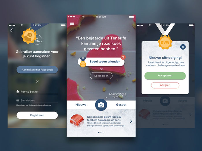
Image source: Remco Bakker[13]
Space should not be overlooked, especially when using a website on a small, vertical screen. As we mentioned, there are many external factors that can influence readability (lighting, motion, finger blocking, etc), which is exactly why extra space is so welcomed.
Due to the small screen size, users have problems to read sentences/paragraphs that stand close to each other. Desktop design deals with this problem using line heights, which is still a huge challenge for mobile designers.
Deciding on layout
Layout can also play an important role for readability and user experience. For instance, shorter (or left adjusted) line lights disrupt the expected reading flow and they distract the user.
The final goal: performance and functionality
Image source: Nimasha Sewwandi Perera[14]
After complying with all of the aforementioned requirements, we’re supposed to have arrived to our final destination- a responsive, perfectly functional site. A well-executed website loads pages quickly and leaves no space for mistakes and reworking.
When it comes to performance, you should consider that you’re not the solemn culprit for slower reading or low-quality access. This can happen to users who are moving, or have unreliable and low bandwidth internet connections. This is not good news for those whose websites use a wide range of @font-face fonts, because such typefaces can decrease significantly the downloading power of the site.
You could set and include your own files, or you could hire professional assistance such as web font services. In both of the cases, a user ought to download the fonts in order to use the website.
Ending thoughts
Image source: Austin Tapper[15]
Overall, we could conclude that the general principles of great typography apply also to mobile web design. The fonts we choose ought to be simple, with easily readable letterforms and some decent spacing.
Due to the growing popularity of mobile devices, each website we create ought to be adjusted to mobile standards. This adjustment is the leading procedure for increasing your business’s productiveness and for attracting a massive audience towards your website. Therefore, don’t just be available-be mobile-friendly!
Before you start adjusting your work to mobile standard, makes sure you’ve checked all of the specific features of the targeted devices, so that you’ll enable as many people as possible to use it. The general rule is that design has to fit the needs of your user.
Once you’ve discovered the perfect font, test it.