In days gone by, books were originally handwritten by monks in monasteries. Later on, they were created out of wooden or metal type, which was used as a part of a printing process. Using typography, therefore, has a long legacy.
In a world where many focus on a drop down menu and the size of a font, how do we tap into typography’s regal history and add interest to resumes, newsletters or business cards?
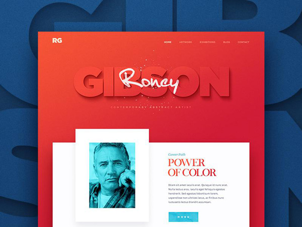
Match the Mood
If you’re unfamiliar with a font or rely on a constant favorite for all of your designs, you might be missing the opportunity to add personality to your work.
Each typeface offers its own sense of style or mood. Some are sleek and modern, others elaborate and elegant. Some fonts are playful and silly. Others offer a sense of occasion. By adjusting your font to the needs of your design, you are able to communicate a message.
If you’re looking at using a font to create a unique design, brainstorm what you’d like to achieve or communicate. If you have access to the content of a site and know what is being said, you can adjust your font accordingly, adding to the message.
Also, think of the style you want to use. If you don’t have an Illustrator background, see what you can do with PS. There are lots of typography Photoshop tutorials out there that can help you.
Start with the body copy
When matching your message to a font, start with the body copy. When you develop a typeface, which is both easy to read, and which sends out a message, you’ll have the main design for the body of your text.
The Baymard Institute share that when designing your page, it is helpful to stick to 50 to 60 characters per line (or column). Use this guideline to help you to select a text which is easy to read using the different typeface options.
Create a scale
When you have identified the font you will use and have an idea of how you want to arrange the copy, you can set a scale, balancing the different elements on your page. These include your body copy, headings and subheadings, quotes, navigation panel, and any legal copy or disclaimers you add to your page.
Determine the typeface and size of each font you use. Many designers use size as their starting point, increasing headings by 200% when compared to body copy, and then making subheadings bold. You can use a grid to work on scale. This will assist with creating a hierarchy for your content.
Measure your lines
Measure refers to length. When working with measure, remember that you want your reader to be comfortable.
Lines of text which are too long (or too short) can be uncomfortable. Long lines can be tiring because the reader has to move his eye across the page. Short lines are only acceptable when there is very little text. Try to use 40 to 80 characters on a line for optimal results. This would include spaces.
Look at leading space
Leading (or the line space in your text body) assists with pulling information together and helps to make the text more readable. When lines are correctly spaced, it is easier for the reader to follow the text.
Leading will alter the color of the font, giving it a denser tone. Many different factors influence leading. These include size, the typeface used, measure and weight. The larger your text, the less leading is required. It’s often helpful to use a guide of font size x 1.25 to get the leading measurement or to make the leading 2 to 5 points larger than the font size.
Indent Hanging quotes
The eye looks for straight lines everywhere, and when these lines are indented because of hanging quotes, the text no longer seems to flow.
As a result, it is often a good idea to hang quotes in the margins, so that the left margin is not disrupted, and the reader still feels as though the text has rhythm. When the left margin remains intact, the result is increased readability.
Create Vertical rhythm
Vertical rhythm means keeping vertical spaces on a page consistent with each other. When you are designing a page, your goal is for your readers to be able to easily scan and absorb information. A continual flow enables you to keep text in balance, no matter which font is used, the size of the text or the leading or measure used.
To ensure that text will flow, keep the spacing between both letters and lines of text equal. You could set both your text and the lines between them at 16 points. Then work in multiples of this number.
To do this, you can use a baseline grid in order to achieve a sense of conformity and flow. Your page will look more orderly and more professional while being easier to read.
Combine measure and leading
Your leading or the spaces between lines should always be larger than the spaces between words. This is because the eye will then move along the lines rather than down or between lines.
If the width of your copy, or measure, is wider than recommended for easy reading, then you could always increase the leading. This will ensure your text remains legible.
Measure and leading are best when used in combination. The smaller your measure, the smaller your leading. This simple rule will ensure your text is easy to read.
Highlighting
When you want to highlight or place emphasis on a specific word, drawing the reader’s attention, it is often possible to use a different typeface. Italics are often used to create emphasis, but using caps, bold font, color, or a different typeface are also options.
However, when you wish to highlight or emphasize a text, stick to a single option. This will keep your text looking neat and clean and won’t disrupt your reader.
Keeping it clean
When the left side of your margin is aligned, but you haven’t justified the text, look at how to keep the uneven side (or ragged side) looking neat and clean without making awkward shapes in the text.
A ragged edge can distract the reader as well as feel chaotic. Soften edges by keeping line spaces as even as possible. This may mean making manual adjustments to the shape of your text.
Keep important text at the top of your design
When you arrange content on your page, keep the important text at the top. If you’re using hierarchies, this will mean the larger text such as headings, slogans or quotes are placed at the top of the page.
Your reader will be able to establish a sense of hierarchy and find out information quickly. Dedicated readers will scroll to the bottom of a page, where smaller, more nuanced content can be placed.
Using bolds and italics

Use bold and italics sparingly to add emphasis rather than distract the reader. You could limit how often you use these forms of typeface, or alternately limit them to headings, subheadings or quotes.
With the goal of creating a clean page which is easy to read, overuse of highlights can create a chaotic feel.
Ending thoughts
Using typography can create a sleek design which adds to the mood of a webpage, convincing clients they have come to the right place, and creating a smooth and easy reading experience.
Once you have created a scale, choice of font and hierarchy for your design, document your choice of styles and create a file so that your following designs in the project remain consistent. Use scale and hierarchy consistently and record your choices so that you make your project completion easier and more consistent.
Using text effectively will assist you to create a well organized and easily legible site which will give a message to your reader. With thought and careful design, typography will assist you to create a well-designed site which will add to user experience.