
Summary:
Contextual menus reduce clutter and interaction cost but have low information scent. Prioritize clarity, consistency, and proximity to balance the tradeoffs.
When used well, contextual menus help reduce visual noise, streamline layouts, and support focused interaction. But when used inconsistently, or when mislabeled, misplaced, or overloaded, they introduce confusion and can slow users down.
Contextual menus are sets of actions related to a specific UI element, an area of the interface, a piece of data in an application, or a view of the application. They are typically used to house secondary functions that people may need to occasionally use and, therefore, should be kept within reach.
These menus are contextual because their contents depend on what the user is interacting with. For example:
- A post’s contextual menu might include options like Edit, Pin, or Delete.
- A photo’s contextual menu might include Share, Download, or Set as Background.
- A calendar event’s contextual menu might include Delete, Reschedule, Duplicate, or Invite.
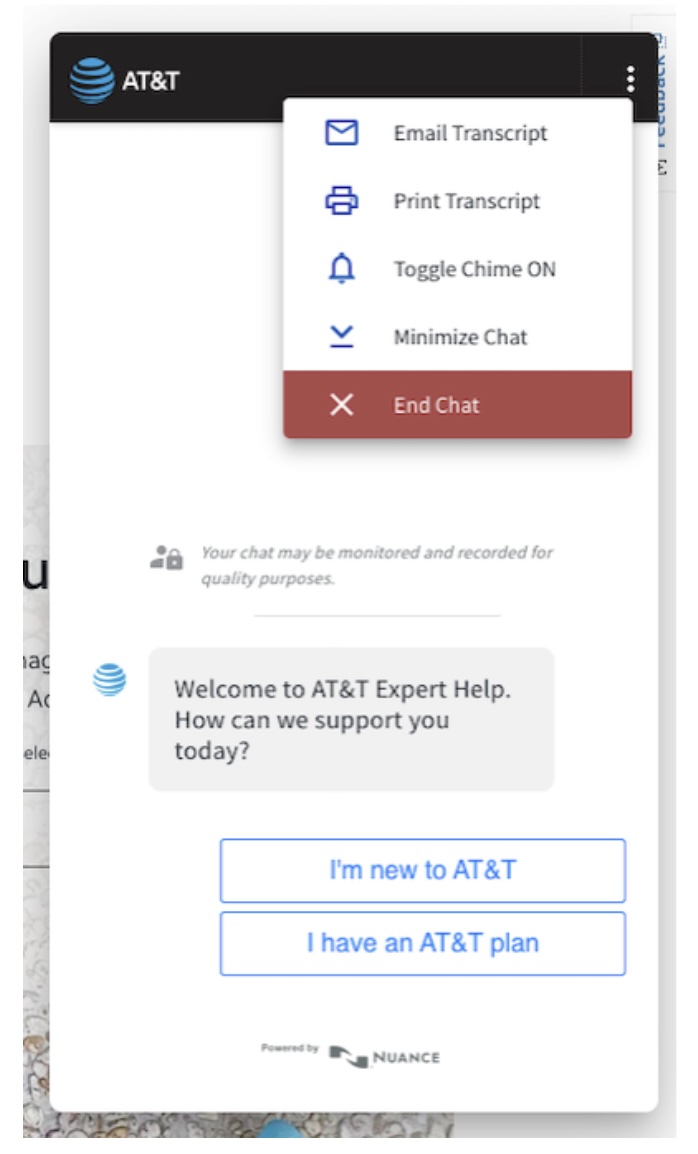
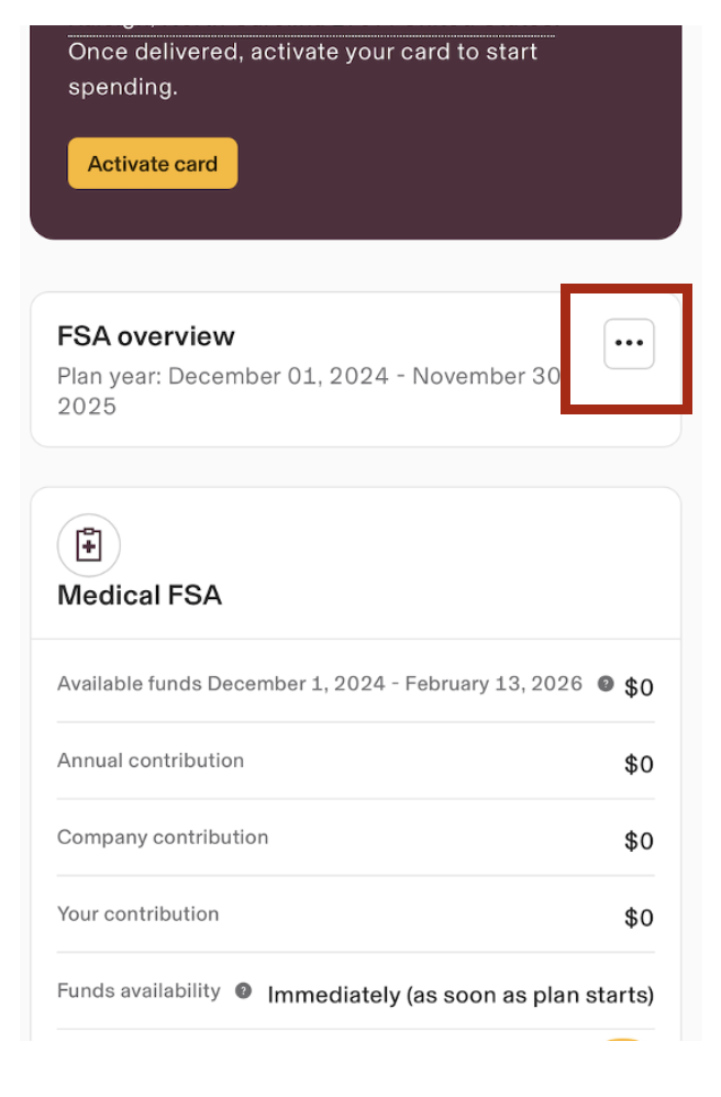
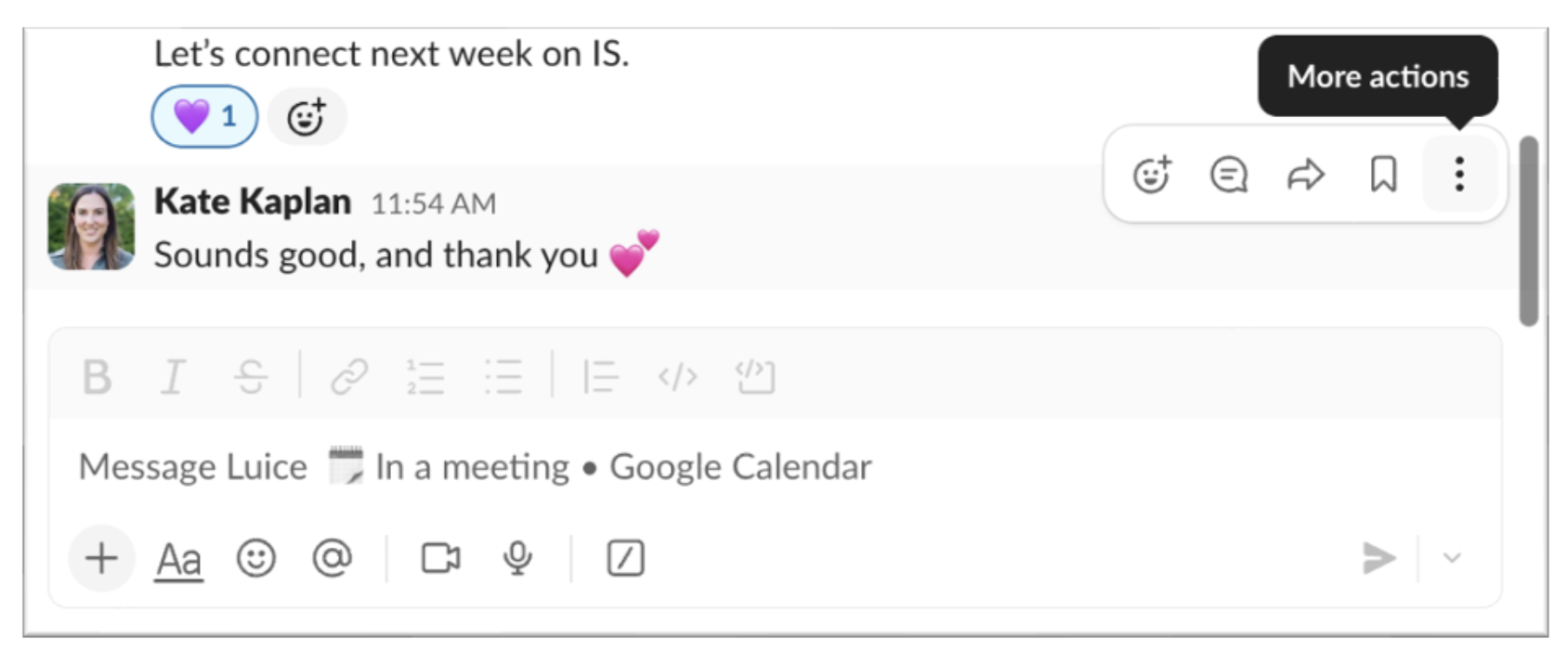
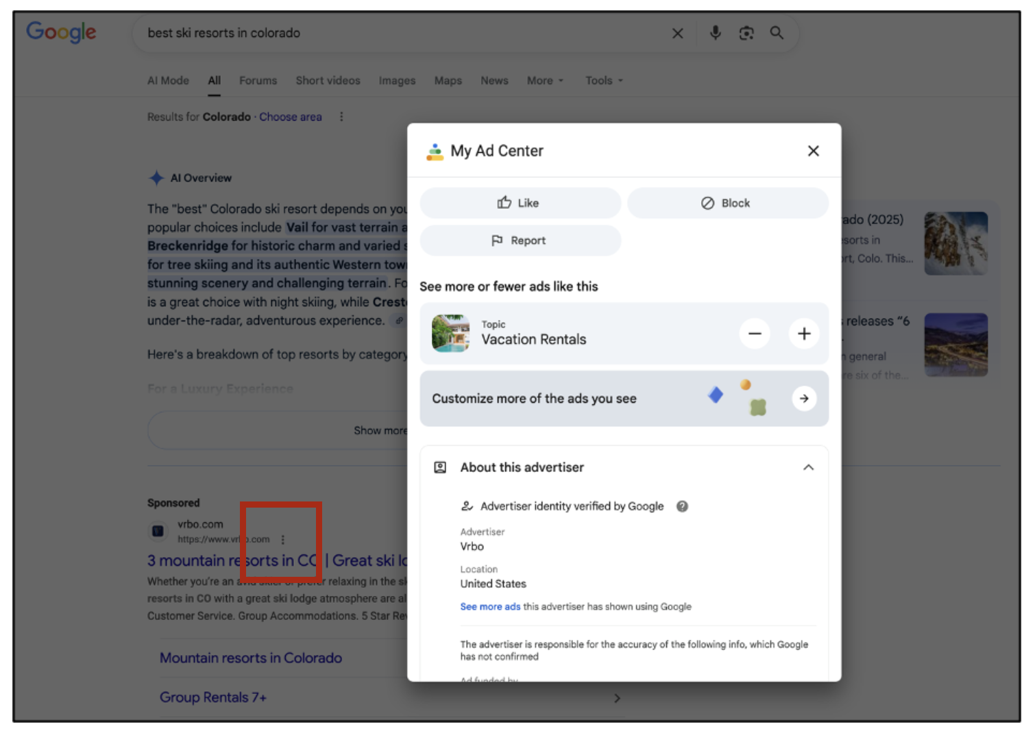
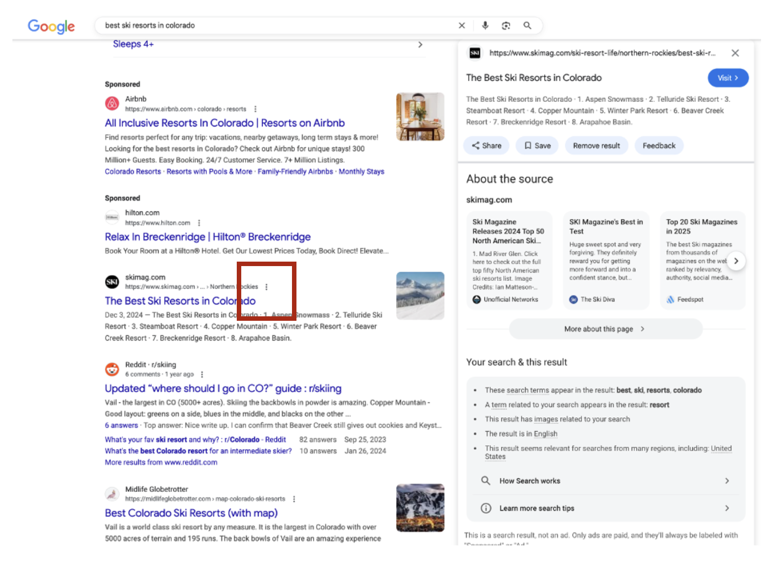
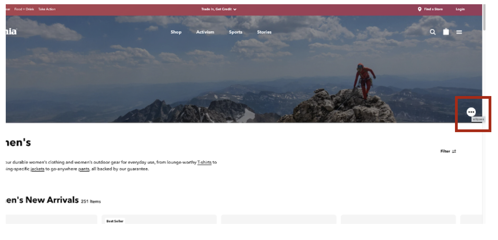
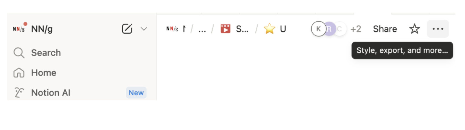
Contextual menus can be revealed in multiple ways, depending on the device and interaction model. On desktop, they often appear through right-clicks or two-finger clicks on a trackpad. On touch interfaces, they may appear after a long press on a specific element. Increasingly, though, designers use small icons, most commonly the kebab (⋮) or meatball (⋯) icons, to visually indicate the presence of a contextual menu.
These icon-based triggers began as mobile-design patterns, but they’ve since become common across desktop applications as well, serving as a recognizable shorthand for “related actions” or “additional options.”
Kebab and Meatball Icons are Recognizable
In research I conducted for the book Digital Icons that Work, participants were shown interfaces containing various icons, including kebab and meatball icons, and asked to describe and predict their functions.
Overall, both kebab (⋮) and meatball (⋯) icons were generally recognized to mean “more options” or “other actions,” as long as the icon followed the guidelines listed in this article. This was true across both mobile and desktop applications.
As one user describing the functionality of the icon explained:
“It usually means there’s some other set of functions or icons that are hidden temporarily that you can click on and get to.”
Both kebab and meatball icons are good choices for representing contextual menus within interfaces.
Despite this general understanding, users often had little idea what specific options were hidden behind the kebab and meatball icons because they have low information scent, even when recognizable.
In addition, some contextual menus were missed entirely when the corresponding icons were:
- Positioned too far from the content they affected
- Rendered too small
- Designed to be low contrast
And so, while contextual menus offer flexibility, they also introduce real usability challenges:
- Reduced findability: Icons representing contextual menus may be missed entirely, especially if they’re small, faint, or far away from the task focus area.
- Low information scent: Users can’t easily predict what the menu contains, making it harder to decide whether to potentially waste time sorting through it.
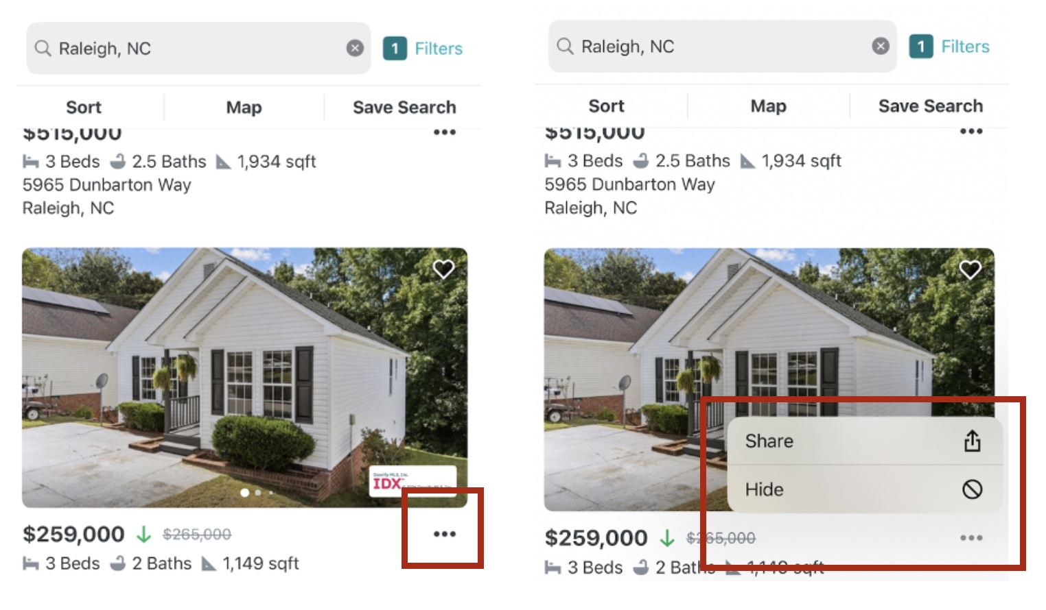
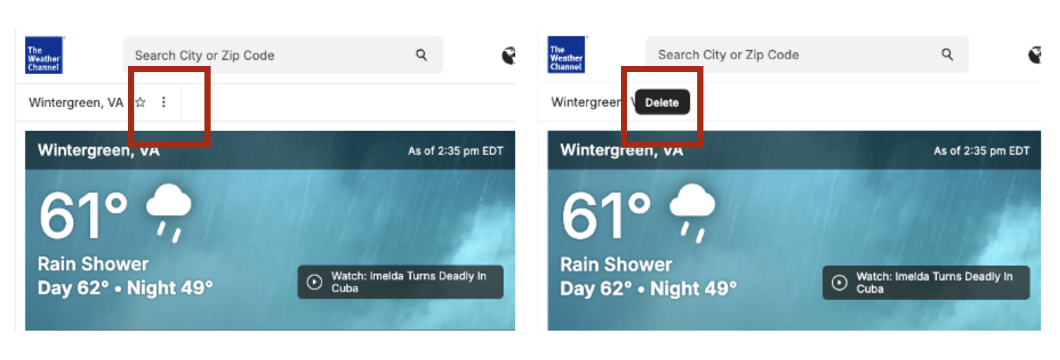
- Misinterpretation risk: Poor placement or inconsistent use may lead users to confuse contextual-menu icons with other functions, such as progress indicators or carousel controls (such as in the example below).
To use contextual menus effectively, designers must weigh their limitations against layout constraints, user expectations, and task prioritization.
1. Use Contextual Menus for Secondary, Noncritical Actions
Contextual menus are not appropriate for actions users rely on frequently. They are best used for secondary or low-priority options that can be accessed when needed but that shouldn’t distract from the core task flow.
- Do: Use research-informed judgement. Hide actions that are not primary but that are used enough that they need to be accessible.
- Don’t: Hide essential, high-frequency actions behind an extra tap or click.
Why: Users are less likely to find or use actions hidden in contextual menus, especially if they are expecting those actions to be visible by default. Burying key actions frustrates users who perform the task frequently.
2. Place Contextual Menus near the Content They Affect
Users rely on spatial proximity to interpret how an element is related to others on the page. The location of the contextual-menu icon should clearly indicate the object it relates to.
- Do: When the contextual menu applies to a specific element (in comparison to an entire screen or page), position its icon directly within or beside the object it controls or supports.
- Don’t: Place it randomly or ambiguously in the interface or far away from its associated element.
Why: Proximity reinforces context and helps users predict what actions the menu will contain.

3. Ensure Contextual-Menu-Icon Visibility with Sufficient Size and Contrast
Too often, contextual-menu icons are visually subtle to the point of invisibility, especially in small mobile interfaces or dense information areas, such as complex applications.
Why: Overly subtle visual design decreases discoverability. Contextual menus are often missed when their representative icons lack visual prominence.

4. Use Contextual Menus to Group Related, Contextual Actions
Contextual menus should group together actions that logically belong to the same object, element, or general hierarchy. Mixing unrelated options leads to confusion.
- Do: Group logically related options (e.g., Duplicate, Share, Delete for a file). If possible, surface a few action-related icons within the space before the overflow icon to add context and increase information scent for what other kinds of actions may be contained within the menu.
- Don’t: Group unrelated options or combine both global and element-specific actions within the same contextual menu.
Why: Groups of unrelated options reduce clarity, decrease findability, hinder spatial memorability, and increase cognitive load.
5. Maintain Consistent Representation and Behavior of Contextual Menus Across the Interface
Contextual-menu icons should have a consistent function, behavior, and appearance across the product. If you decide to use a meatball or kebab icon to represent contextual menus throughout the interface, use it consistently, and reserve it for contextual menus only.
- Do: Use the same icon to represent contextual menus consistently.
- Don’t: Repurpose the icon for unrelated interactions (e.g., using it to expand hidden content in one area, launch a popup in another, and open a side panel in yet another).
Why: Inconsistent usage erodes the user’s mental model and trust in the interface, as well as decreases learnability and memorability.
6. Use Tooltips or Labels to Clarify Ambiguous Contextual-Menu Icons
Because the kebab and meatball icons lack inherent meaning, small cues can greatly increase usability.
- Do: Include helpful labels or tooltips when possible. Be as specific as possible. For example, when the actions are element-specific, include descriptors such as Post Actions or Message Options. If possible, include these descriptions as visible labels for the icons; if not, enable descriptive tooltips on hover.
- Don’t: Leave the icon up for interpretation with no label or hover-state description, rely on ambiguous labels such as Options, or worse, use literal labels like Ellipses, which don’t provide any additional context.
Why: Overflow icons carry low information scent; text cues improve clarity.
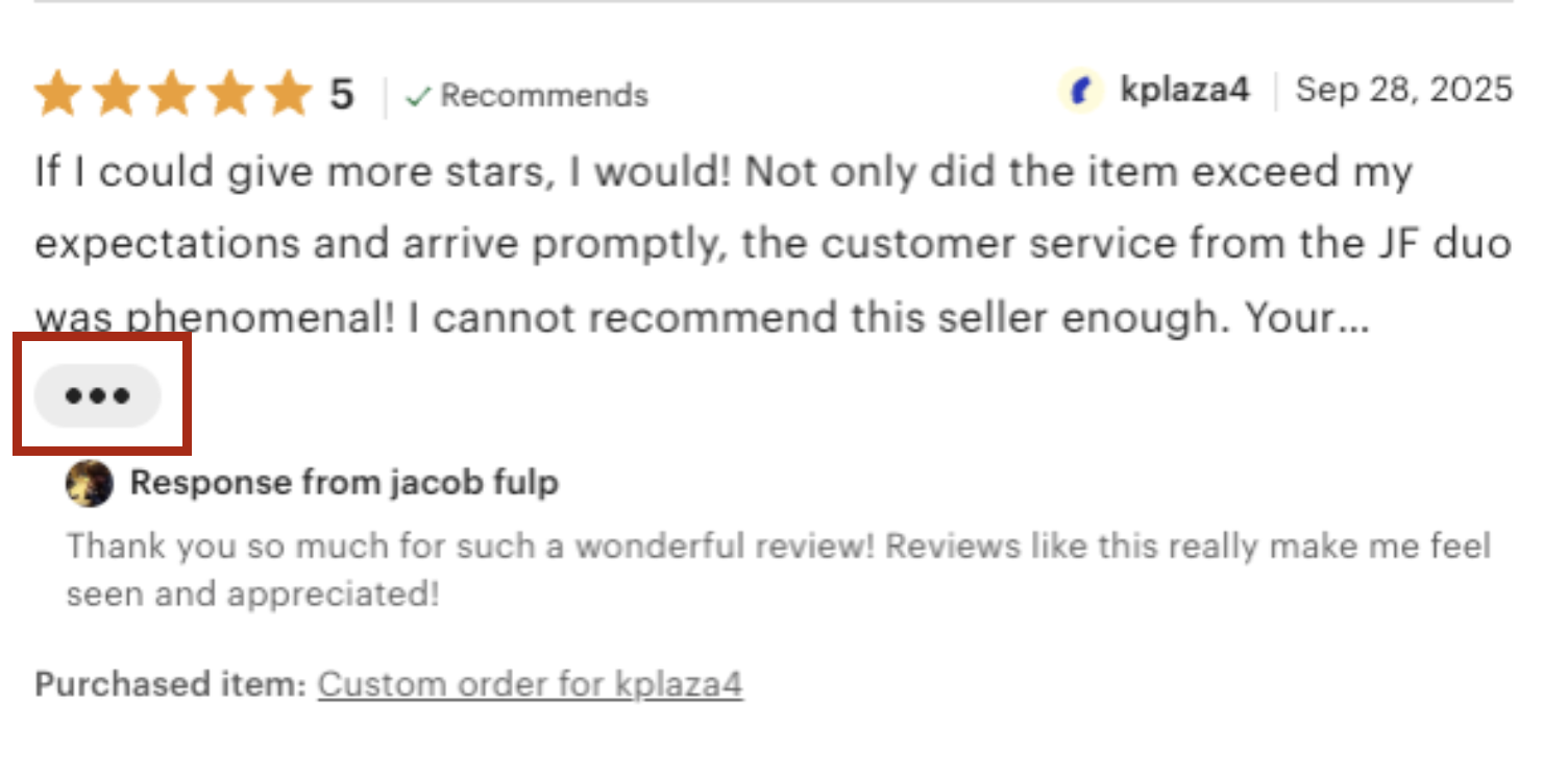
7. Use Contextual-Menu Icons for Showing Actions, Not Expanding Content
Do not use meatball or kebab icons to reveal hidden text or expand images.
- Do: Reserve meatball and kebab menu icons for revealing additional actions and options. When partial text content (e.g., a partial review or product description) can be expanded to show more, use explicit labels such as Read more or Expand.
- Don’t: Use these icons to expand text or images.
Why: These icons signal actions, not content expansion. Using them to reveal content misleads users and reduces clarity.

8. Avoid Using Contextual Menus for One (Or Very Few) Action(s)
If there are only one or two possible actions, don’t make users hunt for those actions behind an icon. That approach increases interaction cost unnecessarily.
- Do: Display single actions (or limited sets of actions) directly in the interface when possible.
- Don’t: Use contextual menus to hide one or two items that could easily be accommodated within the available space.
Why: By arbitrarily hiding one or two actions behind a kebab or meatball icon, you save no space, increase effort, and reduce discoverability. Especially when the action has a well-understood and standardized icon (e.g., an “x” or trashcan icon for deleting an item or a flag for reporting a post), hiding that functionality under an ambiguous icon does not save space.

9. Avoid Hamburger Icons for Triggering Contextual Menus
The hamburger icon (☰) is a widely recognized symbol for global or main navigation, while the kebab and meatball icons (⋮ or ⋯) are recognized as representing contextual actions tied to specific elements or groups of related actions. Misusing one for the other can create confusion and dilute both patterns’ clarity.
- Do: Use the hamburger icon exclusively for accessing main site or app navigation. Use kebab or meatball icons to surface secondary, item-specific actions.
- Don’t: Use the hamburger icon near content to reveal contextual actions. Likewise, don’t use kebab or meatball icons to house global actions like account settings or site-wide preferences.
Why: These icons have distinct and well-established meanings. Swapping their roles breaks users’ mental models, leading to hesitation and missed functionality.
10. Make Contextual Menus Keyboard and Screen Reader Accessible
Contextual menus must be usable by everyone. Users who do not use a mouse to click or fingers to tap need a way to access and interpret these menus efficiently.
- Do: Ensure contextual menus can be opened and navigated using keyboard shortcuts (e.g., tab, enter, arrow keys), and that their contents are fully readable and actionable via screen readers.
- Don’t: Design menus that are accessible only by clicking or tapping. Avoid custom interactions that break standard accessibility behaviors.
Why: Prioritizing accessibility helps all users, not just those with disabilities. It improves efficiency for power users and ensures your interface complies with inclusive design standards.
Conclusion
Contextual menus can streamline interfaces, reduce cognitive clutter, and support focused interaction when used appropriately. But because their discoverability and clarity are limited, they demand careful use. Balance minimalism with usability, reserving contextual menus for true secondary actions, placing them clearly and consistently, and using recognizable triggers.