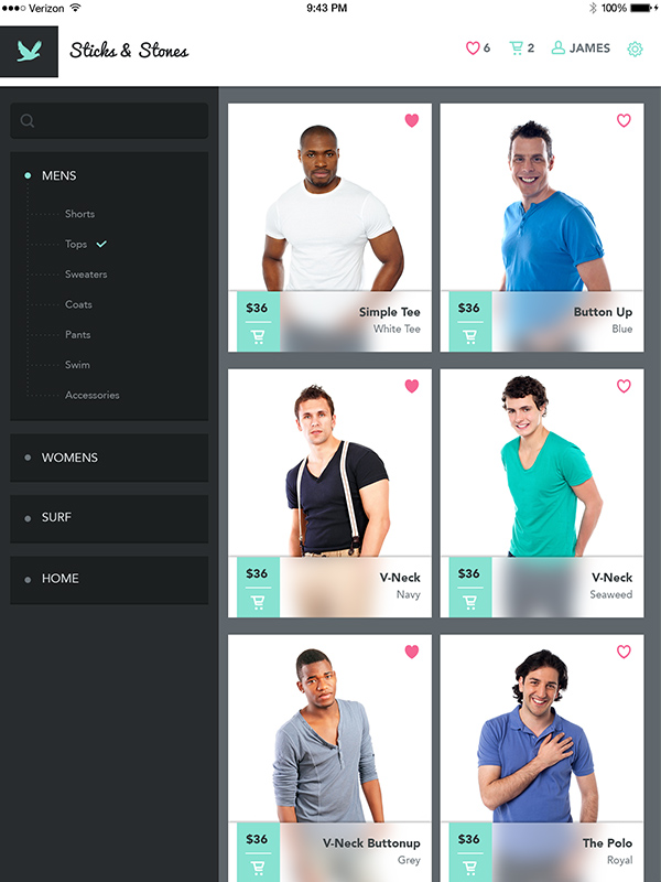
In this tutorial, I will show you the techniques used to create a modern and flat user interface (UI) design for an iPad app.
Tutorial Assets
To complete the tutorial you will need the following assets and plugins. Feel free to find alternative photos and fonts.
- GuideGuide Plugin for Photoshop
- 50 Mini Icons Set
- Additional Icons
- Pacifico Font
- Avenir (Black, Medium, Roman)
- Photo 01
- Photo 02
- Photo 03
- Photo 04
- Photo 05
- Photo 06
1. Create the Products Page
Step 1
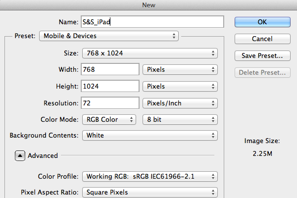
Create a new document (File > New…) using the settings shown below.
Step 2
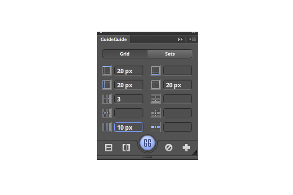
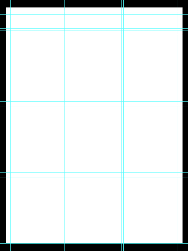
Create the grid (Window > Extensions > GuideGuide) using the settings below. Click the big purple GG Button in the middle to activate the guides.
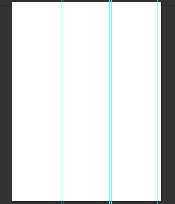
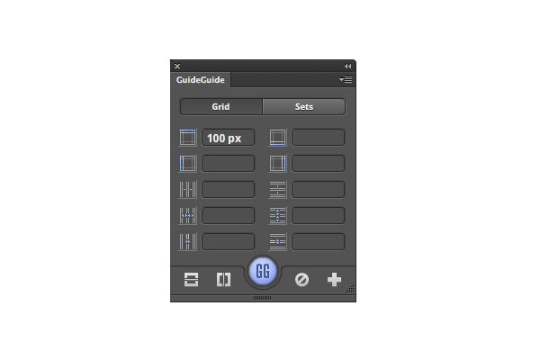
Now create a few additional guides. Delete all the measurements inside the GuideGuide Palette, except for the top margin, which you should change to 100px. Press the GG Button to add the new guide.
Using the Rectangular Marquee Tool, make a selection between the 20px and the 100px horizontal guides, and change the top margin in the GG Palette to 10px and the bottom to 10px.
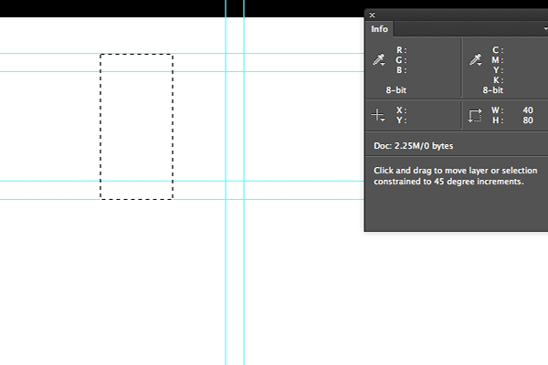
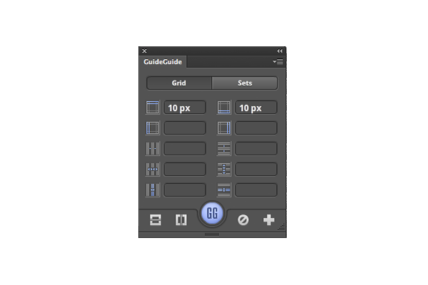
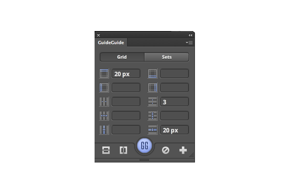
To finish off setting up your grid, use the Rectangular Marquee Tool to select everything under the 100px horizontal guide and enter the following for the margins, the columns and the gutters.
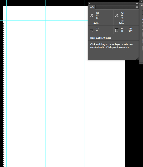
Now you should have something like this:
Step 3
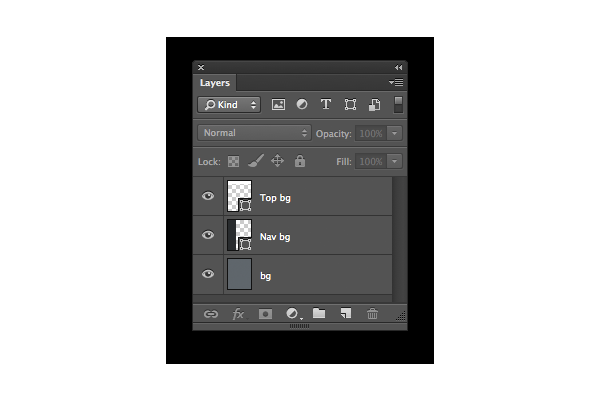
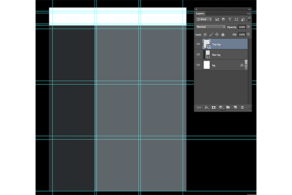
- Create a new layer with a
#5f666bfill. This is your background layer. Call it bg. - Use the Rectangle Tool to create a rectangle shape measuring 257px x 1024px, with a
#292c2efill. Name the layer Nav bg. All your navigation objects will go here. - Use the Rectangle Tool to create a rectangle shape measuring 768 x 100px with a
#fffffffill. This will be the background for the top bar area. Name this layer Top bg.
Step 4
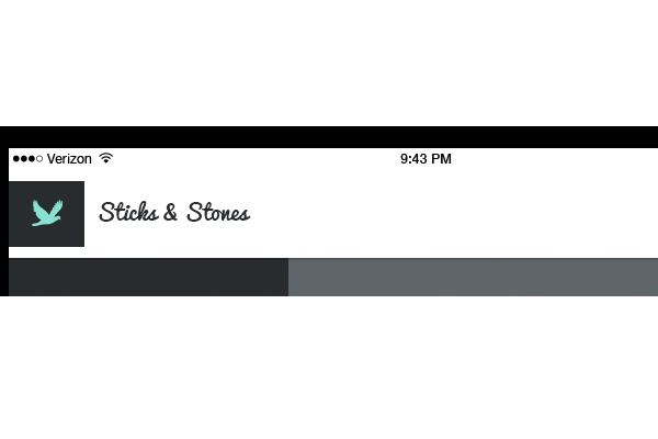
- Open the Additional Icons (provided in the tutorial assets above) and drag or duplicate the status bar layer to your canvas. Place it inside the top 20px margin.
- From the same Additional Icons PSD file, select the icons group and drag or duplicate the logo group onto your canvas.
- Next, on the logo bg layer, write “Sticks & Stones” using the Type Tool, Pacifico Font, 20px,
#292c2e.
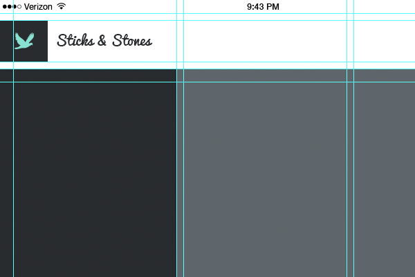
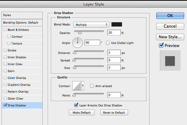
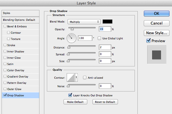
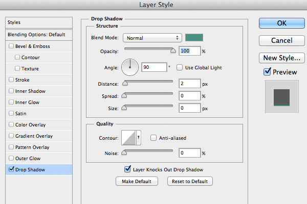
To add a drop shadow to the background, right click on the Top bg layer in the Layers Palette and select Blending Options at the top. Select Drop Shadow from the left menu of the layer styles window, fill in the following settings and click OK.
Step 5
Now it’s time to add the icons to your document.
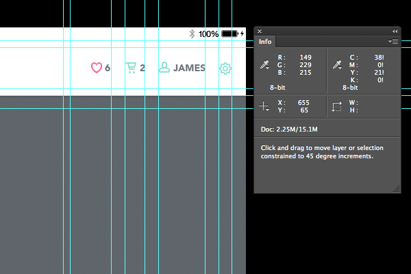
- We’ll start with the settings icon. Drag or duplicate the settings icon layer from Additional Icons PSD onto your canvas. Place it next to the right margin and vertically centered between the top and bottom margins of the top bar.
- Drag a new guide over and place it on the other side of the settings icon so that it looks like the settings icon is sitting between the right margin and the new guide. Drag another guide to the settings icon, but place it 20px to the left, creating a 20px gutter.
- Using the Type Tool type ‘James’ in Avenir Black font, 14pt,
#6d767c, uppercase, and place it next to the 20px gutter. - Open the 50 Mini Icons set (listed in the tutorial assets), and drag or duplicate the User layer onto your document. Place it 5px to the left of James. You can use your Info Palette to see the exact co-ordinates of your placement.
- Repeat this process for the Cart and Heart icons so that the end result looks like this:
Step 6
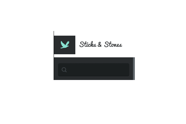
- Use the Rounded Rectangle Tool to set the Corner Radius to 5px and create a 230px x 30px shape with a
#1c1f20fill. Name the layer search bg. - Duplicate or drag the Search icon (from 50 Mini Icons) into your document.
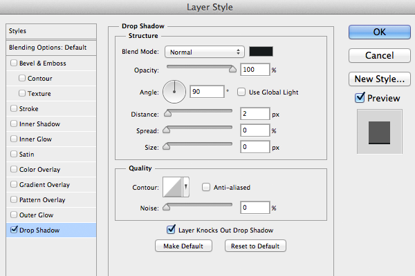
- Add a Drop Shadow to the search bg layer by going into the Blending Options of the layer and copying the settings shown below.
Step 7
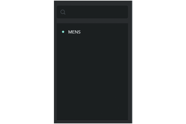
- Create a rectangle measuring 230px x 310px with a
#1c1f20fill. Copy the layer style of the search bg layer by right clicking on the search bg in the Layers Palette and selecting Copy Layer Style. Right click on the MENS background layer, then click Paste Layer Style to add a drop shadow. - Using the Ellipse Tool create a 7×7 ellipse with a
#88e2d2fill. - Using the Type Tool write MENS in Avenir Roman, 14pt,
#ffffff, Uppercase.
Step 8
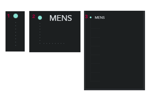
- Using the Rectangle Tool create 1x1px square with a
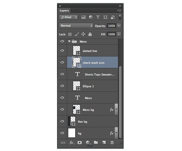
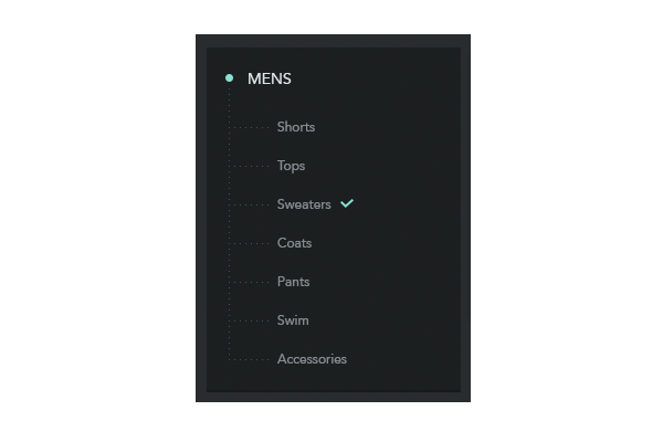
#464d51fill. Press Shift-Option-Command to duplicate the square while moving it 5px down. Repeat 6 times. You should have a line with 8 dots (pixels) with 5px spaces between each dot. Select the 8 shape layers, right click and select Merge Shapes to merge all the shapes into one layer. - Duplicate the layer and press Command/Ctrl-T to rotate the dotted line 90 degrees so that it becomes horizontal. Join the two dotted lines as shown in #2 in the image below and Merge the two shapes.
- Duplicate the shape 7 times and line it up as shown in image #3. Merge the shapes into one layer and call it dotted line.
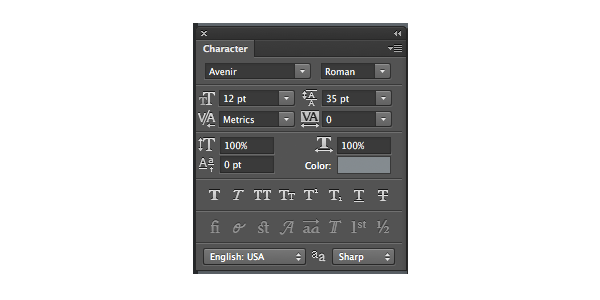
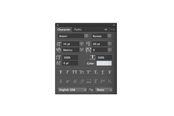
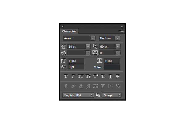
- Using the Type Tool, type "Shorts, Tops, Sweaters, Coats, Pants, Swim, Accessories" In a vertical list. Go to your Characters Palette and make sure the settings are set the image below.
- Duplicate or drag the check-mark icon from the Additional Icons and place it 5px to the right of the word Sweaters.
- Combine all the layers into one group and name it Mens.
Step 9
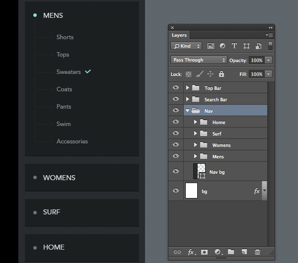
- Select Mens Group and press Command/Ctrl-Shift-Option to duplicate it while simultaneously moving it down.
- Rename the group to Womens and Delete the dotted line layer, the check mark ic, and the vertical categories list.
- Rename the mens bg layer to Womens bg. Press Command/Ctrl-T to change the height of the rectangle to 54px.
- Double Click on the Ellipse 1 to change the fill color to
#6d767c. - Duplicate the Womens group. Move it down 15 pixels from original Women’s group and rename everything to Surf.
- Repeat for Home button.
Step 10
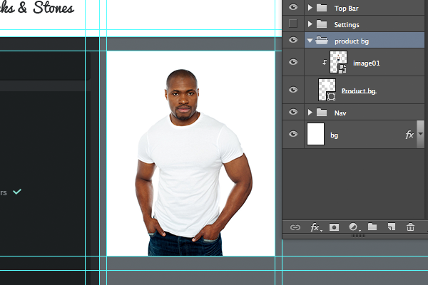
- Create a rectangle 236×288 pixels with a
#fffffffill. - Place image01, as shown below (File > Place > …) into the canvas.
- Press Option-Command-G to create a clipping mask and size the image so it looks approximately the same as it does in the image below. Combine the two layers into one group and call it product bg..
- Duplicate product bg group and name it price bg.
- Rename the group price bg and inside the group rename product bg layer to price bg layer.
- Press Command/Ctrl-T to move the top down to 70 pixels.
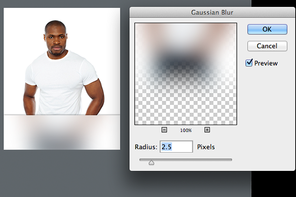
- Select the image01 layer and create a blur by going to Filter > Blur > Guassian Blur and set the radius to 20px as shown an image one.
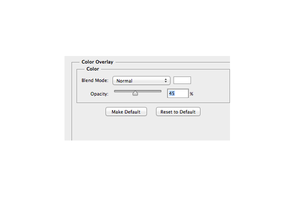
Double click image01 layer to open Layer Styles dialogue. Apply Color Overlay as shown in image below.
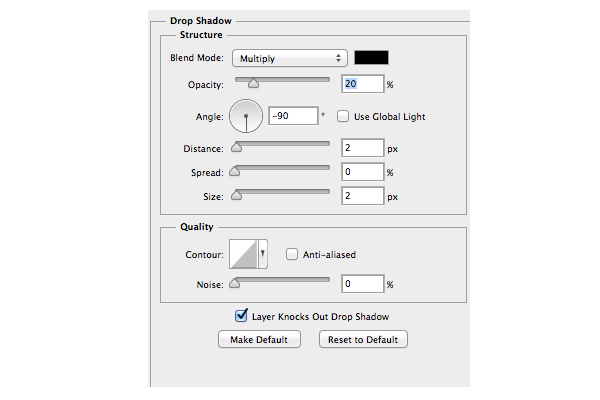
Add a Drop Shadow to price bg layer using the settings below.
Step 11
- Create a rectangle shape 50x70px with a
#88e2d2fill. - Using the Line Tool, set the line weight to 1px and draw a 30px line – horizontally and vertically centered inside the rectangle shape as shown below.
- The type settings for the price $ 36 should be set as follows. Avenir Black, 14pt,
#292c2e; For the Simple Tee Avenir Black, 14,#3b4244; and for White Tee Avenir Medium, 12pt,#6d767c. - Duplicate the Cart ic layer from the top bar. Move the layer so that it sits in the Price tag group with the rest of the layers. Double click on the layer to change the fill to
#ffffffand place it so that the end result matches the image below.
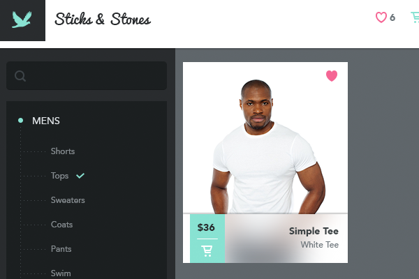
Repeat the last two steps to create the rest of the product images. Combine the product image groups and the nav group into one group, and name it Product Page.

2. Create the Settings Overlay
Step 1
- Create a new group called Settings and make sure that it sits below the Top Bar Group and above the Product Page group.
- Inside the group, create a new background layer filled with
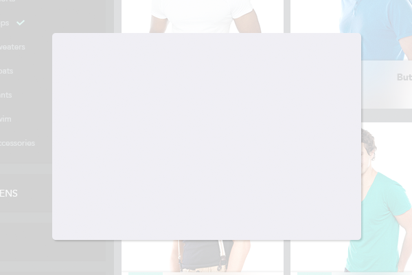
#ffffffand name it Overlay. Reduce the Opacity to 80%. - Using the Rounded Rectangle Tool with the Corner Radius set to 5px create a 450x300px shape with a
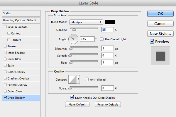
#f0eff5fill. - Add a Drop Shadow to the background using the following settings.
Step 2
- Duplicate Settings bg layer and rename it Settings Top bg. Double click on the layer to change the fill to
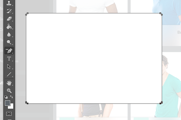
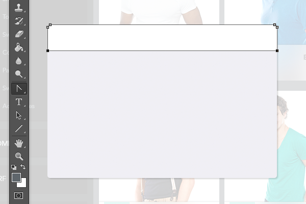
#ffffff. - Using the Delete Anchor Point Tool delete the two inside bottom anchors as shown in below.
Using the Convert Point Tool click on the two bottom anchors to straighten the bottom line.
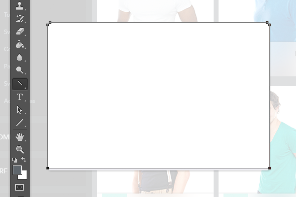
Using the Convert Point Tool select the two bottom anchors, press Command/Ctrl then Click, Hold and Move the bottom line to the top until it’s sitting at 245px as shown in image 03.
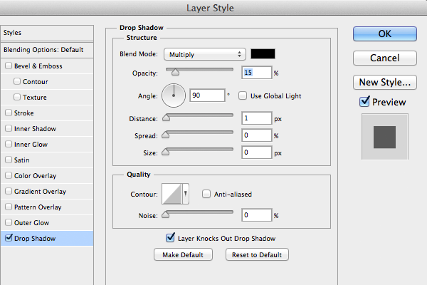
Add a Drop Shadow the layer using the following settings.
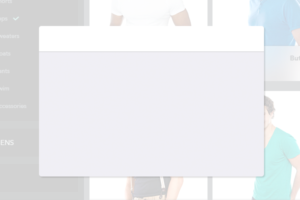
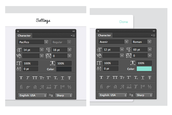
- Add a Settings heading, horizontally and vertically centered within the Settings Top bg making sure it has the setting displayed below.
- Then add Done and position it 20px to the left of the right edge, vertically centered with the settings displayed below.
Step 3
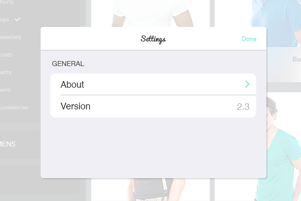
- Create a General Heading in uppercase Helvetica Neue Regular, 14pt,
#4f4f4fand place it 20px below the Settings Top Bar. - Using the Rounded Rectangle Tool with the corner radius set to 5px create a 410x88px shape with a
#fffffffill – position it 10px below the General Heading and name the layer Settings Section 01. - Using the Line Tool, set the weight of the line to 1px, and draw a 390px line. Vertically center it within the rectangle, while also aligning it to the right edge.
- Add About and Version headings in Helvetica Regular 18pt
#292c2eand position them as shown below. - Add 2.3 in Helvetica Regular 18pt
#b4b4b4and position it as shown below. - Duplicate or Drag chevron ic from the Icons.psd and position it as shown below.
Step 4
- Create a Location Services heading in uppercase Helvetica Neue Regular, 14pt,
#4f4f4fand place it 20px below the Setting area 01. - Using the Rounded Rectangle Tool with the corner radius set to 5px create a 410x44px shape with a
#fffffffill. Position it 10px below the Location Services heading. - Add Auto-detect Location heading in Helvetica Regular, 18pt,
#292c2eand position as shown below. - Using the Rounded Rectangle tool set the corner radius to 60px, and create a 51x31px shape filled with
#88e2d2. - Using the Ellipse Tool create a 30x30px Ellipse with a
#fffffffill and add a Drop Shadow with the settings shown below.
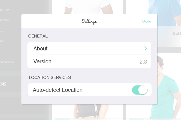
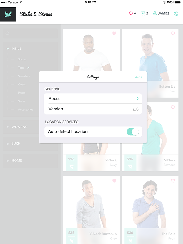
Your settings overlay should look like the image below.

3. Create the Login Page
Step 1
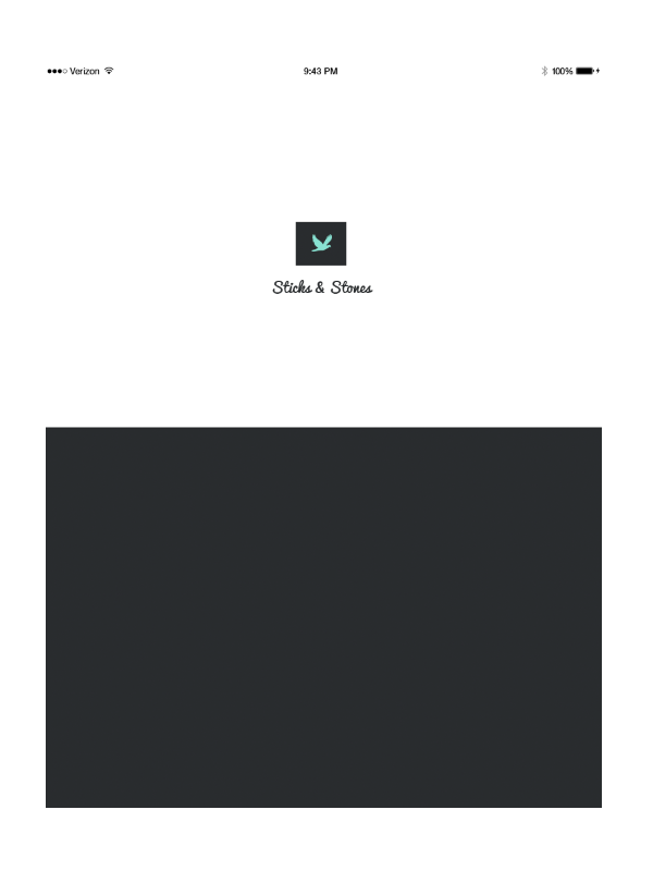
- Turn off all the groups aside for the Top Bar right click, duplicate, and rename the group to Login.
- Inside the new Login group delete the Like, Shopping, and User groups, as well as the settings ic.
- Create a New Layer called bg below the Top Bg Layer, with a
#292c2efill. - Select the Top Bg Layer, press Command/Ctrl-T, Click and Pull the rectangle down until it is 500px as shown below.
- Open the Logo Group and re-arrange the text and images in side so that they match the logo positioning below.
- Combine all the layers – not including bg – into one group and call the group Top Area.
Step 2
- Press Command-; to turn on your guides.
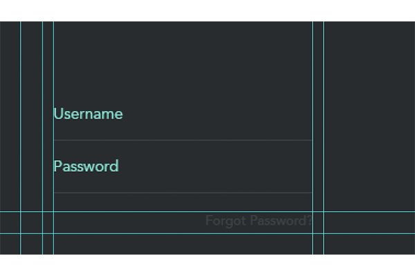
- Using the Line Tool with a 1px weight create a 236px line with a
#3d4144fill that fits inside the middle column as shown below. Position it 150px from Top bg and call it Text field line. - Create a Username label. Avenir Roman, 14pt
#88e2d2. Place it against the left guide and 20px up from the Text field line. - Select the Username and the Text field line layers, press Shift – Option, click and move down 48px to create a duplicate. Rename the Username duplicate to Password.
- Duplicate Password text layer using the above technique. Change it to Forgot Password? and colour to
#3d4144.
Step 3
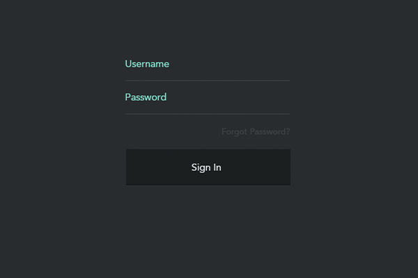
- Using the Rectangle Tool create a 236x50px shape with a
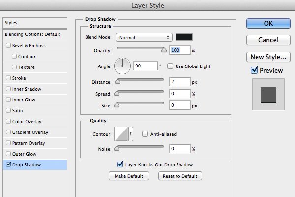
#1c1f20fill and call the layer Login btn. Add Sign In using the setting below and vertically and horizontally position the text inside Login btn. - Add a Drop Shadow to Login btn layer using the settings below.
- Combine on the layers into a Group and call it Sing in btn.
Step 4
- Duplicate the Sign In group and move it down 20px from the original. Rename it to Sign Up.
- Change Login btn layer name to Signup btn, and double click on the layer to change the fill to
#88e2d2. Change the text to read Sign Up and the text color to#292c2e. - Change the Drop Shadow settings to the following.
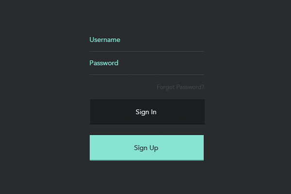
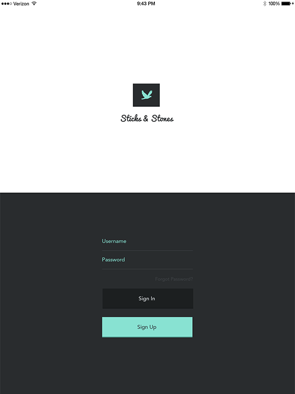
Your Login screen should look like this.

Conclusion
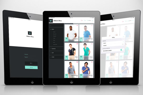
In this tutorial, I showed you how to create 3 distinct screens for an iPad app in Photoshop using a combination of plug-ins, guide lines, vector shapes, and layer styles. When you are finished, you should have some screens similar to the ones below. I hope that you have learned something from this tutorial and can use these techniques to create really amazing mobile interfaces of your own.
