In the web design industry, it’s rare that a tool stays relevant for a decade or more. Things tend to change so quickly that the useful life of an app or framework usually isn’t very long. However, Twitter’s Bootstrap has defied those odds.
Now in existence for over 10 years, the self-described “front-end open source toolkit” is used on over 22% of all websites. And we see it included everywhere from customized UI kits to WordPress themes.
Why has Bootstrap been able to reach such heights? For one, it comes packed with virtually everything designers need to craft a clean, responsive UI. Plus, the fact that it continues to be actively developed and evolve means that web professionals can reliably come back to it again and again.
With a decade under its belt, this is a good time to look at the overall impact Bootstrap has had on the web. Has it been a blessing, curse, or somewhere in-between?
A Tool for Rapidly Implementing an Established Look and Feel
The biggest advantage Bootstrap provides is the ability to implement an established look and feel. Right out of the box, you have a set of UI elements and components that cover just about every use case. It doesn’t matter if you’re selling t-shirts or blogging about your favorite video games – the framework gives you a massive head start on the design.
In addition, Bootstrap is extensible. It’s built with customization in mind, making it a fairly straightforward process to change various components to meet your needs. Creating your own components is also possible.
That goes beyond individuals performing one-off tweaks for a specific project. It also extends to theme developers. They can leverage the framework to bring a familiar front-end UI to content management systems (CMS).
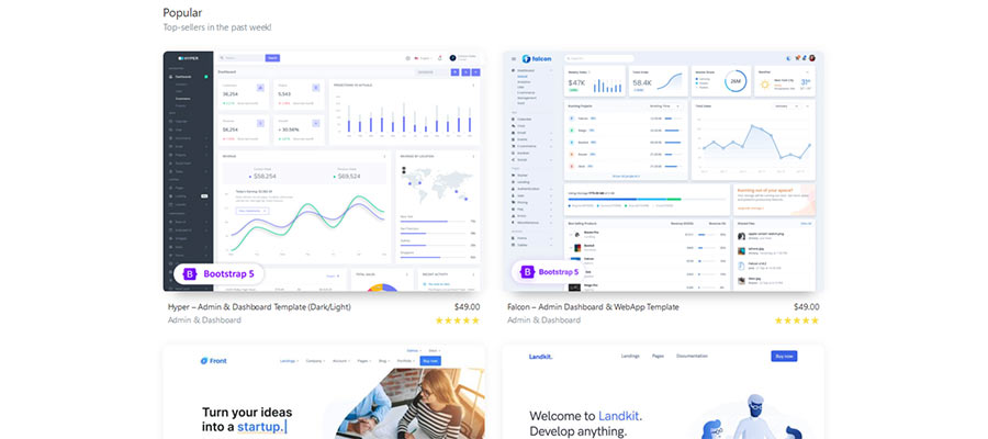
Yet, customization is still optional. If your goal is to design and deploy a project quickly, just installing Bootstrap (or an offshoot UI kit) and familiarizing yourself with its contents is all you need.
This level of convenience and flexibility has undoubtedly played a large role in Bootstrap’s enduring popularity.

The Bootstrapping of the Web
Bootstrap does its intended job quite well. Perhaps a little too well.
As we mentioned, the usage statistics point to nearly a quarter of all websites utilizing the framework. When a UI is so widespread, it’s bound to lead to some sameness when it comes to design.
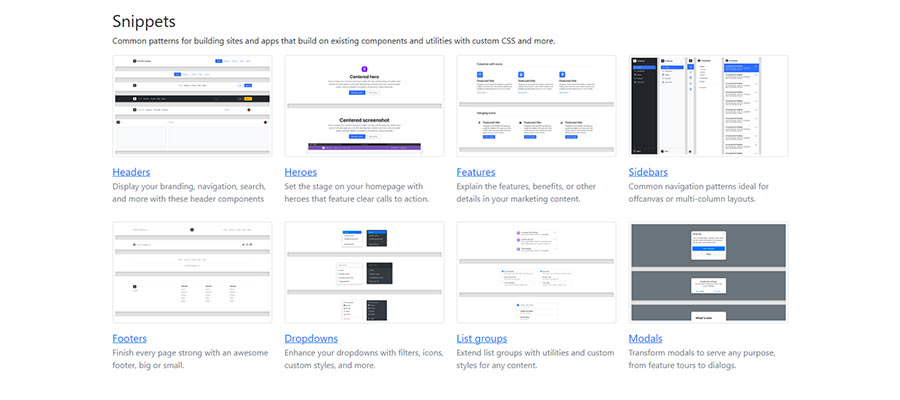
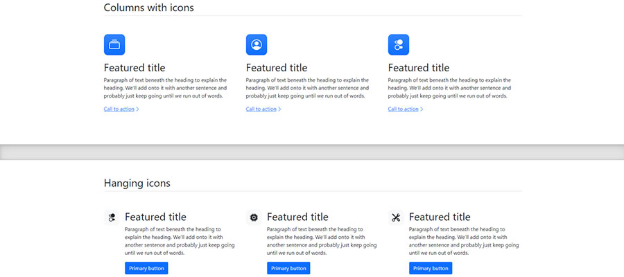
Much like the early days of the CMS, it’s often easy for the trained eye to pick out elements of Bootstrap within a website. You start to notice the same buttons, navigation styles, and pricing tables. Even sites that don’t use it may well attempt to duplicate certain aspects of the look.
To be sure, it’s generally clean, accessible, and easy to read. While that can be considered a good thing, there’s also a bit of a downside. And it isn’t necessarily an issue with Bootstrap itself.
Rather, it’s about designers either accepting its default styles or changing them only minimally. The result is a web that is becoming increasingly homogeneous.

Inspiring a New Category of Frameworks
Perhaps it’s a testament to how well put together Bootstrap is. There aren’t a bunch of shortcomings that need fixed. Everything works as intended right from the start.
With that, some designers may not feel the need to radically change anything. One could even argue that it goes against the very point of the framework in the first place.
Unlike a lot of tools aimed at the web design community, Bootstrap has a universal appeal. There is no particular niche that it can’t fit into. That’s a key to its massive adoption rate. And it has inspired an entire category of CSS and JavaScript frameworks.
Other worthy competitors have popped up in recent years, such as Tailwind CSS. It has a similar appeal. However, it differs in that it’s more “utility” based. The various elements are all there, but depend on the designer to customize them to fit a need.
Bootstrap is unabashedly opinionated in its design. Tailwind CSS goes in the opposite direction. If anything, this provides designers with two great options, depending on their own preferences.
Design from the ground up or implement a completely polished UI – the choice is yours.

A Behind-the-Scenes Powerhouse
Maybe the most impressive aspect of Bootstrap’s 10-year rise is that it’s a completely developer-focused tool. That is, you interact with its code and view the results on the front end. That’s opposed to, say, WordPress, where users create content and install custom functionality via a back-end dashboard.
The framework is generally of interest to professionals. Thus, it relies on web designers for growth. It doesn’t have the same public-facing profile of a CMS.
That says a lot about what Bootstrap has done right over the past decade. To win over a sizeable portion of this industry is no small task. To maintain it and continue to grow for this long is even more telling.
What will the future bring? We don’t have all the answers. But, whatever happens, it’s likely Bootstrap will still play a significant role in web design for years to come.