WordPress has been constantly changing and improving since its inception. The core team of developers keep adding new features while discarding obsolete ones to make sure that the platform keeps up with changing times.
One such major change was the introduction of the Gutenberg Editor. In this post, we will compare the good old classic editor with the Gutenberg editor to learn how they are different from each other.
WordPress Classic Editor
Prior to the Gutenberg editor, the classic WordPress editor was the default editor integrated in WordPress. It is a WYSIWYG editor and has a user-interface similar to different word processing applications like MS Word. The following image shows what the classic WordPress editor looks like.
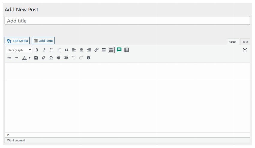
The toolbar at the top contains different buttons to make the text bold or italic, change the text alignment or insert links, etc. It is very easy to use as you can just type your blog post and then use the buttons in the toolbar at the top to make formatting changes.
The classic editor in WordPress uses the free and open-source TinyMCE editor behind the scenes. Users of the classic editor can easily switch between the visual or textual mode of the editor to directly edit the underlying HTML of their blog post. This makes the classic editor a powerful tool for people with basic knowledge of HTML and CSS.
People who had been using WordPress for a long time prefer to use the classic editor due to its simplicity. The classic editor gives them more control over the markup with an easy-to-use interface and no unnecessary clutter.
WordPress Gutenberg Editor
The WordPress Guternberg editor was released in December 2018 as part of the WordPress 5.0 update, and it has been the default WordPress editor since then. This new editor introduced the concept of blocks for creating and editing your blog posts.

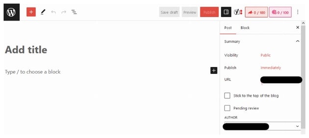
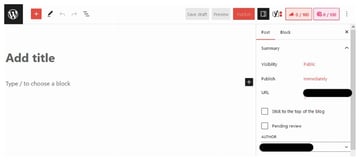
Let’s say that you want to create a new paragraph in your blog post, all you have to do is add a new paragraph block. It takes some time for people to get used to the way blocks work if they have only ever used the classic editor before.
You can move different content blocks up and down while creating a blog post by simply dragging them. The primary reason for developing the Gutenberg editor was the rising popularity of website builders. The lack of built-in capability to design a page layout in WordPress was a competitive disadvantage.
As you will see, the Gutenberg editor isn’t meant to just write blog posts, you can use it to create your own complex layouts.
Major Differences Between the Editors
Both the Gutenberg editor and the classic editor have been developed with different goals in mind. This affects a lot of things such as their user-interface, capabilities and so on. We will summarize some of these differences for you in this section.
User Interface and Customization Options
As we saw in our earlier sections, the classic editor relies on older word-processor layout with a toolbar at the top for creating blog posts. This layout is familiar to people who have been using it for a long time.
On the other hand, the Gutenberg editor relies on blocks for creating a blog post. Everything inside the Gutenberg editor is a block. You can also transform one block into another to change a paragraph into a heading etc.
With the WordPress classic editor, the different elements are always present in the toolbar. You don’t need to go anywhere to look for them. This makes using the classic editor a little easier for people who are creating blog posts for the first time.
With the WordPress Gutenberg editor, you get a floating toolbar after you have typed your text. This toolbar has buttons that let you make the text bold, italic, or change its alignment. One interesting thing about the Gutenberg editor is the sidebar that contains block-specific options for every block that you add to a blog post.

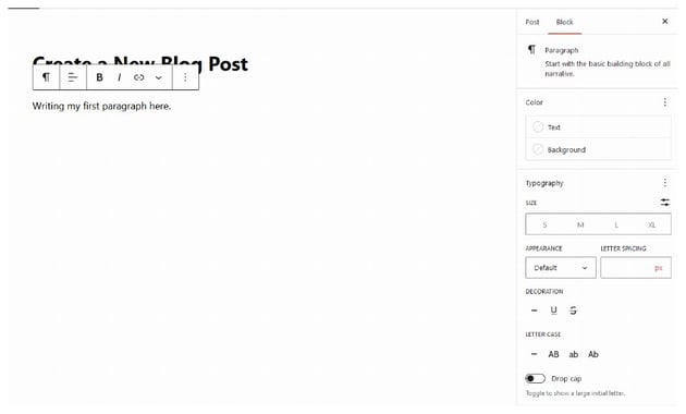
In this case, the sidebar contains different settings to change the color, background or the size of the text to suit your needs. You could use the text decoration section to add either an underline or a strike-through. It is also possible to change the font weight to make the text bold or change the letter spacing.


So, the user interface is simpler with the classic editor, but it gives you a fixed limited set of options. When you use the Gutenberg editor, the options in the sidebar will change dynamically based on the selected block.
You will find that the Gutenberg editor isn’t particularly difficult to use after you have created a few blog posts.
Post and Page Layout Options
The classic WordPress editor works just fine if you are not planning to create unique layouts for different blog posts and pages that you create. However, the Gutenberg editor really shines when you want to change the layout of a blog post to arrange things in columns or rows.

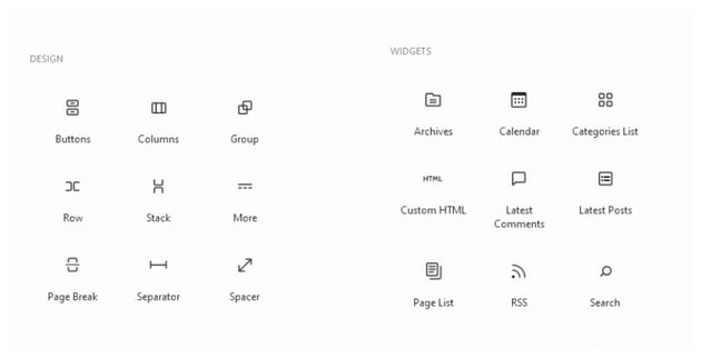

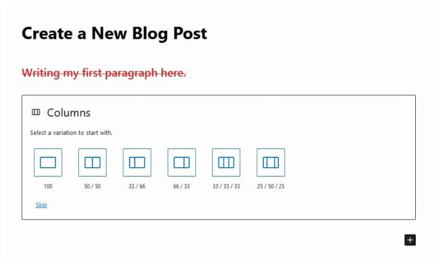
The Gutenberg editor contains blocks for all kinds of things. You can hover over a block to see what it does if you don’t understand it just by reading its name. We could use the Columns block to organize our content in columns. Adding a Columns widget to a blog post shows the following screen. You can choose if you want one, two or three columns in your layout and how those columns should be laid out.
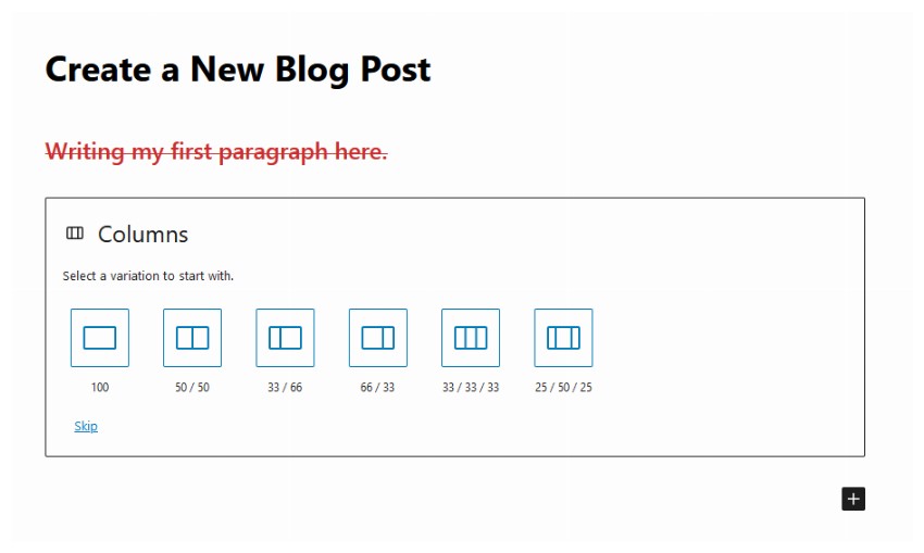
Within each of these columns, you can add other content blocks for headings, images, paragraph text or even more columns. The sidebar allows you to change the number of columns and optionally stack them on smaller devices.
You don’t get this freedom of designing your own blog post layouts with the standalone classic editor.
Performance and Generated Markup
The Gutenberg editor is a lot more complicated than the classic editor. Therefore, it makes sense that they will both perform at different levels. The team of developers behind Gutenberg is constantly working on adding new features while improving the performance of the editor.
For regular blog posts, you won’t feel any significant performance difference between the two. However, my personal experience has been that the Gutenberg editor can lag a bit with extremely long posts.
Another difference between these two is the final markup that they generate. You have full control over the generated HTML with the classic editor. However, the markup in Gutenberg editor can get a bit bloated in comparison. This is primarily due to all the additional capabilities that it offers.
I would like to clarify that the generated HTML bloat is still a lot less compared to other popular page builders. However, it cannot be as lean as the classic editor.
Final Thoughts
In this post, we gave you a brief overview of the classic WordPress editor and the Gutenberg editor. Feature-wise, the Gutenberg editor is far ahead of the classic editor and the gap is just going to increase with the addition of new features.
However, not everyone wants to let go of the classic editor. This is evident from the low user ratings of the Gutenberg editor. The developer team has even added a Classic Editor block to Gutenberg in order to ease users into using the Gutenberg editor.
You should definitely consider moving to the Gutenberg editor if you are still using the classic editor. It is only going to get better with time. You will also get more used to the editor workflow after writing a few blog posts in it.