“What is the best font?” It’s a question I often find myself asking with only seconds to spare. I’ll be putting the finishing touches on a graphic design project, animating the title of a video, or getting ready to press publish on a new blog and wonder, “What’s a good font I can use… right now?”
No matter how many times I repeat this process, I never appreciate how big of a question this is, and I’m overwhelmed by the can of worms it opens every time. Fonts are, for most people, invisible.
Although they’re around constantly, from the buttons and app labels on our phones to the street signs and logos above our heads, most of us only notice fonts when they’re “bad”.
But fonts are rarely bad in and of themselves. Almost every font—save for Papyrus (I kid, I kid)—has a place and ideal use case.
It’s usually the font choice we’re reacting to. Good font choices feel cohesive with the branding and tone of the content surrounding them, whereas bad font choices feel disjointed and aloof.
So, while you may be here looking for a quick answer, let me disabuse you of the notion that there’s one almighty “best font” that works for everyone—there’s not.
Instead, this article will give you everything you need to go out and find the best font for you. Yes, I’ll be highlighting a few fonts along the way that, for all I know, could be your perfect match.
But the main thing I’ll leave you with is a framework to use when trying to find the elusive “best font”, to give you the best chance of making a great font choice and save you from googling “What is the best font?” every time you’re polishing off a new project.
If you like video content, don’t miss this new video from the Envato Tuts YouTube channel:
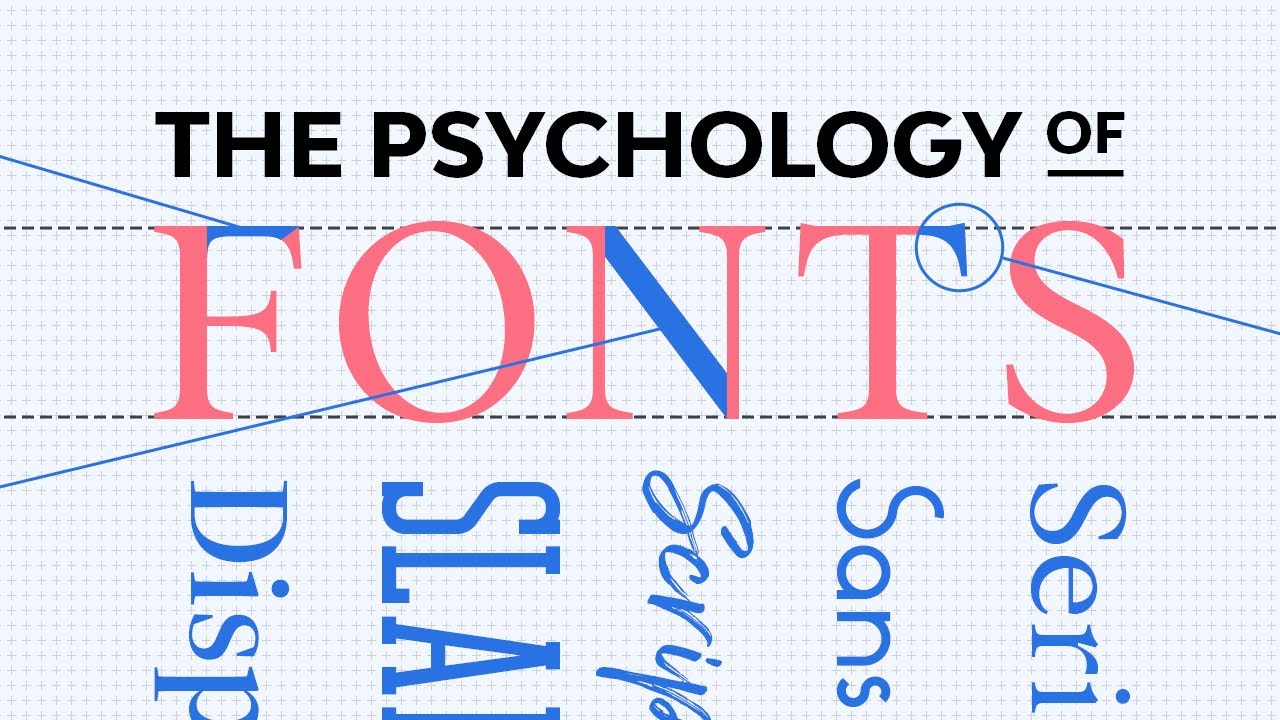
Why Fonts Matter
Until recently, brands mostly appeared on the products they sold, the venues they owned, the packaging they used, and the ads they bought. That’s no longer the case.
Today, brands are experiences that span the physical and digital worlds, where audiences need to feel the same sensation whether it’s in-store or on TikTok. Font choices play a big part in this.
Everything from signs guiding patrons to the bathroom to UI labelling guiding website visitors to their online carts requires a font choice.
Therefore, most brands won’t choose their fonts by scrolling arbitrarily through a list in Word. Rather, they’ll inspect several fonts, analyzing their functionality, versatility, and ability to reflect their style.
They’ll also need to fit the brand’s budget, as fonts cost money to license. As I talked about in an earlier video for Envato, a growing number of brands have created their own fonts to skirt around the need to pay license fees and to allow them to design a font from the ground up that reflects their character and aesthetic.
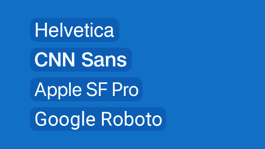
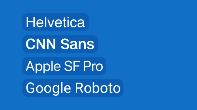
A whole number of brands have created fonts that look suspiciously similar to Helvetica, including CNN, Apple, and Google.

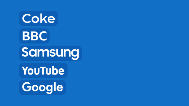
To save themselves over $1 million a year, IBM switched from Helvetica to a bespoke font, Plex. And since then, brands like Coke, the BBC, Samsung, YouTube, and Google (again) have released bespoke fonts as well.


What Bespoke Fonts Can Teach Us
While it’s all well and good for these massive corporations to spend hundreds of thousands of dollars commissioning bespoke fonts, it’s certainly not an expectation that every brand needs to do the same.
However, there are useful lessons you can take from some of these brands and how they landed on the bespoke fonts they now use.
Warner Bros.
As part of a massive rebrand of the now 100-year-old corporation, Warner Bros. introduced a bespoke font, Warner Bros. Sans, in 2019.
Inspired by the letter in their iconic shield logo, which got an update from the design agency, Pentagram, each character in every weight oozes the cartoonish quality of the movie studio’s brand.

The ‘W’ and ‘M’ clearly share DNA with the ‘W’ in the shield. And there’s a clear resemblance between the shield’s ‘B’ and the ‘B’, ‘R’, and ‘P’ of the font.
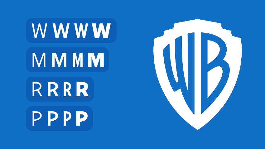


Whether it appears during the opening titles of a film or in the small print at the bottom of a movie poster, when you see this font, you’ll know the brand it represents.
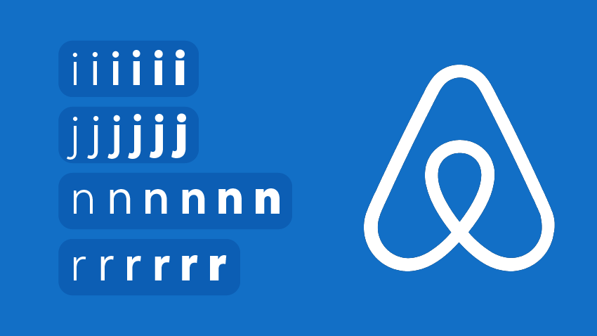
Airbnb Cereal
In 2018, Airbnb introduced Cereal, a bespoke font with a name inspired by its early days of air mattresses on apartment floors where they’d serve cereal, or whatever was left in the founder’s cupboards, for breakfast.
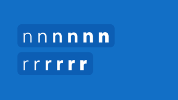
With rounded details like the dots on the lowercase ‘i’, ‘j’, and punctuation marks, the font has a friendly feel to it.
It also features wider grooves in the lowercase ‘n’ and ‘r’ that make it more legible, regardless of the size.


Why These Brands Created Bespoke Fonts
These brands chose to invest in the creation of bespoke fonts so they could be tailored to their specific needs. Think about Warner Bros. Their font needs to be just as legible on cinema screens as it is on mobile apps.
For Airbnb, their font appears in the UI of their website and app, in their ads, and even on gift cards you can grab from the supermarket.
When we use the written word, we’re typically trying to communicate an instruction or idea. But when we use fonts, we also have the opportunity to communicate our character and brand.
With fonts tailored precisely to their characters, while still being functional and legible, these brands have found a way to do both.
5 Tips for Choosing an Existing Font
While we’d all love to have a font created specifically for our brands, that’s not possible for everyone. This means you’ll need to choose a font from the many on offer today.
That’s not a bad thing. There are thousands of fantastic fonts available, many of which have been around for decades communicating on behalf of brands and individuals with great efficiency and style.
But it’s easy to get overwhelmed by the myriad choices. So here are my tips on how to choose the best font for you.
1. Choose a Font That Matches the Character of Your Brand
Do you want something round and playful or something squared off and crisp? You know your brand better than anyone, so try to articulate its main characteristics, and look for a font that embodies them.
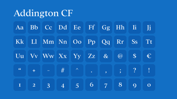
Addington CF Serif by connary has an elegant, classic quality to it.


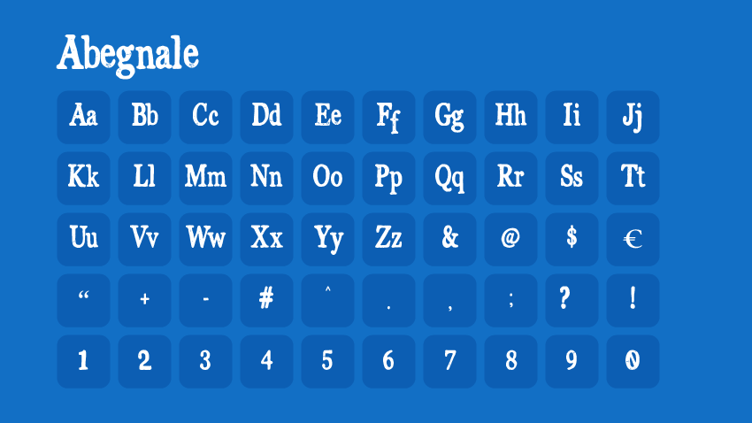
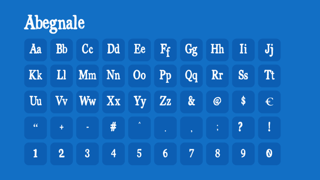
The Abegnale Typeface by irwanwismoyo, on the other hand, is more inky and messy, designed to look as if it’s been produced by letterpress.
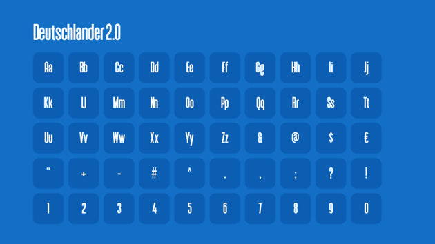
Then there’s the Deutschlander Sans-Serif font by sharkshock, which is tall, compact, and modern.


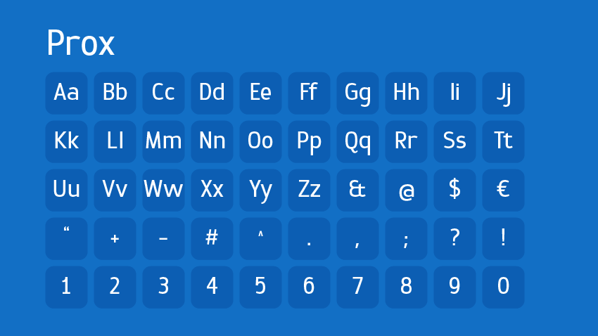
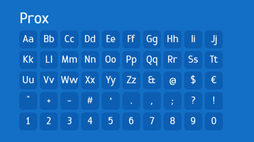
Or check out the sleek Prox font by Typogama, which is beautifully minimalist.

Brands will often choose one style for a logo and hero text, but pair this style with another to create a visual hierarchy.
Online publication Air Mail uses a wide sans serif for its logo and UI labelling, and serifs for its article titles and body text. The New York Times also uses serifs for its titles and body text, but sans serifs for UI labelling and photo subtitles.
A good practice for your brand is to find fonts in each of these styles that match your character. That way, you have options for body text, hero text, UI labelling, signage, and more—deepening your brand toolkit.
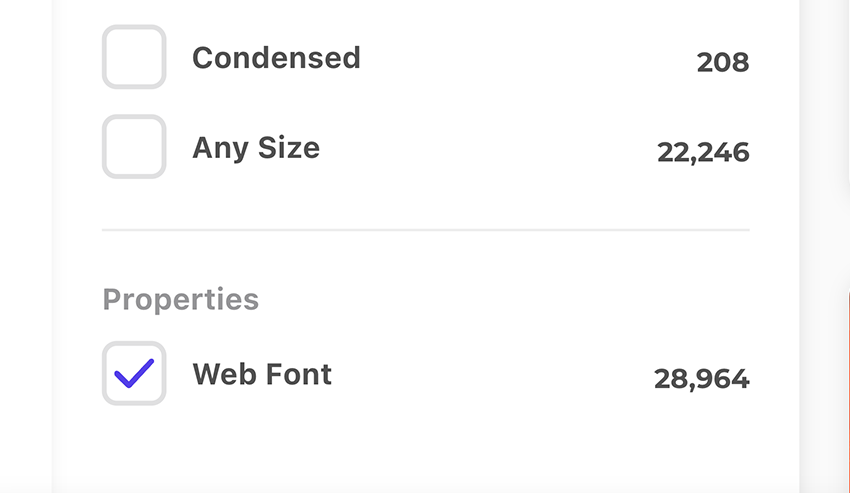
2. Choose a Font That Has Weights and Styles
When picking a font you may use for decades, you’ll want one with versatility and the ability to adapt to any situation. That’s typically going to require a wide range of weights and styles.
Simply having Regular and Bold probably isn’t going to cut it in the long run. Instead, you’ll want options that range from Thin and Ultra Light to Extra Bold and Black.
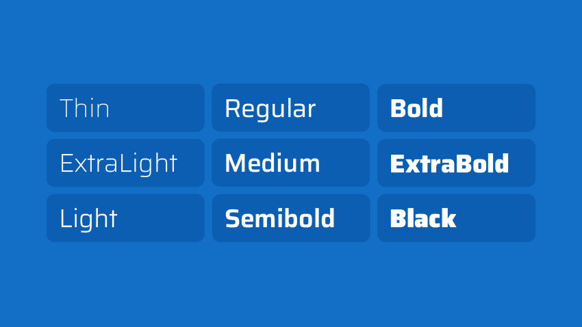
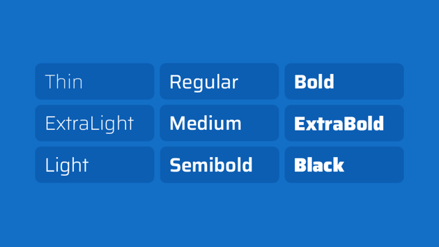

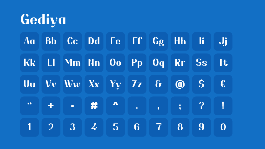
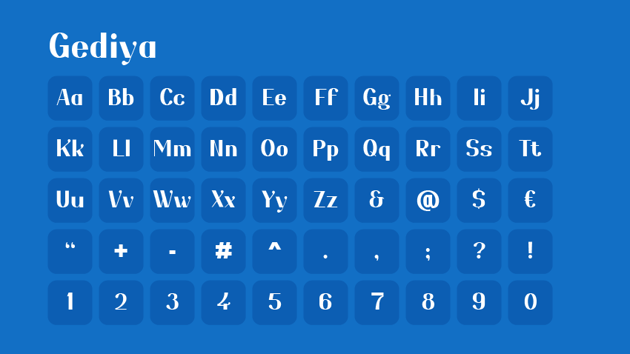
And the sneaky thing is that a lot of font families don’t provide these. However, the Gediya font from Envato Elements author twinletter does. It has Thin, Regular, Bold, and Black options.
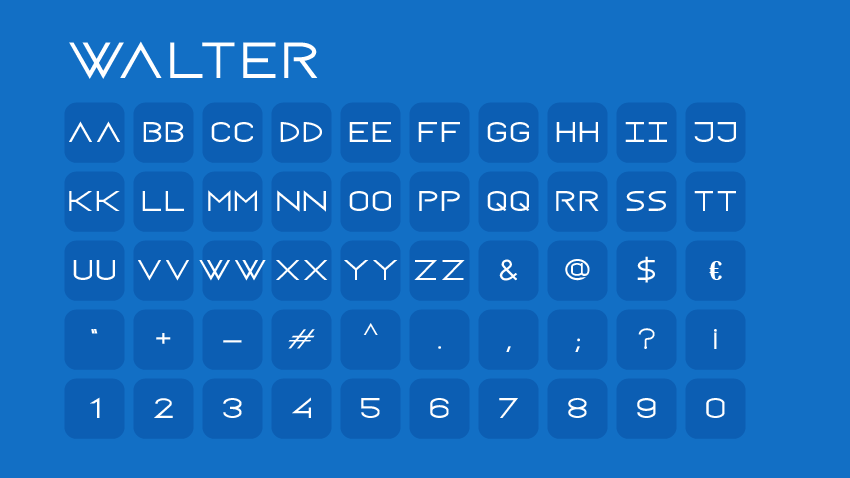
And the Walter font by designova is versatile as well, with Thin, Light, Regular, Bold, and Heavy variants.

You should also look out for “Variable fonts”—a new breed of font that allows you to adjust the weight, width, and other characteristics using a fader.
Along with this, check that your chosen font has an Italic version, as it gives you more ways to express yourself in text, and—if you’re running a publication of some sort—is a must.
Finally, keep a lookout for condensed and widened versions of your chosen font as well. Again, this is one more way your font can offer versatility and adapt to whatever canvas you’re displaying it on.
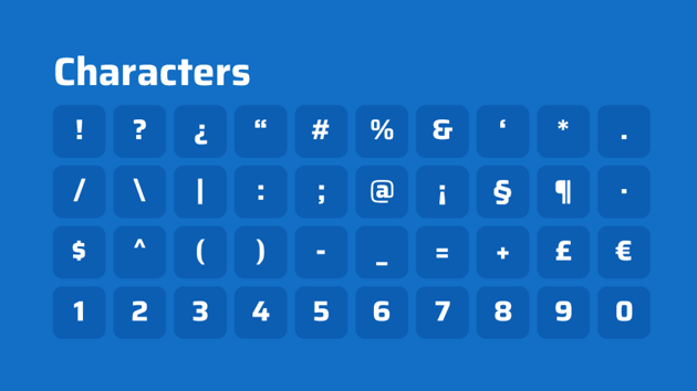
3. Choose a Font That Has All the Characters
You don’t want to spend all this time choosing a font, only to discover it doesn’t have a period, a comma, or a symbol you need.
In today’s Wild West of a font market, practically anyone can make a font. But that means that standards will vary from author to author. You’d be surprised how many fonts are on offer that consist only of the alphabet in one case and nothing else.
When choosing a font, check that it has both upper and lowercase options, along with all the characters you need. If it doesn’t, it shouldn’t matter how pretty it is—ditch it.


4. Choose a Font That Is “Web Safe”
There are certain fonts like Arial and Helvetica that you’ll encounter on websites and apps all the time. While they are extremely popular fonts in their own right, their ubiquity isn’t necessarily due to people actively choosing them.
Rather, they’re “web-safe” fonts that come pre-installed on most devices. And they’re also fonts that browsers and operating systems default to if the chosen font of a website or app doesn’t exist on a user’s device.
You don’t want to have spent all this time choosing a particular font, only for it to show up as a generic font when people enter your branded experience online.
Otherwise, you can check HubSpot’s ultimate list of web-safe fonts or other similar articles to make sure.

5. Choose a Font That Is Legible and Accessible
Finally, you want to make sure people can actually read your font, no matter the quality of their vision or whether or not they’re neurodivergent. It’s one thing for your font to be stylish, but it’s a whole other thing for it to be functional.
The best fonts do both, but the ones that favour style over function make it hard for you to communicate with whole portions of your audience.
Airbnb considered this when creating its Cereal font. By widening the gaps in the ‘n’ and ‘r’, for instance, they’ve improved the legibility of those letters, even when they’re small.
When you’re choosing a font you expect to be readable on business cards to billboards, legibility is a fundamental consideration. You also need to consider the diversity of the vision of people reading your copy.
The characters in your font might be blotchy blobs to people with poor vision or who are neurodivergent. Sharp, streamlined strokes, adequate spacing, and more can have significant effects on readability to them.
Fonts like Helvetica remain a popular choice among brands because they’re clean and readable to most people. However, Helvetica has its readability issues as well, with letters like its capital ‘R’ with its rounded leg at risk of not being accessible. It’s just one of the characters Monotype has altered in response to this as part of its Helvetica redesign for the modern age.
It goes to show that even the most popular fonts aren’t necessarily built for today’s standards and require regular revision. Therefore, it’s important to take this into account when picking your font so you’re not changing it unnecessarily in the future. Here are some useful resources to keep learning:


Function Over Fanciness… But, Ultimately, You Want Both
It’s easy to treat choosing a font as an afterthought. But, if I’m honest, choosing a font is a project unto itself. As I hope this article has shown, there are many important things to consider, from what a font says about your brand to whether it’ll be compatible with people’s devices.
While the content you’re sharing will hopefully matter more than the font you choose to share it in, like it or not, it can affect how people interpret it. So think hard and strive to pick a font that’s stylish, functional, and flexible.
At best, you’ll use it consistently for the next five to ten years and people will see it and immediately think of your brand, while not knowing why. At worst, they’ll think, why did they choose that font?
Discover More Tutorials and Resources
I hope you enjoyed this article about how to choose the best fonts for your project. If you’d like to explore even more resources, Envato Tuts+ and the YouTube channel have lots of great content for you, such as: