There are 32 new mind-blowing Figma updates which will change the way you work. I’m going to show you 20 of the most recent updates related to text, images, components and libraries, prototypes, and quality of life!
For example, now you can resize images and they’ll snap to the perfect aspect ratio. You can take away extra text spacing with vertical trim. And you can add sticky scrolling to prototypes, plus a whole lot more.

Here are some quick links to each of the 20 updates we tested (you’re welcome):
+ Show more
1. Vertical Trim on Text
All right then, let’s get started with the latest changes related to text.
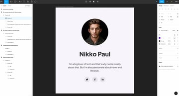
Let’s say you want to create a button or a badge, something like this.
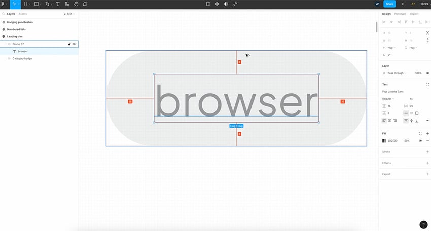
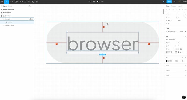
But there’s something that doesn’t feel right about the text, right?
If you select it, you can see that it has the same distance from the top and bottom, but the text box itself has a different spacing on the top than on the bottom.
This is a very common occurrence because of the way line height works and how certain fonts are rendered in Figma.
Well, now you can perform vertical trimming in Figma, which works the following way.
How to Perform Vertical Trim in Figma
Select the text, then go to the inspector in the text properties.

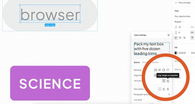
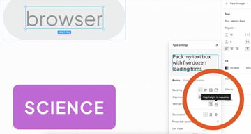
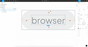
And right here, where it says Vertical trim, you have this option that says Cap height to baseline. When you select that, magic. This happens, basically:

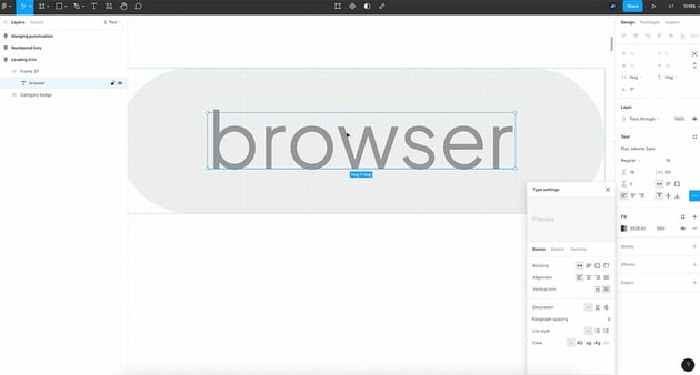
The text box itself is now only as tall as the text, with no extra space on the top and bottom. And this creates a much cleaner appearance for that button, or that badge, or whatever it was that you are trying to create.
In Figma, by using a vertical trim, you get much better text alignment.
2. Hanging Punctuation
Let’s move on to the second change, which is hanging punctuation. This is actually a typographic toolthat’s used to create optically-aligned blocks of text.

So for example, in here, I have two pieces of text. The first line starts with a quote, which actually offsets the first word a little bit to the right size.
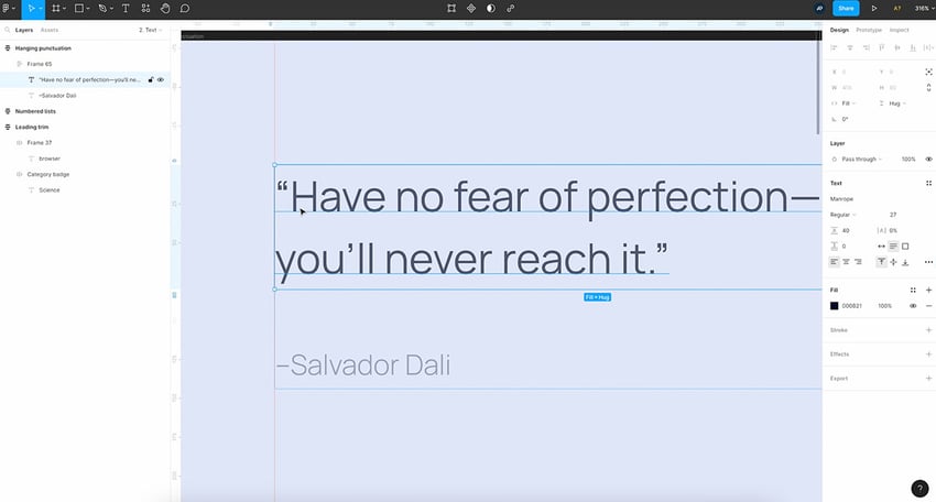

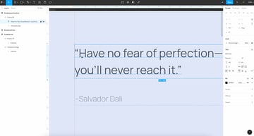
So it doesn’t quite match up with the rest of the text. Well, fear not, in Figma, you now have an option to implement hanging punctuation, which will make punctuation such as quotations and brackets hang outside of the textbox.
So if we go, again, to the inspector in the text or Type settings, we can go under Details, and here we can turn on hanging punctuation.

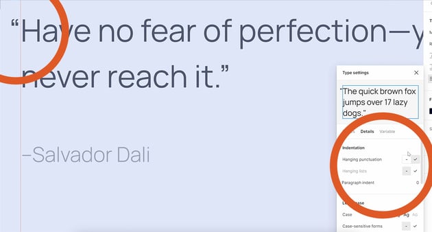

And voila, what is happening is the quotation mark just moves outside of the textbox, allowing the text to now be positioned correctly and aligned nicely, just like that.
3. Specified Order for Number Lists
Moving on to update number three: number lists no longer have to start with the number 1.
So let’s zoom in here. I want to turn this “steps” list into a two-column list, just to match the columns I have above.
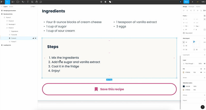
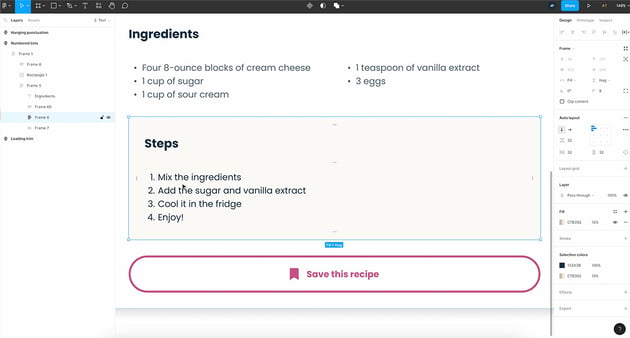

So we would duplicate it, right? Maybe select both, do a Shift+A to add an autoframe. But as you can see, my lists now both start with 1.
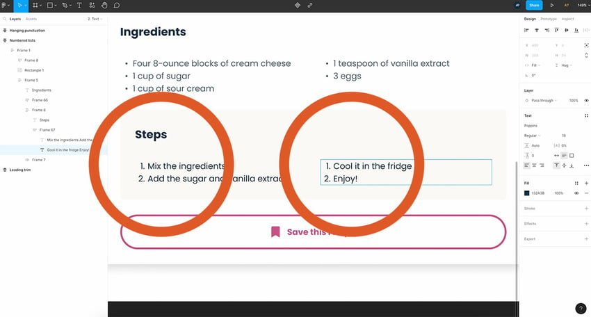
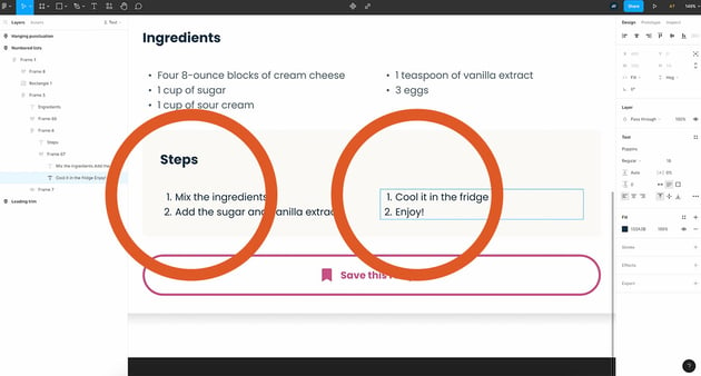
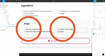
Well, before, there was nothing I could do, but with this new Figma update, I can now change the first item in the second list to number 3, and automatically the following item becomes number 4.
So we can now create numbered lists that start with any number you want, super cool.
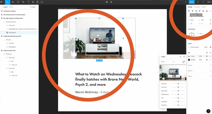
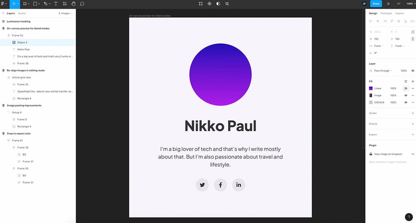
4. Snap to Aspect Ratio
All right, time to discover some image-related changes. And we’ll start with something amazing: snap to aspect ratio.
So let’s consider this example. I have some square images here, 480 by 480. And I want to make them either taller or longer, but I want them to be a certain aspect ratio, the most common being 3:2, 4:3.
And what you would usually do is you would get one of the sizes, either the width or the height, and you would Google for an aspect ratio calculator, and you would get the other dimension.
Or there are actually Figma plugins that will do that for you. Well, no longer, because now in Figma, you can simply resize an image, And it will automatically snap to a perfect aspect ratio.
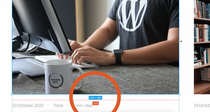


In this example, we have 720 by 480, which if we do a calculation is 1.5. So that’s 3 by 2. How cool is that?
We also get that guide on the bottom telling us that hey, you’ve snapped to a perfect aspect ratio.
Snapping to aspect ratio works, of course, vertically as well.
And from what I’ve tested, 3:2 and 4:3 seem to be the two ratios that Figma will snap to.
We don’t know if more will be added in the future, but for now, these are the ones that we have, and personally, I think they’re more than enough.
If you prefer to disable the snapping, hold down Ctrl and that will disable all Figma’s snapping functionality.
5. Image Pasting Improvements
Next up, we have image pasting improvements.
Let’s consider this image right here. We have a rectangle with an image background and a color overlay, plus we have a solid color fill at the bottom.
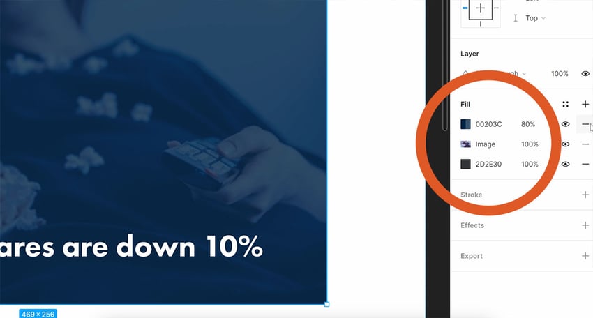


Now, let’s say that I don’t want to use this picture anymore for this element. So I’m going to Unsplash, search for another picture, and I’m just going to copy this image. Back in Figma, with the shape selected, I’m just going to paste it in.


And sure enough, the image changes. But all the other fills that I had are now gone.
So I would have to remake them. Well, not anymore because, you can now select a specific fill color that you want to replace.
So if you go with your mouse cursor to the left of the Fill colors, you can select the precise fill you want to replace. Ctrl+V or Cmd+V, and that new image is going to be pasted in that fill. All the others will stay intact.
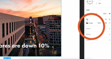
6. Realign Images in Editing Mode
The next update allows us to realign images while we are in editing mode.
So I have this image here that’s part of a frame. To begin with, it’s not aligned. Well, I can now double-click to enter edit mode. And then I can align it just the way I see fit.


This wasn’t previously possible; as soon as you entered an image’s edit mode, the align options were disabled.
7. On-Canvas Preview for Blend Modes
Now, how many times have you played around with blend modes, not knowing exactly what they do? A million times, I guarantee. I’ve done the same.
But with this new option, you can preview the changes without actually selecting a blend mode.
So to show you that, let’s add a gradient fill to an image. Let’s say I want to make this image stand out just a bit more.

I add a new Fill, and I’m going to choose a Linear gradient. And for colors, we’re going blue to purple, great. Let’s bump up the Opacity, all the way up, so now we basically have a gradient on top of that image.


Now, I would like to kind of blend that gradient with the image to get a nice effect. So what I can do is I can select the Fill. I can click on the little icon on the color picker that says Blend mode. And now look what happens.
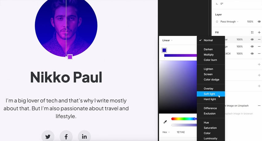

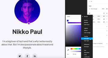
As soon as I move my mouse cursor over each blend mode, I get an instant preview in the canvas. How cool is that?
Blend modes also work on layers and effects, like drop shadows.
8. Luminance Masking
And finally, for the last image related change, we’re looking at luminance masking.
So I think we all know what masking is, right? You would use a mask to show a specific area of an object while concealing the rest.
In Figma, you can now perform luminance masking. This gives us a mask based on the object or the image’s brightness. For example, I have a rectangle which is filled with a darker color. And under that, I have an image from Unsplash. And under that, I have a kind of yellowish circle.
I can click on the image, and I can right-click and select Use as Mask. And by default, Alpha is selected.
But now I can select Luminance, and I can also see a nice preview.
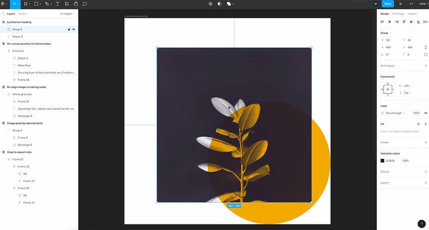


This group is basically now a mask. And when we move it, we can actually see what’s behind the leaves.
As you can see, we’re clearly showing the background in this area. But where it intersects the yellow circle, we’re showing the yellow background.
9. Exposed Nested Instances
Components and libraries were also given some love from the Figma team in this round of little big updates. And there are four changes and additions I want to show you.
We start with exposed nested instances. So let’s say we have a component like this, which has a bunch of other components inside.
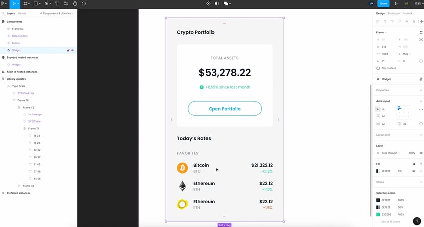
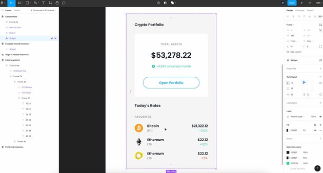
We have for example, a button. And some list items. These are all instances of other components.
Now, the main components have certain properties. For example, on the list items, I have a Trend type which is Positive or Negative.

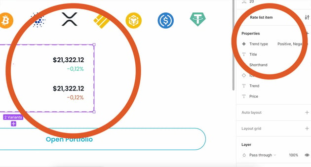

I have a Title, a Shorthand, an Icon, a Trend, and a Price. And each one of these properties corresponds to a certain field.
And the same goes for the button. I have a single text property called Button text.
I created an instance of this, and if I want to change any of the properties for the nested instances, I kind of have to dig down and select that instance. And then in the inspector, I have access to those properties.
The same goes for a list item, for example. I can change the Trend type. I can change the Title, the Shorthand. I can choose the Icon, and so on and so forth. But it’s still a bit inconvenient, because I have to dig down.
Well, now in Figma, you can have exposed nested instances that basically allows you to bubble up the properties of the nested instances without you having to select each one individually.
So how do you do that?
Select the main component, click on the plus sign where it says properties, and then choose expose properties from nested instances. And you can choose which nested instances you want to use to display the properties.


So once you do that, you select the instance again, and now you have access to all of those properties without you having to select an individual nested instance.
Super, super cool.
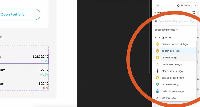
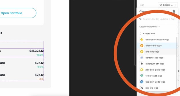
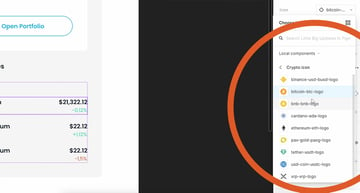
10. Preferred Values for Instances
The next change is amazing and it’s actually great news for people who build design systems.
So let’s say that I have this instance, and I want to change its icon. When I go back to my list item, and I click on the drop-down, I have quite a few icons to choose from.
But what if there are just a couple of icons that I use frequently?
Well, now I can choose what those are because of preferred instances.
So, here’s how I do that. I go to the the main component, and I go under the icon property, and here I see something called preferred values.


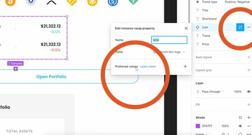
I click on plus, and then I choose the ones that I think I’m going to use the most. Now, if I go back to this example, when I’m going to select the icon, it shows me the preferred instances that I selected first.
Ideal if you have an icon set that has 100 different icons. Instead of showing 100 different icons in a drop-down, users will just have to search and pick the ones that they want.
11. Align to Nested Instances
So here’s something you couldn’t do before. Let’s assume that you have a component in a design and you want to annotate it, or maybe add some documentation to it. And it has a bunch of nested instances. Well now in Figma, you can take your annotation, select whatever it is inside that instance that you want to link to, and then you can move it in place.
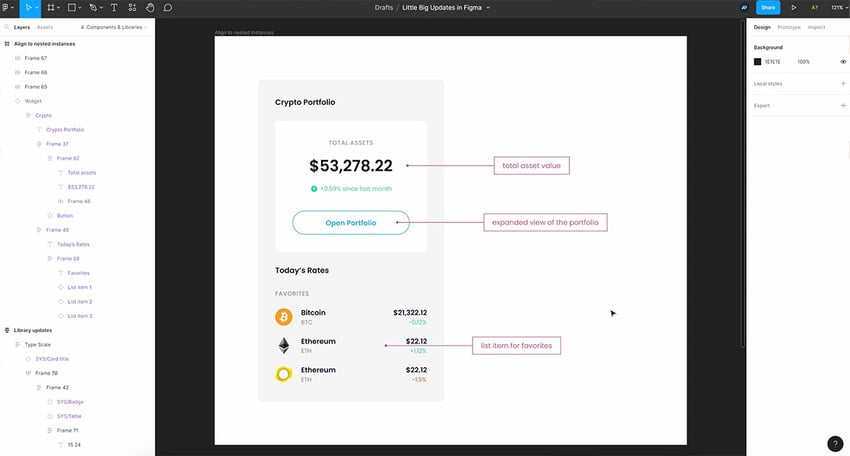

And that’s an alignment to nested instances,
12. Individual Push to Library
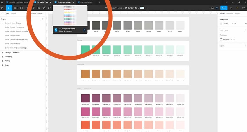
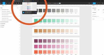
Let’s assume that I have a library that I shared with a file and I’m using some elements from that library. In this case I’m using elements from a library that I called Sys Dashboard. And this just allows me to create kind of a starter design system for some of my projects.
In here I have a bunch of components defined, and a lot of text styles, and color styles. Before, when you were working with Figma libraries, whenever someone updated elements in a library, you would get a notification and you would update to the latest changes.
But you would have to update everything. If there were ten changes, then all ten changes would have been pushed to your local file. Well now, you can do this individually.
Imagine someone has made some alterations to the library and published all the changes. When I next go back to the files that are using that library, it tells me component updates are available.
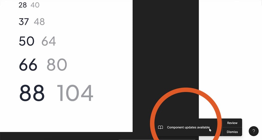

And sure enough, if I select a certain component, I can also see an icon that says update available.
So when I click this icon, I no longer need to apply every single change, but instead, I can update just the selected instance. Or I can click review, update and I can see a side by side comparison.

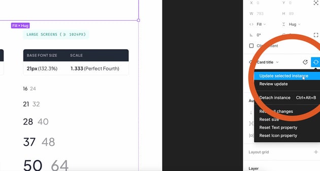

In terms of the library updates, the fact that you can now apply updates to individual instances and layers is super cool.
It’s impossible to discuss Figma without mentioning prototyping! Well, this update includes some really cool changes to prototyping, starting with sticky scrolling.
So let’s say that I have a homepage, and I want to make the yellow bar sticky. So when it gets to the top, it stays there.
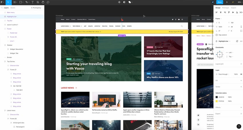


I can easily do that by switching to the Prototype tab, selecting the yellow bar, and then where it says position, I can choose Sticky: Stay at the top edge.

Now, if I open this prototype, as soon as I start scrolling, you’ll see that the yellow bar stays on the top. How cool is that?
14. Prototype Links Open in Same Tab
Let’s look at change number two when it comes to prototyping and that is that prototype links can now open in the same tab.
So to give you a little bit of context, in prototyping mode, I can select an element and I can add an interaction. I can say that on click (or whatever) I can open a link.
Let’s say that when I click a button, I’m going to go to envato.com, for example.
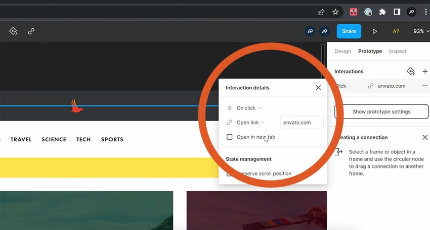

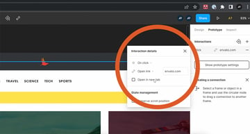
And by default, this would open in a new tab.
Well, now you can actually uncheck this option so it opens in the same tab. Simple, but effective.
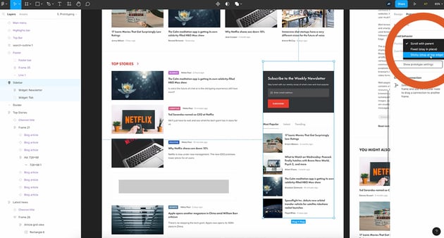
15. Multiple Interactions
Now, here’s change number three when it comes to prototyping, and that’s the ability to create multiple interactions in one go.
So, for example, I have this latest news section and I want every single one of these images or cards to take me to the article page when I click it.
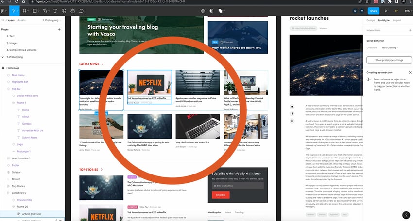


You would usually select the element and then click on the plus sign, and it would create noodle like this, to navigate to the article page.

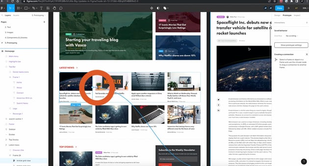
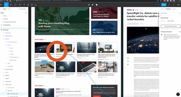
And then you would select the second one and the third, and so on and so forth. But there’s actually a much faster way of doing this.
Now, select a bunch of elements at the same time and click on the plus sign once, then just drag to where you want.
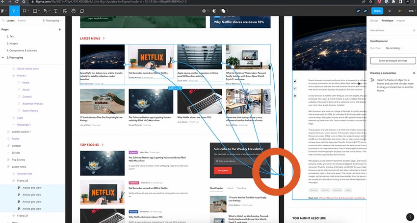
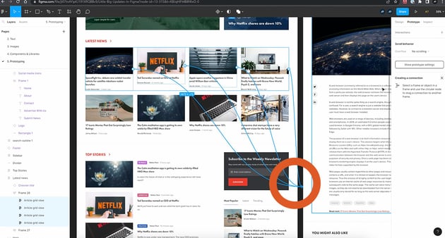
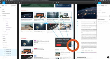
That’s going to create multiple interactions so that in your prototype clicking any of these four, will take you to the article page. So that’s update number three for prototyping.
17. Multi-Select Search
Finally, we’re going to look at some “quality of life” changes, starting with multi-select search.
As we know, there’s a search functionality in Figma (“Find”) and we can bring up that search field by either clicking the icon in the top left of the layers panel, or pressing Ctrl F.
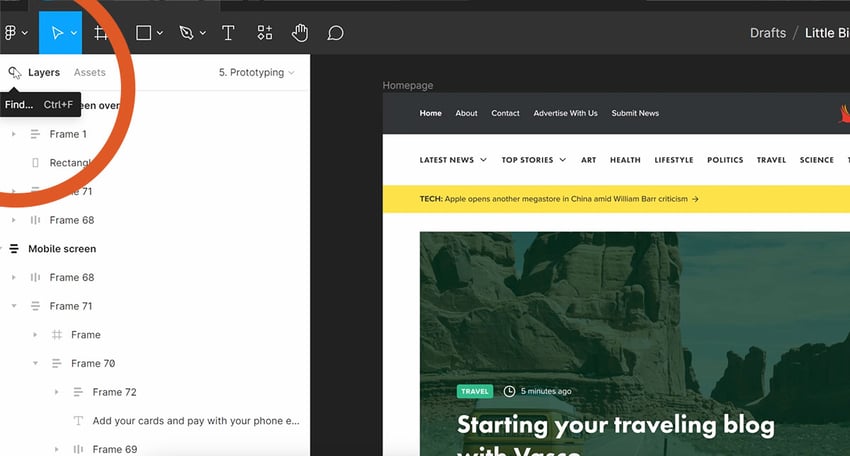

But now what’s interesting is that we can multi-select the search results. So let’s say that I’m looking for an element called article grid view. I have many elements like this, and Figma finds every single one.
I can click on each one and Figma will select it in the canvas.
But now what I can also do is multi-select; I can select as many of these results as I want, and I can change whatever properties I like, applying the change to all selected items.

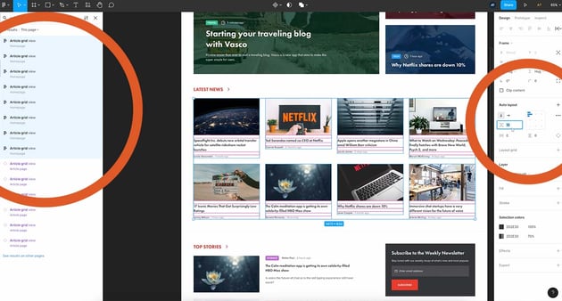
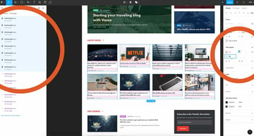
Maybe I want bigger spacing between items because I’m using auto layout, or maybe I want to change the selection colors. Whatever it is, Figma allows me to do that really easily because I can now, select multiple elements in the search results.
18. Visible Search Field
The next quality of life change is about seeing the search field on the desktop app when you’re creating a new tab.
So if you click on the plus sign to create a new tab, besides the usual stuff (the options to create a new design file or a new FigJam file, and a look at some of the recent files that we worked on) you now have the ability to search for a specific file.

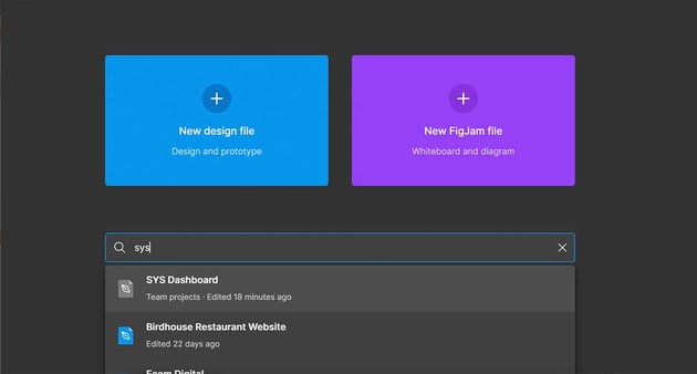
In this example I want to open the Sys Dashboard that I showed you earlier. Now I can do that very easily.
Remember, this search functionality is only available in the desktop app.
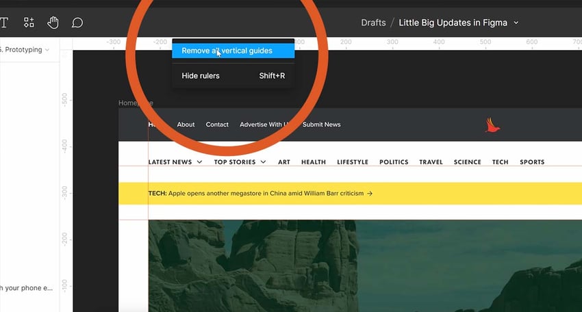
19. Remove Guides
The third “quality of life change” has to do with rulers.
As ever, you can press Shift+R to bring up the rulers in Figma. And let’s say you create a couple of guides just to assist you with the whole designing process.
Using Shift+R again, you can hide them. But they’re still there, they’re not deleted permanently. To do that you can click on each one and press backspace or delete to delete it.
But now you can also right-click on either the top ruler or the left ruler, and you can remove all the vertical and the horizontal guides. You can, of course, hide the rulers altogether with this option.


20. Tabs Preview
And finally, for “quality of life” change number four and the last one on our list is; the following.
On desktop, when we have multiple tabs open, we can hover to see a preview of that file.

So maybe, for example, we have several files opened, and maybe they’re not labeled or named properly? Well, I can quickly use this functionality to get a preview of that file so I can determine what exactly is in it. Very, very nice edition.
Conclusion
All right, and those are 20 of the latest new additions to Figma. Check out what else is new on Figma’s own website!