
Getting started with typography is possibly one of the more accessible parts of learning design, simply because of how easy it is to change and play around with the text to get immediate results. However, refining your typography skills so that you can design something that works well and is effective, is readable and useful for your users, is more of a challenge.
Technical Terms
First off, we’ll get some of the basic technical terms out of the way. This is only a little rundown of some of the most common terms you’ll come across when working with typography, and there are far more comprehensive guides on the web or in books if you want to read up more.
Font vs. Typeface
This first term is one that trips most people up. Typeface describes the designed letterforms. A font is the vehicle which contains the typeface. You download and install a font package in order to use a typeface within your design.
Serif vs. Sans Serif
You can safely think of there being two main type classifications – serif and sans serif. Serif typefaces generally look a little more classic in style, often with little flicks or embellishments (serifs) where letterforms terminate.
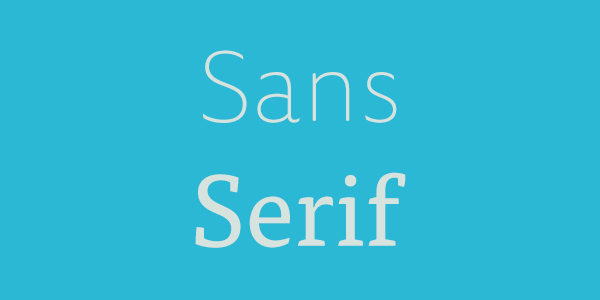
Examples of serif fonts include Times New Roman, Baskerville and Georgia. Sans serif typefaces lack the serif embellishments, instead looking a little more modern. Examples of sans serif fonts include Helvetica, Arial and Futura.
What Makes up a Character?
Let’s briefly examine the anatomy of a letterform.
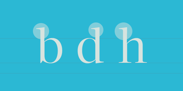
Ascender
The ascender is any part of a lowercase letter that extends above the x-height of the letter. You’ll be familiar with letters which have ascenders such as b, d, f, h, k, l.
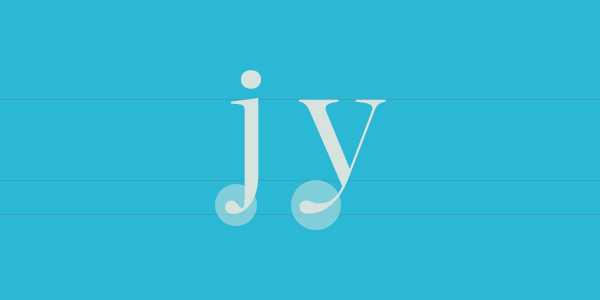
Descender
A descender is any part of a lowercase letter that extends below the x-height of the letter. For example g, j, p, q, y.
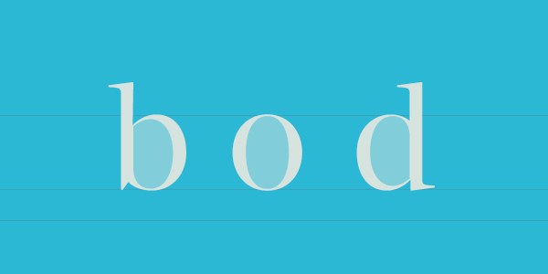
Counter
In a letter, a counter is the curved enclosed (or partially closed) negative space inside a letter. Common letters with counters include b, d, e, o, s.
Serif
As we’ve mentioned, serifs are the extra flicks and embellishments you can see when distinguishing between serif and sans serif font styles.
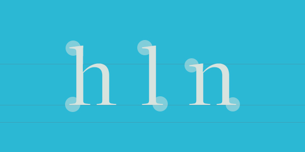
Baseline
The baseline is an invisible line on which all of the characters sit. This baseline can vary massively between different typefaces, but is usually always consistent within an individual typeface.
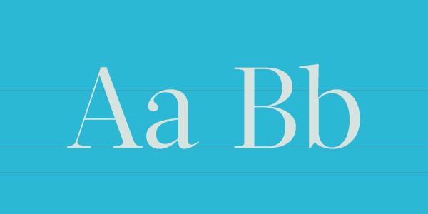
Cap Height
The cap height is the distance from the baseline to the very top of the uppercase letters.
x-height
The x-height is the height of the main part of the lowercase letters (or at least the height of the lowercase x, hence the name). This height does not include the height of additional ascenders or descenders.
Font Glyphs
A glyph is an individual character within a font. These include any symbol or letter, through to extra glyphs that may be available to you which don’t match any of the more commonly known or used symbols or letters.
When Working With Typography…
…you should think about:
Size
When working with typography (and this might sound obvious) you should consider the size of the text that you will be working with.
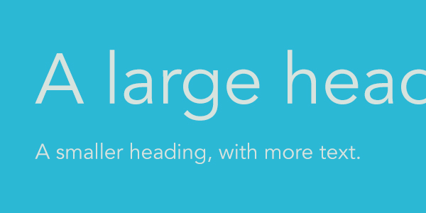
With every design trend that passes there will also be trends on how small or large the text should be. Think, for example, about the intended audience; is your audience a younger or older audience, will they need a larger text size?
Think as well about how the text size will impact your site design. Do you want it to be focused on typography, or do you have other embellishments and design elements you want to include that can influence the way the typography sits in the design?
Contrast
Contrast influences the readability of a block of text enormously. When we talk about contrast there are two key things to keep in mind.
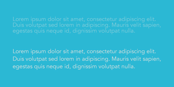
Firstly, you want to ensure the contrast between the text and the background is strong enough to be noticeable. Think about accessibility here – going back to talking about colour accessibility in design, the same applies for your text. If you’re unsure of whether or not your text will have enough contrast then use a tool such as Lea Verou’s Contrast Ratio tool to help you.
You also need to be mindful of the font choices that you make. Many fonts that have very thin weights might not display well at certain sizes and may be more useful for larger fonts or display headlines. Also try to ensure that the fonts or typefaces that you choose have good browser and operating system support. Some fonts and typefaces may work well on one platform, but look and perform terribly on another.
Space
When working with typography, as with any other part of your design, you want to ensure that you give it enough space to breathe and for the content to speak for itself.
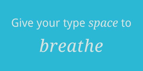
The content on your website is the core experience that your users need to be offered. Aside from any other design elements, all your users really need to see is the content. Because of that, don’t be afraid of giving more space to the content and letting your content do more of the talking.
Negative space is the space or gaps that are left around elements of a design; don’t be afraid of leaving this negative space around your content.
Don’t also forget about the space around every part of your text. Allow for a generous line-height which doesn’t make your text feel cramped and more difficult to read. As a general rule (though feel free to play with this) a line-height that is at least 140% to 160% of the text size should work well and offer a good balance for your text.
Hierarchy
A typographic hierarchy relates to how the content is laid out in your design.
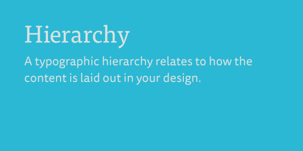
Establishing good content hierarchy starts at the beginning, when you work to create a good structure within your content. Typographic hierarchy then works with your content – through from headings to normal paragraphs and any parts of your content that you want to emphasise – to help form a structure that users can navigate easily.
The impact a hierarchy has on your design can be massive. You should make your users’ journey to find the content they’re after as easy as possible, and establishing a solid hierarchy will only yield positive effects.
You can establish a good, visual, typographic hierarchy in a number of ways, including using colour or varying text sizes to create emphasis and structure in your content. All of the previous tips will help you to establish a better typographic hierarchy, though it’s something that will always come with practice.
Web Fonts
We’ll be discussing web fonts in further detail later on in this series, but the following should be a solid intro into the possibilities of web fonts.
Nowadays we’re really lucky that we have many options for implementing web fonts on our websites – and with the more commonplace use of web fonts on the web (brought on by better across-the-board browser support), we can be more inventive in the typographicstyles and designs we can include in our designs.
As well as being able to host your own fonts using @font-face, there are many online services available to help you use more web fonts online, including:
- H&FJ Web Fonts
- Typekit
- Fontdeck
- Fonts.com
- Google Web Fonts
- FontSquirrel (@font-face downloadable kits)
and many, many more. Even sites such as FontShop or MyFonts (which used to be limited to just selling desktop fonts) are now entering the market of web fonts, offering you downloadable fonts that you can use with the @font-face technique.