Here’s a situation which may be familiar to you: you’re a developer and you build a prototype to demonstrate something. It works just as you mean it to, but the looks of horror on your users’ faces tell you something is wrong–your demo looks like crap.
Let’s look some simple guidelines and tips to help your demos look as good as they should.
Relax
You may have heard the following:
“Good design, when it’s done well, becomes invisible. It’s only when it’s done poorly that we notice it.” – Jared Spool
This is relevant to all designers, but it’s especially pertinent to you, as a developer. You’re building a demo; something which is solely intended to demonstrate something. Its users should be engrossed in whatever task you’re laying out before them, not reacting to the “design”.
Pointer #1: By trying to make a stylistic statement, there’s a high chance you’re actually moving further away from delivering a good demo. Keep it simple. Stick to making it work.
If something “doesn’t look right”, remove any visual details you may have added (such as box shadows, borders, effects) and go back to the drawing board.
Now we have that patronising word of warning out of the way, let’s concentrate on some more practical pointers!
Avoid a Messy Palette
Nothing is more instantaneously offensive to the eyes than poor colour choices. In actual fact, colour decisions should be addressed well into the UI design process, but it’s always tempting to make bold colour choices early on.

If you were wireframing a UI, you’d begin as simply as possible; with rudimentary shapes, lines, and monochrome. Once the layout and relationships were settled upon, you’d add more detail, moving towards higher fidelity until you ultimately begin purposefully exploring colour. So then, some pointers:
Pointer #2: Consider going monochrome on your own demos. Stick to shades of grey (fifty?) until you’re ready to use colour to help clarify things.

Pointer #3: As a rule of thumb, avoid fully saturated colours (ie: colours at full strength, with no added white tint). Particularly when viewed on an illuminated screen, they can be uncomfortable to look at when combined with one another.
Pointer #4: The same is true of black and white. By avoiding the extremes, sticking to off-black and off-white, you’re less likely to give your users tired eyes.
Go even further and add a touch of colour to your blacks and greys. As Ian Storm Taylor said back in 2012:
“Shadows aren’t black”
Ian’s lessons from art school mirror my own–I remember my teacher challenging me to find a black dot in Georges Seurat’s A Sunday Afternoon on the Island of La Grande Jatte.

Pointer #5: When adding colours to your monochrome design, do so one at a time. Each colour you add is an invitation for user distraction. We spoke briefly about avoiding high saturation, but there’s nothing to say you can’t use a range of saturations of one hue. That will give you the variety and depth you need, risk free.

Color Theory
6 Beginner “Safety First” Color Guidelines for the Web
Kezz Bracey

Color Theory
Color for Attention and Depth in 60 Seconds
Kezz Bracey
Don’t Overcomplicate Typography
If we’re talking demos and prototypes there’s really no need to go beyond using system fonts (see Pointer #1). Still, consider the following:
Pointer #6: You’re in safe hands with sans-serif (“without” serif). Serif typefaces are those which have the details where strokes terminate (some jargon in there for you).

Serifs can be useful for adding personality to a design, and they can often make a body of text easier to read. But they’re not traditionally used in UI design, especially at smaller sizes, as much of the time they display varied stroke weights.
Note: as screen resolutions increase, clarity improves, and this argument holds less weight.

Google make use of the “humanist” Droid Sans in their Android interfaces, and more recently Roboto and Noto. Apple use San Francisco for their range of operating systems, and before that Neue Helvetica. Firefox OS uses Fira Sans. Notice the common theme here? All sans-serif.
Pointer #7: Avoid ambiguity. Character combinations such as O0, aeo, 8B, Il1, 5S, 2Z, 6b, and 9g are sometimes difficult to distinguish, depending on the chosen type. Test them; if you struggle to tell them apart then you’d be wise to choose a different typeface.

Room to Breathe
Whitespace (functional space) serves the visual designer in many ways. It helps create a sense of balance, draws attention to necessary aspects of the design, reduces cognitive load for the user (I could go on). If your UI is cramped it will quickly make users feel uncomfortable and reduce their ability to process tasks effectively.
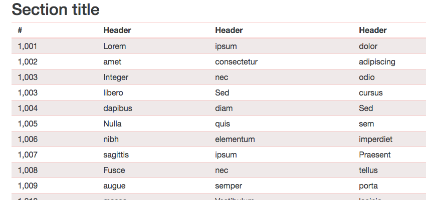
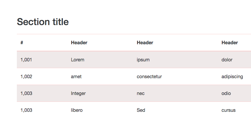
When dealing with a lot of information, it’s tempting to squeeze as much in as possible, but which of these two examples do you find easier on the eye?


Pointer #8: Where breathing space is concerned “more” is almost always better. Add padding, add margins, boost line-heights, spread everything out.
Pointer #9: Make your spacing consistent. Use a standard unit as your base, adding space in increments of (for example) 10px. Consistency is the key to creating rhythm and harmony.

Make Your Life Easier
There’s no shame in it; let frameworks like Bootstrap and Foundation do the hard work for you. They’re often criticised for making production websites look generic and unimaginative, but for prototypes they’re absolutely perfect, straight out of the box.
All the decisions we’ve discussed so far have already been made for you: typography, colours, spacing, consistency, and for messy details like forms you can’t go wrong.
Pointer #10: Stand on the shoulders of others. Grab existing Bootstrap templates, Foundation templates, or Material Design Lite, or Skeleton, or Pure CSS, or UIKit, or whichever one of the million CSS frameworks you fancy! Don’t be afraid to add your own styles on top, bearing in mind all the points we’ve discussed so far.

These frameworks are all very comprehensive. Make sure you use all the pieces you need; you’ll likely run into problems if you cherry-pick just a few elements.
Conclusion
This wasn’t intended to be a design fundamentals article, but instead aims to help you smooth over any problems you’re having with your prototype designs. If you’re a developer–perhaps recording a course, or presenting a product to clients or your team–and you really want your demos to do their job, these pointers should get you on the right track. Let me know in the comments if you have any specific questions. Good luck!


