If you’re a woman, you probably know that when you go shopping to the mall, you have to enter every store at least once until you actually decide to buy something. If you’re a man, you probably never do this, unless, of course, you’re acompanying a woman.
So, in this case, imagine how great it would be if you could enter a store and everything you’re looking for would be right in front of you, with all the information you need about the products displayed clearly and the only thing left for you to do is actually buy it. Image how much time you’d save. Whatever will you now do with all this spare time on your hands?
What you’ve just imagined is an ideal shopping experience, something that can be called a “customer friendly” store. It loosely fits the definition of the perfect shop, where you see what you want, you quickly learn information about it and you buy what you need in no time. You’re probably thinking that this kind of store doesn’t exist. But if you think about it from a website perspective, you’ll realise the idea is not impossible. This kind of website is called a user driven website and it can be easily made by focusing on the user.
What are user driven websites?
The development perspective
A website is a combination of processes, content and services provided for the user. To make this combination is user driven, you have to ensure that the interaction between the user and the website works seemlesly, helping the user find what he’s looking for or solve any of his problems as fast as possible. This kind of merger should ensure a user experience (UX) that would help users to easily attain their purposes.
The design perspective
The design of a website is very important as well because a user friendly web design will help the user to better see and comprehend how all the features and applications work and it will improve the user interaction with the website. For this to happen, the website must perfectly match the users’ expectations.
In what follows, we’ll take a closer look at the ‘designing’ aspect of user driven websites.
What makes a website’s design user friendly?
When browsing the Internet, you will realize that you spend more time on some websites than on others. This usually happens because subconsciously your mind makes the difference between a user friendly website and a non-friendly one, and decides to absorb the firsts content more readily. There are certain website features that influence our subconscious when deciding how user-friendly the website is. Some of these features are:
– Navigation is made easy
– Pages load in no time
– Well organized content
– An easy to understand site map
– Easy to search
– Easy to read
– High quality images
– Well placed action buttons
– No messy overly complicated designs
The designing process
First: Know your users and what they like
In order to identify target users you have to learn more about them. Things like where they’re from, what they like and even what kind of website they usually access will help you know them better.
User behavior: designing a user driven website implies understanding your users. Most users want to feel good when visiting a website. Your website should make them feel welcome and also safe. Most of them are quite eager to participate in everything happening on the website, such as aquiring new information, understanding it and distributing these pieces of information.
When you understand the user behavior of your target audience, you will be able to easily discover what their needs and expectations are. Although these can vary from user to user, there are some fundamental expectations that never change. Every user will be expecting the website to be:
– Accessible
– Functional
– Flexible
– Reliable
– Stable
– Usable
Second: Make a concept design
After you have all the information you need about your target users, you have to start putting together a design concept for your website that will satisfy their requirements. In conceptualizing the design, you should take the following steps:
– Choose a design pattern
– Decide on the layout and identify the necessary functions
– See what current web design trends you should incorporate into your website
– Choose the design elements that help achieve the purpose of your project
– Select the images that will generate the right emotions – this will produce the right user reaction
– Come up with interesting and innovative design ideas that will make your website stand out
– Identify the most suitable design technologies in order to make your website come alive
After going through all these steps, your concept design will certainly meet your users’ expectations and provide a very good user experience.
Third: Designing user action flows
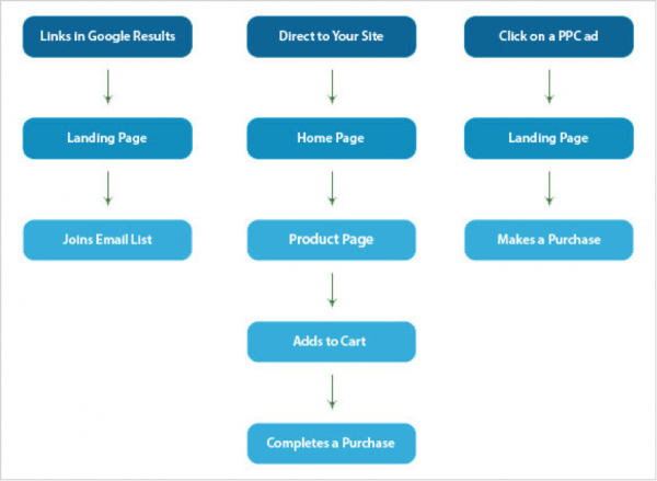
To help your user go through your site from the beginning to the end of the browsing experience in the easiest and fastest way, you have to design a user action flow. The user action flow will be designed immediately after conceptualization and you will need to combine it with your website purpose in order to create a user friendly website.
The purpose of your website and the user flow are interconnected. Here are three examples of how user flow works. The user flow levels will change depending on the complexity of the website and its objective. But mostly the basics of a user flow will remain as shown below.
Fourth: Start designing
Wireframing
The wireframe represents the page layout and you can create it either by drawing it directly on paper, or by using a special software such as Photoshop. This will help you see how the website will look like and if it is user friendly enough.
Design
After approving the wireframe you can start writing the code for the basic design. Before getting to the interactive elements you have to make sure each code you write is validated.
Here are some examples of user driven websites:
Amazon
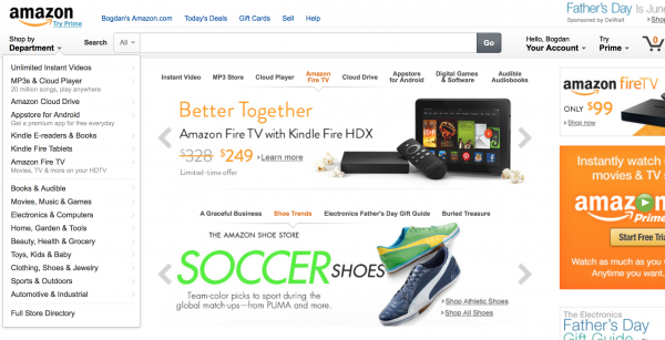
Amazon is one of the most popular ecommerce websites and that is mostly because it is user driven. It is very easy to browse and find exactly what you need. Using the search bar you can type the name of the product you are looking for and pick a category either from the navigation bar or from the list of product categories on the left of the screen. You can easily find any information regarding the use of the website or about the products.
Alertful
Alertful is “the free reminder service”. Everything you need to know about this website you can find on its Home Page. This page is all about their product, or better said, their service. The design focuses on the service and putting it in the spotlight. The best thing about it is that when you enter the site, you immediately learn what it’s all about and simply start using it.
Clearleft
This is a website for a company that offers various web design services. The website itself is an advertisement for their services. The Home Page has a slider where users can see the company’s portfolio and learn about their past projects. They focus on telling users about the services they provide and they’re doing it in a very practical and appealing way.
Conclusion
Creating a user driven website takes a lot of planning and research. You have to learn what the user wants and understand what he needs, in order to build a project that will fulfill the users’ expectations. In this case is not as much about writing code and knowing how to work with web design, but more about knowing the people and their requirements. If you start by being user oriented, you will end up having a website that users love.


