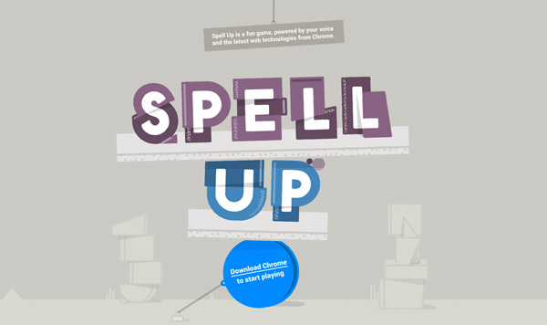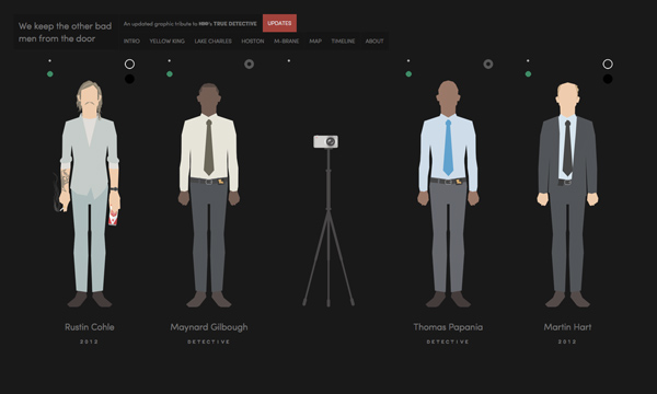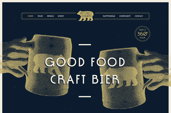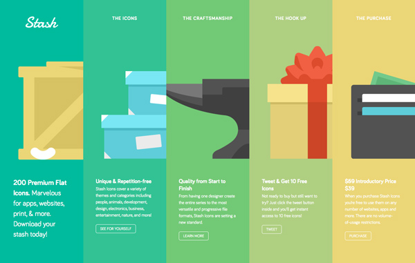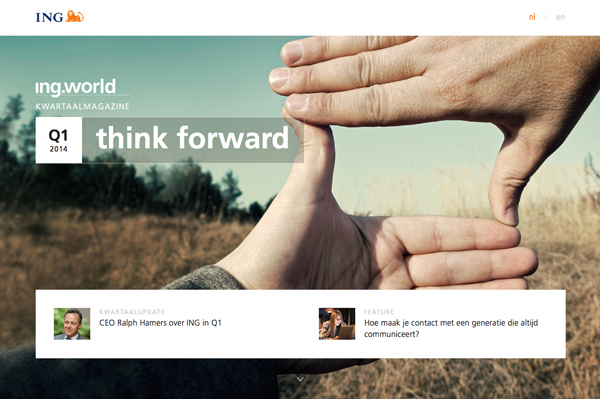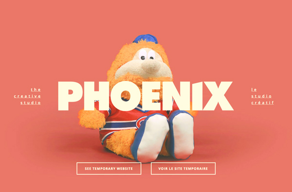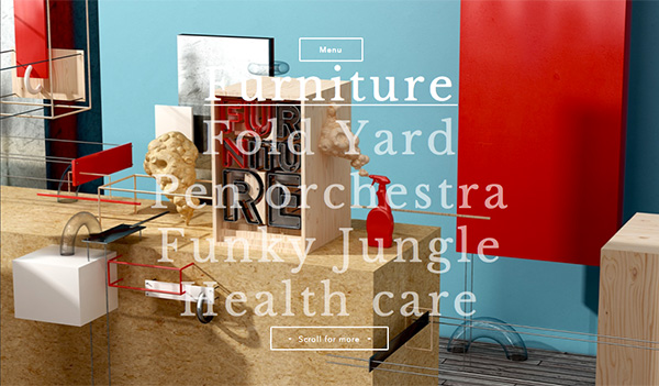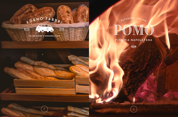
So how will you know the next big thing when you see it? Flat design took designers by storm — evolving from a few simple projects to becoming a significant part of web, and especially application, design.
But what’s next on the horizon? And how will you know it? Here are a few ways to predict web design trends (with a few trendy web design examples) … and maybe even start one yourself.
SEE ALSO: Coming and Going Web Design Trends for 2014
Look at Various Portfolios
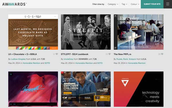
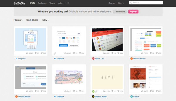
Young designers are often at the forefront of new design. Peruse portfolios on sites such as Dribbble (try the Debuts list) and Behance to see what others are working on. Look at website collections that are getting attention from Awwwards or The Best Designs.
Side projects can be a great indicator. Why? Because those are the things that designers often want to work on. Projects that are not hindered by client restrictions.
Take a close look at color choices – bright, bold, muted, minimal – and typography first. What do you see? What kinds of decisions are designers making?
Then look at interface. What do the visual elements look like? How do you interact with the site? How does it look on other devices? All of these things can be predictors of trends.
Examine Other Fields
Look to other creative fields for inspiration. Art, fashion and architecture are all areas where web designers can draw inspiration and start trends.
Fashion can be a great indicator or trendy color choices. Images from fashion week can help you see what colors will be the next big thing. Pantone’s annual color of the year selection is also a valuable tool when it comes to predicting color trends.
Art can be helpful as well. What are modern images saying? What’s the style? Straightforward or abstract, textured or flat, serene or chaotic? These themes can all play a role in web design. (Graffiti can also help you see what others are thinking in terms of text and style.)
Note the shapes of new buildings. Carry these angles into design projects. The same can be said for the textures used on facades of buildings and the color of building materials.
Think about how these mediums merge. Not all that long ago, video was a thing for television or YouTube. Now video is a trendy element as part of website backgrounds. And more animation is popping up on a variety of websites, frequently meshing with or taking the place of parallax scrolling.
Analyze the Visuals
The key is that most “real” design trends are sustainable. Look at flat design, for example, which has been a dominant design force for more than a year now. Major companies, including Apple, adopted it. And it started with one designer.
This trend included three components that make it sustainable:
- Usefulness
- Meshes with past design trends
- History
Think about these three factors in terms of any successful design project.
Good design is useful. Plain and simple. No user will interact with a design or user interface that does not work in an intuitive way. Users must know what and where to click or tap and understand distinctions between elements.
Current trends often work with some elements carried over from past trends. This evolution of design makes it more practical for designers to work. It is also a product of hesitation. Consider taking a new or relatively unseen idea to a client; they accept part of it, but not the entire concept. This is where the meshing of trends often comes from. (Think flat to almost-flat design.)
Finally, many trends are rooted in history. Everything that is old … is new again. While a trend may not reappear in the exact same form, elements are likely to emerge in new ways.
Keep an Eye on Social Media
What’s the chatter on social media about? What is getting shared?
Designers networking over social media can help predict what’s next. (As can traditional forms of in-person networking.)
But what are you talking about? What are your peers saying? Don’t dismiss any ideas because any of them could be what everyone is talking about six months from now.
Who do you follow? Check out this previous Designmodo list of 25 designers to follow on Twitter.
Get Scientific
Conduct an informal trend analysis. This process is the act of collecting information to spot patterns in information.
Once a week, note things that you have noticed in websites you’ve visited. Look at things like color, typography styles, effects, UI elements, user interface actions and anything else that impacts the look and use of projects you are working on.
Over time, you will start to see certain commonalities emerge. This can be an easy and great predictor of trends.
Consider Technology and Usability
When thinking about trends, don’t overlook things you do everyday. Consider the types of devices you use and how you use them to interact with websites.
Not that long ago every button needed to be clicked, for example, now many are tap-friendly. Consider the games you play online and on mobile devices? How are they powered? What actions make them work? Popular games can be a solid predictor of what actions people are comfortable with on devices.
Stay current with technology and trends as well. What devices are the most popular? What items are changing the way people interact, shop and chat online? These are all important conversations to have within your design and development team.
New technology and technological trends can be one of the top factors contributing to web design trends, especially for new devices.
Watch Design Blogs
Keep an eye on design blogs, such as Designmodo, to stay-up-to-date on what is happening in the world of web design. Things are changing almost daily and just reading about what’s going on can help you be ready to spot the next trend.
What can you look for? Start by reading tutorials about new techniques. Once a significant group of designers learns a certain technique, it is sure to start showing up in finished projects.
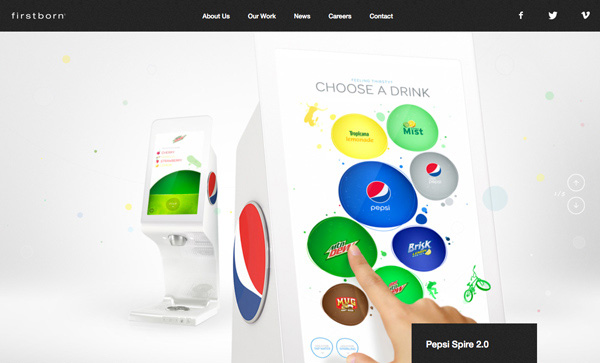
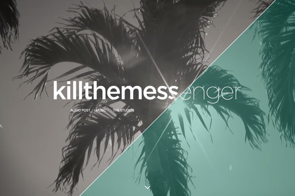
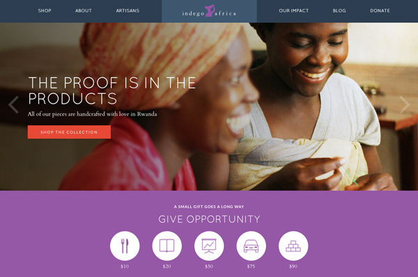
Look at the examples provided with articles and tutorials. (Designmodo provides a link with each image.) Visit the sites showcased. Are you starting to see common elements? Those are likely the things that will trend next.
Conclusion
Predicting trends is a fine art, not a science. What may be trendy today may be gone tomorrow. The best – and most usable – trends are ones that have long-term impacts.
If you want to be uber-trendy, consider starting with elements such as color or typography choices rather than an overall aesthetic. That way you can judge success before leaping to a larger scale design change.

