While weaving a logo, you might play up a traditional design and play it to the gallery, but there should be an element of imagination to the whole set up. A brand logo must possess a manipulative prowess that takes hold of a looker, and never lets him go. Creating an intriguing logo that works one over goes beyond making a good start.
While we can go on with our sermon to how one can create an incredible logo, there is no dearth of people who goof it up and end up falling prey to logo design mistakes and create logos that become poster-child for criminally bad designs. Here is where they go wrong.
1. Not Letting Passé be Passé
There are ways to bring back nostalgia. Unless you are sure how to do so, do not shoot apple off the head. There is a thin line between nostalgic and cliché. You won’t want to fall in the latter category, for it will spell doom for your design and your business. Logo is the first point of visual contact for any business, and when it passes of something they have seen before, any aspirations of making an impact are burned to the ground.

Image courtesy: LogoMoose
2. Lack of Uniqueness
If your idea of creating a logo is taking 3 smashing logo designs and cooking up a new design that borrows its flavors heavily from them, you have got it all wrong already.
“Create your own visual style… let it be unique for yourself and yet identifiable for others.” – Orson Welles
3. Making it Scream with Colors and Effects
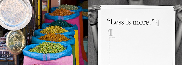
You know what they say about restrained exquisiteness, don’t you? Boiling the logo with unbridled hues and shadowy effects will only render it look puerile.
4. Using Too Many Fonts
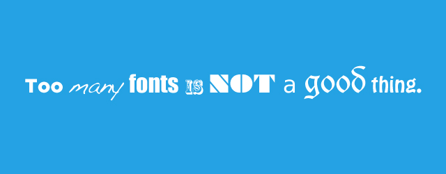
Using too many fonts in your design makes it look like something coming form an amateur. In your bid to add variety to the design, you might as well rule out the reason. And as much as using minimum number of fonts is recommended, observing acutely which font will suit the logo matters too.

Image courtesy: Red Rocket
5. Using Raster Images
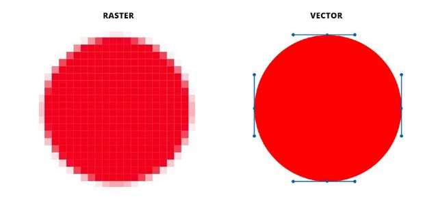
An experienced designer would vouch for the vector graphics software, like the Adobe Illustrator for creating designs that are accurate, and are desirably pixilated. As and when the logos are reproduced, the pixels aren’t lost and the logo is replicated in exactly the same form it was created in. However, if you are using the raster images for creating logos, reproducing can lead to glaring discrepancies in the visual representation of the logo. Logos created through this non-recommended technique may experience cluttered zooming, making it altogether ineffective.
6. A ‘Heading Nowhere’ Brand Message
It all boils down to what message is your logo trying to convey. If it fails on that front, you might keep on piling features, they won’t help!
7. Using Clip-Arts
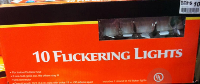
This is when we say, “Grow up” How Solemnly it is to create logos using clip arts! Not only it exhibits your lack of effort, but using those readymade clip arts might just lead to creating a creaking design.

8. Client Brief – Not Paying Attention to the Details
Be it creating a logo or designing a full-fledged website, if you aren’t clear what the target audience wants, all your hard work is likely to go kaput. And when you are working for a corporate client, trust them to know what their customers want. They will communicate the same to you and put forth all their expectations right there on the table for your consideration. Thus, do not waste time restlessly roaming around ideas that may not be relevant at all. Creating a logo that’s restlessly bouncing off the walls is going to make your client run for their sorry bags. Now, we aren’t saying you have to follow the client’s brief down to the last thread, but even if you drift a little from what they were expecting, make this drift worthwhile and surprise the client by delivering something even better than what they bargained for.
9. Ignoring How the Logo Will Look on Different Mediums
When you are a brand, you aren’t likely to use your logo on only your official website. The same logo will be reproduced on t-shirts, billboards and other such mediums. Make sure to design it in a way that it gels in seamlessly across all mediums.
10. Hugger-Mugger of a Design
A muddled up logo design, thanks to the too many words, too many curves, too much detail is only going to pass around evoking a lot of gibe and sneer.
Conclusion
A design is perched in a category of “good” when it doesn’t free you from its grip. Do not let typical mistakes leak out towards the people who matter (clients, customers, or some random folks who are there to judge you).
Your logo design may not be sweat-soaked, but let the maturity of your vision expand and create a blockbuster design that stirs your client up.
Featured image, AspireBoard sketches by Eddie Lobanovskiy.
