Check out these inspiring packaging design trends. Whether you’re looking for the best food, cosmetic, consumer, or even beauty packaging trends for 2024, there’s plenty of inspiration to see.
What Are the Current Trends in Packaging?
So what are new trends in packaging, and what are some packaging trends that continue to make waves? Take a look at these packaging design trends for 2024.
Jump to content in this section:
1. Bold, Stand-Out Typography
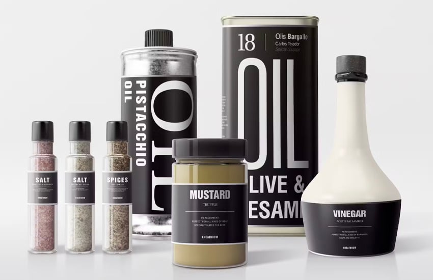
Bold typography that takes center stage is certainly on trend. This collection of oils and seasonings is a beautiful example of this design approach. Notice how the typography does all the talking. It’s also quite complementary to the shape of the packaging itself. The seasonings, in particular, are a great example. We have bold but clean type and then plenty of space to see the seasonings themselves.


This approach can also be seen in beauty packaging trends for 2024. There is something so elegant and chic about bold, beautiful, high-contrast type. Keep in mind that type can be communicative in ways beyond the obvious, too. Take a look at the product pumps below—the bold numbering could imply that these two cosmetic items are to be used in succession, for example.
2. High-Contrast Surface Graphics
Here’s another packaging trend that is absolutely a treat. High-contrast surface graphics can make such an eye-catching statement. From contrasting graphics to entire faces of the packing having high contrast against one another, it can really make a big impact. Opening a box, for example, only to be greeted with a stark contrast on the interior, can prove to be very communicative and energetic.
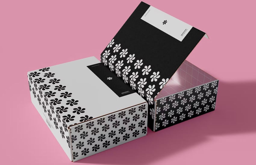

These package designs, below, are a great example. In the first example, on the left, the interior is a darker, contrasting pink. Not only that, but we get a hello message—greeting the user as they open the box. The blue example, on the right, takes a different approach. Notice how the base of the box differs greatly, while the interior is a continuation of the lid. This too is communicative.
3. Strategic Color Variants
Color variants continue to be one of the more popular food packaging trends for 2024—and for good reason. It makes excellent sense because color is so communicative. These chips are fun example of this premise. The visual consistency here, from the branding to the overall presentation, tells us that these chips are part of one family. However, the color differences easily imply different flavors—even without reading anything.
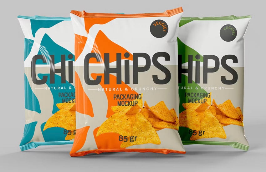


This is one of those packaging trends in 2024 that really favors the concept of a family of products. That’s why it’s such a popular option with food packaging—but other industries can play into this design trend too. In particular, consider this approach when you’re aiming to communicate strategic variants in a series of products.
4. Stylish Minimalism
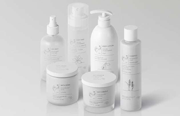
Minimalism is one of those timeless packaging trends that always seems to get reimagined and revisited as design changes with time. There’s good reason too—well-done minimalism can communicate an air of sophistication unlike any other. Check out this beautiful example of a series of cosmetic package designs. The design is clean, airy, and beautiful.
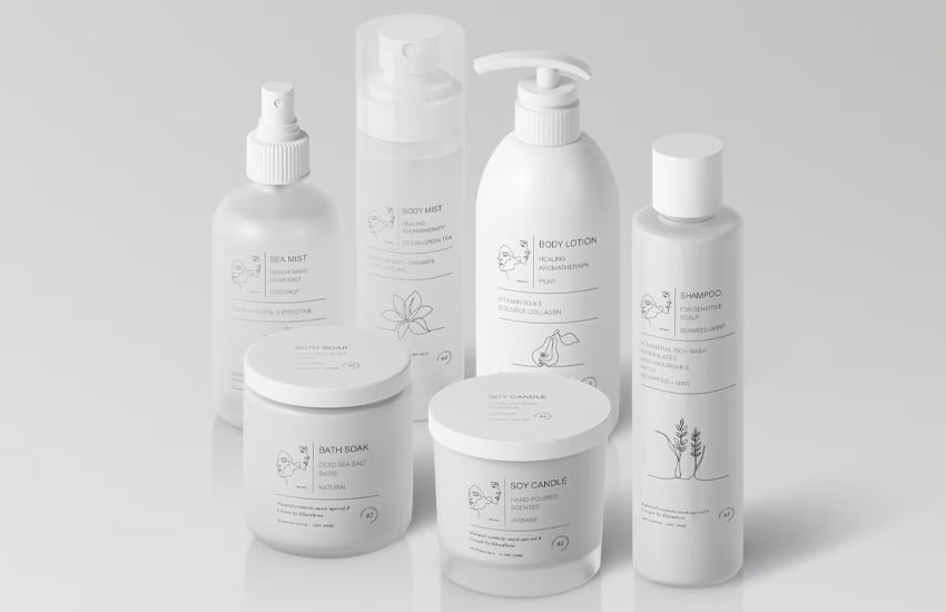
But minimalism isn’t necessarily exclusive to white or even designs that favor lighter values. The key here is generous negative space. That open quality lends itself to luxury. This is especially popular in beauty packaging trends for 2024. It’s a look and feel that goes hand and hand with products designed to evoke emotions like prestige, beauty, cleanliness, and relaxation.
5. Bold Shapes and Energetic Color Choices
If you’re looking to turn heads, bold shapes and energetic colors are one of the big packaging trends to keep an eye on. This is one of the more exciting food packaging trends for 2024. Check out this fun and playful package design concept, for example. Between the high contrast in the colors and the typography, it’s a concept that sure to stand out against the same old thing on the store shelves.

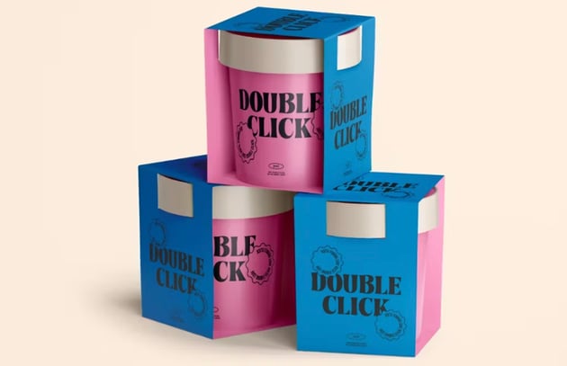

Color can be incredibly communicative—so it’s not just about screaming in the loudest colors possible. It’s about using that bold, energetic approach to communicate what makes your product just that: bold and energetic. We wouldn’t expect this from something like pharmaceuticals, for example, so be strategic when experimenting with this approach.
Higher saturation and playful, energetic color choices are definitely a trendy choice, especially for retro-inspired designs (which we’ll talk about a little later too). This bold approach can be an excellent way to stand out from the crowd.
6. Multi-Face Wrap-Around Design Elements
When you’re designing a package, every face comes together to make a completed, adhesive composition. Design elements that wrap around more than one face are particularly popular. It’s especially evident in food packaging trends for 2024. These welcoming burger boxes are an approach you may have seen—and will likely continue to see as we continue into the year.
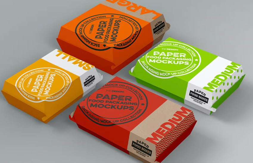

What makes this approach work so well? It doesn’t conform to the shape of the packaging in a rigid way—and this inherently opens up the opportunity to do something more visually engaging. A can, for example, that uses larger, wrap-around graphics is going to encourage a person to pick up and turn the can (to see what there is to see!). Elements that extend imply movement and can drive the eye to other parts of the design, just like we’d see in general applications of design principles.
7. Organic Earthy Charm
We’ll continue to see rustic, earthy looks in 2024’s packaging trends—and that’s because there’s a certain charm and even trust in a homemade look and feel. Take a look at the package design for this honey, below. Even if it was mass produced, it has a very “farm feel”, rather than something sterile or machine-like. This can be a particularly strong approach for products that are organic, natural, artisanal, or even healthy, as it helps visually imply those qualities.
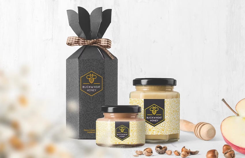

Texture is a common quality highlighted in these packaging design trends too. For example, you may see materials with neutral colors or a more evident paper texture. Recycled materials with a heavier tooth or more predominant texture may also fit this aesthetic very well. Beauty products can also benefit from this aesthetic—think, for example, about clean beauty products, or even fragrance free products for those who may be sensitive to artificial additives or colors.
8. Complementary Illustrative Elements
Illustrative elements can prove to be a very trendy design solution when checking out 2024’s packaging trends. This isn’t necessarily a product logo—but rather fun, illustrative extras that help take the package design further. They tend to be a supplement and not the star of the show. Check out this fun cosmetic example. The illustrations, both lined and solid, imply plants, leaves, and flowers without actually saying it to the viewer.
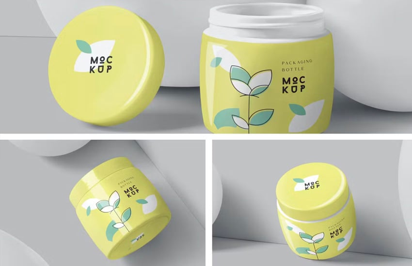
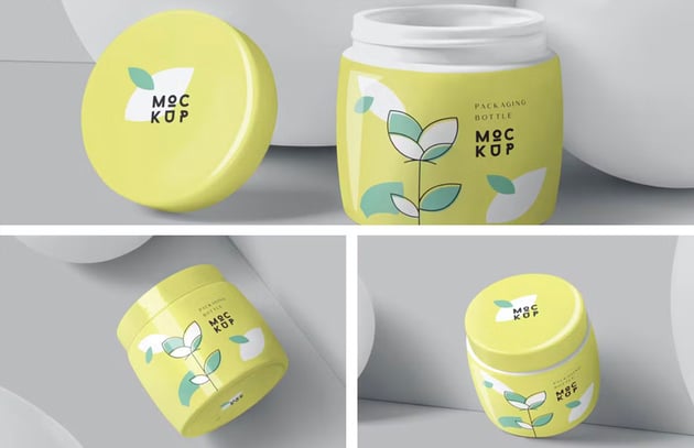

Illustrations, much like type, can come in such a wide variety of shapes, sizes, and colors. Stacked illustrations work lovely with a letterpress look or with the chalkboard aesthetic that often goes hand in hand with a cafe look. Designing something cute? A touch of illustrative texture or even a fun little doodle might take the look and feel even further. You’ll likely see this around as you observe packaging trends in 2024.
9. Cheeky Throwback Inspiration
Vintage and retro design has only continued to take a hold on design trends overall, and this remains strong and evident in 2024’s package design trends. Nostalgia hits just right sometimes—especially if it’s a brand that has that history. But that doesn’t mean throwback design is exclusive to “old” products. Retro type, retro color schemes, and even retro layouts can be a fun and engaging approach for a variety of packaging products.

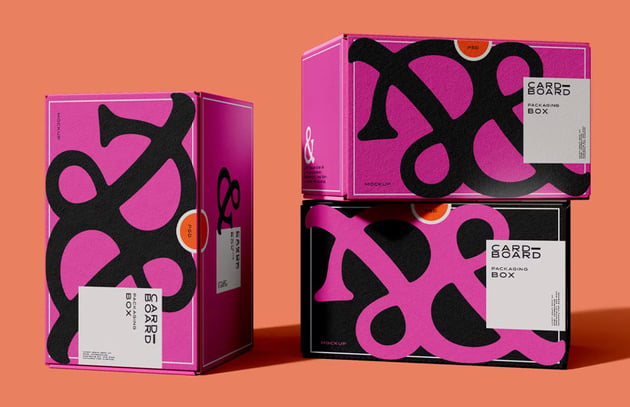

You may have noticed a number of food products take this approach—it’s certainly one of the more fun food packaging trends in 2024. Seeing some of our favorite products as they were 20 or 30 years ago can encourage consumers to not only reminisce, but also buy. That’s not to say that new products can’t embrace an old-fashioned look, especially if it makes good sense with the overall brand and marketing strategy.
10. Playful Use of Pattern
Pattern can be such a powerful addition to package design, give the nature of surface graphics. This can have some overlap with design elements that wrap over multiple faces—another trend for 2024. Use pattern to create an ambient, rhythmic aesthetic, or use it to create something bold, creative, and eye-catching. You may also see logos and other key branding elements used this way in 2024.
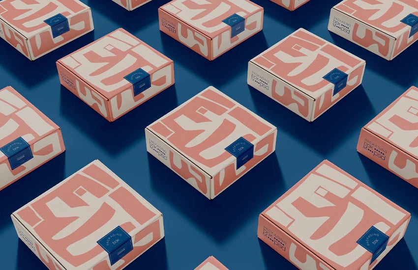


This technique isn’t exclusive to the more bold and daring designs out there either. Notice how the beautiful floral elements in the design to the left help create a soft, elegant aesthetic—ambient and complementary to key points like the product logo. Or check out the other example to the right. In this case, the logo has been used in a different color with lighter value—ambient, but also playful.
11. Eco-Friendly Materials
But what about sustainable packaging? Trends also reflect the need and desire for more eco-friendly packaging—but not necessarily at a detriment to beautiful design. Sustainable packaging trends combine the best of both words. In fact, experimenting with texture, paper, and materials can yield really creative results. One might assume that recycled products would exclusively lean towards neutral colors and a very earthy look, but that doesn’t always have to be the case.
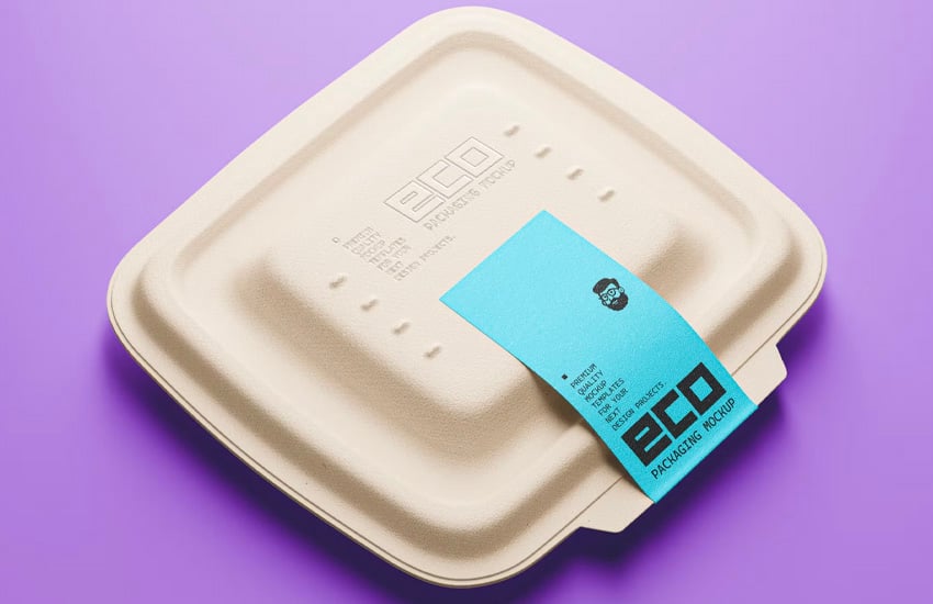


This isn’t exclusive to quick-use packaging either—although it’s becoming more and more common in food packaging trends. 2024 has the potential to pave the way for even more sustainable packaging trends. From reusable bags to recycled materials to more eco-friendly inks, there are so many options that we as designers can explore in our work. In addition, embracing the tactile quality of recycled materials can make for a lovely aesthetic. Consider your materials and their impact, whether you want it to be highly visible in your work or not.
12. Strategic Use of Texture
That said, texture is not exclusive to eco-centric branding or earthy, natural-based products. The below design is an excellent example. Use texture, embossing, and even foils to craft a tactile narrative. In this case, it creates an air of luxury that goes beyond what is seen. The consumer can feel it—imagine a velvety texture versus something that might feel “cheaper”, like a plain card stock. It’s a simple but timeless way to imply luxury.
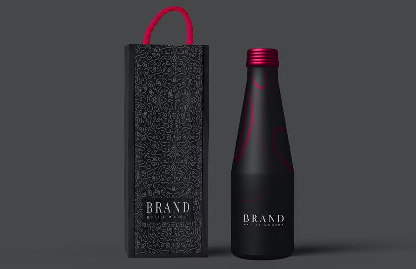


Of course, this isn’t exclusive to luxury items or cosmetics. Think about “the hand feel” in your packaging designs—you’ll see this in package design trends for 2024. Everything from how packages open to where stickers are placed can have a tactile influence on how the consumer interacts with and interprets your packaging.
Download Package Design Templates, Mockups, and More on Envato Elements
Envato Elements is an amazing resource for today’s creative professional. It’s like the ultimate cheat code for any design toolkit—with simple, all-inclusive commercial licensing at an amazing price.
Looking for a realistic mockup to showcase your package design concept? Or maybe you need just the right font, illustration, or pattern. Envato Elements has all that and more—and all of it is included for one low monthly price. Make sure to check out Envato Elements today.
Learn More About Package Design
Want to learn more about package design? From design inspiration to walkthroughs and tutorials, you can find it all here on Envato Tuts+. Check out these awesome articles today.
Which Packaging Design Trends Are Your Favorite?
With all the trendy and creative concepts influencing packaging trends in 2024, which are your favorites? None of them are one size fits all, so when checking out design inspiration, make sure to consider what you aim to communicate with your work. That’s often the key to a successful design.
Looking for even more design inspiration? Check out these collections. There’s even more lovely design work to see.