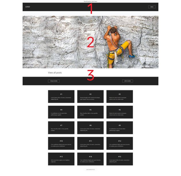
Here’s the demo page that we’re going to create to demonstrate things:
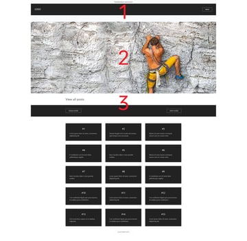
Be sure to scroll down the page to notice how specific elements become sticky.
As with other UIkit tutorials, familiarity with this framework will be beneficial to follow along.
The Demo Project
Our page will consist of the following sections:
- The header
- The hero banner
- The posts
Here’s how it will look:

Here are the important parts of the page markup:
<header class="page-header">
  <div class="notification uk-background-muted uk-text-center uk-h4 uk-margin-remove">...</div>
  <nav uk-sticky>
    <div class="uk-background-secondary uk-light uk-padding uk-padding-remove-horizontal uk-h3 uk-margin-remove">...</div>
    <div class="uk-background-muted uk-padding-small uk-padding-remove-horizontal uk-text-center uk-h4 uk-margin-remove uk-visible@m">...</div>
  </nav>
</header>
<section class="uk-background-cover" uk-height-viewport="offset-top: true" style="background-image: url(unsplash-posts.jpg);"></section>
<section class="uk-margin-large-bottom">
  <div class="post-filters uk-background-secondary uk-light uk-padding uk-padding-remove-horizontal uk-h4">
    <div class="uk-container">
      <form class="post-filters-form uk-flex uk-flex-middle uk-flex-between">
        <div class="post-filters-form-inner uk-flex-1">
          <button class="uk-button uk-button-default" type="button">TOGGLE FILTERS</button>
          <div class="post-filters-dropdown" uk-dropdown="mode: click; boundary: .post-filters-form; pos: bottom-justify">ALL FILTERS HERE</div>
        </div>
        <button class="uk-button uk-button-default" type="submit">APPLY FILTERS</button>
      </form>
    </div>
  </div>
  <div class="uk-container uk-margin-large">
    <div class="uk-child-width-1-2@s uk-child-width-1-3@m" uk-grid>
      <div class="uk-flex">
        <article class="uk-card uk-card-secondary uk-card-body uk-width-1-1">
          <h3 class="uk-text-center">...</h3>
          <p>...</p>
        </article>
      </div>
      <!-- more cards here -->
    </div>
  </div>
</section>
Notice that we’re using different UIkit classes to build the layout. Beyond these predefined classes, there are also a few custom ones that will help us call specific elements via JavaScript.
If you are completely unfamiliar with UIkit, I’d recommend you to open your browser developer tools and inspect different elements to understand what all these classes are doing.
Update Components
Going into more detail, the page header will consist of two elements:
- A notification bar
- A sticky
navelement with two childdivelements. Note that the seconddivwill be visible only on screens whose width is at least 960px.
The posts section will include the filters and grid.
Sticky
As we scroll down the page, the filters should remain sticky and sit underneath the sticky nav element.
The following JavaScript code will set them as sticky:
const pageHeader = document.querySelector(".page-header");
const nav = pageHeader.querySelector("nav");

const postFilters = UIkit.sticky(".post-filters", {
  offset: nav.offsetHeight
});
If we now print in the console this sticky element, we’ll see all its available options:
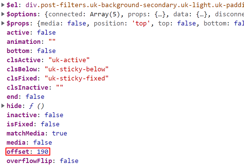


Pay attention to the offset property. Its value will be different depending on the screen size. Remember that the second div of the nav element will only be visible on screens that are at least 960px wide.
If we start resizing the page, we’ll notice that the filters won’t remain sticky at the expected position. This happens because we don’t update the offset value, but instead keep only the one that comes on page load. So, to make this component accurate we should add this piece of code:
window.addEventListener("resize", function () {
  postFilters.offset = nav.offsetHeight;
});
Dropdown
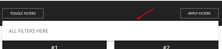
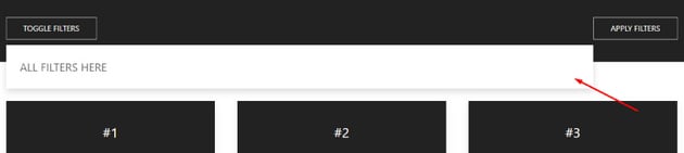
If you click on the Toggle Filters button, you’ll notice there’s a dropdown. In a real scenario, this might include all post tags, categories, or any other taxonomy terms. Its width will change depending on the screen size.
That said, on screens up to 959px, it will look like this:


However, on larger screens it will be as follows:


Notice that, in the second case, the dropdown doesn’t cover the full parent width but grows just before the Apply Filters button.
To accomplish this requirement, we’ll first initialize a new dropdown component by using custom attributes like this:
<div class="post-filters-dropdown" uk-dropdown="mode: click; boundary: .post-filters-form; pos: bottom-justify">
  ALL FILTERS HERE
</div>
Feel free to read the component’s documentation to understand the options we’re passing.
Next, we’ll get a reference to this component like this:
const dropdown = UIkit.dropdown(".post-filters-dropdown");
Again to see all the dropdown options, we’ll print it in the console:
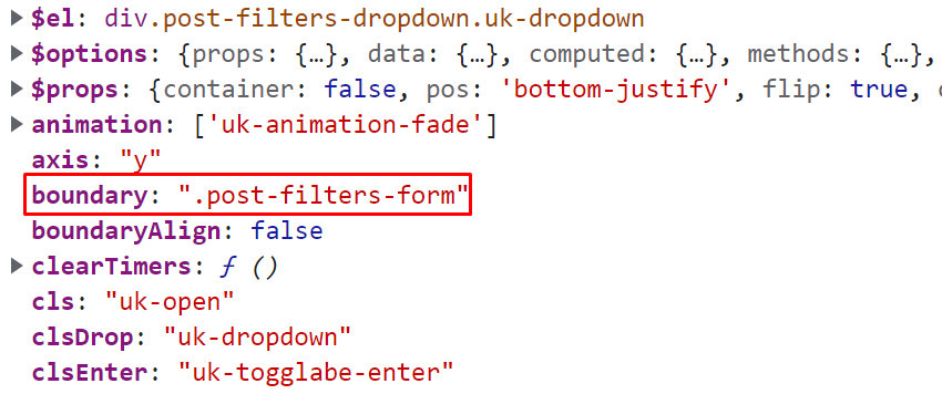
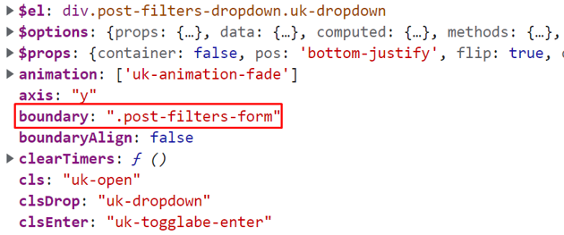
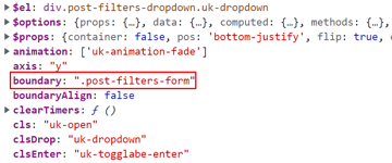
Notice the boundary parameter value. By default, we set this value to the form element which ensures that the dropdown will match its width. This is fine for small screens, but on screens that are at least 960px wide, its width should match the width of the .post-filters-form-inner element. So, to do this, we’ll add this condition:
...

if (mqMedium.matches) {
  dropdown.boundary = postFiltersFormInner;
}
Finally, to ensure that this condition will meet on window resize, we’ll add this piece of code:
...

window.addEventListener("resize", function () {
  if (mqMedium.matches) {
    dropdown.boundary = postFiltersFormInner;
  } else {
    dropdown.boundary = postFiltersForm;
  }
});
You can check all the code needed by toggling the JavaScript tab of the demo.
Conclusion
That’s it for today, folks! This exercise showed how to update the options of two UIkit components, giving you enough knowledge for updating other UIkit components as well.
Here’s our demo page as a reminder:
Last but not least, in the documentation, there’s some info on how to update a component by using the update event. Keep this in mind in case it’s needed.
As always, thanks a lot for reading!
UIkit Tutorials on Tuts+
UIkit, in the developers’ own words, is a “lightweight and modular front-end framework for developing fast and powerful web interfaces”. It’s a really popular way of building front end interfaces, so get onboard with these tutorials!