As a designer, you can enhance the user experience of a website or mobile application by adding subtle animations to its components. One such component is a search input box. This tutorial will cover how to create an expanding search input; one which expands when a user clicks on a search icon.
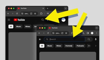
You’ll find this sort of expanding search input effect if ever you use Youtube in the browser:


HTML Structure
The HTML Structure will be just a simple div containing an input element and a button.
1 |
<div class="search-wrapper"> |
2 |
<input type="search" placeholder="Search" /> |
3 |
<button class="search-btn"> |
4 |
<i id="search-icon" class="fa-solid fa-magnifying-glass"></i> |
5 |
</button>
|
6 |
</div>
|
You’ll notice this is an input with a type of search, not text. There’s no real difference between the two, but search is semantically correct in our case.
“<input> elements of type search are text fields designed for the user to enter search queries into. These are functionally identical to text inputs, but may be styled differently by the user agent.” — mdn
Styling With CSS
The first thing we want to do is to center everything using Flexbox. Apply the following styles to the body.
1 |
body { |
2 |
display: flex; |
3 |
align-items: center; |
4 |
justify-content: center; |
5 |
background-color: gray; |
6 |
min-height: 100vh; |
7 |
}
|
Next, we will style the full search input and later we will work on the expanding feature. For the wrapper element, add an height, width, border, border-radius and a background .
1 |
.search-wrapper { |
2 |
width: 50px; |
3 |
height: 50px; |
4 |
display: flex; |
5 |
border-radius: 4rem; |
6 |
background: #fff; |
7 |
align-items: center; |
8 |
justify-content: center; |
9 |
outline: none; |
10 |
border: 2px solid #888; |
11 |
|
12 |
}
|
We have also added the style display: flex to the wrapper div element so that the child elements .i.e. input and button will also be centered. For the input element, set border:none, and outline:none. We also want it to have a full width and height. Set a margin-left:20px to the placeholder text and some padding.
1 |
.search-wrapper input { |
2 |
width: 100%; |
3 |
height: 100%; |
4 |
padding: 10px; |
5 |
margin-left: 20px; |
6 |
outline: none; |
7 |
border: none; |
8 |
font-size: 1.5rem; |
9 |
|
10 |
}
|
To make the icon visible, set a background color to the button. Round the button with border-radius:50%, and position it to the right of the wrapper element by setting margin-left: auto . The styles will look like this:
1 |
.search-btn { |
2 |
font-size: 2rem; |
3 |
border-radius: 50%; |
4 |
padding: 10px; |
5 |
border: 2px solid white; |
6 |
width: 60px; |
7 |
cursor: pointer; |
8 |
height: 60px; |
9 |
background: #e66610; |
10 |
margin-left: auto; |
11 |
}
|
Expanding Feature
Now that the entire search input is complete, we can work on the expand feature. The first thing we want to do is reduce the width of the wrapper element.
1 |
.search-wrapper { |
2 |
width: 60px; |
3 |
height: 60px; |
4 |
display: flex; |
5 |
border-radius: 4rem; |
6 |
background: white; |
7 |
align-items: center; |
8 |
justify-content: center; |
9 |
border-radius: 100px; |
10 |
outline: none; |
11 |
|
12 |
|
13 |
}
|
Next, Set position:relative to the wrapper div element and position:absolute to the input element; This will ensure that the input’s position is relative to the parent element rather than the body.
1 |
.search-wrapper {
|
2 |
/* the rest of the CSS */ |
3 |
position: relative; |
4 |
} |
5 |
|
6 |
|
7 |
.search-wrapper input {
|
8 |
position: absolute; |
9 |
top: 0; |
10 |
left: 0; |
11 |
/* the rest of the CSS */ |
12 |
} |
Now we have something like this.


As you can see, we still need additional CSS.
Let’s make the button float on top of the input by setting z-index:1 to the button.
1 |
.search-btn { |
2 |
font-size: 2rem; |
3 |
border-radius: 50%; |
4 |
padding: 10px; |
5 |
border: 1px solid #be0671; |
6 |
width: 60px; |
7 |
cursor: pointer; |
8 |
height: 60px; |
9 |
background: #be0671; |
10 |
margin-left: auto; |
11 |
z-index: 1; |
12 |
|
13 |
}
|
The final style is to hide any overflow by setting overflow: hidden on the wrapper div element.
1 |
.search-wrapper { |
2 |
/* rest of the CSS */
|
3 |
overflow: hidden; |
4 |
|
5 |
}
|
JavaScript Functionality
The JavaScript functionality will expand the wrapper element to full width when you hover with a mouse and reduce the width if you remove the mouse. Let’s first define the CSS class for increasing the width.
1 |
.active { |
2 |
width: 350px; |
3 |
}
|
Select the wrapper div element
1 |
const search = document.querySelector(".search-wrapper"); |
Next, add two event listeners, mouseover and mouseout. On mouseover, we will add the active CSS style; on mouseout, we will remove the CSS style.
1 |
search.addEventListener("mouseover", () => { |
2 |
if (!search.classList.contains("active")) { |
3 |
search.classList.add("active"); |
4 |
}
|
5 |
});
|
6 |
|
7 |
search.addEventListener("mouseout", () => { |
8 |
if (search.classList.contains("active")) { |
9 |
search.classList.remove("active"); |
10 |
}
|
11 |
});
|
Animation
The final step is to add a transition effect to make the transition effect smooth.
1 |
.search-wrapper { |
2 |
/* the rest of the CSS */
|
3 |
transition: 400ms ease-in-out; |
4 |
|
5 |
}
|
You can play around with the transition values to achieve the desired feel. That’s it for this tutorial; check out the CodePen below.
Conclusion
This tutorial has covered creating an expanding search bar that includes animations to improve interactivity. Incorporating transitions in your design is essential to make the user interface more engaging and enjoyable.