Wouldn’t it be fun to create your own beautiful Digital Clock with basic web technologies? This tutorial will cover how to create a faux-3D digital Clock with HTML, CSS, and Vanilla JavaScript.
Let’s get started!
HTML Structure
The HTML structure will consist of a rectangular container with a time display inside. The time display will contain elements for the current hour, minutes, and seconds.
1 |
<div class="rectangle-container"> |
2 |
<div class="rectangle"></div> |
3 |
<div class="time"> |
4 |
<p class="hours">12</p> |
5 |
<p class="separator">:</p> |
6 |
<p class="minutes">00</p> |
7 |
<p class="seconds"> </p> |
8 |
|
9 |
</div>
|
10 |
</div>
|
Styling with CSS
First, let’s define the global styles:
1 |
:root { |
2 |
--background: #dde1e7; |
3 |
--rectangle-background: rgb(227, 222, 231); |
4 |
--shadow-light: rgba(255, 255, 255, 0.45); |
5 |
--shadow-medium: rgba(94, 104, 121, 0.3); |
6 |
--shadow-dark:rgba(0, 0, 0, 0.45); |
7 |
--darkBlue:rgb(0, 0, 45); |
8 |
--time-text-light: #dde1e7; |
9 |
--textColor:#fff; |
10 |
}
|
Then, we’ll style the body to ensure all our elements are at the center of the page.
1 |
body {
|
2 |
display: flex; |
3 |
justify-content: center; |
4 |
align-items: center; |
5 |
min-height: 100vh; |
6 |
background: var(--background); |
7 |
font-family: "Protest Guerrilla", sans-serif; |
8 |
} |
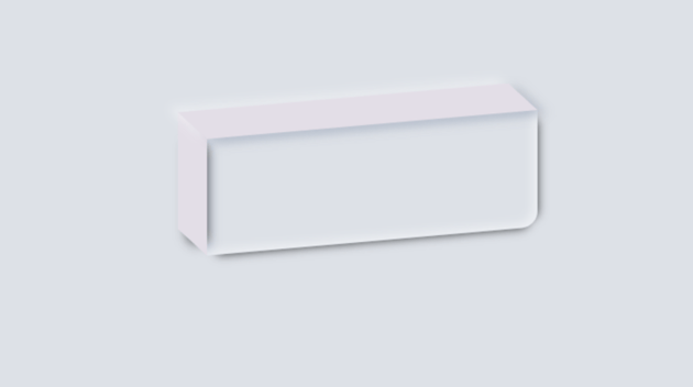
Faux 3D Effect
The next step is to create a rectangular element to house our digital clock. To ensure the rectangle appears slanted like in the demo, we will apply the style transform: skewY(-5deg);. We will also add a box shadow to the right and the top and inset box shadows on all sides.
1 |
.rectangle {
|
2 |
position: relative; |
3 |
width: 340px; |
4 |
height: 120px; |
5 |
transform: skewY(-5deg); |
6 |
border-bottom-right-radius: 16px; |
7 |
box-shadow: inset -5px -5px 9px var(--shadow-light), |
8 |
inset 5px 5px 9px var(--shadow-light), |
9 |
0px 10px 10px -10px var(--shadow-dark), |
10 |
10px 0px 10px -10px var(--shadow-dark); |
11 |
} |
The next step is to create an illusion of depth on the left and the top of the rectangle; we will do that by adding pseudo-elements to the left and top sides.
Let’s start with the left side.
1 |
.rectangle::before { |
2 |
content: ""; |
3 |
position: absolute; |
4 |
top: 0; |
5 |
left: -30px; |
6 |
width: 30px; |
7 |
height: 100%; |
8 |
background: var(--background); |
9 |
transform-origin: right; |
10 |
transform: skewY(45deg); |
11 |
box-shadow: 0px 10px 10px -10px var(--shadow-dark), |
12 |
10px 0px 10px -10px var(--shadow-dark); |
13 |
}
|
By specifying the height as 100%, we want the element to cover the entire height of the rectangle. By setting transform: skewY(45deg) property, it skews this element by 45 degrees along the Y-axis, giving it a slanted appearance.
The box-shadow property adds a shadow effect to this slanted element, enhancing its three-dimensional look. You can play around with the values to achieve the desired look.
In this pseudo-element, we also add a box shadow on the right and bottom of the element. The spread radius of the shadow is set to a negative value to ensure that the shadow travels toward the inside of the element.
We are also using absolute positioning to ensure the element fits exactly on the left side of the rectangle.
For the top pseudo-element, we have the following:
1 |
.rectangle::after { |
2 |
content: ""; |
3 |
position: absolute; |
4 |
top: -30px; |
5 |
left: 0; |
6 |
width: 100%; |
7 |
height: 30px; |
8 |
background: rgb(227, 222, 231); |
9 |
transform-origin: bottom; |
10 |
transform: skewx(45deg); |
11 |
box-shadow: -5px -5px 9px var(--shadow-light), |
12 |
5px 5px 9px var(--shadow-medium); |
13 |
}
|
The pseudo-element will stretch the entire width of the rectangles and use absolute positioning to ensure it fits precisely on top of the rectangle when skewed. We are adding a box shadow with a minimal blur on all sides of this element.
At this point, we have something like this:


The Time
Let’s work on the nested time element, which contains the clock.
1 |
.time { |
2 |
display: flex; |
3 |
font-weight: 900; |
4 |
justify-content: space-around; |
5 |
align-items: center; |
6 |
text-align: center; |
7 |
position: absolute; |
8 |
margin: 5px 25px 0 10px; |
9 |
width: 300px; |
10 |
height: 80px; |
11 |
top: 48.5%; |
12 |
left: 50%; |
13 |
transform: translate(-50%, -50%) skewY(-5deg); |
14 |
font-size: 40px; |
15 |
transform-origin: right; |
16 |
background-color: transparent; |
17 |
box-shadow: inset -5px -5px 9px var(--shadow-light), |
18 |
inset 5px 5px 9px var(--shadow-medium); |
19 |
}
|
Use Flexbox to ensure the child elements are aligned at the center and distributed evenly inside the parent. Set the font to bold and specify a width and height to ensure it doesn’t overflow outside the rectangle.
We are also skewing it to ensure the content flows with the shape of the enclosing element. The inset box-shadow on all sides creates an illusion of depth.
The final piece is to style the content .
1 |
.hours, |
2 |
.separator, |
3 |
.minutes, |
4 |
.seconds { |
5 |
background: var(--darkBlue); |
6 |
color: var(--textColor); |
7 |
margin-left: 10px; |
8 |
padding: 2px 10px; |
9 |
border-radius: 10px; |
10 |
font-weight: 900; |
11 |
}
|
12 |
.seconds { |
13 |
font-size: 15px; |
14 |
padding: 10px 4px; |
15 |
|
16 |
}
|
By doing this last step we have applied some margin and padding to ensure adequate spacing and readability and background color to make the text visible.
JavaScript Functionality
Let’s use JavaScript to make the clock functional. Create a function called updateTime().
1 |
function updateTime() { |
2 |
|
3 |
});
|
Inside the function, Let’s first get all the elements that will need to be updated.
1 |
const hours = document.querySelector(".hours"); |
2 |
const minutes = document.querySelector(".minutes"); |
3 |
const seconds = document.querySelector(".seconds"); |
Create a variable called currentTime to store the current time. The current time is gotten using the new Date() constructor, as shown below.
1 |
const currentTime = new Date(); |
The built-in Date() object has several GET methods that we can use to specific components such as the current year, the current month, the current hour, the current minutes, and so on.
We need the following methods.
getHours(): returns the current hour (0-23).getMinutes(): returns the current minutes (0-59).getSeconds(): returns the current seconds (0-59).
Let’s get the current hour, minutes, and seconds and update the corresponding elements.
1 |
hours.innerHTML = currentTime.getHours().toString().padStart(2, "0"); |
2 |
minutes.innerHTML = currentTime.getMinutes().toString().padStart(2, "0"); |
3 |
seconds.innerHTML = currentTime.getSeconds().toString().padStart(2, "0"); |
Updating the Time
The clock now shows the current time, but it’s not updating. To update it, we will use the setInterval(). setInterval() is a built-in method that updates a function after a specific time interval; in our case, we want the UpdateTime() function to be updated every 1 second (1000 milliseconds).
1 |
setInterval(updateTime, 1000); |
And here is the final demo!
Conclusion
This tutorial has covered how to use CSS and JavaScript to build a realistic faux-3D Digital clock. Hopefully, this will serve as an inspiration to build more advanced and appealing components.