
Always wanted to use the Gradient Overlay layer style, but never knew exactly where to start?
From applying a photo gradient overlay to creating a rainbow gradient overlay, the entire process is actually really easy, as we will see in the following moments.
So, if you want to learn how to use a gradient overlay to create things such as a gold gradient overlay in Photoshop or a color gradient overlay in Photoshop, you’ve come to the right place, since you’ll find all the information that you need to know in order to get started.
Follow along with us over on our Envato Tuts+ YouTube channel:
The Uses for Gradient Overlay
Gradient Overlay is mainly used for one thing, adding depth to your design.
Using Gradient Overlay with different Blend Modes can also help you blend items with the layers beneath them.

The Layer Styles Gradient Overlay Dialog Box
Gradient Overlay consists of a few basic settings, and it does just what the name says. It creates a gradient that can be adjusted using different blending modes, transparency, and more to give you different looks.
Tip: When using Gradient Overlay, it can be helpful to set the Fill transparency of your layer to 0% first. Fill can be found just underneath Opacity in the Layers palette.

Blend Mode
The Blend Mode allows you to set the blending mode for your Gradient Overlay.
Leaving it on Normal allows you to create simple gradients, while other options will blend with the layers beneath your gradient.
If you are unfamiliar with how all the different Blending Modes work, I highly recommend checking out the Blending Is Fun Basix tutorial.

In the following example, you can see how changing the Blend Mode from Normal to Linear Burn makes our slight red gradient darken the layer beneath it.

Opacity
A smaller number here makes your Gradient Overlay more transparent, while a higher number gives a stronger effect.

In the following example, you can see that a lower Opacity makes our text see-through.

Gradient
This is where you set the actual colors in your gradient. It can be a simple two-color fade or a complex set of colors for special effects, like metal.
Checking the Reverse checkbox will reverse the direction of your gradient.

In the following example, you can see the difference between a simple two-color gradient and an intricate, multi-color chrome gradient.

Style
The Style dropdown contains five different choices:
- Linear: A standard gradient between two points
- Radial: A gradient starting from a center point and radiating outwards
- Angle: A gradient that rotates around a center pivot point
- Reflected: A linear gradient that duplicates itself as a mirror image
- Diamond: A diamond gradient that radiates from a center point
The Align with Layer checkbox aligns the Gradient with the item it is applied to. You can also click and drag within your document while the Layer Styles dialog box is open to manually position your Gradient.

In the following example, the Linear gradient starts from the top and fades to the bottom, while the Angle gradient rotates around the center point of the text.

Angle
The Angle spinner lets you set the angle of your gradient.

In the following example, you can see how changing the angle affects the look of the style. Adjusting the Angle is helpful if you need to match the look of your gradients to other lighting effects within your scene.

Scale
You can alter the start and end point locations of your Gradient by adjusting the Scale slider.

In the following example, you can see how decreasing the Scale parameter can give our style a more dramatic look.

Saving and Loading Default Settings
You can save and load default settings for each effect in the Layer Styles dialog box. If you click Make Default, Photoshop will store whatever settings are currently active as the new default settings for that effect.
If you click Reset to Default, Photoshop will then load whatever settings were last saved. This allows you to experiment and simply reload custom default settings if you want to start over.

Grow Your Layer Styles Library
Want to build an extended Photoshop Layer Styles Library, but don’t quite have the time to make them yourself? Well, if that’s the case then you should definitely head over to Envato Elements, where you’ll find a great selection such as these ones:
Golden Era Layer Styles
Turn any piece of text into gold using this incredible pack of layer styles that will make your artwork shine to the next level.

Liquid Tasty Layer Styles
This one is probably one of my favorite layer styles packs, since it brings flavor to any design. Just look at what you can create using only a couple of clicks!

Orange Layer Styles
Give your text an orange flavor using this set of playful layer styles that are just waiting for you to use and abuse them.

Expand Your Photoshop Skills
Just started out using Adobe Photoshop and feel like learning more? Well, today’s your lucky day since I’ve put together a little list of tutorials that should keep you going for the next few days!
-
![]()
Adobe Photoshop CC (and versions before it) is filled with tools, panels, and effects meant to give users as much control as possible over their…
-
![]()
Photoshop layer styles are a popular way to add effects, such as drop shadows and strokes, to layers in a non-destructive way. With the right knowledge and…
-
![]()
Photoshop layer styles are a popular way to add effects, such as drop shadows and strokes, to layers in a non-destructive way. With the right knowledge and…
-
![]()
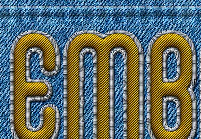
In this tutorial, I will show you how to create a realistic embroidery text effect in Photoshop using stitch brushes and layer styles. The end result will be…
-
![]()
This super easy and quick tutorial will show you how to use a couple of textures and layer styles to create a shiny, reflective chrome text effect. Let’s get…
-
![]()
Photoshop layer styles are a popular way to add effects, such as drop shadows and strokes, to layers in a non-destructive way. With the right knowledge and…
-
![]()
Learn an easy way to create a Stranger Things series inspired text effect, using only layer styles and some simple adjustments.
-
![]()
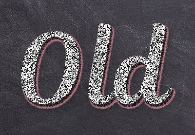
Use a texture, a couple of filters, and some drop shadow effects to create a super easy and quick stylized chalk text effect
-
![]()
In this tutorial we are going to create a text effect inspired by the ‘Frozen’ Disney movies. The main concept is to show you how to create an ice texture…
-
![]()
In this quick tip tutorial we will show you how to create a glass text effect using layer styles in Photoshop. Let’s get started!