From Barbie to Kill Bill, marketing a movie is a daunting task. Some films choose to embrace existing branding, while others choose to downplay it and convert it into something they think the audience will like. Films like Kill Bill target audiences with precision, while others like Drive play their cards close to the chest.
Today, we’re going to explore color theory and how color is used to market films.
Color is one of the most effective design elements that can be used strategically both in the film production and in the marketing materials.
A movie’s color palette can evoke emotions and also reinforce brand identity. Colors play a pivotal role in shaping how a movie is perceived and remembered.
Wizard of Oz & Wicked

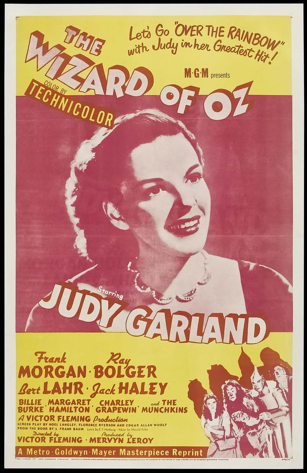
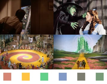
The Wizard of Oz wasn’t the first movie to be presented in color, but its impact was massive. The journey from monochromatic Kansas to colorful Oz marked a pivotal moment in movie magic and in the use of color as an element in film and movie marketing.
The moment Judy Garland opened a black and white door to reveal the colorful world of Oz cemented the relationship between cinematography and color as a magical and expressive element. Of course, in 1939, no matter what the movie color palette was, promoters couldn’t broadcast a trailer in people’s homes showing the scene in which Judy Garland opened the door. Black and white television was nascent, and radio certainly couldn’t capture the magic. Instead, the studio had to rely on a movie poster color palette that would wow audiences.
The choice of green as a skin color for the Wicked Witch of the West was a playful exploration of color in 1939. It not only identified her as the antagonist but also set her up as a character unfairly maligned due to her skin color. In the upcoming film adaptation of Wicked, marketing materials have instead embraced green as a symbol of magical potency.


The Matrix Trilogy
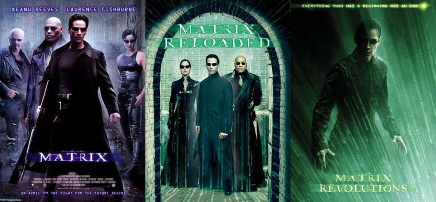


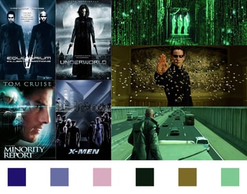
Speaking of green, the Matrix trilogy demonstrated a unique shift in marketing strategy as the later films embraced the green color grading of the virtual world in the movie poster color palette. The color palette of the first movie’s poster has more in common with other sci-fi and fantasy franchises from the late 1990s and 2000s like Equilibrium and Underworld. Monochromatic blue dominated movie poster color palettes.
The signature green tint became synonymous with the franchise by 2003, illustrating how marketing strategies need to adapt and embrace color schemes that connect with audiences.


Batman
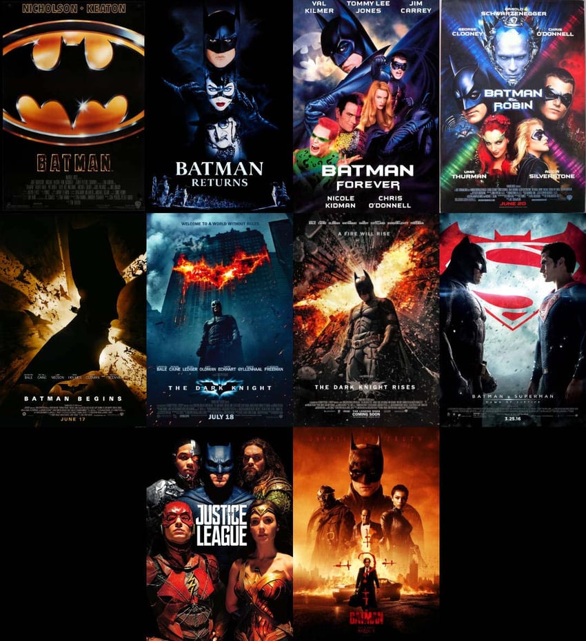


There is perhaps no better example of brand versatility than Batman. The Dark Knight Detective’s branding journey is as diverse as the city of Gotham itself.
Tim Burton opted to contrast vibrant villains in purple and green with a hero clad in black leather reminiscent of a horror movie color palette. Joel Schumacher, originally a fashion designer, increased the contrast with even more extravagant villains. Christopher Nolan rebooted the franchise in gritty realism and semi-sepia tones popular in the late 2000s (see the Twilight movie color palette, for instance). Matt Reeves’s The Batman reprised a darker, more realistic color palette for the film but diverged in the marketing with an intense red and black color palette. While Nolan’s portrayal proved to be a hit with adult audiences, Burton and Schumacher’s portrayals opened up the marketing to kids, which can be particularly profitable beyond the box office.
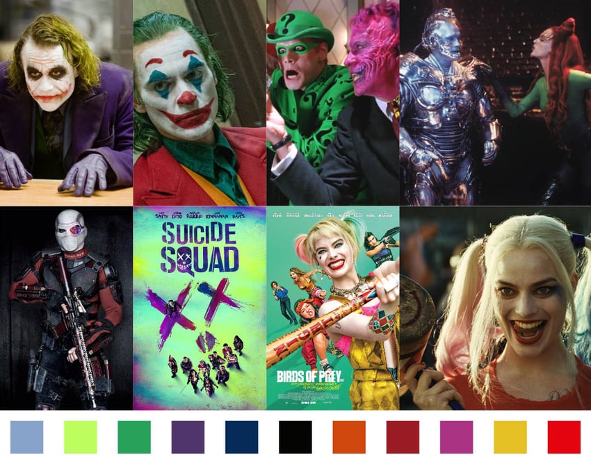
Batman is one of the few franchises in which the villains consistently get their own films. Todd Phillips’s 2019 Joker opted for an unusual color scheme for the character with a red suit, yellow-orange vest, and blue-green shirt instead of the typical purple and green.
The Joker movie color palette was designed to remind audiences of the film’s inspiration, particularly Taxi Driver from 1976. In fact, everything from the title sequence text being filmed practically to the reprisal of Warner Bros’ 1970s-era logo evinced an era more familiar to Gen X than the Millennials that earlier films had targeted. In terms of marketing, this appealed to an audience that typically wouldn’t be interested in the superhero genre. Filming on real-world locations, like the staircase located in The Bronx, NY, also connected to the real-world struggles of Millennials today.
On the other hand, in films like Suicide Squad, The Suicide Squad, and Birds of Prey, in which Joker’s paramour Harley Quinn takes a lead role, the colors are vibrant and intense. The movie poster color palette for Suicide Squad in particular embraces a frenetic mix of neon pink, blue, and green for its cadre of supervillains that is more reminiscent of Schumacher’s rogues from the 90s, promising audiences a fun and action-packed ride.


Deadpool & Wolverine

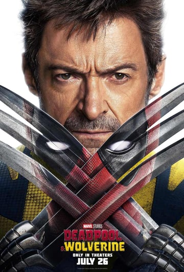
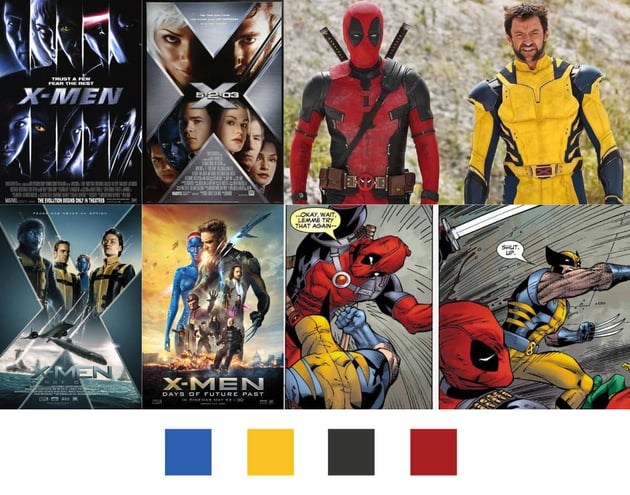
The first X-Men movie in 2000 chose to discard the vibrant color schemes of the comics and cartoons in favor of a more marketable movie color palette. As I mentioned in the section on The Matrix, the early 2000s were rife with black leather and monochromatic blue movie poster color palettes. With the exception of Batman, comic book franchises were relatively unfamiliar to audiences at the time, and the marketing team chose to play it safe and go for a familiar color palette.
The X-Men franchise has maintained fairly consistent branding and continuity and has continued with the muted colors reminiscent of a horror movie color palette. Even when X-Men: First Class provided the opportunity for a soft reboot, Wolverine again showed up in dark leather.
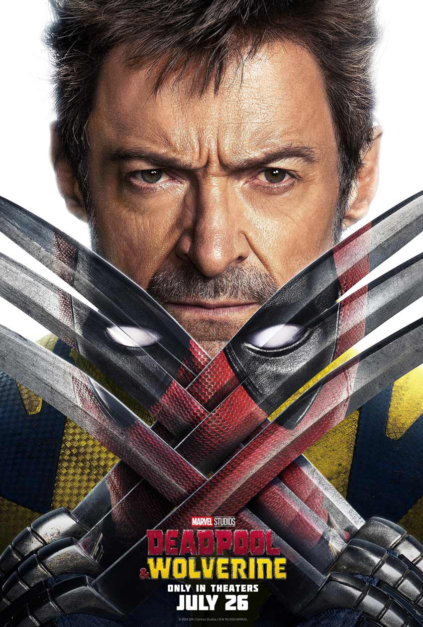
The success of Tim Miller and Ryan Reynolds’s wisecracking Deadpool seems to have opened the door to fully embracing comic-book conceits like fourth-wall breaks and vibrant costumes. Deadpool & Wolverine provided an opportunity to embrace the bright blue and yellow Wolverine costume and the fact that it looks a little silly in live action. Characters like Deadpool and Wolverine have benefited from this trend, with their signature colors serving as visual shorthand for their personalities and narratives.

Barbie

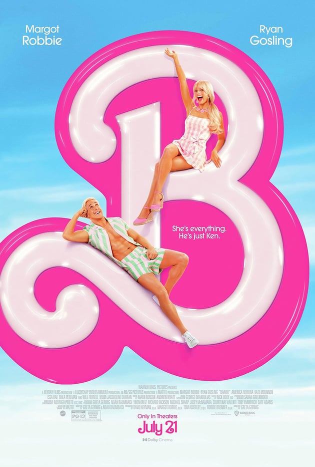

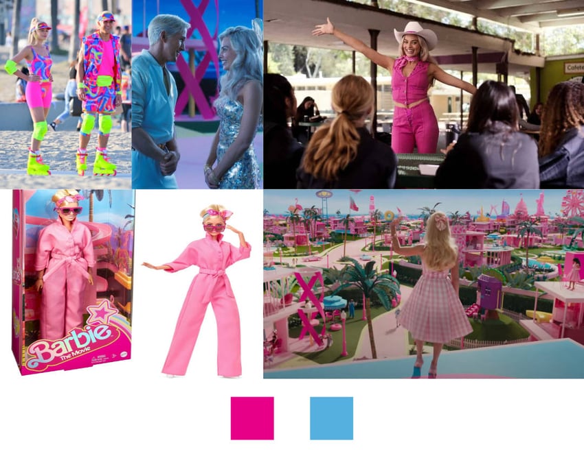
The Barbie movie color palette embraced the branding of the franchise with zeal. The tightly controlled blue and pink color palette also worked as a clever narrative device. As Barbie and Ken crossed over into the real world, all the colors of the Barbie movie branding subverted audience expectations to convey the disconnect between the Barbie universe and reality.
By juxtaposing the bright, fantastical world of Barbie with the drab colors of reality, the Barbie movie color palette challenged the characters and audience to explore their own individuality. The Barbie movie poster branding leveraged brand familiarity to target its audience. It also clearly communicated the tone of the film.

Kill Bill

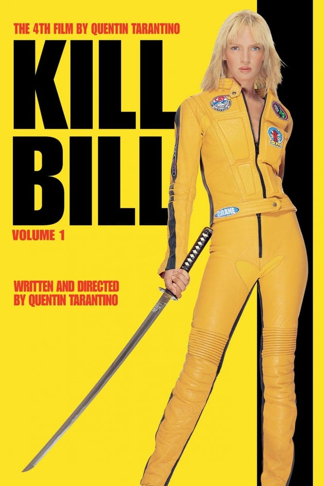

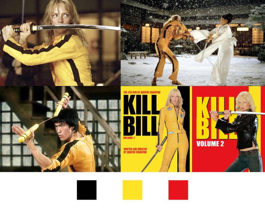
Quentin Tarantino loves to pay homage to the movies he grew up with. Uma Thurman donned the iconic black and yellow jumpsuit for only a few minutes on screen, but the movie poster color palette for volume 1 is entirely black and yellow.
The outfit referenced the jumpsuit that Bruce Lee wore in the 1978 film Game of Death. As a marketing tool, the movie color palette served to connect with audiences that also liked the same kinds of cinematography as Tarantino himself, with plenty of crash zooms, powerful wide shots, and gratuitous violence. Targeting a specific audience is a good way to ensure that negative reviews don’t drag the film’s performance down.


Drive


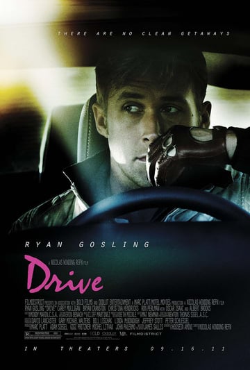
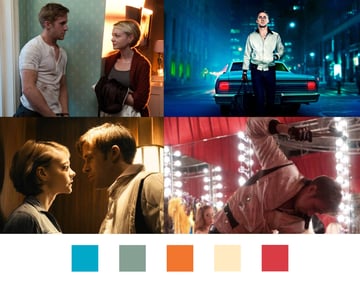
The aesthetic of Drive took a less direct approach to a similar audience. It was reminiscent of a Wes Anderson movie color palette but with a neo-Western narrative. Characters are framed in pastel hues symbolic of their demeanor. Ryan Gosling’s character, typically stoic and impenetrable, traded wreaths of blue and teal for intense reds and orange as internal conflict raged beneath the surface.
The marketing approach for Drive was almost the inverse of Kill Bill, effectively tricking audiences into seeing a narrative rooted in mid-century Westerns like 1964’s A Fist Full of Dollars. Audience appetite for Westerns has all but disappeared, but the movie poster color palette for Drive dressed up a classic narrative of honor and revenge in the neon pink and orange sodium street lights of contemporary Los Angeles.


The Darjeeling Limited
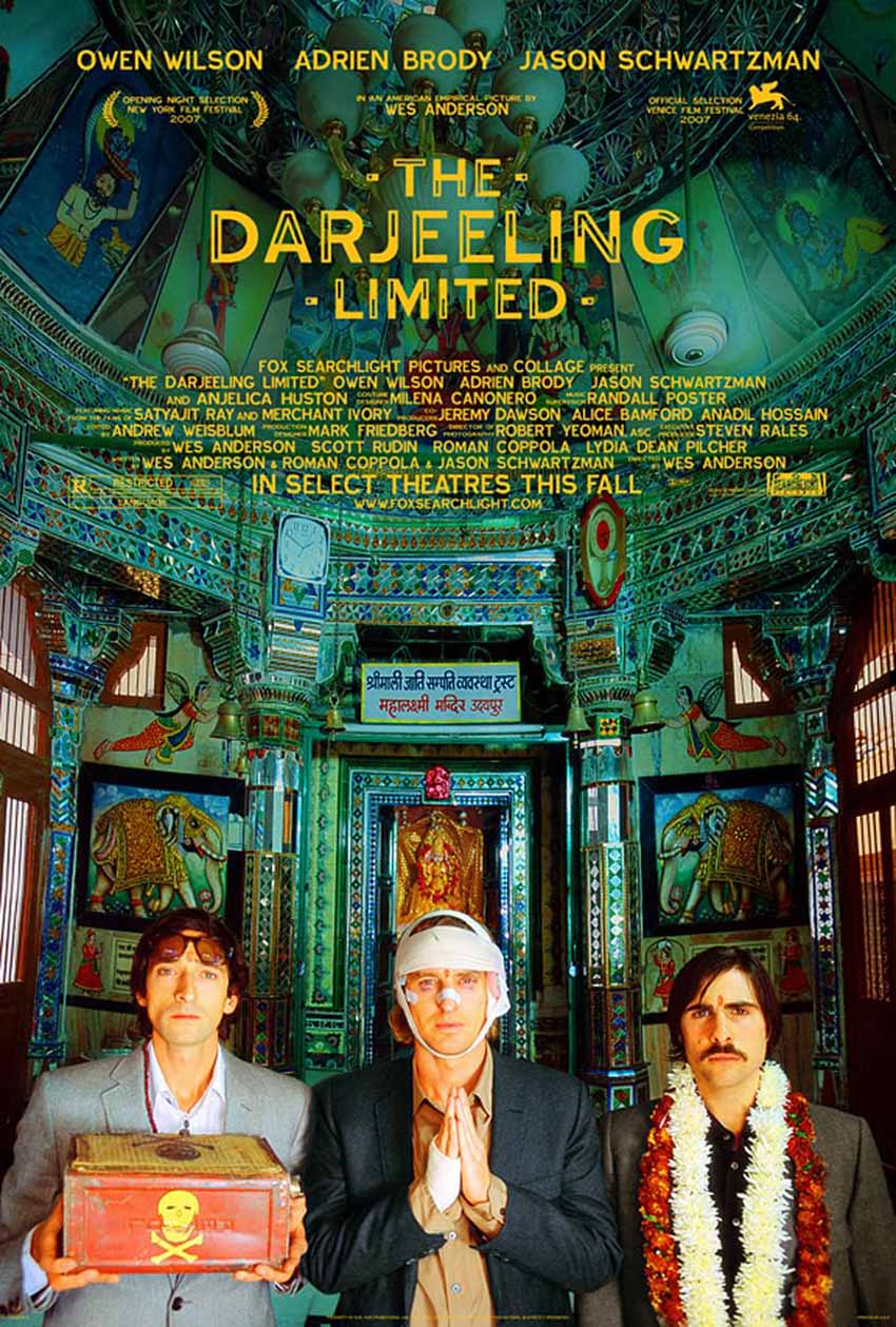


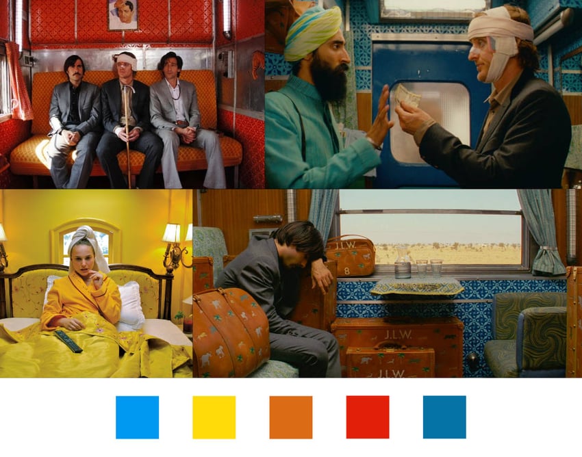
Part of the appeal of a Wes Anderson movie is the distinctive Wes Anderson movie color palette. As a director, Wes Anderson works color theory into every scene, deliberately selecting vibrant, saturated colors. In The Darjeeling Limited, the orange luggage that the three brothers travel with stood out against the deep blues and teal in the train and set backgrounds.
The colors in The Darjeeling Limited also created a timeless feeling, confounding the sense of time with a mid-century look. It was a surprise to see an iPod make an appearance in the third act. The Wes Anderson movie color palette is warm and inviting, and when it comes to branding and the movie poster color palettes, the colors play a key role in grabbing audiences’ attention.


Inside Out 2


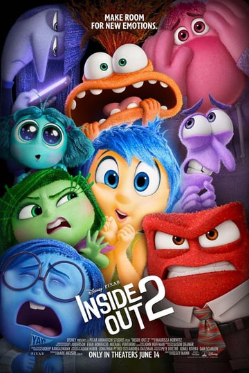
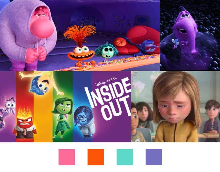
Color symbolism took precedence in the first Inside Out. The film assigned a distinct color palette to each character according to the emotion they represented. The characters alone created a complex movie color palette, and the backgrounds cleverly managed to play off the vibrant characters, with a dark, almost horror movie color palette taking over the mind as Riley descended into depression.
The 2024 sequel will introduce new emotions like anxiety and embarrassment, each of which will have its own respective color scheme. In their case, though, the colors will be broken hues, indicating that they may each be related to the multiple members of the original cast of emotions.
With all of the vibrance available, the movie poster color palette is eye-catching. As with all Pixar movies, it’s marketed to families. The vibrant colors indicate that it will welcome kids, but Pixar movies always have a more complex subtext for adult audiences.

Conclusion
The movie poster color palette is only one consideration when marketing a film. Films connected to existing properties have the opportunity to leverage existing branding, and clever use of them can immediately connect with audiences, as in the case of Barbie.
On the other hand, sometimes it’s necessary to discard existing color palettes in order to appeal to a wider audience, as in the case of X-Men and Drive. By using color symbolism, filmmakers can evoke emotions, reinforce brand identity, and craft immersive experiences that resonate with audiences long after the credits roll, as in the case of Inside Out, The Darjeeling Limited, and The Matrix.
And sometimes, movie color palettes are chosen simply because they look cool, as in the case of Kill Bill. As designers, it can be challenging to identify so many varied considerations, but skillful and clever use of color can go a long way to connecting with audiences.