
Possibly the most obvious typographic question in the hands of a designer is “which typefaces should I use?” The second question, one which rarely gets the kind of attention it ought, is “at what sizes should I set my type?” Establishing a modular scale is the best way to determine typographic sizes, in fact, it can help with laying out measurements and proportions across your whole page layout.

During this session we’ve looked at hierarchy; how size and other factors can influence the visual relationship of typographic elements. We’ve also recently looked at vertical rhythm, the visual consistency of spacing and elements on a page. Then we have the issue of setting a baseline grid, which ties in with establishing vertical rhythm. We’ve even talked about using ems as a unit of measurement, twice in actual fact. All these aspects of typography are tied together by the fundamental presence of size, so how exactly do you decide how big your typographic elements should be?
Introducing Modular Scale
The term Modular Scale refers to a series of harmonious values. Being a scale, each value is a factor of the others and it might look something like this:
Applying this scale to some basic typographic CSS, we might get:
h1 {
	font-size:36px
}
h2 {
	font-size:24px
}
h3 {
	font-size:18px
}
h4 {
	font-size:14px
}
p {
	font-size:11px
}
small {
	font-size: 9px
}
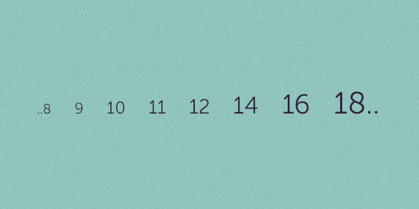
You might recognize these values as being part of the classic modular scale, illustrated by Robert Bringhust in The Elements of Typographic Style.
A modular scale, like a musical scale, is a prearranged set of harmonious proportions.
By adhering to this scale and setting your various typographic bits and pieces to the values shown, they’ll take on an inherent beauty; proportions which have worked for typographic designers for centuries.
That’s right, centuries.
In actual fact, the origins of establishing a typographic scale came as much from a practical need as an aesthetic judgement. In the heady days of foundry metal typesetting, when each letterform was cast as a metal block (called a sort) it was impractical, too expensive, to manufacture and store whole character sets of each typeface, in all the various weights, in all possible sizes.
Typesetters therefore settled, over the course of time, on a usable range of sizes which worked harmoniously together.
Establishing Your Own Modular Scale
Let’s set up a simple scale, for use in our own projects.
Pick a Number
We need to start somewhere, so we’ll begin with a significant base number; our base font size. I’m in the habit of starting at whatever the browser dictates as being default, so we’ll use 16px as our base. Tim Brown recommends starting with the font size at which your typeface is most crisply displayed – more often than not, that will be 16px for fonts designed with the web in mind.
I Knew Him, Ho-Ratio
(Sorry, that was the only quote I could think of containing ratio.)
So now, we need to establish a ratio, a value by which we’ll exponentially multiply and divide our base value. This ratio can be whatever you please; if you have some scale which holds specific beauty in your eyes, that’s fine.
You might, for example, go for the golden section 1:1.61803398875. This ratio has its roots in the very fabric of the world around us, and has been used by designers and architects to structure aesthetic harmony since.. forever.

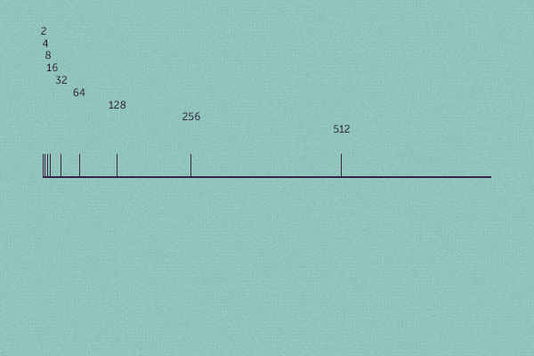
To illustrate what’s going on easily, we’re going to use 1:2 (the musical among you, which isn’t me by the way, will recognize this as being an octave). Beginning with 16, we get the following:
16 * 2 = 32 32 * 2 = 64 64 * 2 = 128
And this can continue exponentially. To establish our scale downwards, we divide:
16 / 2 = 8 8 / 2 = 4 4 / 2 = 2
This gives us the beginnings of our scale:
which we can apply to our simple typographic CSS like so:
h1 {
	font-size:256px
}
h2 {
	font-size:128px
}
h3 {
	font-size:64px
}
h4 {
	font-size:32px
}
p {
	font-size:16px
}
small {
	font-size: 8px
}
Great work so far!
Fill the Gaps
This scale is fairly extreme. It works, but for measurements on a web page it’s pretty unforgiving. To allow ourselves more flexibility, let’s give ourselves more options by adding a second dimension to the scale, a process outlined by Tim Brown in his A List Apart article More Meaningful Typography.
Pick another number. Any number, so long as it holds some significance to your design. We’ve already used 16 because it’s our base font size, so let’s compliment that by adding 95, the width of a single column I’ll be using in this fictitious 1,140px wide layout.
Tip: There may be many aspects of your design which hold significance; measurements and dimensions which resonate throughout the layout. Experiment with the values you choose, you may be surprised as to which proportions feel right.
Applying the ratio of 1:2 to 95, we get the following scale:
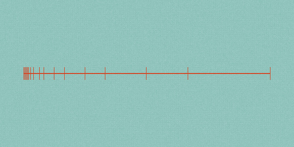
11.875 / 2 = 5.938 23.75 / 2 = 11.875
47.5 / 2 = 23.75
95 / 2 = 47.5
95 * 1 = 95
95 * 2 = 190
190 * 2 = 380
380 * 2 = 760
So now we have two scales, both based on the same ratio, which therefore coexist quite nicely:
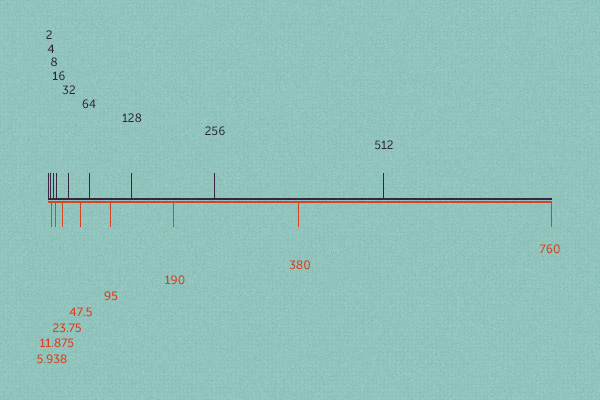
In fact, we can combine them, to give us a scale like this:
760.000 512.000 380.000 256.000 190.000 128.000 95.000 64.000 47.500 32.000 23.750 16.000 11.875 8.000 5.938 4.000 2.969 2.000 1.485
This fills the gaps for us, making our scale look far more complete.
What Do I Do With These Numbers?
We’ve already mentioned how we can apply our scale to basic typographic elements, so let’s update that.
 h1 {
	font-size:64px
}
h2 {
	font-size:47.5px
}
h3 {
	font-size:32px
}
h4 {
	font-size:23.75px
}
p {
	font-size:16px
}
small {
	font-size: 8px
}
There we go, not quite so intense. Our scale can also lend itself to other typographic features, such as the line-height and therefore the whole baseline grid:
p {
		font-size:16px;
		line-height:23.75px;
		margin: 0 0 16px 0;
}
And we can can improve this all by using ems too, making the relationships and proportions neater:
body {
		font-size:100%;
}
p {
		font-size:1em;
		line-height:1.484;
		margin: 0 0 1em 0;
}
If you’re struggling with the calculations at this point, head on over to Tim Brown’s Modular Scale. His calculator will automatically churn out the pixel and em values for you.
For reference, here’s what our scale looks like in terms of ems (in other words, relative to the base font size):
64 47.5 32 23.75 16 11.875 8 5.938 4 2.969 2 1.484 1 0.742 0.5 0.371 0.25 0.186 0.125 0.093
Sizing Our Grid
Having tackled the basic type elements of our page, let’s turn our attention to some structure. A simple stack of twelve columns is easily laid out:
.column-1  {
	width:95px
}
;
	* .column-2  {
	width:190px
}
;
	* .column-3  {
	width:285px
}
;
.column-4  {
	width:380px
}
;
	* .column-5  {
	width:475px
}
;
.column-6  {
	width:570px
}
;
.column-7  {
	width:665px
}
;
.column-8  {
	width:760px
}
;
	* .column-9  {
	width:855px
}
;
.column-10  {
	width:950px
}
;
.column-11  {
	width:1045px
}
;
.column-12  {
	width: 1140px
}
;
/* in a fluid grid,these would be converted to % values */
You’ll recognize the values with an asterisk next to them as featuring in our modular scale.
Each column will need to float too, plus, to form the gutters, we can add some padding to each one of 1em (16px, which also features in our scale.)
/* apply a natural box layout model to all elements */ *,*:before,*:after {
	-moz-box-sizing:border-box;
	-webkit-box-sizing:border-box;
	box-sizing:border-box;
}
.column {
		float:left;
		padding: 0 1em;
}
Very quickly we’ve laid the foundations for a solid grid, plus typography, all based on an harmonious scale.
Taking it Further
Combining grids with typography can be a complex business; calculating harmony can seem very unintuitive at times! Once you’ve started with some basic groundings though, you’ll find you can’t layout a web page without some kind of meaning to the relationships on your pages.
What we’ve done so far is a good start, but there’s still a lot more to be done and plenty of fine tuning. The baseline grid, for example might be a bit awkward to build from this point, so you may find some of the initial values don’t work. Additionally, we’d probably want our grid to be flexible, so the columns wouldn’t retain the fixed values we originally used. For this reason, you might find our horizontal values don’t always work with our vertical measurements.
There are established scales and grids, tried and tested through the ages. Why not try applying some of them to your own work? Have you ever applied a deliberate modular scale to your work? If not, how do you decide on your typographic sizing? Are there any specific problems you encounter with scales? Let’s hear your thoughts in the comments!
Useful References
- More Meaningful Typography by Tim Brown
- Modular Scale from Tim Brown
- Typeplate a Typographic starter kit
- The Typographic Scale
- Scale & Rhythm by Iain Lamb
- Definition of Modulor proportions on Wikipedia
- Don’t compose without a scale