
One of the most important aspects of typography on the web is vertical rhythm – and this can also be one of the more difficult to get right, as it often takes a lot of time and experimentation. There are many ways to achieve a good vertical rhythm on a page, though some may boil down to simply what feels and looks right to you on the screen.
What is Vertical Rhythm?
Rhythm is…
a strong, regular, repeated pattern of movement or sound
and the more consistent and familiar a rhythm is, the better and stronger it becomes.
We can apply this to the web with the term “vertical rhythm” – in the Western culture, as we read from left to right and top to bottom, we want to try to keep a consistent visual rhythm to the content on our page. Keeping our vertical rhythm consistent means that we can create a visually more-relaxing experience, evoking a feeling of familiarity to our users, removing visual barriers and making content far more readable.
Creating a good vertical rhythm on a website design can be tough. The aim is to create a harmonious relationship between all the content (including images and text) on your website.
For example, how does the spacing between paragraphs look (is it too big or too small?), how easy do you, yourself, find it to read? There are many questions to ask and most of it will boil down to how easy it is to read (even quickly scanning across) your website’s content. Even just the slightest changes that make for a better reading experience on your website will make for a huge difference to your users.
What Defines Good Vertical Rhythm?
So now we know what vertical rhythm is, we need to learn a little more about what makes a good vertical rhythm. The key here is readability.
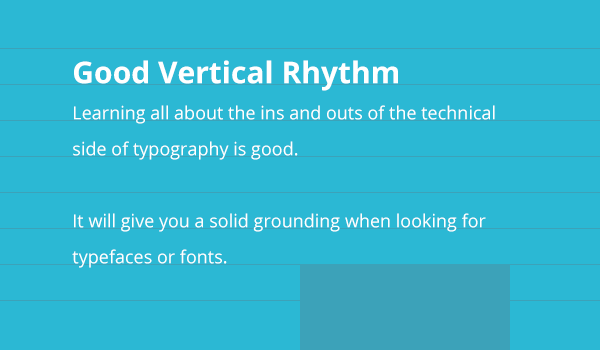
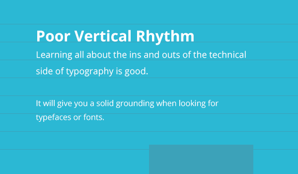
When you’re working with typography on the web, the two major things you want to pay attention to are the font sizes and line heights. Although there’s so much else that goes along with those two things, these are your two key components to creating a better vertical rhythm on your page design. If your font sizes don’t fit together well – by having massive heading sizes and ridiculously tiny body paragraph text sizes, for example – then this is going to make the content that much harder to read or scan through quickly. Similarly, if your content has a line height that makes text awkward to read – either through being spaced too closely together or being too far apart – that will turn your users off, when you want to be engaging with them.
Creating Good Vertical Rhythm
Creating good vertical rhythm in your designs comes with a lot of practice, but also a lot of theory, and sometimes maths as well.
First up, you need to start looking at a baseline (also known as a baseline grid). A baseline is the standard line-height that you’ll base your vertical rhythm on – and from there, you can start to use this baseline to aid you in line-heights for all the other fonts and content in your design.
When working with a baseline, it’s a good idea to go with the line-height of the most commonly used or primary font-size in your design. The easiest example I can think of is to think of your main base font-size of 100% (which equates to 16px in most browsers). If you have a line-height of 1 then your line-height will also be 16px. However, line-heights are usually best sitting between 1.4-1.6 times the size of your font (visually, this just seems to work with most fonts – though don’t take that as a rule, just play around with it). If we then look at having a line-height right in the middle of that, of 1.5, our line-height will be 24px – and that is our baseline number. From here on out, we want to make sure that all the content and typographical elements on our design match or add up to this 24px figure.
Another important thing to measure is our margins. A really easy way to keep our rhythm in check is to use this magic number (24px) for our margins.
I’ve been a big fan of single-direction margins ever since Harry Roberts suggested this in an article in mid-2012 , where the margins we apply to all block-level elements are placed in one direction (ie: on the bottom of elements). The same can be said when we’re designing too, so as 24px is our “magic number” – and the number that everything should be multiples of, or at least relate to – we can add a bottom margin to all our block-level elements of 24px (or 1.5rem, if you so prefer – however you want to add this code in your CSS is fine!). This helps us keep our vertical rhythm flowing nicely, and makes all of our elements keep in line with the baseline that we’ve created.
Images in Your Design
One little tip I find when working with images in my design – and ensuring that they don’t throw our baseline and vertical rhythm completely out of whack – is to make sure that image heights match up to a multiple of our magic number. So, for example, an image might have a height of 240px (10 x 24px, our magic number) with a bottom margin of 24px. Or we could even have a height of 252px with a bottom margin of 12px – as long as it all adds up to that multiple of 24px, we should be okay.
Improvise!
While it’s important to remember your magic number, you can still always break from it slightly – if something doesn’t quite feel right at the 1.5 line height that you’ve set, then try something else – as long as you can realign the other values so that it falls back into the baseline and thus keeps your vertical rhythm in check.
For example, if you choose to instead go with a slightly higher line-height of 26 pixels (which works out at around 1.625 times the original font size we had of 16px), then as long as your margins then reflect this, your vertical rhythm will be okay. As we’ve added an extra two pixels to the line height, we need to take those two pixels from the bottom margin of that element. Obviously, if you can, try and look for patterns in your design where this might happen and architect your CSS in a way that reflects this pattern – so creating a modular CSS class for elements that have that design pattern, as you would with any project you’re developing.
Tools for Building Vertical Rhythm
Working to create a good vertical rhythm can be tough – but luckily, as with most design and development techniques, there are a few good tools to help us out. I find these tools in particular great for practicing and visually understanding more about typography on a page.
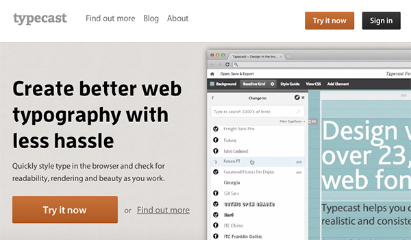
Typecast App
Typecast is an amazing tool for designers – not only does it allow you to play around with thousands of different fonts or font combinations, but it also helps us in typesetting and forming a proper baseline. I find that I always dive into this before anything else when I’m starting to look at typography in my design.
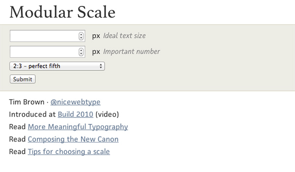
Modular Scale
The modular scale is another little technique that can be harnessed or used in designing with typography – as described on A List Apart
a modular scale is a sequence of numbers that relate to one another in a meaningful way.
Those numbers can be used (through a lot of experimentation and swapping-and-changing) in your designs, if you so wish. It’s at least worth a look and a play – and may help you to make more informed decisions about things such as the widths of containers, and how these other numbers can also play a part in your vertical rhythm.
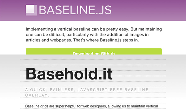
Basehold.it and Baseline.js
If you’re a fan of designing in the browser, or just want to ensure that the baselines you’ve designed elsewhere are following through when you start coding – then using one of these two JavaScript plugins will help you to check how your baseline is performing in your code. The first (Basehold.it), by Dan Eden and Michael Wright, provides you with a JavaScript overlay on your webpage, whereas Baseline.js by Dan Eden provides you with a way of managing images on your page, if they’re needed.
Assignments
For this assignment, I want you to simply play around with a baseline grid – whether this is through a trial in Typecast, using one of the aforementioned JavaScript plugins or simply through creating a baseline grid outline in Photoshop or other graphics app is totally up to you. Once you have a baseline grid ready, start to put the principles of this article into it; put some of your content in place, and start to figure out the scales and font-sizes that you want to use.
Once you have those in place, start looking at how these all tie together with your baseline grid. If you’ve never done this before, it can be quite a bit of work to get your head around – but it’s well worth taking the time to understand exactly how they work. After that, you’ll be able to start integrating a good vertical rhythm into your website designs much more easily – and your users will thank you!