Color blindness and vision deficiencies are hard to imagine if you are not affected by them. However, it’s important to take people with visual impairments into consideration when designing a color palette for a website or application. If you don’t, they might be unable to use vital features such as clicking links or buttons, or filling in forms.
To really push the point home, here’s why accessibility matters:
Chrome DevTools’ color blindness emulator helps you design for color blindness. It was introduced in Chrome 83 and makes it possible to quickly emulate five common types of vision deficiencies.
This tool is so user-friendly that it takes just four clicks to test color palettes for visual disabilities. It’s not just for live websites either; you can also use it with web-based design applications such as Figma and online color palette generators. In this way, you can check colors for visual accessibility in the design phase.
Now let’s see how to use Chrome DevTools to design for color blindness.
Open Chrome DevTools
Navigate to the page you want to test and hit F12 to open Chrome DevTools. Alternatively, you can right-click the page and choose the Inspect option.
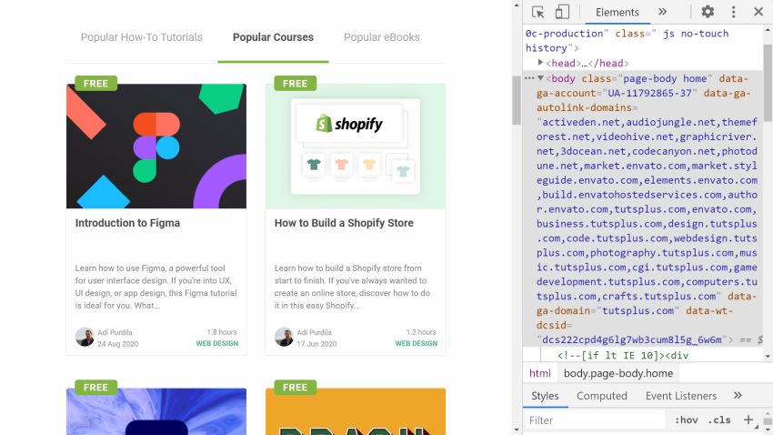
For the screenshots, I’ll use TutsPlus’ homepage.
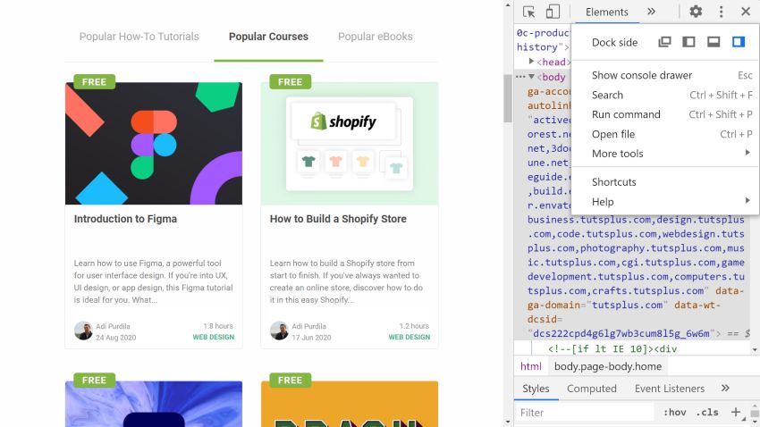
1st Click: Three Dots
At the top right corner of Chrome DevTools, click the three vertical dots icon to open the customization menu.
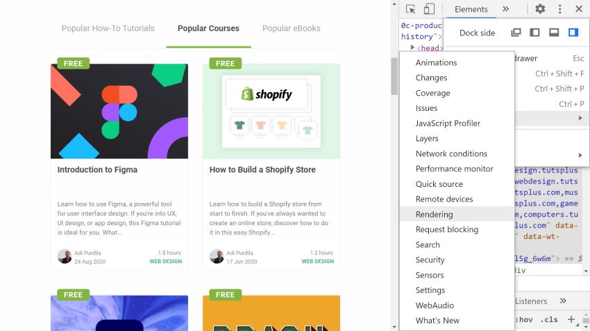
2nd Click: The “Rendering” Option
Here, hover the cursor over the More tools option, and a dropdown menu will appear. Click the Rendering option.
3rd Click: The “No emulation” Button
Now, a new Rendering view has appeared at the bottom of Chrome DevTools. Navigate to this view and scroll down to the bottom. You’ll find the color blindness emulator here.
Click the No emulation button.
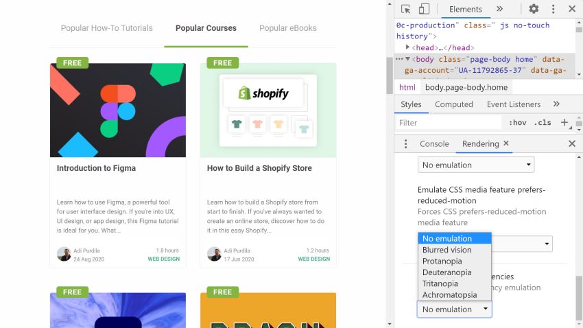
4th Click: Vision Deficiency Type
The No emulation button has opened a drop-up submenu where you can choose between five vision deficiencies:
- Blurred vision – lack of sharpness
- Protanopia – can’t see any red light (most common form of color blindness)
- Deuteranopia – can’t see any green light
- Tritanopia – can’t see any blue light
- Achromatopsia – only can see the shades of grey (total color blindness)
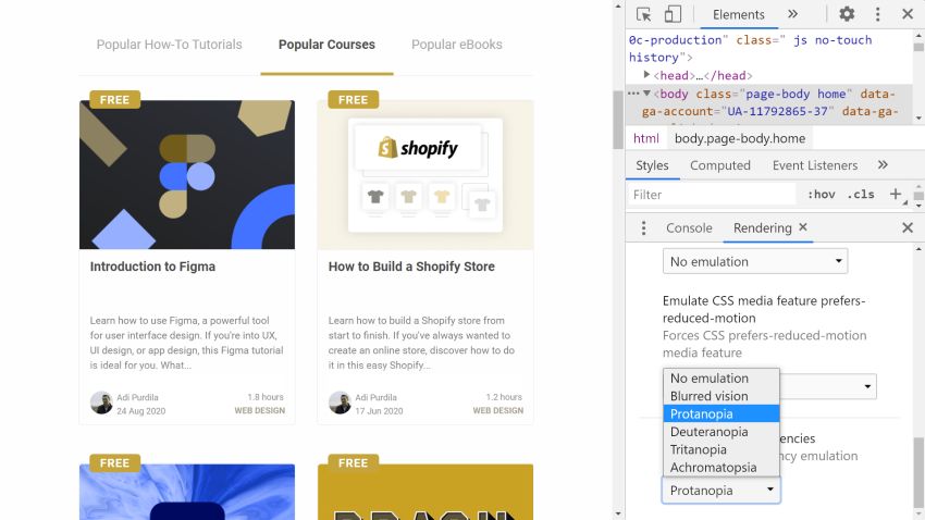
For the screenshot below, I selected protanopia. You can see that the colors have changed, and not for the better. For instance, green and orange now look almost the same, even though on the original image they are easy to distinguish. You can also scroll up and down the page to see how the rest of the design has changed.
Make Your Whole Process About Designing for Color Blindness
Chrome DevTools’ color blindness emulator includes the most common types of vision deficiencies–each one to its fullest manifestation. However, in real life, visual disabilities vary more and exist in various extents. To learn more about the symptoms and types of color blindness, check out the Color Blind Awareness website.
Also note that even though picking an accessible color scheme is essential, it’s also important to use non-color designators for user actions (this is also a WCAG 2.0 requirement). I wrote about how you can make links accessible by adding other types of visual markers in detail on my blog, and here are some CSS tips for better color accessibility too.
 CSSCSS Tips for Better Color and Contrast Accessibility
-
AccessibilityAccessibility Basics: Designing for Visual Impairment


Testing color blindness with Chrome DevTools is so easy that it’s a great idea to add it to your design workflow, as it can help prevent future headaches. Learn more about accessibility and how Chrome DevTools can help with the following tutorial: