
In this tutorial I am going to show you how to create a simple, elegant blog layout in Photoshop. We’ll use a strong image above the fold (wherever that may be) with some straightforward messaging, followed by very clean and elegant typography.
Tutorial Assets
In order to follow along you will need the following (freely available) assets:
- Cafe photo from Refe
- PT Serif font from Font Squirrel
- Bentham font from Font Squirrel
Get the Document Ready
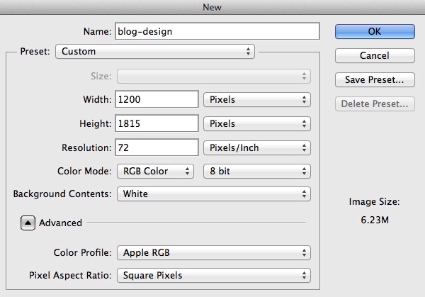
Step 1
Begin by creating a new document (File > New…) using the settings shown below. You’re free to use a canvas of whatever dimensions you prefer – the web is not fixed width, after all.
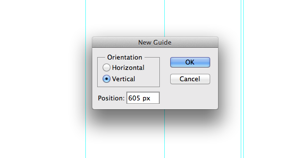
Step 2
Let’s set some guides so our layout has enough space and looks balanced. I don’t always use a grid, but setting some guidelines will ensure neatness and will help to define our website’s width. Go to View > New Guide… and set some guidelines. I usually choose 1000px as a website width and add some guidelines from the corners so it has space to breathe.
Note: Guidelines used for this tutorial: vertical at 100px, 285px, 445px, 600px, 605px, 765px, 925px and 1100px.
Tip: You could also use the GuideGuide Photoshop plugin to make this process even quicker.
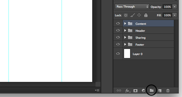
Step 3
Sticking to this Photoshop etiquette will keep things organized and easy to navigate or edit. Let’s create three layer groups named Header, Content, Sharing and Footer. To create groups go to Layer > New > Group… and give each one a title as mentioned. For quick creation of a group just click the icon.
Designing the Header Area
The header area plays a very important role in engaging with users and ensuring that visitor stays on the website. For this blog I will use a welcoming-looking shot of a cafe in London. When choosing an image for your project make sure it sends the right message to visitors and fulfils the needs of the client.
Step 1
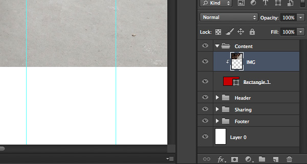
Let’s first create background of the blog. Inside the Header group draw any color rectangle shape using the Rectangle Tool (U). In my case I drew 1200x600px size rectangle and placed it at the top of the document.
Now download Cafe photo, drag it to the Photoshop document and place it above the rectangle layer. Rename the image layer to something you can recognize later, in my case I’ve used IMG. After that hold down the Alt key and mouse over the photo layer until you see a little arrow pointing down, then release it. You have just created a Clipping Mask.
Now hit CMD+T and resize the photo to fit your needs.
Tip: hold down Shift key to transform proportionally.
Step 2
Now we need to make our blog background darker and more neutral so when we put copy on top it’s readable. Let’s slightly blur our image by going to Filter > Blur > Gaussian Blur… and setting Radius to 3 pixels. Using a slight blur effect helps eliminate sharp image details and allows visitors’ eyes to focus on more prominent elements, in our case the blog message.
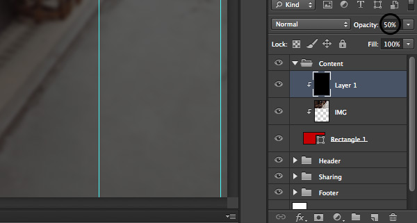
Let’s create a new layer above the placed image and make it a Clipping Mask as shown in the previous step. Then fill it with a black shade and reduce opacity to 50% so our image gets darker, but still is quite visible.
Step 3
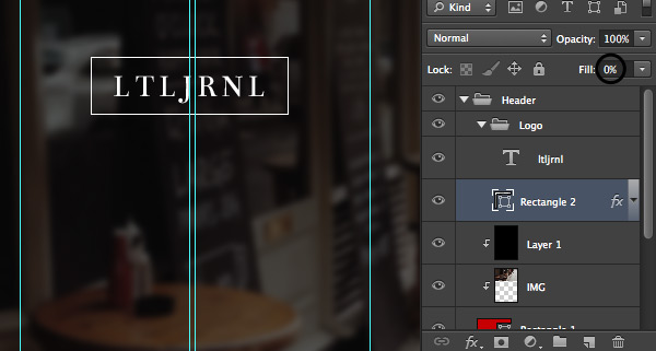
It’s time to add a logo for our blog. Create a new group inside the Header group and name it Logo. For this tutorial I’ll use a simple, typography based logo. Pick the Horizontal Type Tool (T), Bentham 30px size font and write the title of your blog. Notice that letter spacing is larger than usual, creating a more elegant look and feel and making the uppercase characters easier to read.
To add emphasis let’s make a border around it. Pick a Rectangle Tool (U) and draw a rectangle that is slightly bigger than the text.
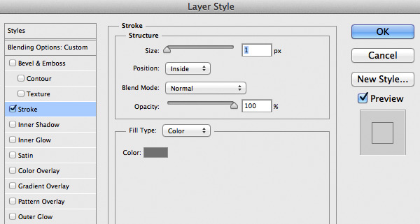
Now click the right mouse button on the layer and select Blending Options… apply the following stroke options.
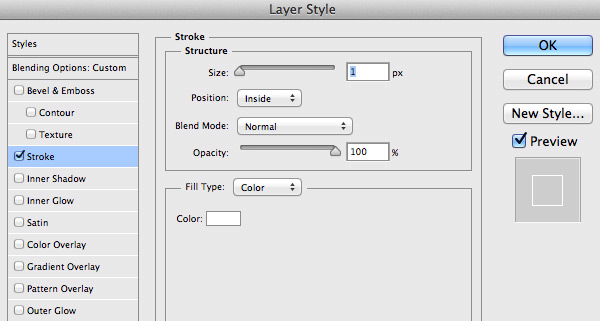
Finally set rectangle layer Fill to 0% and you have a nice 1px stroke around your fictional logo.
Step 4
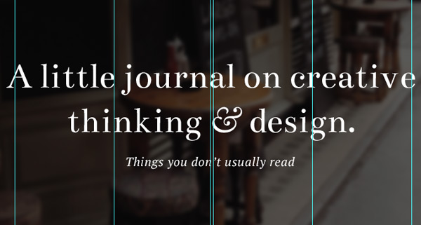
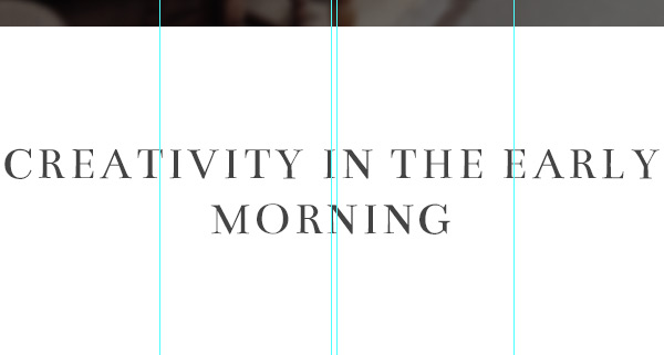
This is the moment when we add a blog message which sums up what this blog is all about. Pick the Horizontal Type (T), 60px size Bentham font and write down a short message for your readers. Make sure that the line height is roomy enough so text has space to breathe and looks balanced.
For the ampersand I’ve used Baskerville (Italic) as it is more ornate. For the secondary message I have used PT Serif (Italic) font set to 20px in size. Make sure you put your message vertically in the middle of the header image so it looks balanced and polished.
Designing the Content Area
Minimise the Header group by clicking the small arrow next to the title of the group and open up the Content group so all the layers are organized and easy to navigate through.
Step 1
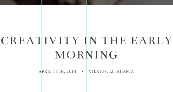
Let’s start crafting our blog post. Pick the Horizontal Type Tool (T) and, using a dark color and quite large font, write down your post headline. Try to avoid using absolute black and pick a more subtle color, like dark gray, so it doesn’t look too harsh. For this tutorial I am using dark gray #444444 42px size Bentham font in uppercase. Place your headline in the middle of the document and give quite a lot of space at the top so readers’ attention is drawn to the headline.
Step 2
Reduce the font size to around 14px and enter the date of the blog post, author, category, tags, location or whatever you wish, so it gives your readers an overview of the publication. In my case I’ve put date and location of the entry in uppercase to remain true to the headline.
Step 3
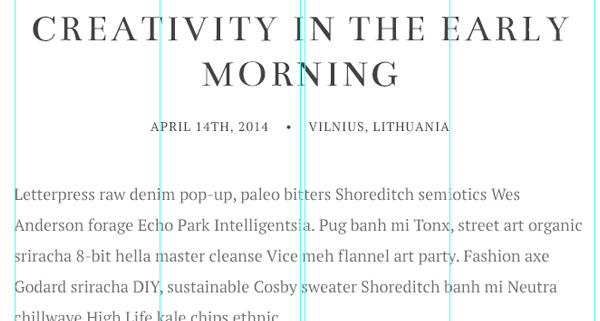
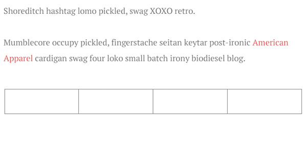
A blog without real content is worth nothing, no matter how good the design is. Using the Horizontal Type Tool (T) hold down your mouse button and make a container between the second and penultimate guidelines. The container width between these guidelines should be 640px and height will depend on the length of your post.
Set the background color to something lighter and easy on the eye. In my case I use lighter gray #6f6f6f 18px PT Serif with a line height set to 34px. Line height should often be around 1.5 – 1.9 depending on the style of the typeface. You can easily calculate the line height by multiplying the size of the font you use by 1.9, for example in my case I use 18px font size, so: 18*1.8=34.2.
Step 4
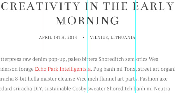
As a designer you always need to think about designing a dynamic environment so include styles for hyperlinks or hover states for buttons. Believe me, developers will thank you for this. Pick a subtle color that will stand out in your main copy, highlight one of the phrases that will link to somewhere else and change its color. In my case I am using pale red #e3514e.
Designing Sharing Buttons
We’re done with the main copy for the blog post and now will create some sharing buttons so readers can share content with their network of choice.
Step 1
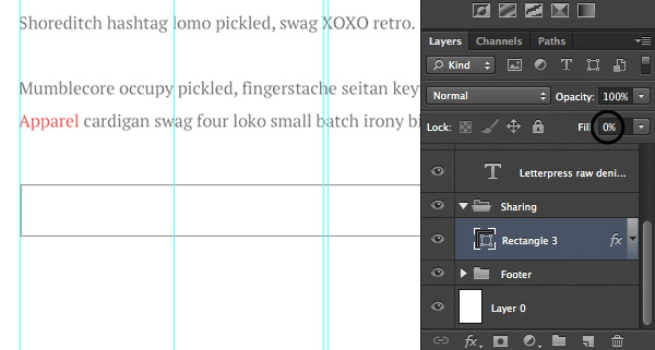
Minimise the Content group and open up Sharing group where we’ll place our buttons. Pick a Rectangle Tool (U) and draw a rectagle to be between the second and penultimate guidelines as the main post copy. In my case it’s 640x54px. Then right-click, select Blending Options… and apply following options.
Finally, reduce the layer’s Fill option to 0% and you will have an outline container for your social media networks.
Step 2
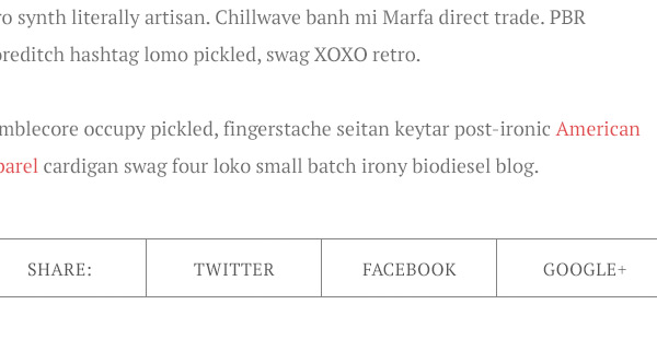
Pick the Line Tool (U) and set width to 1px, after that draw three vertical lines that will divide our container into four equal pieces. The guidelines will help position them. Make sure the lines are the same color as the outline of the container.
Tip: hold down Shift key to ensure that lines run perfectly straight.
Tip: click CMD+; to hide/show guidelines.
Step 3
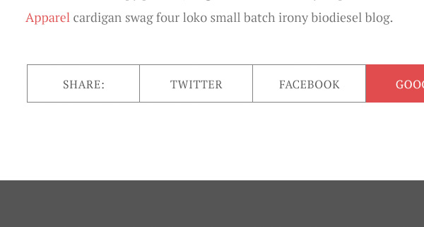
Finally pick the Horizontal Type Tool (T) and write some copy, letting people know it’s for sharing. In my case I use simple SHARE:, after which I’ve written down the names of the social networks available for sharing.
Place the names inside the the container and center them to be in the middle of the separated blocks.
Step 4
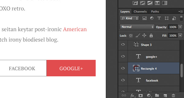
Great! Social sharing is done, all we need to finish it is to create a mouse over state for the button. Simply pick the Rectangle Tool (U) and, using the same color as used for the link, draw a rectangle below one of the social network name covering the divided space.
Designing Footer
It’s finally time to wrap our blog design by putting a simple footer with a copyright information.
Step 1
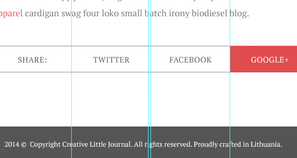
Minimise the Sharing group and open up the Footer group. After that draw a simple rectangle at the bottom going across horizontally of the document and leave enough space at the top. I’ve used gray #555555 and around 110px white space above the shape.
Step 2
Finally pick the Horizontal Type Tool (T) and write down some simple copyright copy. In my case I’ve used PT Serif 14px white #FFFFFF. Place your copy in the middle of the rectangle and align it vertically.
Conclusion
In this tutorial we walked through the process of creating a very simple and elegant blog layout. It has a strong image-based header above the fold, and uses a typography-first approach to the blog’s content.
In a future tutorial we’ll look at building this blog layout for the browser, integrating with with a blogging platform for good measure, so stay tuned!
If you have any questions or thoughts, please let us know in the comments area!