
In this tutorial I’ll guide you through the process of creating a simple and clean Instagram-based portfolio. We’ll use some striking imagery, a clean color palette and smooth typefaces. We’ll start off by creating a web version and then I’ll show you how to quickly adapt it for mobile view.
Tutorial Assets
In order to follow along you will need the following (freely available) assets:
- Mountains photo from Unsplash
- Kaushan Script font from Font Squirrel
- Lato font from Font Squirrel
- Social media icons from Iconfinder
- Stock photos from Unsplash
- Stock photos from Refe
Get the Document Ready
Step 1
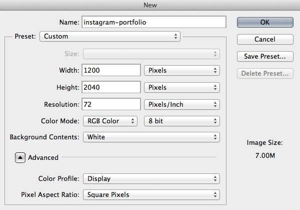
Begin by creating a new Photoshop document (File > New…) using the settings shown below. You’re free to use a canvas of whatever dimensions you prefer – the web is not fixed width, after all.
Step 2
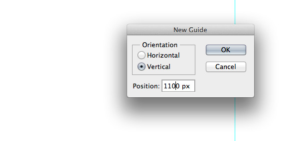
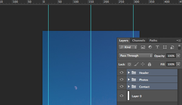
Let’s set some guides so our layout has enough space and looks balanced. I don’t always use a grid, but setting some guidelines will ensure neatness and will help to define our website’s width. Go to View > New Guide… and set some guidelines. I usually choose 1000px as a website width and add some guidelines from the corners so it has space to breathe.
Note: Guidelines used for this tutorial: vertical at 100px, 600px and 1100px.
Tip: You could also use the GuideGuide Photoshop plugin to make this process even quicker.
Step 3
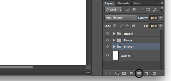
Sticking to Photoshop etiquette we’ll keep things organized and easy to navigate and edit. Let’s create three layer groups named Header, Photos and Contact. To create groups go to Layer > New > Group… and give each one a title as mentioned. For quick creation of a group just click the icon.
Designing the Header Area
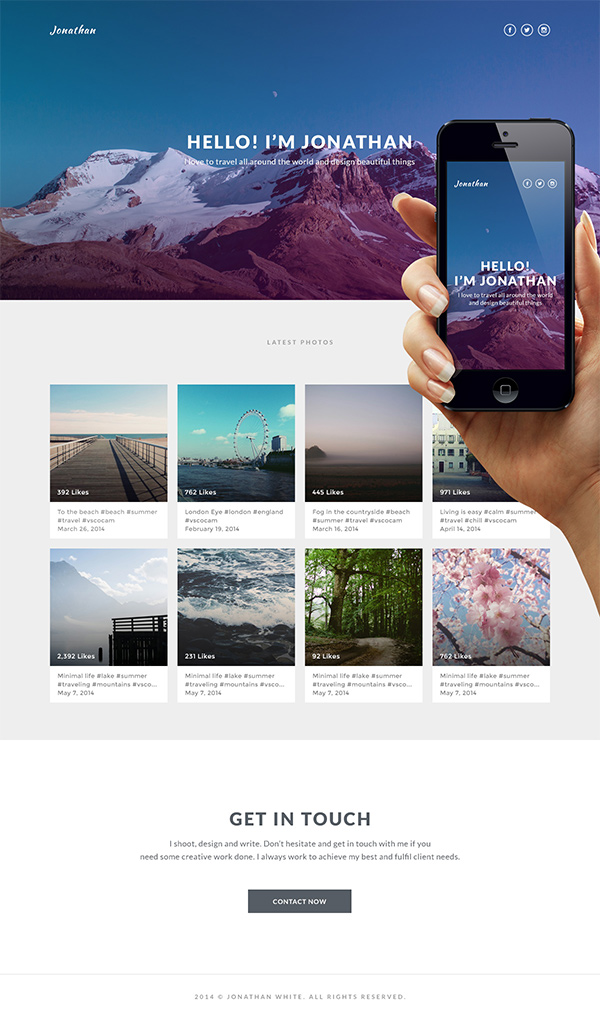
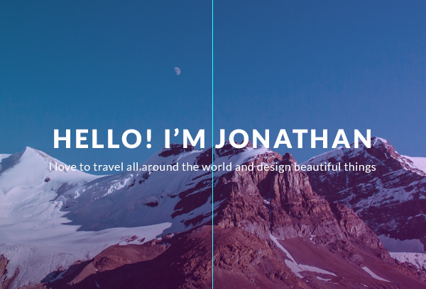
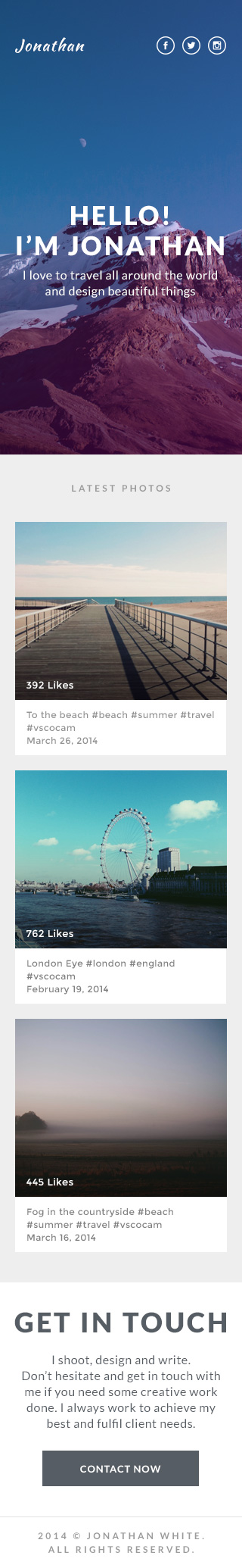
The header or “above the fold” (wherever that is these days) area plays a very important role in engaging with users and ensuring that visitors stay on the website. For this portfolio I will use a shot of some beautiful mountains and simple messaging to portray adventure and challenge.
Step 1
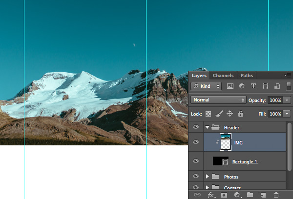
Let’s first create background of the blog. Inside the Header group draw any color rectangle shape using the Rectangle Tool (U). In my case I drew 1200x600px size rectangle and placed it at the top of the document.
Now download Mountains photo, drag it to the Photoshop document and place it above the rectangle layer. Rename the image layer to something you can recognize later, in my case I’ve used IMG. After that hold down the Alt key and mouse over the photo layer until you see a little arrow pointing down, then release it. You have just created a Clipping Mask.
Now hit CMD+T and resize the photo to fit your needs.
Tip: hold down Shift key to transform proportionally.
Step 2
Let’s make some adjustments to our image so it looks more vivid and memorable. Create a new layer, call it Shadow and create a Clipping Mask as we did for the mountains image. Then pick the Gradient Tool (G) and set gradient colors to go from black #000000 to transparent, holding down the Shift key drag from the bottom of the placed image to around middle of it. Finally reduce the gradient layer’s Opacity to 60%.
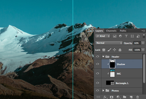
I usually use this technique to darken bright images and place white text on top.
Step 3
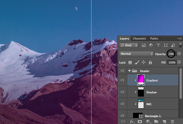
Let’s add some more colors to our header to make it even more awesome. Create a new layer, name it Gradient and once again pick the Gradient Tool (G). After that set the gradient colors to go from purple #37056b to pink #ff01fc (or any other colors you want) and drag from the top left corner of the image to the right bottom corner. Finally, reduce the gradient layer’s Opacity to 20%.
Step 4
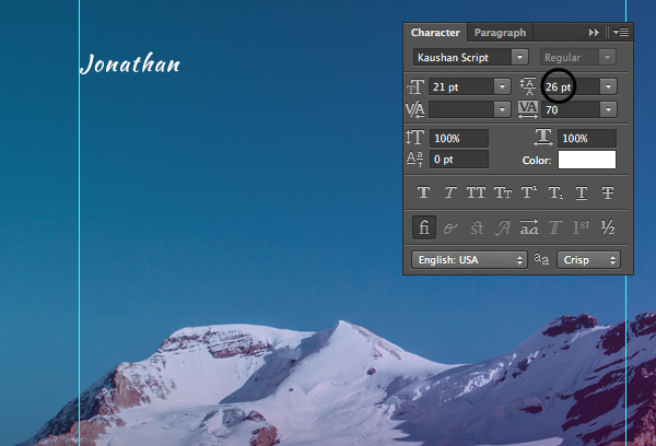
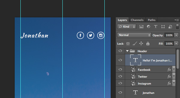
Time to place a logo for our portfolio. Pick the Horizontal Type Tool (T) and enter the name of your portfolio, whether it’s your name or nickname. For this tutorial I’ve used a very stylish Kaushan Script 21px size font. Place your new logo at the top left corner of your website next to the first vertical guideline. Push it down 50px to give it enough negative space so it looks clean and professional.
Step 5
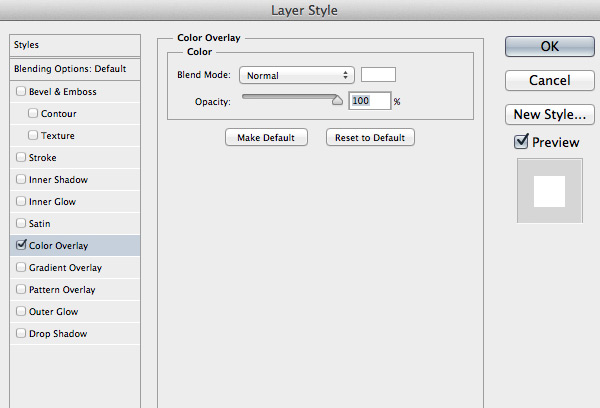
We’ll add some social media icons so people can follow you and your work. Drag Facebook, Twitter and Instagram icons from Iconfinder to your Photoshop document, rename the layers so they are quickly recognisable and place them on the top right side next to the last vertical guideline. After that, click the right mouse button on one of the icon layers, select Blending Options… and apply the Color Overlay option with the color white #ffffff. Do the same with the rest of the icons.
Make sure you allow enough space to the sides and align your icons horizontally with your logo.
Step 6
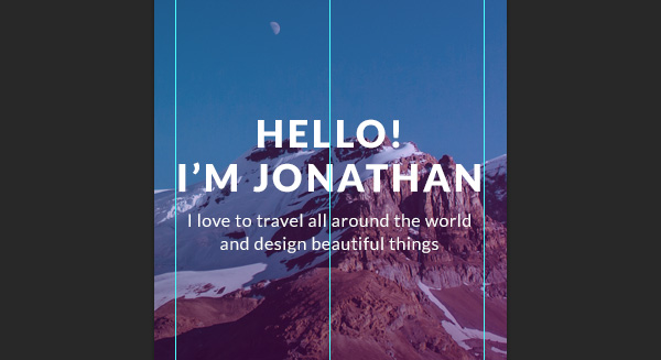
Let’s finish off our Header area. We have a beautiful image and loads of space. Let’s put a simple introduction message so visitors can understand what this website is all about.
Choose the Horizontal Type Tool (T) and using 36px size Lato (Black) font enter a couple of words. In my case I use “HELLO! I’M JONATHAN”. Right after that, on a new line abd with a smaller font enter some more stuff about yourself or your work that visitors may find interesting. For this tutorial I’ve used 16px size Lato (Regular)
I love to travel all around the world and design beautiful things.
Make sure the line height is large enough so your text has space to breathe. Finally, place your text in the middle of the Header area.
Designing Photos Area
In this area we’ll place photos from Instagram to show off some examples of work, demonstrating how skilled and relevant the artist or designer is.
Step 1
Let’s first change the background for this area. Minimise the Header group by clicking a small arrow next to the group name and open up the Photos group. After that, pick the Rectangle Tool (U) and draw a slightly grey rectangle. In my case I’ve used #eeeeee for the color and drawn a 1200x880px rectangle.
Step 2
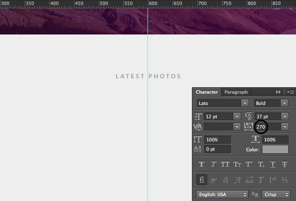
Now let’s add a line describing the work. This can be simply “Latest Work” or in my case “LATEST PHOTOS”. The text should readable, for that reason I’ve used grey #9b9b9b and the font is Lato (Bold) 12px size. Please note that letter spacing is quite substantial (270) which is used just to stylize the title of the area and wouldn’t work for regular text. Once again give your title enough space and move it down from the image for 80px.
Step 3
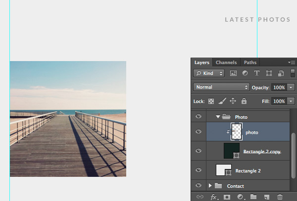
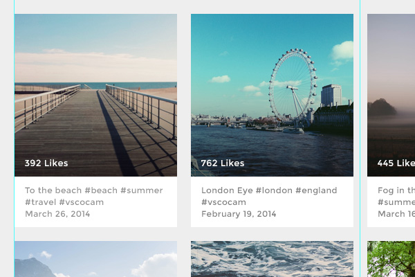
Great! We’re finally ready to add some cool photos to our portfolio. Create a new group called Photo. After that you need to decide how many pictures you want to display in a row. I’ve decided to go with four, so I need to do some maths before determining the pixels.
Our website width is 1000px, so I’ll divide it by 4 giving me 250px for each image, but we also need to leave some spacing on the sides, let’s say 20px gutter between the images. So the final image width will be (1000px-60px)/4=235px.
Pick the Rectangle Tool (U) and, holding down Shift key, draw a 235x235px size rectangle. After that pick an image from your Instagram feed or grab one from unsplash.com or getrefe.tumblr.com, drag it to your Photoshop document and place it above the rectangle. Then, holding down the Alt key, create a Clipping Mask and using CMD+T resize the image and place it as you wish.
Step 4
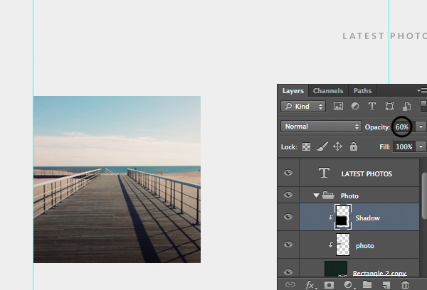
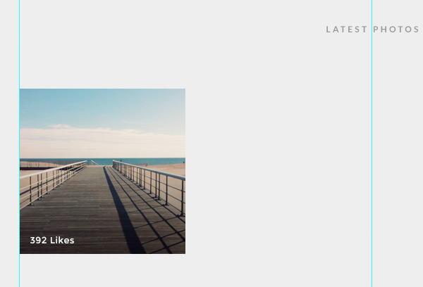
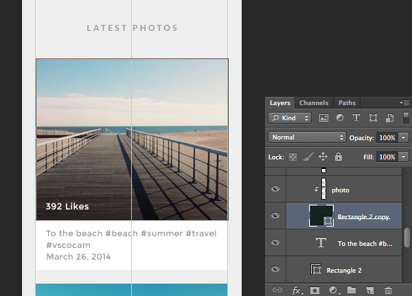
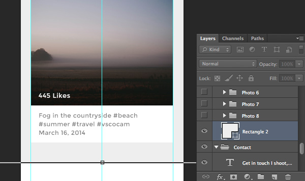
Now we need to add the number of “likes” (to act as some social proof) and a short description. Create a new layer and name it Shadow, place it above the image and make sure to create a Clipping Mask for it as well. After that, using the Gradient Tool (G) apply a gradient going from black to transparent as used earlier in this tutorial. Finally reduce its Opacity to 60%.
Pick the Horizontal Type Tool (T) and enter a number of likes. I’ve used 13px size Montserrat font and left 15px space on the left and bottom in order to give enough space to breath but not to overwhelm the image.
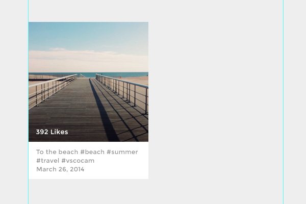
Now pick the Rectangle Tool (U) and draw a white rectangle shape below the photo. Then grab the Horizontal Type Tool (T) and write a short photo description you’d use on Instagram, including hashtags and also a posting date on a new line. The font I’ve used for this tutorial is Montserrat 12px size in grey #808080.
Note: make sure you’re consistent with your spacing, if you’ve used 15px on the sides for the likes number do the same with the description.
Step 5
We’re done with the photo item and now it’s time to add some more photos to our portfolio. Minimize the Photo group and duplicate it by hitting CMD+J or clicking the right mouse button on the group name and selecting Duplicate Group… after that duplicate as many photos as you want to have and organize them in a grid. In my example I have 20px for spacing and different images from unsplash.com and getrefe.tumblr.com.
Designing Contact Area
In this area we’ll put a simple message and contact “call to action” as well as generic copyright information.
Step 1
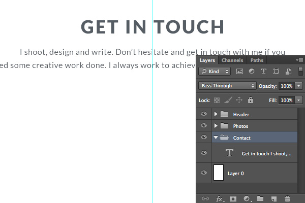
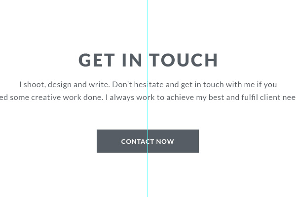
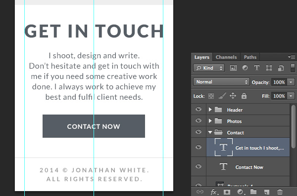
Minimise Photos group by clicking a small arrow next to the group name and open up Contact group. After that pick the Horizontal Type Tool (T) and using quite large type enter a headline for the section, in my case it’s “GET IN TOUCH”. Give it plenty of space at the top and add a short description to urge action from the user. I’ve used #565d64 for the color and 36px size Lato (Black) font for the headline and 16px Lato (Regular) for the description.
Step 2
Now we need a call to action button that users will click on to carry out the desired action. For this tutorial let’s use a simple contact button. I’ve used the Rectangle Tool (U), drawn a simple shape and placed text on top of it. Make sure to use plenty of space above the button so it looks balanced and clean.
Step 3
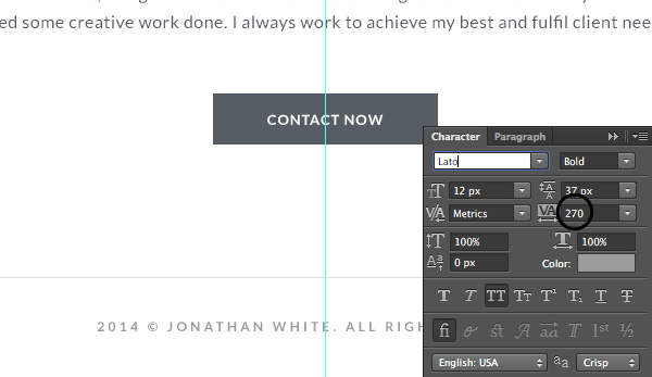
Finally let’s put a generic copyright line at the bottom of our portfolio. Before doing so, pick the Line Tool (U) and draw a subtle grey #e0e0e0 horizontal 1px line across the document leaving around 90px of space at the very bottom. Right after that place your copyright line. In this case I’ve used 12px size Lato (Bold) font with letter spacing of 270 and dark grey #9b9b9b.
You’re Done… With the Web Version
And here you are, all done with the web version of the portfolio! Now I’ll show you how you can quickly transform the web version for the mobile so you can visualise the responsive website.
Designing a Mobile Version
Step 1
Let’s create a new document and set the dimensions to be 320x2100px. Create three vertical guidelines at 20px, 150px and 300px to guide us, leaving some space at the sides. After that select all groups in our web version document, drag them all to a new document tab until the new document shows up and release the groups there.
Step 2
Now open up Header group, find our logo and using the Move Tool (V) move it to the right until it is visible in our new narrow layout. Leave it next to the first vertical guideline. After that find the social icons and move them to the left.
Step 3
Now it is time to adapt the main message. Pick the Horizontal Type Tool (T), break the description line and reduce the main message font to fit it between the first and third vertical guidelines. Adjust the line height options and you’re good to go.
Step 4
Open up the Photos group and move up the “LATEST PHOTOS” title as we don’t need so much space on mobile view. After that find the Photo group and move it between the vertical guidelines. Then open up the group, click on the description background rectangle shape, hit CMD+T and resize it to be 280px in width. Do the same with the photo rectangle. Finally, arrange the photos in one column and resize them to fit between the guidelines.
Step 5
Our Photos section has become longer than on the web version, so background adjustments are needed. Find the Photos background layer and hit CMD+T to resize it, make it taller and leave some space at the bottom of the section.
Step 6
Finally we need to rearrange our contact section so the message fits between our set guidelines and is nicely aligned. Open up the Contact group and using the Horizontal Type Tool (T) break the contact message lines to make them fit between our guidelines. Be sure to reduce the space above and below the elements as we don’t need that much white space for the mobile view. Also, reduce the line height for the message so it looks clean and professional.
The very last thing is to break the copyright line into two lines so it also falls between the guidelines.
Congratulations!
That’s it. We’re done with the web and mobile versions of our fresh Instagram based portfolio. I hope you learnt something new and that the skills you’ve gained will help you to build some amazing things in the future.
I’d love to hear your feedback and see the outcomes of this tutorial!


![]()